Open-source React UI library built with Tailwind CSS. Production-ready components, blocks, and templates to help you build modern, accessible web apps faster.
See the codeTailgrids is an open-source React UI component library built with Tailwind CSS. Ship modern web applications faster with an extensive collection of 100+ production-ready, fully customizable, copy-paste friendly components, plus premium UI blocks and templates.
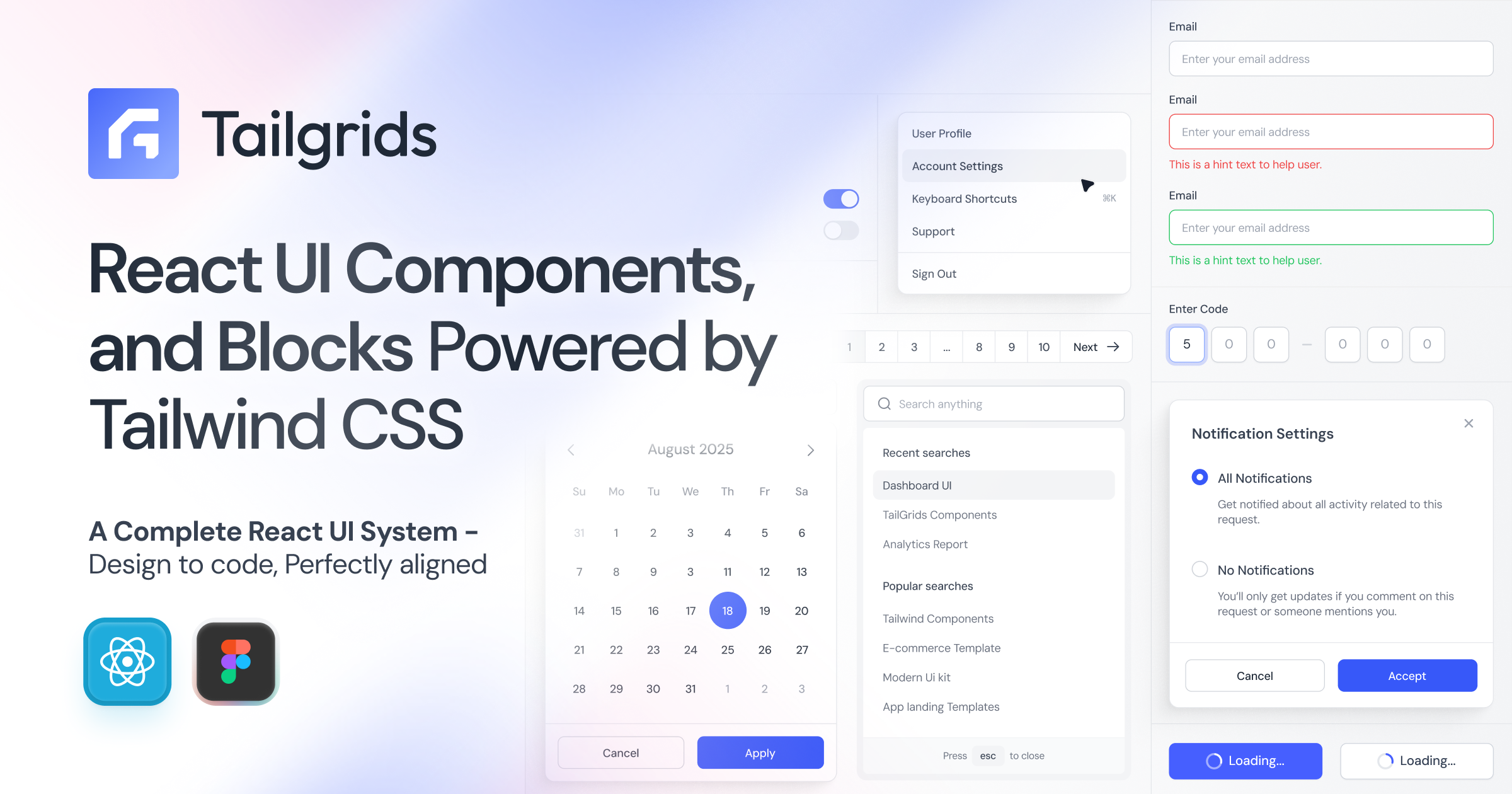
All components feature a sleek, handcrafted, pixel-perfect design optimized for exceptional UX, high performance, accessibility (a11y), dark mode, and responsiveness.
Build human-centered websites, dashboards, SaaS products, landing pages, and internal tools — without reinventing the UI from scratch.


Set up Tailgrids in your React / Next.js project in seconds.
npx @tailgrids/cli@latest init
This creates the config, base styles, and installs required dependencies.
npx @tailgrids/cli@latest add button
import { Button } from "@/components/core/button";

export default function Home() {
  return <Button variant="primary">Hello Tailgrids!</Button>;
}
Full installation guide → Tailgrids Installation Docs
| Resource | Link |
|---|---|
| Website | tailgrids.com |
| Documentation | tailgrids.com/docs |
| All Components | tailgrids.com/docs/components |
| UI Blocks | tailgrids.com/blocks |
| Templates | tailgrids.com/templates |
| Changelog | tailgrids.com/docs/changelog |
| GitHub Repository | TailGrids/tailgrids |
| CLI Documentation | Installation Guide |
100+ free, production-ready React components — categorized for easy browsing.
All components are fully documented with examples, API references, accessibility notes, and copy-paste code.
Browse the full interactive component library → tailgrids.com/docs/components
UI Blocks – Pre-built sections for dashboards, apps, marketing, e-commerce, and AI products → Explore Blocks
Templates – Complete, ready-to-use React + Tailwind pages and layouts → Browse Templates
Tailgrids is designed for developers and designers who ship real products:
This project is licensed under the MIT License — free for personal and commercial use.
See LICENSE for details.
We welcome contributions! Feel free to:
Made with ❤️ for the React Tailwind community.
Start building faster today → Get Started
169 followers · starred May 2024
418 followers · starred Sep 2026
52 followers · starred May 2026
3 followers · starred Apr 2026
Open-source React UI library built with Tailwind CSS. Production-ready components, blocks, and templates to help you build modern, accessible web apps faster.
See the codeTailgrids is an open-source React UI component library built with Tailwind CSS. Ship modern web applications faster with an extensive collection of 100+ production-ready, fully customizable, copy-paste friendly components, plus premium UI blocks and templates.
All components feature a sleek, handcrafted, pixel-perfect design optimized for exceptional UX, high performance, accessibility (a11y), dark mode, and responsiveness.
Build human-centered websites, dashboards, SaaS products, landing pages, and internal tools — without reinventing the UI from scratch.
Set up Tailgrids in your React / Next.js project in seconds.
npx @tailgrids/cli@latest init
This creates the config, base styles, and installs required dependencies.
npx @tailgrids/cli@latest add button
import { Button } from "@/components/core/button";

export default function Home() {
  return <Button variant="primary">Hello Tailgrids!</Button>;
}
Full installation guide → Tailgrids Installation Docs
| Resource | Link |
|---|---|
| Website | tailgrids.com |
| Documentation | tailgrids.com/docs |
| All Components | tailgrids.com/docs/components |
| UI Blocks | tailgrids.com/blocks |
| Templates | tailgrids.com/templates |
| Changelog | tailgrids.com/docs/changelog |
| GitHub Repository | TailGrids/tailgrids |
| CLI Documentation | Installation Guide |
100+ free, production-ready React components — categorized for easy browsing.
All components are fully documented with examples, API references, accessibility notes, and copy-paste code.
Browse the full interactive component library → tailgrids.com/docs/components
UI Blocks – Pre-built sections for dashboards, apps, marketing, e-commerce, and AI products → Explore Blocks
Templates – Complete, ready-to-use React + Tailwind pages and layouts → Browse Templates
Tailgrids is designed for developers and designers who ship real products:
This project is licensed under the MIT License — free for personal and commercial use.
See LICENSE for details.
We welcome contributions! Feel free to:
Made with ❤️ for the React Tailwind community.
Start building faster today → Get Started
169 followers · starred May 2024
418 followers · starred Sep 2026
52 followers · starred May 2026
3 followers · starred Apr 2026