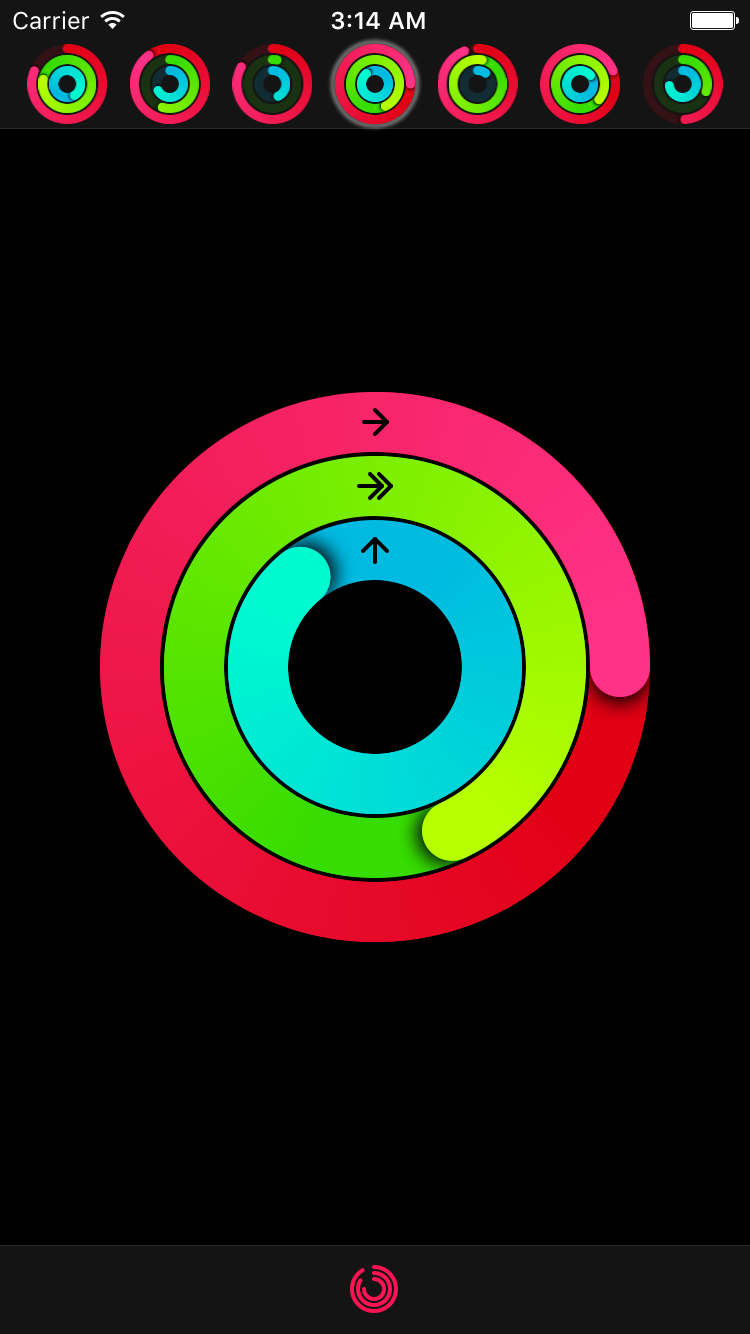
⭕️ Ring progress view similar to Activity app on Apple Watch
Swift
1,569
99 commits
updated May 4, 2023






Ring progress view similar to Activity app on Apple Watch
To install MKRingProgressView via CocoaPods, add the following line to your Podfile:
pod 'MKRingProgressView'
To install MKRingProgressView via Carthage, add the following line to your Cartfile:
github "maxkonovalov/MKRingProgressView"
Note: Instructions below are for using SwiftPM without the Xcode UI. It's the easiest to go to your Project Settings -> Swift Packages and add MKRingProgressView from there.
To integrate using Apple's Swift package manager, without Xcode integration, add the following as a dependency to your Package.swift:
.package(url: "https://github.com/maxkonovalov/MKRingProgressView.git", .upToNextMajor(from: "2.3.0"))
See the example Xcode project. It contains 2 targets:
MKRingProgressView can be set up in Interface Builder. To use it, set the custom view class to MKRingProgressView. Most of the control's parameters can be customized in Interface Builder.
let ringProgressView = RingProgressView(frame: CGRect(x: 0, y: 100, width: 100, height: 100))
ringProgressView.startColor = .red
ringProgressView.endColor = .magenta
ringProgressView.ringWidth = 25
ringProgressView.progress = 0.0
view.addSubview(ringProgressView)
The progress value can be animated the same way you would normally animate any property using UIView's block-based animations:
UIView.animate(withDuration: 0.5) {
    ringProgressView.progress = 1.0
}
To achieve better performance the following options are possible:
gradientImageScale to lower values like 0.5 (defaults to 1.0)startColor and endColor to the same valueshadowOpacity to 0.0allowsAntialiasing to falseMKRingProgressView is available under the MIT license. See the LICENSE file for more info.
367 followers · starred Jul 2018
495 followers · starred Feb 2018
89 followers · starred Feb 2018
590 followers · starred Nov 2020
⭕️ Ring progress view similar to Activity app on Apple Watch
Swift
1,569
99 commits
updated May 4, 2023
Ring progress view similar to Activity app on Apple Watch
To install MKRingProgressView via CocoaPods, add the following line to your Podfile:
pod 'MKRingProgressView'
To install MKRingProgressView via Carthage, add the following line to your Cartfile:
github "maxkonovalov/MKRingProgressView"
Note: Instructions below are for using SwiftPM without the Xcode UI. It's the easiest to go to your Project Settings -> Swift Packages and add MKRingProgressView from there.
To integrate using Apple's Swift package manager, without Xcode integration, add the following as a dependency to your Package.swift:
.package(url: "https://github.com/maxkonovalov/MKRingProgressView.git", .upToNextMajor(from: "2.3.0"))
See the example Xcode project. It contains 2 targets:
MKRingProgressView can be set up in Interface Builder. To use it, set the custom view class to MKRingProgressView. Most of the control's parameters can be customized in Interface Builder.
let ringProgressView = RingProgressView(frame: CGRect(x: 0, y: 100, width: 100, height: 100))
ringProgressView.startColor = .red
ringProgressView.endColor = .magenta
ringProgressView.ringWidth = 25
ringProgressView.progress = 0.0
view.addSubview(ringProgressView)
The progress value can be animated the same way you would normally animate any property using UIView's block-based animations:
UIView.animate(withDuration: 0.5) {
    ringProgressView.progress = 1.0
}
To achieve better performance the following options are possible:
gradientImageScale to lower values like 0.5 (defaults to 1.0)startColor and endColor to the same valueshadowOpacity to 0.0allowsAntialiasing to falseMKRingProgressView is available under the MIT license. See the LICENSE file for more info.
367 followers · starred Jul 2018
495 followers · starred Feb 2018
89 followers · starred Feb 2018
590 followers · starred Nov 2020