
Bulma's pure JavaScript extension to display toasts
See the codeREADME
bulma-toast


Bulma's pure JavaScript extension to display toasts. Basically a Bulma's notification implemented as a toast plugin.
Options
The plugin comes with the following options:
message: The actual message to be displayed. It can be a string, a template string, or a DOM node. See examples. This is required.type: Essentially a Bulma's css class. It can beis-primary,is-link,is-info,is-success,is-warning,is-danger, or any other custom class. Default is a whitesmoke background with dark text as shown here.duration: Duration of the notification in milliseconds. Default is2000milliseconds.position: Position where the notification will be shown. The default istop-right, so if you want it to be on the top-left just addtop-leftto this option. The available options are:top-left,top-center,top-right,center,bottom-left,bottom-center, andbottom-right.dismissible: Whether the notification will have a close button or not. Default isfalse.pauseOnHover: Pauses delay when hovering the notification. Default isfalse.single: Only show a single toast inappendTo. Default isfalse.closeOnClick: Dismisses the notification when clicked. Default istrue.opacity: The notification's container opacity. Default is1.animate: See here. Default is no animations.appendTo: By default, the notification will be appended todocument.body. Pass a different Node to have it appended else where in the DOM.extraClasses: Adds classes for styling the toast notification.
Install
npm install bulma-toast
or
yarn add bulma-toast
Quick Start
- Link to bulma-toast.min.js
<script src="bulma-toast.min.js"></script>
- Use bulma-toast to display a toast
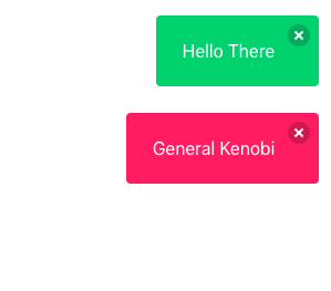
bulmaToast.toast({ message: 'Hello There' })
bulmaToast.toast({ message: 'General Kenobi', type: 'is-danger' })
ES Modules
// Import the toast function
import * as bulmaToast from 'bulma-toast'
// Or use
// import { toast as superToast } from 'bulma-toast'
// to rename your import

toast({
  message: 'Hello There',
  type: 'is-success',
  dismissible: true,
  animate: { in: 'fadeIn', out: 'fadeOut' },
})
Default config
A simple default object to prevent errors. Your options will be merged with these and the defaults will be used if the fields are not provided.
{
  "duration": 2000,
  "position": "top-right",
  "closeOnClick": true,
  "opacity": 1,
  "single": false,
  "offsetTop": 0,
  "offsetBottom": 0,
  "offsetLeft": 0,
  "offsetRight": 0
}
The default config can be updated using the funcion setDefaults. Also, it's possible to reset to the default config using resetDefaults
bulmaToast.setDefaults({
  duration: 1000,
  position: 'top-left',
  closeOnClick: false,
})
Change document context
bulmaToast.setDoc(window.document)
This can be changed before each toast call and can be set to eny element.
Animate
Bulma Toast supports animate.css (and maybe others?). You MUST include animate.css on your document's <head>
<head>
  <link rel="stylesheet" href="animate.min.css" />
  <!-- or -->
  <link
    rel="stylesheet"
    href="https://cdn.jsdelivr.net/npm/animate.css@4.0.0/animate.min.css"
  />
  <!-- or -->
  <link
    rel="stylesheet"
    href="https://cdnjs.cloudflare.com/ajax/libs/animate.css/4.0.0/animate.min.css"
  />
</head>
Accepts a object with in and out with css classes to add animations. Using Animate.css you would pass a object like this:
  {
    message: "I'm animated! Yay!",
    duration: 2000,
    position: "top-right",
    animate: { in: 'fadeIn', out: 'fadeOut' }
  }
Warning: Don't use opacity when using animations. Some of them use the opacity property like fade in and fade out.
Examples
import { toast } from 'bulma-toast'

toast({
  message: 'Hello There',
  type: 'is-success',
  dismissible: true,
  pauseOnHover: true,
})

toast({
  message: '<h1>LOOK HERE</h1>',
  type: 'is-danger',
  dismissible: true,
  pauseOnHover: true,
  animate: { in: 'fadeIn', out: 'fadeOut' },
})

const myMessage = `It's ${new Date().toDateString()}`

toast({
  message: myMessage,
  type: 'is-primary',
  position: 'center',
  closeOnClick: true,
  pauseOnHover: true,
  opacity: 0.8,
})

const elm = document.createElement('a')
elm.text = 'Visit my website!'
elm.href = 'https://rfoel.com'

toast({
  message: elm,
  type: 'is-warning',
  position: 'center',
  closeOnClick: true,
  pauseOnHover: true,
  animate: { in: 'fadeIn', out: 'fadeOut' },
})
Contributing
Issues and pull requests are welcome.
License
Contributors


Similar repos


Languages
JavaScript
51.4%
HTML
48.6%
Bulma's pure JavaScript extension to display toasts
See the codeREADME
bulma-toast
Bulma's pure JavaScript extension to display toasts. Basically a Bulma's notification implemented as a toast plugin.
Options
The plugin comes with the following options:
message: The actual message to be displayed. It can be a string, a template string, or a DOM node. See examples. This is required.type: Essentially a Bulma's css class. It can beis-primary,is-link,is-info,is-success,is-warning,is-danger, or any other custom class. Default is a whitesmoke background with dark text as shown here.duration: Duration of the notification in milliseconds. Default is2000milliseconds.position: Position where the notification will be shown. The default istop-right, so if you want it to be on the top-left just addtop-leftto this option. The available options are:top-left,top-center,top-right,center,bottom-left,bottom-center, andbottom-right.dismissible: Whether the notification will have a close button or not. Default isfalse.pauseOnHover: Pauses delay when hovering the notification. Default isfalse.single: Only show a single toast inappendTo. Default isfalse.closeOnClick: Dismisses the notification when clicked. Default istrue.opacity: The notification's container opacity. Default is1.animate: See here. Default is no animations.appendTo: By default, the notification will be appended todocument.body. Pass a different Node to have it appended else where in the DOM.extraClasses: Adds classes for styling the toast notification.
Install
npm install bulma-toast
or
yarn add bulma-toast
Quick Start
- Link to bulma-toast.min.js
<script src="bulma-toast.min.js"></script>
- Use bulma-toast to display a toast
bulmaToast.toast({ message: 'Hello There' })
bulmaToast.toast({ message: 'General Kenobi', type: 'is-danger' })
ES Modules
// Import the toast function
import * as bulmaToast from 'bulma-toast'
// Or use
// import { toast as superToast } from 'bulma-toast'
// to rename your import

toast({
  message: 'Hello There',
  type: 'is-success',
  dismissible: true,
  animate: { in: 'fadeIn', out: 'fadeOut' },
})
Default config
A simple default object to prevent errors. Your options will be merged with these and the defaults will be used if the fields are not provided.
{
  "duration": 2000,
  "position": "top-right",
  "closeOnClick": true,
  "opacity": 1,
  "single": false,
  "offsetTop": 0,
  "offsetBottom": 0,
  "offsetLeft": 0,
  "offsetRight": 0
}
The default config can be updated using the funcion setDefaults. Also, it's possible to reset to the default config using resetDefaults
bulmaToast.setDefaults({
  duration: 1000,
  position: 'top-left',
  closeOnClick: false,
})
Change document context
bulmaToast.setDoc(window.document)
This can be changed before each toast call and can be set to eny element.
Animate
Bulma Toast supports animate.css (and maybe others?). You MUST include animate.css on your document's <head>
<head>
  <link rel="stylesheet" href="animate.min.css" />
  <!-- or -->
  <link
    rel="stylesheet"
    href="https://cdn.jsdelivr.net/npm/animate.css@4.0.0/animate.min.css"
  />
  <!-- or -->
  <link
    rel="stylesheet"
    href="https://cdnjs.cloudflare.com/ajax/libs/animate.css/4.0.0/animate.min.css"
  />
</head>
Accepts a object with in and out with css classes to add animations. Using Animate.css you would pass a object like this:
  {
    message: "I'm animated! Yay!",
    duration: 2000,
    position: "top-right",
    animate: { in: 'fadeIn', out: 'fadeOut' }
  }
Warning: Don't use opacity when using animations. Some of them use the opacity property like fade in and fade out.
Examples
import { toast } from 'bulma-toast'

toast({
  message: 'Hello There',
  type: 'is-success',
  dismissible: true,
  pauseOnHover: true,
})

toast({
  message: '<h1>LOOK HERE</h1>',
  type: 'is-danger',
  dismissible: true,
  pauseOnHover: true,
  animate: { in: 'fadeIn', out: 'fadeOut' },
})

const myMessage = `It's ${new Date().toDateString()}`

toast({
  message: myMessage,
  type: 'is-primary',
  position: 'center',
  closeOnClick: true,
  pauseOnHover: true,
  opacity: 0.8,
})

const elm = document.createElement('a')
elm.text = 'Visit my website!'
elm.href = 'https://rfoel.com'

toast({
  message: elm,
  type: 'is-warning',
  position: 'center',
  closeOnClick: true,
  pauseOnHover: true,
  animate: { in: 'fadeIn', out: 'fadeOut' },
})
Contributing
Issues and pull requests are welcome.
License
Similar repos
Contributors
Languages
JavaScript
51.4%
HTML
48.6%