
Toast library for Flutter.
515
stars
154
commits
Dart
primary language
Jan 19, 2026
updated
README
oktoast




A library for flutter.
A pure dart toast Library.
You can completely customize the style of toast.
Screenshot
| Default | Custom | GIF |
|---|---|---|
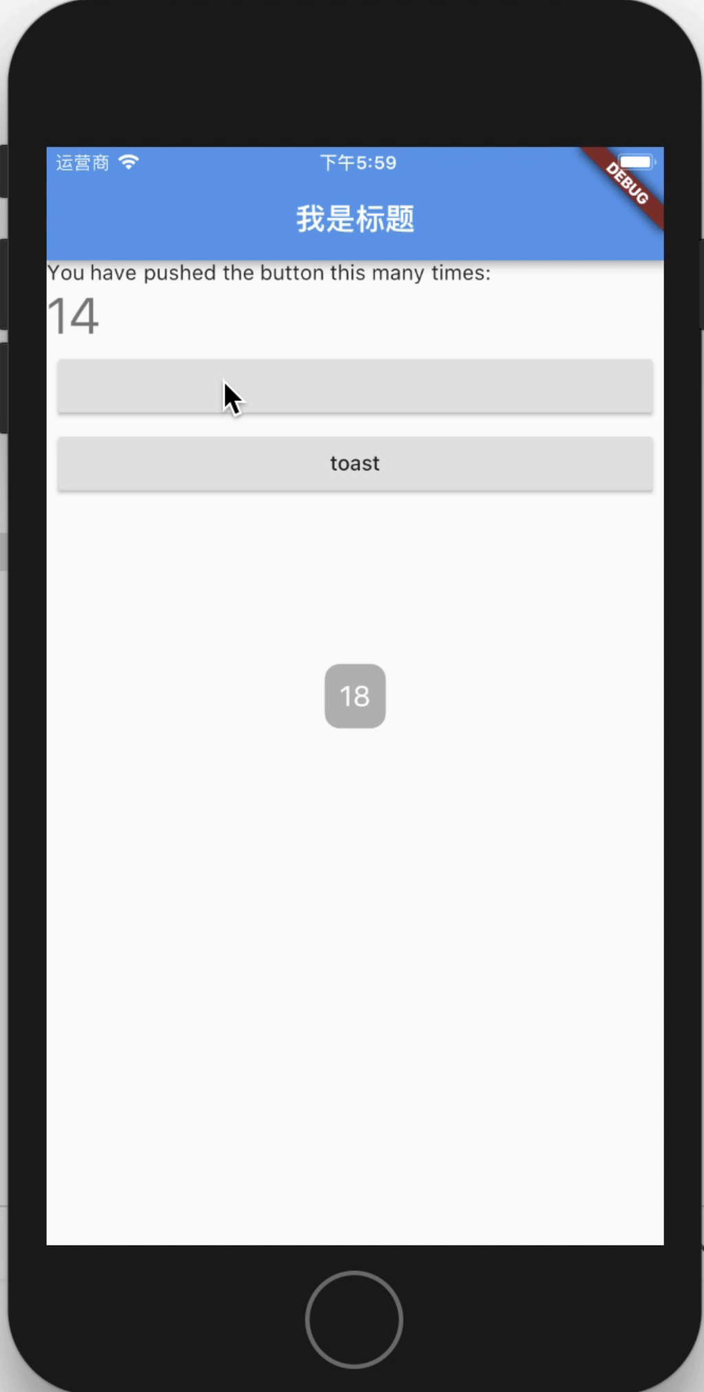 | 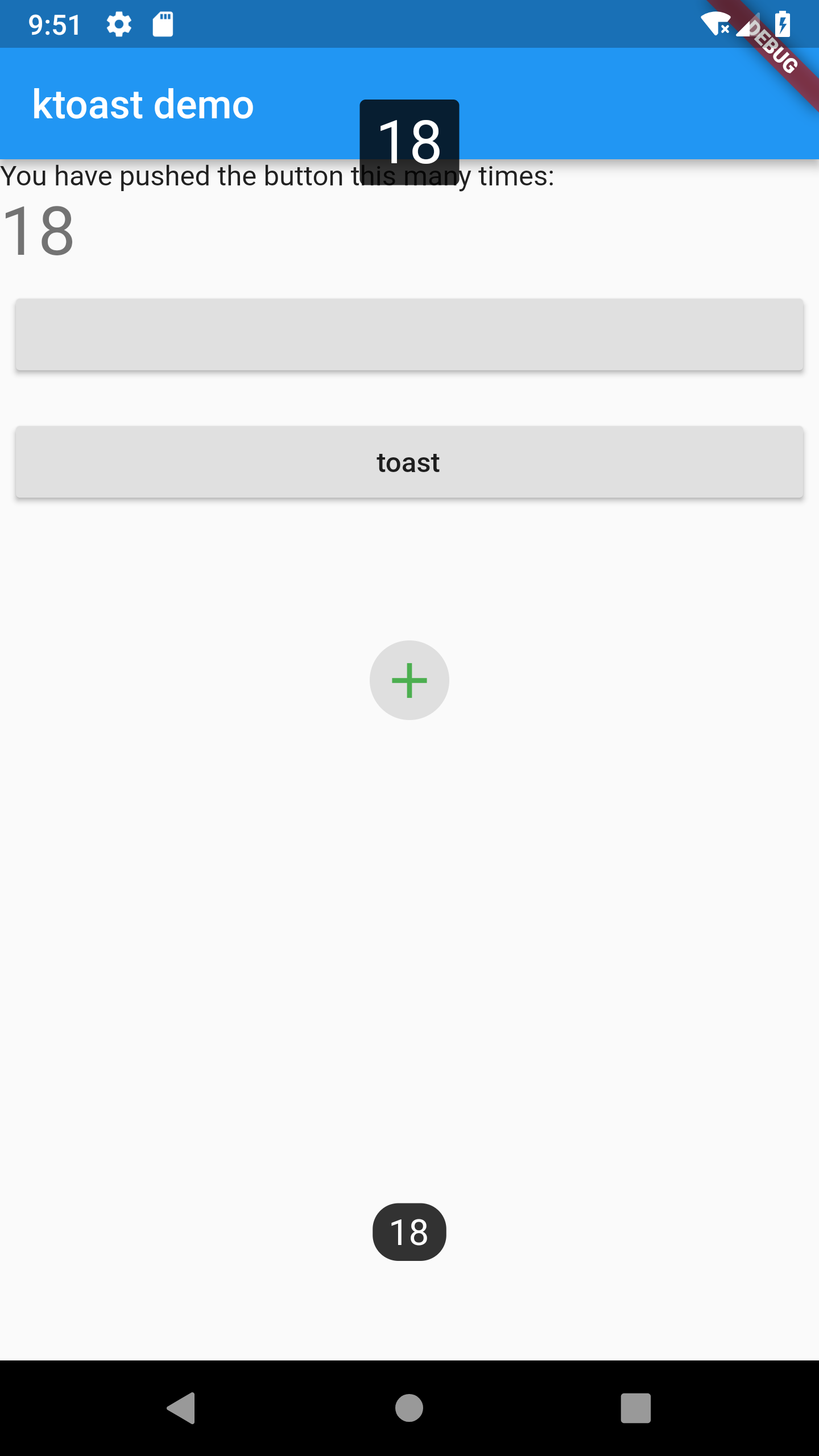 | 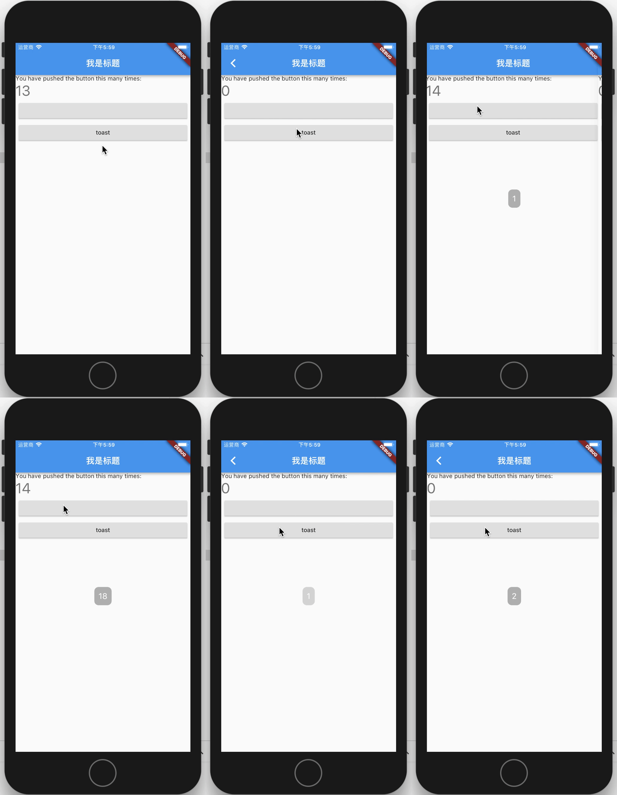 |
Versions
3.x.x
Starting from the 3.x version, OKToast provides a null-safety version, the specific introduction of null-safety can be viewed in dart or flutter.
The 2.3.2 version is the last version that does not support null-safety.
About version 1.x
if you use OKToast 1.x, Please use the 1.x branch, and read version readme.
Proposed migration to 2.x version. The new version does not require buildContext.
And you can completely customize the style of toast, because now you can use showToastWidget.
Usage
1. Add library to your pubspec.yaml
flutter pub add oktoast
2. Import library in dart file
import 'package:oktoast/oktoast.dart';
3. Wrap your app widget
OKToast(
  /// set toast style, optional
  child:MaterialApp()
);
Tips:
If you happened error like: No MediaQuery widget found,
you can try to use this code
to include OKToast to your App.
MaterialApp(
  builder: (BuildContext context, Widget? widget) {
    return OKToast(child: widget);
  },
);
4. Call method showToast
showToast('content');

// position and second have default value, is optional
showToastWidget(Text('hello oktoast'));
Explain
There are two reasons why you need to wrap MaterialApp
- Because this ensures that toast can be displayed in front of all other controls
- Context can be cached so that it can be invoked anywhere without passing in context
Properties
OKToast params
OKToast have default style, and you also can custom style or other behavior.
| name | type | need | desc |
|---|---|---|---|
| child | Widget | required | Usually Material App |
| textStyle | TextStyle | optional | |
| radius | double | optional | |
| backgroundColor | Color | optional | backroundColor |
| position | ToastPosition | optional | |
| dismissOtherOnShow | bool | optional | If true, other toasts will be dismissed. Default false. |
| movingOnWindowChange | bool | optional | If true, when the size changes, toast is moved. Default true. |
| textDirection | TextDirection | optional | |
| textPadding | EdgeInsetsGeometry | optional | Outer margin of text |
| textAlign | TextAlign | optional | When the text wraps, the align of the text. |
| handleTouch | bool | optional | Default is false, if it's true, can responed use touch event. |
| animationBuilder | OKToastAnimationBuilder | optional | Add animation to show / hide toast. |
| animationDuration | Duration | optional | The duration of animation. |
| animationCurve | Curve | optional | Curve of animation. |
| duration | Duration | optional | Default duration of toast. |
Method showToast
Display text on toast.
Description of params see OKToast.
| name | type | need | desc |
|---|---|---|---|
| msg | String | required | Text of toast. |
| context | BuildContext | optional | |
| duration | Duration | optional | |
| position | ToastPosition | optional | |
| textStyle | TextStyle | optional | |
| textPadding | EdgeInsetsGeometry | optional | |
| backgroundColor | Color | optional | |
| radius | double | optional | |
| onDismiss | Function | optional | |
| textDirection | TextDirection | optional | |
| dismissOtherToast | bool | optional | |
| textAlign | TextAlign | optional | |
| animationBuilder | OKToastAnimationBuilder | optional | |
| animationDuration | Duration | optional | |
| animationCurve | Curve | optional |
Method showToastWidget
Display custom widgets on toast
Description of params see showToast.
| name | type | need | desc |
|---|---|---|---|
| widget | Widget | required | The widget you want to display. |
| context | BuildContext | optional | |
| duration | Duration | optional | |
| position | ToastPosition | optional | |
| onDismiss | Function | optional | |
| dismissOtherToast | bool | optional | |
| textDirection | TextDirection | optional | |
| handleTouch | bool | optional | |
| animationBuilder | OKToastAnimationBuilder | optional | |
| animationDuration | Duration | optional | |
| animationCurve | Curve | optional |
Method dismissAllToast
Dismiss all toast.
Return value of showToast and showToastWidget
about return type:
showToast and showToastWidget return type is ToastFuture,
The ToastFuture can be use to dismiss the toast.
For all dismiss toast method
An optional parameter showAnim is added to control whether fading animation is required for dismiss.
The praram default value is false.
Examples
import 'package:flutter/material.dart';
import 'package:oktoast/oktoast.dart'; // 1. import library

void main() => runApp( MyApp());

class MyApp extends StatelessWidget {
  @override
  Widget build(BuildContext context) {
    return OKToast(
      // 2. wrap your app with OKToast
      child:  MaterialApp(
        title: 'Flutter Demo',
        theme:  ThemeData(
          primarySwatch: Colors.blue,
        ),
        home:  MyHomePage(),
      ),
    );
  }
}

class MyHomePage extends StatefulWidget {
  MyHomePage({Key key}) : super(key: key);

  @override
  _MyHomePageState createState() =>  _MyHomePageState();
}

class _MyHomePageState extends State<MyHomePage> {
  int _counter = 0;

  void _incrementCounter() {
    _counter++;

    // 3.1 use showToast method
    showToast(
      "$_counter",
      duration: Duration(seconds: 2),
      position: ToastPosition.bottom,
      backgroundColor: Colors.black.withOpacity(0.8),
      radius: 13.0,
      textStyle: TextStyle(fontSize: 18.0),
    );

    showToast(
      "$_counter",
      duration: Duration(seconds: 2),
      position: ToastPosition.top,
      backgroundColor: Colors.black.withOpacity(0.8),
      radius: 3.0,
      textStyle: TextStyle(fontSize: 30.0),
    );

    // 3.2 use showToastWidget method to custom widget
    Widget widget = Center(
      child: ClipRRect(
        borderRadius: BorderRadius.circular(30.0),
        child: Container(
          width: 40.0,
          height: 40.0,
           color: Colors.grey.withOpacity(0.3),
          child: Icon(
            Icons.add,
            size: 30.0,
            color: Colors.green,
          ),
        ),
      ),
    );

    ToastFuture toastFuture = showToastWidget(
      widget,
      duration: Duration(seconds: 3),
      onDismiss: () {
        print("the toast dismiss"); // the method will be called on toast dismiss.
      },
    );

    // can use future
    Future.delayed(Duration(seconds: 1), () {
      toastFuture.dismiss(); // dismiss
    });

    setState(() {

    });
  }

  @override
  Widget build(BuildContext context) {
    return  Scaffold(
      appBar:  AppBar(
        title:  Text("ktoast demo"),
      ),
      body: Stack(
        children: <Widget>[
           Center(
            child: ListView(
              children: <Widget>[
                 Text(
                  'You have pushed the button this many times:',
                ),
                 Text(
                  '$_counter',
                  style: Theme.of(context).textTheme.display1,
                ),
                Padding(
                  padding: const EdgeInsets.all(8.0),
                  child: RaisedButton(
                    onPressed: () {
                      Navigator.push(context,
                          MaterialPageRoute(builder: (ctx) => MyHomePage()));
                    },
                  ),
                ),
                Padding(
                  padding: const EdgeInsets.all(8.0),
                  child: RaisedButton(
                    onPressed: _incrementCounter,
                    child: Text('toast'),
                  ),
                ),
              ],
            ),
          ),
        ],
      ),
    );
  }
}
CHANGELOG
LICENSE
Contributors



Similar repos


Languages
Dart
95.0%
Swift
1.8%
HTML
1.6%
Ruby
1.2%
Toast library for Flutter.
515
stars
154
commits
Dart
primary language
Jan 19, 2026
updated
README
oktoast
A library for flutter.
A pure dart toast Library.
You can completely customize the style of toast.
Screenshot
| Default | Custom | GIF |
|---|---|---|
| | |
Versions
3.x.x
Starting from the 3.x version, OKToast provides a null-safety version, the specific introduction of null-safety can be viewed in dart or flutter.
The 2.3.2 version is the last version that does not support null-safety.
About version 1.x
if you use OKToast 1.x, Please use the 1.x branch, and read version readme.
Proposed migration to 2.x version. The new version does not require buildContext.
And you can completely customize the style of toast, because now you can use showToastWidget.
Usage
1. Add library to your pubspec.yaml
flutter pub add oktoast
2. Import library in dart file
import 'package:oktoast/oktoast.dart';
3. Wrap your app widget
OKToast(
  /// set toast style, optional
  child:MaterialApp()
);
Tips:
If you happened error like: No MediaQuery widget found,
you can try to use this code
to include OKToast to your App.
MaterialApp(
  builder: (BuildContext context, Widget? widget) {
    return OKToast(child: widget);
  },
);
4. Call method showToast
showToast('content');

// position and second have default value, is optional
showToastWidget(Text('hello oktoast'));
Explain
There are two reasons why you need to wrap MaterialApp
- Because this ensures that toast can be displayed in front of all other controls
- Context can be cached so that it can be invoked anywhere without passing in context
Properties
OKToast params
OKToast have default style, and you also can custom style or other behavior.
| name | type | need | desc |
|---|---|---|---|
| child | Widget | required | Usually Material App |
| textStyle | TextStyle | optional | |
| radius | double | optional | |
| backgroundColor | Color | optional | backroundColor |
| position | ToastPosition | optional | |
| dismissOtherOnShow | bool | optional | If true, other toasts will be dismissed. Default false. |
| movingOnWindowChange | bool | optional | If true, when the size changes, toast is moved. Default true. |
| textDirection | TextDirection | optional | |
| textPadding | EdgeInsetsGeometry | optional | Outer margin of text |
| textAlign | TextAlign | optional | When the text wraps, the align of the text. |
| handleTouch | bool | optional | Default is false, if it's true, can responed use touch event. |
| animationBuilder | OKToastAnimationBuilder | optional | Add animation to show / hide toast. |
| animationDuration | Duration | optional | The duration of animation. |
| animationCurve | Curve | optional | Curve of animation. |
| duration | Duration | optional | Default duration of toast. |
Method showToast
Display text on toast.
Description of params see OKToast.
| name | type | need | desc |
|---|---|---|---|
| msg | String | required | Text of toast. |
| context | BuildContext | optional | |
| duration | Duration | optional | |
| position | ToastPosition | optional | |
| textStyle | TextStyle | optional | |
| textPadding | EdgeInsetsGeometry | optional | |
| backgroundColor | Color | optional | |
| radius | double | optional | |
| onDismiss | Function | optional | |
| textDirection | TextDirection | optional | |
| dismissOtherToast | bool | optional | |
| textAlign | TextAlign | optional | |
| animationBuilder | OKToastAnimationBuilder | optional | |
| animationDuration | Duration | optional | |
| animationCurve | Curve | optional |
Method showToastWidget
Display custom widgets on toast
Description of params see showToast.
| name | type | need | desc |
|---|---|---|---|
| widget | Widget | required | The widget you want to display. |
| context | BuildContext | optional | |
| duration | Duration | optional | |
| position | ToastPosition | optional | |
| onDismiss | Function | optional | |
| dismissOtherToast | bool | optional | |
| textDirection | TextDirection | optional | |
| handleTouch | bool | optional | |
| animationBuilder | OKToastAnimationBuilder | optional | |
| animationDuration | Duration | optional | |
| animationCurve | Curve | optional |
Method dismissAllToast
Dismiss all toast.
Return value of showToast and showToastWidget
about return type:
showToast and showToastWidget return type is ToastFuture,
The ToastFuture can be use to dismiss the toast.
For all dismiss toast method
An optional parameter showAnim is added to control whether fading animation is required for dismiss.
The praram default value is false.
Examples
import 'package:flutter/material.dart';
import 'package:oktoast/oktoast.dart'; // 1. import library

void main() => runApp( MyApp());

class MyApp extends StatelessWidget {
  @override
  Widget build(BuildContext context) {
    return OKToast(
      // 2. wrap your app with OKToast
      child:  MaterialApp(
        title: 'Flutter Demo',
        theme:  ThemeData(
          primarySwatch: Colors.blue,
        ),
        home:  MyHomePage(),
      ),
    );
  }
}

class MyHomePage extends StatefulWidget {
  MyHomePage({Key key}) : super(key: key);

  @override
  _MyHomePageState createState() =>  _MyHomePageState();
}

class _MyHomePageState extends State<MyHomePage> {
  int _counter = 0;

  void _incrementCounter() {
    _counter++;

    // 3.1 use showToast method
    showToast(
      "$_counter",
      duration: Duration(seconds: 2),
      position: ToastPosition.bottom,
      backgroundColor: Colors.black.withOpacity(0.8),
      radius: 13.0,
      textStyle: TextStyle(fontSize: 18.0),
    );

    showToast(
      "$_counter",
      duration: Duration(seconds: 2),
      position: ToastPosition.top,
      backgroundColor: Colors.black.withOpacity(0.8),
      radius: 3.0,
      textStyle: TextStyle(fontSize: 30.0),
    );

    // 3.2 use showToastWidget method to custom widget
    Widget widget = Center(
      child: ClipRRect(
        borderRadius: BorderRadius.circular(30.0),
        child: Container(
          width: 40.0,
          height: 40.0,
           color: Colors.grey.withOpacity(0.3),
          child: Icon(
            Icons.add,
            size: 30.0,
            color: Colors.green,
          ),
        ),
      ),
    );

    ToastFuture toastFuture = showToastWidget(
      widget,
      duration: Duration(seconds: 3),
      onDismiss: () {
        print("the toast dismiss"); // the method will be called on toast dismiss.
      },
    );

    // can use future
    Future.delayed(Duration(seconds: 1), () {
      toastFuture.dismiss(); // dismiss
    });

    setState(() {

    });
  }

  @override
  Widget build(BuildContext context) {
    return  Scaffold(
      appBar:  AppBar(
        title:  Text("ktoast demo"),
      ),
      body: Stack(
        children: <Widget>[
           Center(
            child: ListView(
              children: <Widget>[
                 Text(
                  'You have pushed the button this many times:',
                ),
                 Text(
                  '$_counter',
                  style: Theme.of(context).textTheme.display1,
                ),
                Padding(
                  padding: const EdgeInsets.all(8.0),
                  child: RaisedButton(
                    onPressed: () {
                      Navigator.push(context,
                          MaterialPageRoute(builder: (ctx) => MyHomePage()));
                    },
                  ),
                ),
                Padding(
                  padding: const EdgeInsets.all(8.0),
                  child: RaisedButton(
                    onPressed: _incrementCounter,
                    child: Text('toast'),
                  ),
                ),
              ],
            ),
          ),
        ],
      ),
    );
  }
}
CHANGELOG
LICENSE
Similar repos
Contributors
Languages
Dart
95.0%
Swift
1.8%
HTML
1.6%
Ruby
1.2%