React Native button component. Awesome Button is a 3D at 60fps, progress enabled, social ready, extendable, production ready component that renders an awesome animated set of UI buttons. 📱
See the code@rcaferati/react-native-awesome-button brings the Awesome Button interaction,
progress, sizing, and theme system to React Native with native Pressable,
accessibility, and animation behavior.
The library exports:
AwesomeButton as the default exportThemedButtongetThemeAwesomeButtonProps, ThemedButtonProps, ButtonWidth, ThemeName, ButtonVariant, and ButtonSize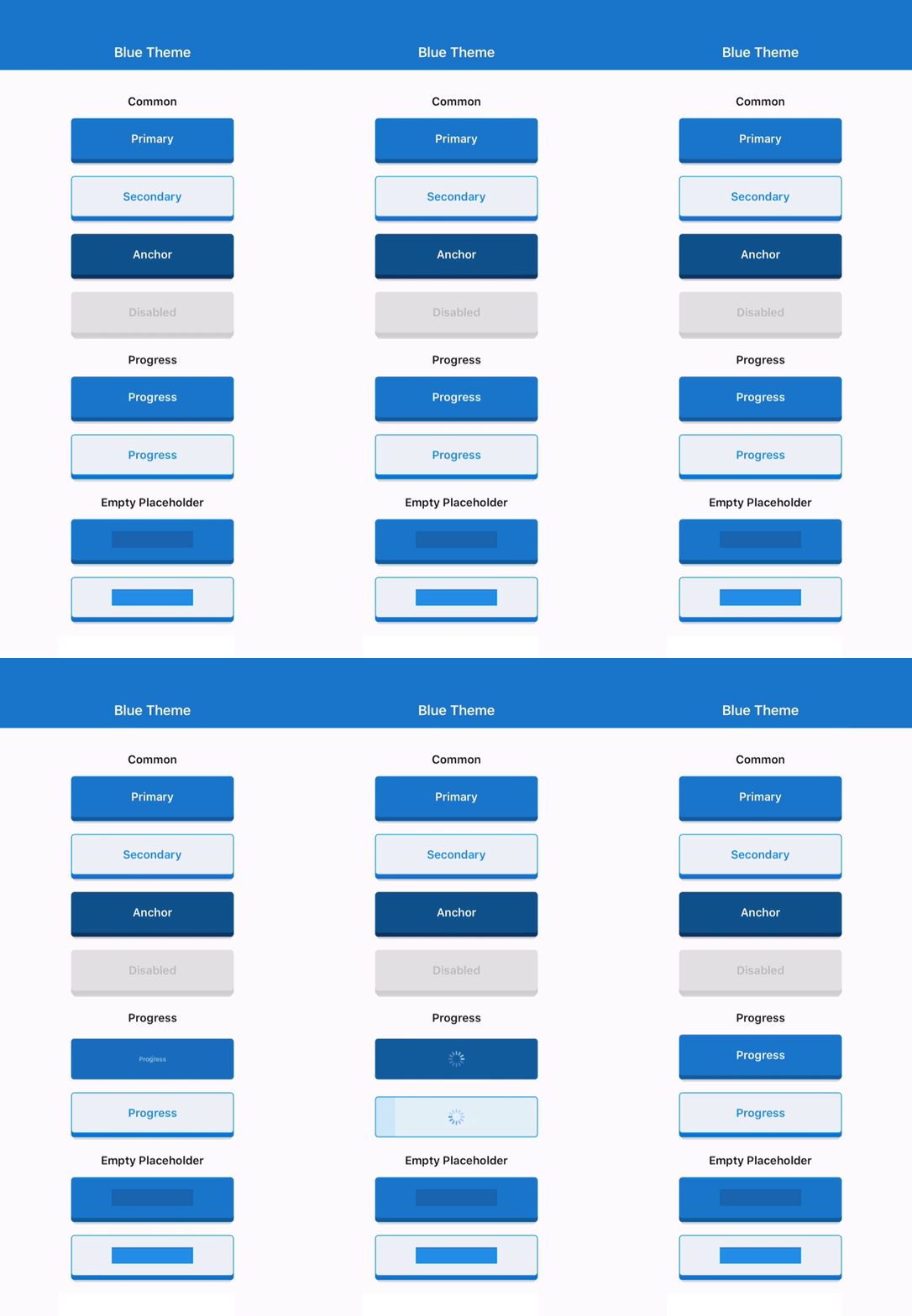 | 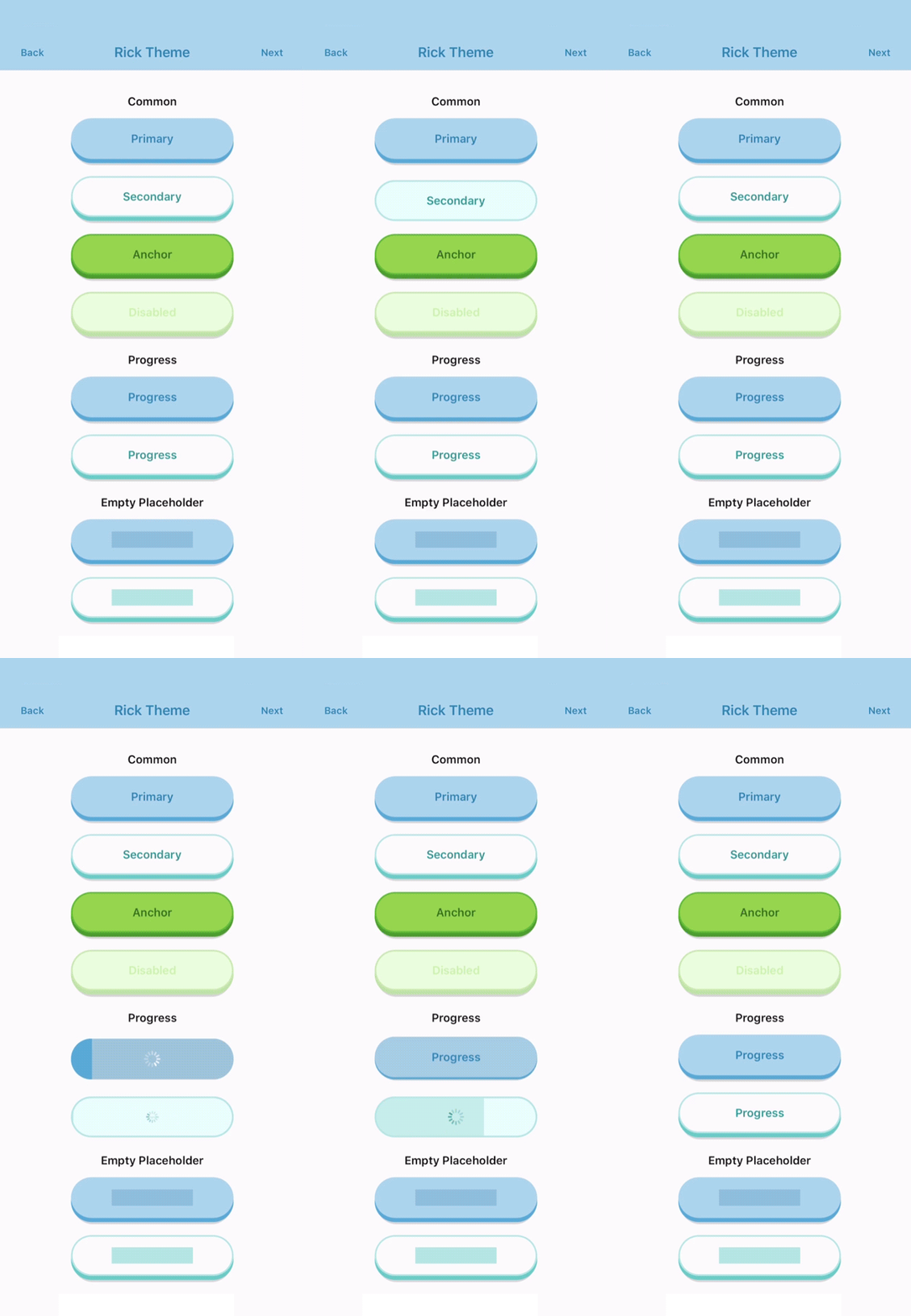 | 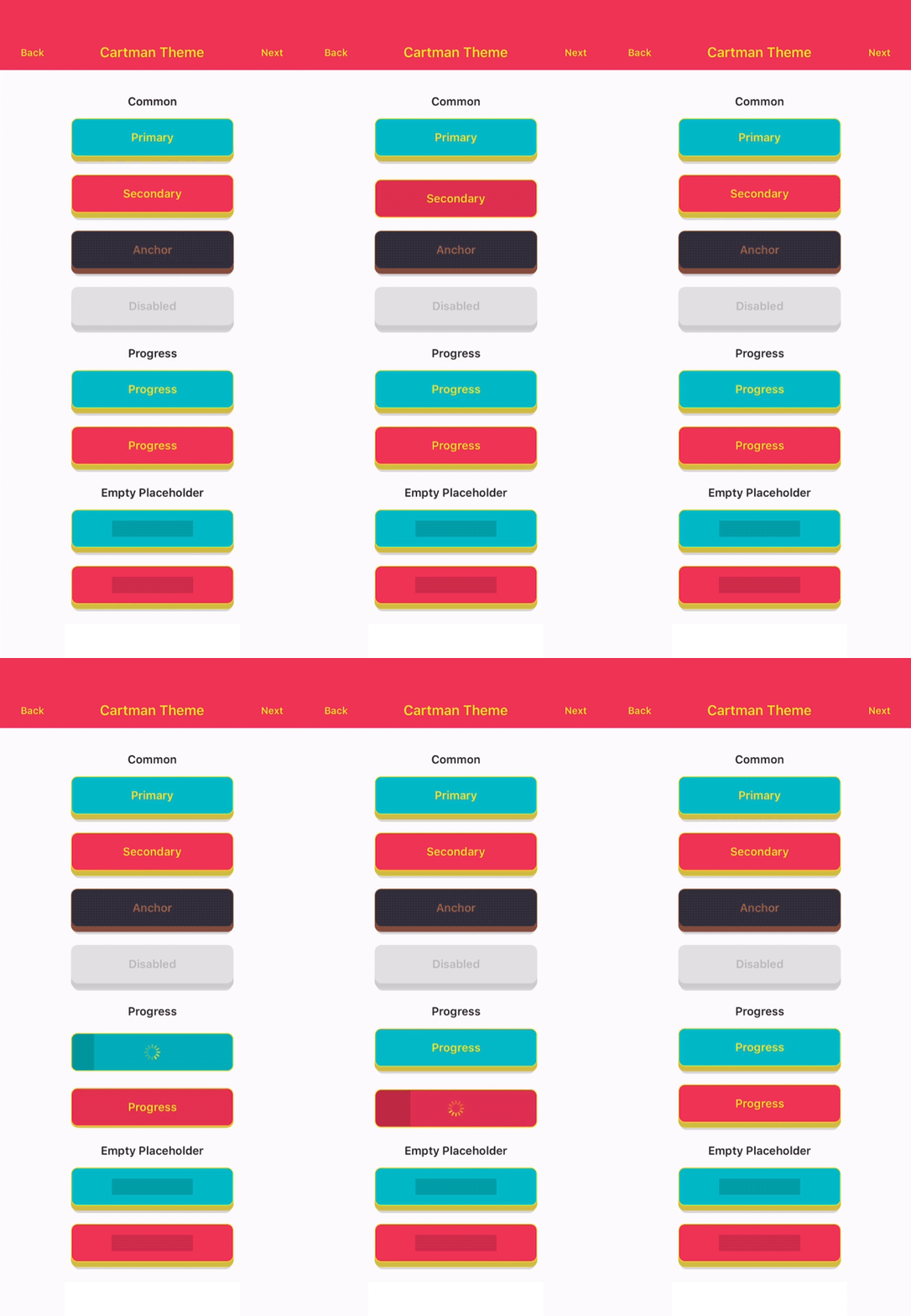 |
|---|
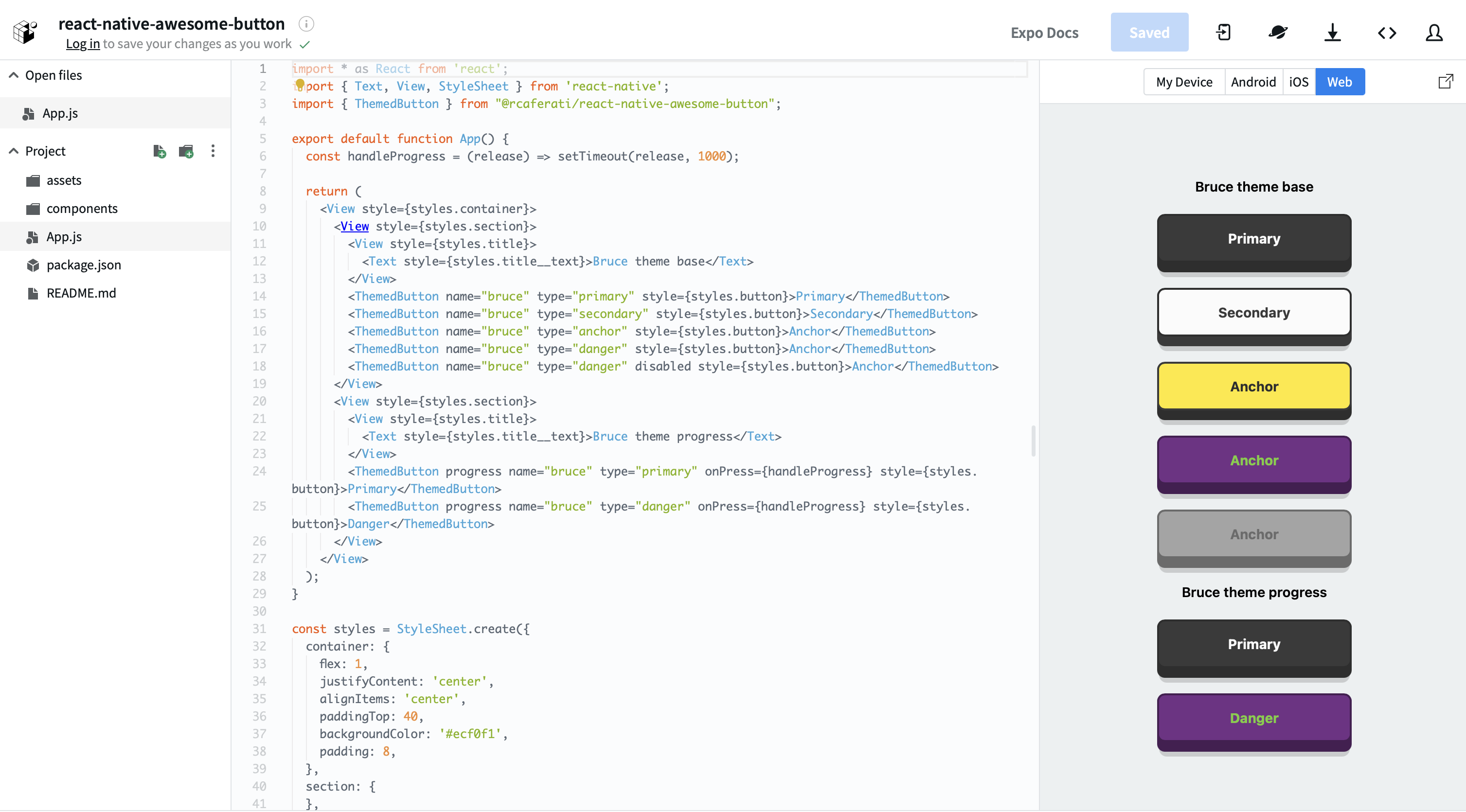
Try the live package demo on expo.dev.
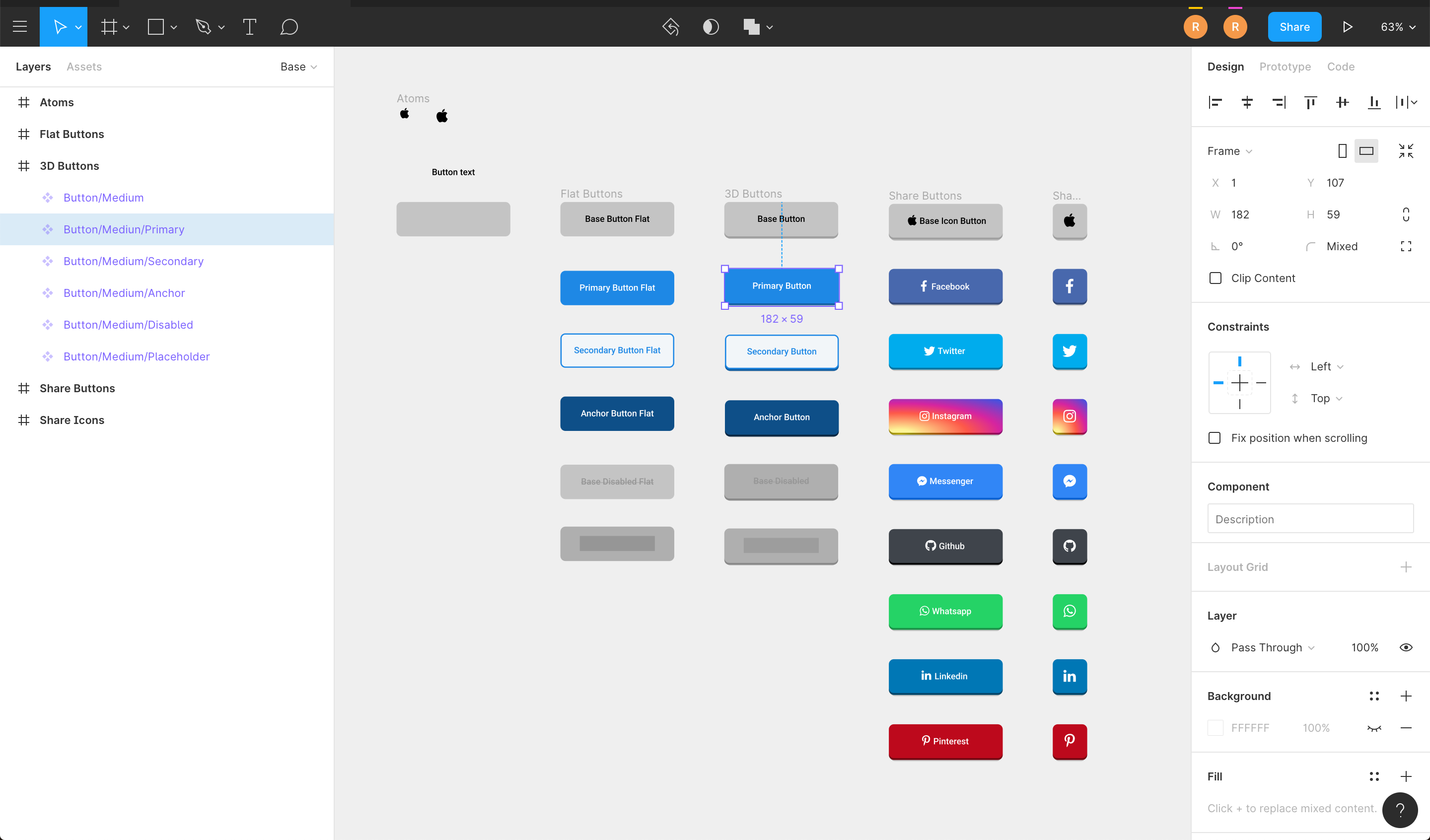
Explore the shared Awesome Button visual system in the Figma design file. The Figma file is a visual design reference; this package's documentation defines its behavior, accessibility, and public API contract.
npm install @rcaferati/react-native-awesome-button
Current peer support:
react >= 18.2.0react-native >= 0.76.0import AwesomeButton from '@rcaferati/react-native-awesome-button';
export function SaveButton() {
return <AwesomeButton>Save</AwesomeButton>;
}
AwesomeButton supports both plain string labels and arbitrary React Native content.
animateSize is enabled by default.
textTransition plus auto width:
textTransition, wider labels keep the fitting source visible until the target fits; the target remains clipped to one line until a matching native layout commit confirms physical-pixel fit, while narrower labels swap before width shrinksanimateSize={false} settles target geometry before text begins; Reduced Motion settles both immediately3.1.0import { ThemedButton } from '@rcaferati/react-native-awesome-button';
export function SizeExample({
isLong,
size,
}: {
isLong: boolean;
size: 'small' | 'medium' | 'large';
}) {
const label = isLong ? 'Open analytics dashboard' : 'Open';
return (
<>
<ThemedButton name="basic" autoWidth textTransition>
{label}
</ThemedButton>
<ThemedButton name="basic" autoWidth animateSize={false}>
{label}
</ThemedButton>
<ThemedButton name="rick" size={size}>
{size}
</ThemedButton>
</>
);
}
When progress is enabled, onPress receives a next callback. Call it when your work is done to complete the progress animation and release the button.
import AwesomeButton from '@rcaferati/react-native-awesome-button';

export function SubmitButton() {
  return (
    <AwesomeButton
      progress
      onPress={(next) => {
        setTimeout(() => {
          next?.();
        }, 800);
      }}
    >
      Submit
    </AwesomeButton>
  );
}
import { ThemedButton } from '@rcaferati/react-native-awesome-button';

export function ThemeExample() {
  return (
    <>
      <ThemedButton name="rick" type="primary">
        Rick Primary
      </ThemedButton>
      <ThemedButton name="rick" type="secondary">
        Rick Secondary
      </ThemedButton>
    </>
  );
}
If you need the full registered theme object, use getTheme.
import { ThemedButton, getTheme } from '@rcaferati/react-native-awesome-button';

export function ThemeConfigExample() {
  const theme = getTheme(0);

  return (
    <ThemedButton config={theme} type="anchor">
      {theme.title}
    </ThemedButton>
  );
}
getTheme() safely falls back to the default basic theme if the provided index or name is invalid.
Use before and after for inline content that should animate with the label, and extra for content rendered behind the button body.
import { StyleSheet, Text } from 'react-native';
import { AntDesign } from '@expo/vector-icons';
import { LinearGradient } from 'expo-linear-gradient';
import AwesomeButton from '@rcaferati/react-native-awesome-button';

export function ButtonContentExample() {
  return (
    <AwesomeButton
      before={<AntDesign name="arrowleft" size={18} color="#FFFFFF" />}
      after={<AntDesign name="arrowright" size={18} color="#FFFFFF" />}
      extra={
        <LinearGradient
          colors={['#4C63D2', '#BC3081', '#F47133', '#FED576']}
          style={StyleSheet.absoluteFillObject}
        />
      }
    >
      <Text style={{ color: '#FFFFFF', fontWeight: '700' }}>Continue</Text>
    </AwesomeButton>
  );
}
transparent is supported on ThemedButton. It removes the visible shell layers while preserving the content, hit target, and active/progress feedback.
import { ThemedButton } from '@rcaferati/react-native-awesome-button';

export function TransparentExample() {
  return (
    <ThemedButton name="bruce" type="anchor" transparent>
      Transparent
    </ThemedButton>
  );
}
basicbojackcartmanmysterionc137ricksummerbruceprimarysecondaryanchordangerdisabledflatx (canonical request-only bridge)twittermessengerfacebookgithublinkedinwhatsappredditpinterestyoutubex is the canonical social request. The legacy closed ButtonVariant and
SocialButtonVariant unions still contain twitter so exhaustive v3.1
consumers remain source-compatible; ThemedButtonProps.type accepts the
request-only AwesomeButtonVariant bridge, which adds x. A custom theme's
optional x style wins for an x request and otherwise falls back to its
required legacy twitter style. A twitter request continues to use the
legacy key.
Unknown variants fall back safely at runtime instead of crashing.
iconsmallmediumlargeThe tables below cover the primary consumer-facing props. The checked-in
API Extractor report and exported
AwesomeButtonProps / ThemedButtonProps types are the complete public
TypeScript reference.
| Attribute | Type | Default | Description |
|---|---|---|---|
activityColor | string | #FFFFFF | Activity indicator color shown during progress mode. |
activeOpacity | number | 1 | Opacity applied while the button is pressed. |
animatedPlaceholder | boolean | true | Enables the shimmer loop when the button has no children. |
animateSize | boolean | true | Animates fixed-size geometry changes and auto-width string-label changes. |
backgroundActive | string | rgba(0, 0, 0, 0.15) | Active overlay color rendered over the face while pressed. |
backgroundColor | string | #c0c0c0 | Main front-face background color. |
backgroundDarker | string | #9f9f9f | Bottom-face background color used for the raised 3D effect. |
backgroundPlaceholder | string | rgba(0, 0, 0, 0.15) | Placeholder bar background color when the button is empty. |
backgroundProgress | string | rgba(0, 0, 0, 0.15) | Progress bar background color used during progress mode. |
backgroundShadow | string | rgba(0, 0, 0, 0.15) | Shadow layer background color. |
before | ReactNode | null | Content rendered before the main label inside the button face. |
after | ReactNode | null | Content rendered after the main label inside the button face. |
extra | ReactNode | null | Content rendered behind the active/content layers, useful for gradients and custom backgrounds. |
children | ReactNode | null | Button label or custom content. Plain string labels also support textTransition. |
borderColor | string | undefined | Front-face border color. |
borderRadius | number | 4 | Shared border radius applied to the button face and lower layers. |
borderBottomLeftRadius | number | undefined | Bottom-left radius override. |
borderBottomRightRadius | number | undefined | Bottom-right radius override. |
borderTopLeftRadius | number | undefined | Top-left radius override. |
borderTopRightRadius | number | undefined | Top-right radius override. |
borderWidth | number | 0 | Front-face border width. |
dangerouslySetPressableProps | AwesomeButtonPressableProps | {} | Escape hatch for extra Pressable props. Core onPress, onPressIn, and onPressOut remain owned by the component. |
debouncedPressTime | number | 0 | Debounces onPress in milliseconds. |
disabled | boolean | false | Disables interactions and marks the internal Pressable as disabled. |
height | number | 60 | Legacy shell height before padding. Its moving face is the shell height minus the resolved raise amount. |
faceHeight | number | undefined | Canonical moving-face height bridge. Wins over legacy height. |
hitSlop | PressableProps['hitSlop'] | undefined | Optional press target expansion. |
paddingHorizontal | number | 16 | Horizontal content padding. |
paddingTop | number | 0 | Additional top padding for the content row. |
paddingBottom | number | 0 | Additional bottom padding for the content row. |
progress | boolean | false | Enables the progress-button flow. onPress receives a next callback in this mode. |
progressLoadingTime | number | 3000 | Duration of the loading bar animation in progress mode. |
showProgressBar | boolean | true | Shows or hides the face progress layer. The spinner, busy state, callbacks, and completion handle remain active when false. |
raiseLevel | number | 4 | Vertical raise distance used to render the 3D depth effect. |
springRelease | boolean | true | Uses spring-based release animation instead of timing-based release. |
stretch | boolean | false | Makes the button fill the available horizontal space. |
style | StyleProp<ViewStyle> | undefined | Extra style applied to the outer animated container. |
containerStyle | StyleProp<ViewStyle> | undefined | Canonical outer layout style. Applied after legacy outer style. |
buttonStyle | AwesomeButtonStyle | undefined | Canonical visual bridge. Its fields win over legacy top-level visual aliases; animationDuration owns direct resolved-palette changes and pressInAnimationDuration overrides press-down timing. |
textColor | string | #FFFFFF | Default label text color. |
textFontFamily | string | undefined | Optional font family for string labels. |
textLineHeight | number | 20 | Placeholder bar height and the resolved line height applied to visible and measured string labels. |
textSize | number | 14 | Default font size for string labels. |
textTransition | boolean | false | Enables the measured, grapheme-aware scramble/reveal animation for nonempty string-label replacements. Transient frames are one line; Reduced Motion settles immediately. |
width | number | 'auto' | null | null | Fixed width, measured auto width (null / 'auto'), or pair with stretch for full width. Auto-width string labels can now both grow and shrink. |
onPress | (next?) => void | undefined | Main press callback. In progress mode it receives the completion handler. |
onLongPress | PressableProps['onLongPress'] | undefined | Deprecated physical-only callback that receives the real press event. |
onLongPressAction | () => void | undefined | Eventless physical and assistive long action. Wins over legacy eventful onLongPress. |
accessibilityLabel | string | undefined | undefined | Spoken identity override; plain string children are inferred when absent. |
accessibilityHint | string | undefined | undefined | Optional explanation for ordinary assistive activation. |
accessibilityLongPressLabel | string | undefined | undefined | Optional name for the eventless assistive long action. |
onPressIn | (event) => void | undefined | Native press-in observer callback. |
onPressOut | (event) => void | undefined | Native press-out observer callback. |
onPressedIn | () => void | undefined | Fires after committed eligibility is revalidated and before press-down visual work starts. |
onPressedOut | () => void | undefined | Fires after the internal release animation completes. |
onProgressStart | () => void | undefined | Fires when progress mode transitions into loading. |
onProgressEnd | () => void | undefined | Fires when progress mode finishes and the button releases. |
ThemedButton accepts the AwesomeButton props plus these theme-resolution
props.
| Attribute | Type | Default | Description |
|---|---|---|---|
config | AwesomeButtonThemeDefinition | undefined | Explicit theme object. When provided, it takes precedence over name and index. |
flat | boolean | false | Requests the flat theme variant when available, including while disabled. |
index | number | null | null | Theme index used by getTheme(index) when config and name are not provided. |
name | ThemeName | null | null | Named built-in theme selector. Falls back safely to basic if invalid. |
size | ButtonSize | medium | Built-in theme size preset: icon, small, medium, or large. |
transparent | boolean | false | Makes the visible shell layers transparent while keeping content, press, and progress feedback active. |
autoWidth | boolean | undefined | Canonical intrinsic-width decision. An explicit value wins over the legacy width="auto" sentinel. |
type | AwesomeButtonVariant | primary | Built-in variant request, including canonical x. |
Physical presses, long presses, keyboard activation, and accessibility actions share one eligibility, debounce, and one-shot progress contract. Callback replacements committed before dispatch remain live; release and accepted progress-completion callbacks are captured when their transition begins. Disablement, placeholder entry, pointer cancellation, and unmount terminate an active gesture once without dispatching a stale activation.
The button exposes one native button element. Atomic accessibility activation
shares debounce and progress ownership without fabricating held
onPressIn/onPressOut callbacks. Disabled, busy, and placeholder states
remove package activation actions. Custom content that does not provide a
plain string should supply accessibilityLabel.
Reduced Motion snaps package-owned press, release, style, size, text,
placeholder, and progress presentation while preserving callback ordering,
debounce, long-press thresholds, and progress completion ownership. A progress
run keeps its spinner/content lifecycle; showProgressBar={false} omits only
the traveling/static face layer.
Numeric inputs never throw: non-finite optional values act as absent,
non-finite required values use their declared defaults, negative geometry and
durations clamp to zero, and opacity clamps to [0, 1]. Fixed width zero stays
an explicit constrained width.
The compatibility bridge keeps v3.1 behavior callable while making the shared vocabulary available. Bridge fields win conflicts; no implicit parity mode changes legacy geometry or defaults.
| Current field | Canonical replacement | Current behavior |
|---|---|---|
outer style | containerStyle | Both remain; containerStyle wins. |
buttonStyle | future style | Typed canonical visual bridge; rename is deferred to a major. |
legacy height | faceHeight (future height) | Legacy stack geometry remains; faceHeight wins when supplied. |
width="auto" | autoWidth={true} | Sentinel remains; an explicit autoWidth decision wins. |
eventful onLongPress | onLongPressAction (future onLongPress) | Legacy callback is physical-only; the eventless bridge owns assistive long activation. |
backgroundDarker | buttonStyle.depthColor | Legacy alias remains at lower precedence. |
backgroundShadow | buttonStyle.shadowColor | Legacy alias remains at lower precedence. |
textColor | buttonStyle.foregroundColor | Legacy alias remains at lower precedence. |
raiseLevel | buttonStyle.raiseAmount | Legacy alias remains at lower precedence. |
borderLeftBottomRadius | buttonStyle.borderBottomLeftRadius | Misspelled alias remains at lower precedence. |
activityColor | buttonStyle.activityColor | Legacy alias remains at lower precedence. |
activeOpacity | buttonStyle.activeOpacity | Legacy alias remains at lower precedence. |
backgroundActive | buttonStyle.backgroundActive | Legacy alias remains at lower precedence. |
backgroundColor | buttonStyle.backgroundColor | Legacy alias remains at lower precedence. |
backgroundPlaceholder | buttonStyle.backgroundPlaceholder | Legacy alias remains at lower precedence. |
backgroundProgress | buttonStyle.backgroundProgress | Legacy alias remains at lower precedence. |
borderColor | buttonStyle.borderColor | Legacy alias remains at lower precedence. |
borderRadius | buttonStyle.borderRadius | Legacy alias remains at lower precedence. |
borderTopLeftRadius | buttonStyle.borderTopLeftRadius | Legacy alias remains at lower precedence. |
borderTopRightRadius | buttonStyle.borderTopRightRadius | Legacy alias remains at lower precedence. |
borderBottomLeftRadius | buttonStyle.borderBottomLeftRadius | Legacy alias remains at lower precedence. |
borderBottomRightRadius | buttonStyle.borderBottomRightRadius | Legacy alias remains at lower precedence. |
borderWidth | buttonStyle.borderWidth | Legacy alias remains at lower precedence. |
paddingHorizontal | buttonStyle.paddingHorizontal | Legacy alias remains at lower precedence. |
paddingTop | buttonStyle.paddingTop | Legacy alias remains at lower precedence. |
paddingBottom | buttonStyle.paddingBottom | Legacy alias remains at lower precedence. |
textFontFamily | buttonStyle.textFontFamily | Legacy alias remains at lower precedence. |
textLineHeight | buttonStyle.textLineHeight | Legacy alias remains at lower precedence. |
textSize | buttonStyle.textSize | Legacy alias remains at lower precedence. |
springRelease | native release spring | Both legacy values remain; the optional non-spring path is noncanonical debt. |
twitter | request-only x | Legacy closed unions/maps stay unchanged; removal requires a reviewed major migration. |
React Native still has explicit cross-platform debt: its legacy outer style,
legacy height meaning and default geometry, 100 ms press fallback when no
bridge timing is supplied, and optional non-spring release behavior. This
release does not claim complete family parity.
Root quality gates:
yarn release:check
The aggregate checks formatting, ESLint, TypeScript, package-owned Jest tests
with informational coverage, the built package, reviewed API report, exported
TSDoc summaries, and the npm tarball shape. It does not publish or modify the
API baseline. See CONTRIBUTING.md,
MIGRATION.md, and PERFORMANCE.md.
Demo app commands:
yarn --cwd demo install
yarn demo
yarn demo:ios
yarn demo:android
yarn demo:web
The Expo demo resolves @rcaferati/react-native-awesome-button to the local src/ folder, so you can iterate on the library without publishing it first.
The demo/ app is an Expo SDK 52 compatibility harness for:
Themed tab, covering every registered theme, placeholder and flat
states, before/after/icon slots, auto-width, stretch, and extra contentProgress tab, covering progress ownership and completionSocial tab, covering every social visual variantSize Changes tab, covering variant, text, and geometry transitionsSee demo/README.md for demo-specific instructions.
Awesome Button is maintained as four native packages that share product semantics while following each platform's implementation model:
Created and maintained by Rafael Caferati.
MIT. See LICENSE.
1,272 followers · starred Apr 2018
441 followers · starred Jun 2020
939 followers · starred Aug 2018
99 followers · starred May 2024
React Native button component. Awesome Button is a 3D at 60fps, progress enabled, social ready, extendable, production ready component that renders an awesome animated set of UI buttons. 📱
See the code@rcaferati/react-native-awesome-button brings the Awesome Button interaction,
progress, sizing, and theme system to React Native with native Pressable,
accessibility, and animation behavior.
The library exports:
AwesomeButton as the default exportThemedButtongetThemeAwesomeButtonProps, ThemedButtonProps, ButtonWidth, ThemeName, ButtonVariant, and ButtonSize | | |
|---|
Try the live package demo on expo.dev.
Explore the shared Awesome Button visual system in the Figma design file. The Figma file is a visual design reference; this package's documentation defines its behavior, accessibility, and public API contract.
npm install @rcaferati/react-native-awesome-button
Current peer support:
react >= 18.2.0react-native >= 0.76.0import AwesomeButton from '@rcaferati/react-native-awesome-button';
export function SaveButton() {
return <AwesomeButton>Save</AwesomeButton>;
}
AwesomeButton supports both plain string labels and arbitrary React Native content.
animateSize is enabled by default.
textTransition plus auto width:
textTransition, wider labels keep the fitting source visible until the target fits; the target remains clipped to one line until a matching native layout commit confirms physical-pixel fit, while narrower labels swap before width shrinksanimateSize={false} settles target geometry before text begins; Reduced Motion settles both immediately3.1.0import { ThemedButton } from '@rcaferati/react-native-awesome-button';
export function SizeExample({
isLong,
size,
}: {
isLong: boolean;
size: 'small' | 'medium' | 'large';
}) {
const label = isLong ? 'Open analytics dashboard' : 'Open';
return (
<>
<ThemedButton name="basic" autoWidth textTransition>
{label}
</ThemedButton>
<ThemedButton name="basic" autoWidth animateSize={false}>
{label}
</ThemedButton>
<ThemedButton name="rick" size={size}>
{size}
</ThemedButton>
</>
);
}
When progress is enabled, onPress receives a next callback. Call it when your work is done to complete the progress animation and release the button.
import AwesomeButton from '@rcaferati/react-native-awesome-button';

export function SubmitButton() {
  return (
    <AwesomeButton
      progress
      onPress={(next) => {
        setTimeout(() => {
          next?.();
        }, 800);
      }}
    >
      Submit
    </AwesomeButton>
  );
}
import { ThemedButton } from '@rcaferati/react-native-awesome-button';

export function ThemeExample() {
  return (
    <>
      <ThemedButton name="rick" type="primary">
        Rick Primary
      </ThemedButton>
      <ThemedButton name="rick" type="secondary">
        Rick Secondary
      </ThemedButton>
    </>
  );
}
If you need the full registered theme object, use getTheme.
import { ThemedButton, getTheme } from '@rcaferati/react-native-awesome-button';

export function ThemeConfigExample() {
  const theme = getTheme(0);

  return (
    <ThemedButton config={theme} type="anchor">
      {theme.title}
    </ThemedButton>
  );
}
getTheme() safely falls back to the default basic theme if the provided index or name is invalid.
Use before and after for inline content that should animate with the label, and extra for content rendered behind the button body.
import { StyleSheet, Text } from 'react-native';
import { AntDesign } from '@expo/vector-icons';
import { LinearGradient } from 'expo-linear-gradient';
import AwesomeButton from '@rcaferati/react-native-awesome-button';

export function ButtonContentExample() {
  return (
    <AwesomeButton
      before={<AntDesign name="arrowleft" size={18} color="#FFFFFF" />}
      after={<AntDesign name="arrowright" size={18} color="#FFFFFF" />}
      extra={
        <LinearGradient
          colors={['#4C63D2', '#BC3081', '#F47133', '#FED576']}
          style={StyleSheet.absoluteFillObject}
        />
      }
    >
      <Text style={{ color: '#FFFFFF', fontWeight: '700' }}>Continue</Text>
    </AwesomeButton>
  );
}
transparent is supported on ThemedButton. It removes the visible shell layers while preserving the content, hit target, and active/progress feedback.
import { ThemedButton } from '@rcaferati/react-native-awesome-button';

export function TransparentExample() {
  return (
    <ThemedButton name="bruce" type="anchor" transparent>
      Transparent
    </ThemedButton>
  );
}
basicbojackcartmanmysterionc137ricksummerbruceprimarysecondaryanchordangerdisabledflatx (canonical request-only bridge)twittermessengerfacebookgithublinkedinwhatsappredditpinterestyoutubex is the canonical social request. The legacy closed ButtonVariant and
SocialButtonVariant unions still contain twitter so exhaustive v3.1
consumers remain source-compatible; ThemedButtonProps.type accepts the
request-only AwesomeButtonVariant bridge, which adds x. A custom theme's
optional x style wins for an x request and otherwise falls back to its
required legacy twitter style. A twitter request continues to use the
legacy key.
Unknown variants fall back safely at runtime instead of crashing.
iconsmallmediumlargeThe tables below cover the primary consumer-facing props. The checked-in
API Extractor report and exported
AwesomeButtonProps / ThemedButtonProps types are the complete public
TypeScript reference.
| Attribute | Type | Default | Description |
|---|---|---|---|
activityColor | string | #FFFFFF | Activity indicator color shown during progress mode. |
activeOpacity | number | 1 | Opacity applied while the button is pressed. |
animatedPlaceholder | boolean | true | Enables the shimmer loop when the button has no children. |
animateSize | boolean | true | Animates fixed-size geometry changes and auto-width string-label changes. |
backgroundActive | string | rgba(0, 0, 0, 0.15) | Active overlay color rendered over the face while pressed. |
backgroundColor | string | #c0c0c0 | Main front-face background color. |
backgroundDarker | string | #9f9f9f | Bottom-face background color used for the raised 3D effect. |
backgroundPlaceholder | string | rgba(0, 0, 0, 0.15) | Placeholder bar background color when the button is empty. |
backgroundProgress | string | rgba(0, 0, 0, 0.15) | Progress bar background color used during progress mode. |
backgroundShadow | string | rgba(0, 0, 0, 0.15) | Shadow layer background color. |
before | ReactNode | null | Content rendered before the main label inside the button face. |
after | ReactNode | null | Content rendered after the main label inside the button face. |
extra | ReactNode | null | Content rendered behind the active/content layers, useful for gradients and custom backgrounds. |
children | ReactNode | null | Button label or custom content. Plain string labels also support textTransition. |
borderColor | string | undefined | Front-face border color. |
borderRadius | number | 4 | Shared border radius applied to the button face and lower layers. |
borderBottomLeftRadius | number | undefined | Bottom-left radius override. |
borderBottomRightRadius | number | undefined | Bottom-right radius override. |
borderTopLeftRadius | number | undefined | Top-left radius override. |
borderTopRightRadius | number | undefined | Top-right radius override. |
borderWidth | number | 0 | Front-face border width. |
dangerouslySetPressableProps | AwesomeButtonPressableProps | {} | Escape hatch for extra Pressable props. Core onPress, onPressIn, and onPressOut remain owned by the component. |
debouncedPressTime | number | 0 | Debounces onPress in milliseconds. |
disabled | boolean | false | Disables interactions and marks the internal Pressable as disabled. |
height | number | 60 | Legacy shell height before padding. Its moving face is the shell height minus the resolved raise amount. |
faceHeight | number | undefined | Canonical moving-face height bridge. Wins over legacy height. |
hitSlop | PressableProps['hitSlop'] | undefined | Optional press target expansion. |
paddingHorizontal | number | 16 | Horizontal content padding. |
paddingTop | number | 0 | Additional top padding for the content row. |
paddingBottom | number | 0 | Additional bottom padding for the content row. |
progress | boolean | false | Enables the progress-button flow. onPress receives a next callback in this mode. |
progressLoadingTime | number | 3000 | Duration of the loading bar animation in progress mode. |
showProgressBar | boolean | true | Shows or hides the face progress layer. The spinner, busy state, callbacks, and completion handle remain active when false. |
raiseLevel | number | 4 | Vertical raise distance used to render the 3D depth effect. |
springRelease | boolean | true | Uses spring-based release animation instead of timing-based release. |
stretch | boolean | false | Makes the button fill the available horizontal space. |
style | StyleProp<ViewStyle> | undefined | Extra style applied to the outer animated container. |
containerStyle | StyleProp<ViewStyle> | undefined | Canonical outer layout style. Applied after legacy outer style. |
buttonStyle | AwesomeButtonStyle | undefined | Canonical visual bridge. Its fields win over legacy top-level visual aliases; animationDuration owns direct resolved-palette changes and pressInAnimationDuration overrides press-down timing. |
textColor | string | #FFFFFF | Default label text color. |
textFontFamily | string | undefined | Optional font family for string labels. |
textLineHeight | number | 20 | Placeholder bar height and the resolved line height applied to visible and measured string labels. |
textSize | number | 14 | Default font size for string labels. |
textTransition | boolean | false | Enables the measured, grapheme-aware scramble/reveal animation for nonempty string-label replacements. Transient frames are one line; Reduced Motion settles immediately. |
width | number | 'auto' | null | null | Fixed width, measured auto width (null / 'auto'), or pair with stretch for full width. Auto-width string labels can now both grow and shrink. |
onPress | (next?) => void | undefined | Main press callback. In progress mode it receives the completion handler. |
onLongPress | PressableProps['onLongPress'] | undefined | Deprecated physical-only callback that receives the real press event. |
onLongPressAction | () => void | undefined | Eventless physical and assistive long action. Wins over legacy eventful onLongPress. |
accessibilityLabel | string | undefined | undefined | Spoken identity override; plain string children are inferred when absent. |
accessibilityHint | string | undefined | undefined | Optional explanation for ordinary assistive activation. |
accessibilityLongPressLabel | string | undefined | undefined | Optional name for the eventless assistive long action. |
onPressIn | (event) => void | undefined | Native press-in observer callback. |
onPressOut | (event) => void | undefined | Native press-out observer callback. |
onPressedIn | () => void | undefined | Fires after committed eligibility is revalidated and before press-down visual work starts. |
onPressedOut | () => void | undefined | Fires after the internal release animation completes. |
onProgressStart | () => void | undefined | Fires when progress mode transitions into loading. |
onProgressEnd | () => void | undefined | Fires when progress mode finishes and the button releases. |
ThemedButton accepts the AwesomeButton props plus these theme-resolution
props.
| Attribute | Type | Default | Description |
|---|---|---|---|
config | AwesomeButtonThemeDefinition | undefined | Explicit theme object. When provided, it takes precedence over name and index. |
flat | boolean | false | Requests the flat theme variant when available, including while disabled. |
index | number | null | null | Theme index used by getTheme(index) when config and name are not provided. |
name | ThemeName | null | null | Named built-in theme selector. Falls back safely to basic if invalid. |
size | ButtonSize | medium | Built-in theme size preset: icon, small, medium, or large. |
transparent | boolean | false | Makes the visible shell layers transparent while keeping content, press, and progress feedback active. |
autoWidth | boolean | undefined | Canonical intrinsic-width decision. An explicit value wins over the legacy width="auto" sentinel. |
type | AwesomeButtonVariant | primary | Built-in variant request, including canonical x. |
Physical presses, long presses, keyboard activation, and accessibility actions share one eligibility, debounce, and one-shot progress contract. Callback replacements committed before dispatch remain live; release and accepted progress-completion callbacks are captured when their transition begins. Disablement, placeholder entry, pointer cancellation, and unmount terminate an active gesture once without dispatching a stale activation.
The button exposes one native button element. Atomic accessibility activation
shares debounce and progress ownership without fabricating held
onPressIn/onPressOut callbacks. Disabled, busy, and placeholder states
remove package activation actions. Custom content that does not provide a
plain string should supply accessibilityLabel.
Reduced Motion snaps package-owned press, release, style, size, text,
placeholder, and progress presentation while preserving callback ordering,
debounce, long-press thresholds, and progress completion ownership. A progress
run keeps its spinner/content lifecycle; showProgressBar={false} omits only
the traveling/static face layer.
Numeric inputs never throw: non-finite optional values act as absent,
non-finite required values use their declared defaults, negative geometry and
durations clamp to zero, and opacity clamps to [0, 1]. Fixed width zero stays
an explicit constrained width.
The compatibility bridge keeps v3.1 behavior callable while making the shared vocabulary available. Bridge fields win conflicts; no implicit parity mode changes legacy geometry or defaults.
| Current field | Canonical replacement | Current behavior |
|---|---|---|
outer style | containerStyle | Both remain; containerStyle wins. |
buttonStyle | future style | Typed canonical visual bridge; rename is deferred to a major. |
legacy height | faceHeight (future height) | Legacy stack geometry remains; faceHeight wins when supplied. |
width="auto" | autoWidth={true} | Sentinel remains; an explicit autoWidth decision wins. |
eventful onLongPress | onLongPressAction (future onLongPress) | Legacy callback is physical-only; the eventless bridge owns assistive long activation. |
backgroundDarker | buttonStyle.depthColor | Legacy alias remains at lower precedence. |
backgroundShadow | buttonStyle.shadowColor | Legacy alias remains at lower precedence. |
textColor | buttonStyle.foregroundColor | Legacy alias remains at lower precedence. |
raiseLevel | buttonStyle.raiseAmount | Legacy alias remains at lower precedence. |
borderLeftBottomRadius | buttonStyle.borderBottomLeftRadius | Misspelled alias remains at lower precedence. |
activityColor | buttonStyle.activityColor | Legacy alias remains at lower precedence. |
activeOpacity | buttonStyle.activeOpacity | Legacy alias remains at lower precedence. |
backgroundActive | buttonStyle.backgroundActive | Legacy alias remains at lower precedence. |
backgroundColor | buttonStyle.backgroundColor | Legacy alias remains at lower precedence. |
backgroundPlaceholder | buttonStyle.backgroundPlaceholder | Legacy alias remains at lower precedence. |
backgroundProgress | buttonStyle.backgroundProgress | Legacy alias remains at lower precedence. |
borderColor | buttonStyle.borderColor | Legacy alias remains at lower precedence. |
borderRadius | buttonStyle.borderRadius | Legacy alias remains at lower precedence. |
borderTopLeftRadius | buttonStyle.borderTopLeftRadius | Legacy alias remains at lower precedence. |
borderTopRightRadius | buttonStyle.borderTopRightRadius | Legacy alias remains at lower precedence. |
borderBottomLeftRadius | buttonStyle.borderBottomLeftRadius | Legacy alias remains at lower precedence. |
borderBottomRightRadius | buttonStyle.borderBottomRightRadius | Legacy alias remains at lower precedence. |
borderWidth | buttonStyle.borderWidth | Legacy alias remains at lower precedence. |
paddingHorizontal | buttonStyle.paddingHorizontal | Legacy alias remains at lower precedence. |
paddingTop | buttonStyle.paddingTop | Legacy alias remains at lower precedence. |
paddingBottom | buttonStyle.paddingBottom | Legacy alias remains at lower precedence. |
textFontFamily | buttonStyle.textFontFamily | Legacy alias remains at lower precedence. |
textLineHeight | buttonStyle.textLineHeight | Legacy alias remains at lower precedence. |
textSize | buttonStyle.textSize | Legacy alias remains at lower precedence. |
springRelease | native release spring | Both legacy values remain; the optional non-spring path is noncanonical debt. |
twitter | request-only x | Legacy closed unions/maps stay unchanged; removal requires a reviewed major migration. |
React Native still has explicit cross-platform debt: its legacy outer style,
legacy height meaning and default geometry, 100 ms press fallback when no
bridge timing is supplied, and optional non-spring release behavior. This
release does not claim complete family parity.
Root quality gates:
yarn release:check
The aggregate checks formatting, ESLint, TypeScript, package-owned Jest tests
with informational coverage, the built package, reviewed API report, exported
TSDoc summaries, and the npm tarball shape. It does not publish or modify the
API baseline. See CONTRIBUTING.md,
MIGRATION.md, and PERFORMANCE.md.
Demo app commands:
yarn --cwd demo install
yarn demo
yarn demo:ios
yarn demo:android
yarn demo:web
The Expo demo resolves @rcaferati/react-native-awesome-button to the local src/ folder, so you can iterate on the library without publishing it first.
The demo/ app is an Expo SDK 52 compatibility harness for:
Themed tab, covering every registered theme, placeholder and flat
states, before/after/icon slots, auto-width, stretch, and extra contentProgress tab, covering progress ownership and completionSocial tab, covering every social visual variantSize Changes tab, covering variant, text, and geometry transitionsSee demo/README.md for demo-specific instructions.
Awesome Button is maintained as four native packages that share product semantics while following each platform's implementation model:
Created and maintained by Rafael Caferati.
MIT. See LICENSE.
1,272 followers · starred Apr 2018
441 followers · starred Jun 2020
939 followers · starred Aug 2018
99 followers · starred May 2024



