React-useanimations is a collection of free animated open source icons for React.js.
See the codeThe official React component for useAnimations:
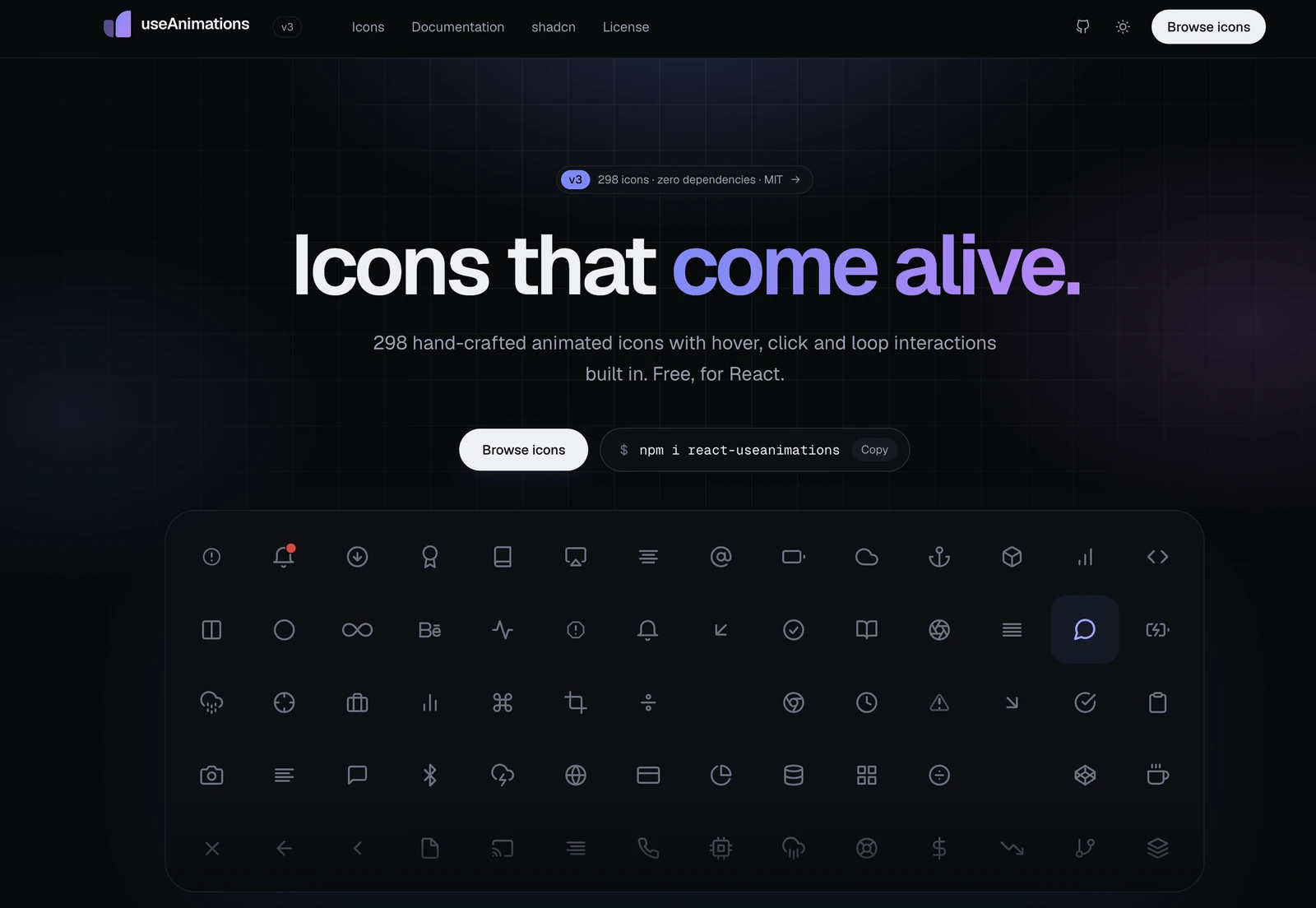
300 free animated icons with hover, click and loop interactions built in.




Browse all icons → · Documentation · shadcn/ui · Upgrading from v2
currentColor, so className="text-blue-600", Tailwind and plain CSS just work.aria-label, played by keyboard focus too, and still when the user prefers reduced motion.dynamic(..., { ssr: false }) needed.npm install react-useanimations
import UseAnimations from 'react-useanimations';
import github from 'react-useanimations/lib/github';

export default function App() {
  return <UseAnimations animation={github} size={32} />;
}
Point at the icon: it loops while hovered, exactly like on useanimations.com. Every icon is its own module, so only what you import ends up in your bundle.
Several icons can also be imported from one place; production builds still include only the icons you use:
import { github, heart, menu } from 'react-useanimations/icons';
Prefer react-useanimations/lib/<name> when your dev server or test runner doesn't tree-shake, since react-useanimations/icons loads every icon there.
The component is also available as the named exports UseAnimations and UseAnimation (the name used by the shadcn registry).
Every icon is also in a shadcn registry. The CLI adds a ready-made component and installs react-useanimations:
npx shadcn@latest add https://useanimations.com/r/checkmark.json
import { AnimatedCheckmark } from '@/components/animations/checkmark';

<AnimatedCheckmark size={24} />;
Each icon comes with the interaction it has on useanimations.com. Pass interaction to pick another one.
| Interaction | What it does | For example |
|---|---|---|
hover-replay | plays once on hover | arrowRight, zap |
click-replay | replays on every click | download, send |
click-toggle | toggles between two states on click | menu, heart |
loop | plays continuously | loading, activity |
hover | plays forward on hover, backward on leave | trash, settings |
hover-loop | loops while hovered, finishes the cycle on leave | github, twitter |
<UseAnimations animation={download} interaction="hover" />
Hover animations also play on keyboard focus (when the icon or its wrapper is focusable) and ignore taps on touch screens. Looping icons pause while they are scrolled out of view.
<UseAnimations animation={github} size={56} strokeColor="#2563eb" style={{ padding: 100 }} />
| Prop | Default | Definition |
|---|---|---|
| animation | / | icon imported from react-useanimations/lib/<name>, or { animationData, interaction } for your own Lottie JSON |
| size | 24 | width and height; numbers are pixels, strings are any CSS length (e.g. '1.5em') |
| strokeColor | 'currentColor' | color of the icon's strokes; by default the icon follows the text color |
| fillColor | strokeColor | color of the icon's filled parts (e.g. a liked heart) |
| interaction | per icon | 'loop', 'click-toggle', 'click-replay', 'hover', 'hover-loop' or 'hover-replay' |
| active | / | for click-toggle icons: true shows the end state; controlled, so set it in onClick (clicks don't toggle it) |
| autoplay | per icon | true for loop icons, unless reduced motion is preferred |
| loop | per icon | true for loop and hover-loop icons |
| speed | 1 | playback speed (1 is normal speed) |
| render | / | render prop for a custom wrapper, see A real button |
Any other prop (className, aria-label, onClick, onMouseEnter, …) is passed to the wrapper <span>. Your event handlers run before the animation's; call event.preventDefault() to skip the animation.
Icons follow the text color by default, so className="text-blue-600" or style={{ color: 'red' }} recolors them. The built-in rule has zero specificity, so your own CSS always wins:
// Tailwind
<UseAnimations animation={github} className="text-blue-600 [&_path]:stroke-[3]" />
/* plain CSS: <UseAnimations animation={github} className="icon" /> */
.icon path {
  stroke-width: 3;
}
Some icons cut a gap into themselves (the slash in visibility, microphone, video, volume and notification, the check in download, the ring around notification3's badge). The gap takes the page background: white on light pages and dark on pages with color-scheme: dark. On other backgrounds, set it with the --ua-knockout CSS variable, e.g. body { --ua-knockout: #0f172a; }.
import { useState } from 'react';
import UseAnimations from 'react-useanimations';
import menu from 'react-useanimations/lib/menu';

export const MenuButton = () => {
  const [open, setOpen] = useState(false);

  return (
    <UseAnimations
      animation={menu}
      size={40}
      active={open} // also animates when `open` changes elsewhere, e.g. the menu closes on Escape
      onClick={() => setOpen(!open)}
    />
  );
};
For clickable icons, put an interactive element around the icon with the render prop, so it is focusable and works with the keyboard:
import heart from 'react-useanimations/lib/heart';

export const LikeButton = () => (
  <UseAnimations
    animation={heart}
    size={60}
    onClick={() => console.log('liked')}
    render={(eventProps, animationProps) => (
      <button type="button" aria-label="Like" {...eventProps}>
        <span {...animationProps} />
      </button>
    )}
  />
);
eventProps holds the onClick, onMouseEnter, onMouseLeave, onPointerEnter, onFocus and onBlur handlers for your interactive element and animationProps holds the animation itself, which you spread on a <span> inside it.
import animationData from './my-animation.json';

<UseAnimations animation={{ animationData, interaction: 'hover' }} />;
The player supports what icon animations use: shape layers, precompositions, null layers and parenting, paths, rectangles, ellipses, strokes, fills, trim paths, masks, keyframes with easing, holds and motion paths, and the loopOut() and wiggle() expressions. Gradients, solid, text and image layers, effects, mattes and other expressions are not rendered; the console warns about them once per animation. If the player can't draw an animation, that animation stops and the error is logged once; other icons keep playing.
The component is marked 'use client' and renders the animation only in the browser, so it can be rendered from server components without dynamic(..., { ssr: false }). Functions such as onClick or render can't be passed from a server component: render the icon inside a client component for those. Icons inside a shadow root are styled there too.
aria-hidden). Pass aria-label to have the icon announced as an image.<button> with an aria-label (see A real button) and reflect toggle state with aria-pressed or aria-expanded.prefers-reduced-motion: reduce), icons stay still: looping icons show their first frame, hover and replay animations don't play, and toggles switch to their new state immediately. Pass autoplay to play a loader anyway.Browse and search all 300 icons on the website, or expand the full list:
activity, airplay, alertCircle, alertOctagon, alertTriangle, alignCenter, alignJustify, alignLeft, alignRight, anchor, aperture, archive, arrowDown, arrowDownCircle, arrowDownLeft, arrowDownRight, arrowLeft, arrowLeftCircle, arrowRight, arrowRightCircle, arrowUp, arrowUpCircle, arrowUpLeft, arrowUpRight, atSign, award, barChart, barChart2, battery, batteryCharging, behance, bluetooth, bold, book, bookmark, bookOpen, box, briefcase, calendar, camera, cameraOff, cast, check, checkBox, checkCircle, checkmark, chevronDown, chevronLeft, chevronRight, chevronsDown, chevronsLeft, chevronsRight, chevronsUp, chevronUp, chrome, circle, clipboard, clock, cloud, cloudDrizzle, cloudLightning, cloudOff, cloudRain, cloudSnow, code, codepen, codesandbox, coffee, columns, command, copy, cornerDownLeft, cornerDownRight, cornerLeftDown, cornerLeftUp, cornerRightDown, cornerRightUp, cornerUpLeft, cornerUpRight, cpu, creditCard, crop, crosshair, database, delete, disc, discord, divide, divideCircle, divideSquare, dollarSign, download, download2, downloadCloud, dribbble, droplet, edit, edit2, edit3, error, explore, externalLink, facebook, fastForward, figma, file, fileMinus, filePlus, fileText, film, filter, flag, folder, folderMinus, folderPlus, framer, frown, gift, gitBranch, gitCommit, github, gitlab, gitMerge, gitPullRequest, globe, grid, hardDrive, hash, headphones, heart, heart2, help, hexagon, home, image, inbox, infinity, info, instagram, italic, key, layers, layout, lifeBuoy, link, link2, linkedin, list, loading, loading2, loading3, loading4, lock, logIn, logOut, mail, map, mapPin, maximize2, maximizeMinimize, maximizeMinimize2, meh, menu, menu2, menu3, menu4, messageCircle, messageSquare, micOff, microphone, microphone2, minimize2, minus, minusCircle, minusSquare, monitor, moon, moreHorizontal, moreVertical, mousePointer, move, music, navigation, navigation2, notification, notification2, notification3, notification4, octagon, package, paperclip, penTool, percent, phone, phoneCall, phoneForwarded, phoneIncoming, phoneMissed, phoneOff, phoneOutgoing, pieChart, playPause, playPauseCircle, plusCircle, plusSquare, plusToX, pocket, power, printer, radio, radioButton, refresh, refresh2, refreshCcw, repeat, rewind, rotateCcw, rotateCw, rss, save, scissors, scrollDown, searchToX, send, server, settings, settings2, share, shield, shieldOff, shoppingBag, shoppingCart, shuffle, sidebar, skipBack, skipForward, slack, slash, smartphone, smile, speaker, square, star, stopCircle, sun, sunrise, sunset, table, tablet, tag, target, telegram, terminal, thermometer, thumbsDown, thumbUp, toggle, tool, trash, trash2, trello, trendingDown, trendingUp, triangle, truck, tv, twitch, twitter, twitterX, type, umbrella, underline, upload, uploadCloud, user, userCheck, userMinus, userPlus, users, userX, video, video2, videoOff, visibility, visibility2, visibility3, voicemail, volume, watch, wifi, wifiOff, wind, xOctagon, xSquare, youtube, youtube2, zap, zapOff, zoomIn, zoomOut
Import each one from react-useanimations/lib/<name> or react-useanimations/icons. delete and package are reserved words in JavaScript: import them under another name, e.g. import deleteIcon from 'react-useanimations/lib/delete';, or as deleteIcon and packageIcon from react-useanimations/icons.
To find an icon by what it shows, search react-useanimations/catalog.json: every icon has its title, category, keywords (e.g. visibility matches eye, notification matches bell), default interaction, import line and a preview image (except calendar, loading, loading2, loading3, zoomIn and zoomOut, which have no static SVG).
The package contains the whole icon set, and useanimations.com is built from it:
react-useanimations/catalog.json: metadata of every icon (name, website id, title, category, keywords, interaction, export, import, static svg states, preview)react-useanimations/icons: the Lottie animation of every icon, as { animationData, interaction }react-useanimations/svg.json: static SVGs of the icons' states, e.g. svg.visibility.eye (all icons except the six listed above)import { writeFileSync } from 'node:fs';
import catalog from 'react-useanimations/catalog.json' with { type: 'json' };
import * as icons from 'react-useanimations/icons';
// Write each icon as a plain Lottie file, e.g. for a CDN or a native app.
for (const icon of catalog) {
writeFileSync(`${icon.id}.json`, JSON.stringify(icons[icon.export].animationData));
}
Imports and the component stay the same, and all 79 v2 icons are still there. The full guide, with before/after code, is at useanimations.com/documentation#upgrading-from-v2.
reverse is now active, fully controlled: update it in onClick, a click alone doesn't toggle the icon (reverse still works as in v2 but is deprecated).react-useanimations/lib/<name> (or from react-useanimations/icons): internal paths such as lib/github/index or lib/github/github.json no longer resolve; the Lottie JSON is the icon's animationData.currentColor); set strokeColor="#000" to keep them black.wrapperStyle is deprecated (use style); pathCss and options were removed (use CSS, and the loop, autoplay and speed props; passing them logs a warning once).<span> instead of a <div>, hidden from screen readers unless you pass aria-label; spread animationProps on a <span> in the render prop.zoomIn plays on hover instead of looping, github loops on hover instead of playing once, the arrow circles replay on click instead of toggling); pass interaction to keep the old behavior.react-useanimations (Animation, AnimationKey, Interaction, UseAnimationsProps); the react-useanimations/utils paths were removed.react-useanimations/icons, reduced-motion support and server rendering without workarounds.The tooling is Vite+ (Vitest, Oxlint, Oxfmt and tsdown), configured in vite.config.ts.
npm install
npx playwright install chromium firefox webkit  # once, for the browser tests
npm run check       # formatting, lint and type checks (vp check)
npm run format      # fixes formatting and lint issues
npm test            # tests in Chromium, Firefox and WebKit, plus server rendering in Node
npm run build       # builds dist/: the component (vp pack) and the icon modules
npm run verify      # check, tests, build and package check
npm run icons       # validates icons/ and updates the files generated from it
npm run website:dev # useanimations.com, built from the same icons and component
The icon set lives in icons/: one Lottie file per icon (icons/<name>.json), the static SVGs (icons/svg.json) and the metadata (icons/catalog.json). To add an icon, add its Lottie file, its catalog entry and its SVGs, then run npm run icons.
MIT. The code and the animations are free for personal and commercial use. Attribution is not required but appreciated, e.g. "Animated icons by useAnimations".
useanimations.com · X · Instagram · Facebook
Overall
Maintained
Code review
Latest release
Releases this year
336 followers · starred Jun 2022
98 followers · starred Oct 2019
309 followers · starred Jan 2024
76 followers · starred Feb 2024
React-useanimations is a collection of free animated open source icons for React.js.
See the codeThe official React component for useAnimations:
300 free animated icons with hover, click and loop interactions built in.
Browse all icons → · Documentation · shadcn/ui · Upgrading from v2
currentColor, so className="text-blue-600", Tailwind and plain CSS just work.aria-label, played by keyboard focus too, and still when the user prefers reduced motion.dynamic(..., { ssr: false }) needed.npm install react-useanimations
import UseAnimations from 'react-useanimations';
import github from 'react-useanimations/lib/github';

export default function App() {
  return <UseAnimations animation={github} size={32} />;
}
Point at the icon: it loops while hovered, exactly like on useanimations.com. Every icon is its own module, so only what you import ends up in your bundle.
Several icons can also be imported from one place; production builds still include only the icons you use:
import { github, heart, menu } from 'react-useanimations/icons';
Prefer react-useanimations/lib/<name> when your dev server or test runner doesn't tree-shake, since react-useanimations/icons loads every icon there.
The component is also available as the named exports UseAnimations and UseAnimation (the name used by the shadcn registry).
Every icon is also in a shadcn registry. The CLI adds a ready-made component and installs react-useanimations:
npx shadcn@latest add https://useanimations.com/r/checkmark.json
import { AnimatedCheckmark } from '@/components/animations/checkmark';

<AnimatedCheckmark size={24} />;
Each icon comes with the interaction it has on useanimations.com. Pass interaction to pick another one.
| Interaction | What it does | For example |
|---|---|---|
hover-replay | plays once on hover | arrowRight, zap |
click-replay | replays on every click | download, send |
click-toggle | toggles between two states on click | menu, heart |
loop | plays continuously | loading, activity |
hover | plays forward on hover, backward on leave | trash, settings |
hover-loop | loops while hovered, finishes the cycle on leave | github, twitter |
<UseAnimations animation={download} interaction="hover" />
Hover animations also play on keyboard focus (when the icon or its wrapper is focusable) and ignore taps on touch screens. Looping icons pause while they are scrolled out of view.
<UseAnimations animation={github} size={56} strokeColor="#2563eb" style={{ padding: 100 }} />
| Prop | Default | Definition |
|---|---|---|
| animation | / | icon imported from react-useanimations/lib/<name>, or { animationData, interaction } for your own Lottie JSON |
| size | 24 | width and height; numbers are pixels, strings are any CSS length (e.g. '1.5em') |
| strokeColor | 'currentColor' | color of the icon's strokes; by default the icon follows the text color |
| fillColor | strokeColor | color of the icon's filled parts (e.g. a liked heart) |
| interaction | per icon | 'loop', 'click-toggle', 'click-replay', 'hover', 'hover-loop' or 'hover-replay' |
| active | / | for click-toggle icons: true shows the end state; controlled, so set it in onClick (clicks don't toggle it) |
| autoplay | per icon | true for loop icons, unless reduced motion is preferred |
| loop | per icon | true for loop and hover-loop icons |
| speed | 1 | playback speed (1 is normal speed) |
| render | / | render prop for a custom wrapper, see A real button |
Any other prop (className, aria-label, onClick, onMouseEnter, …) is passed to the wrapper <span>. Your event handlers run before the animation's; call event.preventDefault() to skip the animation.
Icons follow the text color by default, so className="text-blue-600" or style={{ color: 'red' }} recolors them. The built-in rule has zero specificity, so your own CSS always wins:
// Tailwind
<UseAnimations animation={github} className="text-blue-600 [&_path]:stroke-[3]" />
/* plain CSS: <UseAnimations animation={github} className="icon" /> */
.icon path {
  stroke-width: 3;
}
Some icons cut a gap into themselves (the slash in visibility, microphone, video, volume and notification, the check in download, the ring around notification3's badge). The gap takes the page background: white on light pages and dark on pages with color-scheme: dark. On other backgrounds, set it with the --ua-knockout CSS variable, e.g. body { --ua-knockout: #0f172a; }.
import { useState } from 'react';
import UseAnimations from 'react-useanimations';
import menu from 'react-useanimations/lib/menu';

export const MenuButton = () => {
  const [open, setOpen] = useState(false);

  return (
    <UseAnimations
      animation={menu}
      size={40}
      active={open} // also animates when `open` changes elsewhere, e.g. the menu closes on Escape
      onClick={() => setOpen(!open)}
    />
  );
};
For clickable icons, put an interactive element around the icon with the render prop, so it is focusable and works with the keyboard:
import heart from 'react-useanimations/lib/heart';

export const LikeButton = () => (
  <UseAnimations
    animation={heart}
    size={60}
    onClick={() => console.log('liked')}
    render={(eventProps, animationProps) => (
      <button type="button" aria-label="Like" {...eventProps}>
        <span {...animationProps} />
      </button>
    )}
  />
);
eventProps holds the onClick, onMouseEnter, onMouseLeave, onPointerEnter, onFocus and onBlur handlers for your interactive element and animationProps holds the animation itself, which you spread on a <span> inside it.
import animationData from './my-animation.json';

<UseAnimations animation={{ animationData, interaction: 'hover' }} />;
The player supports what icon animations use: shape layers, precompositions, null layers and parenting, paths, rectangles, ellipses, strokes, fills, trim paths, masks, keyframes with easing, holds and motion paths, and the loopOut() and wiggle() expressions. Gradients, solid, text and image layers, effects, mattes and other expressions are not rendered; the console warns about them once per animation. If the player can't draw an animation, that animation stops and the error is logged once; other icons keep playing.
The component is marked 'use client' and renders the animation only in the browser, so it can be rendered from server components without dynamic(..., { ssr: false }). Functions such as onClick or render can't be passed from a server component: render the icon inside a client component for those. Icons inside a shadow root are styled there too.
aria-hidden). Pass aria-label to have the icon announced as an image.<button> with an aria-label (see A real button) and reflect toggle state with aria-pressed or aria-expanded.prefers-reduced-motion: reduce), icons stay still: looping icons show their first frame, hover and replay animations don't play, and toggles switch to their new state immediately. Pass autoplay to play a loader anyway.Browse and search all 300 icons on the website, or expand the full list:
activity, airplay, alertCircle, alertOctagon, alertTriangle, alignCenter, alignJustify, alignLeft, alignRight, anchor, aperture, archive, arrowDown, arrowDownCircle, arrowDownLeft, arrowDownRight, arrowLeft, arrowLeftCircle, arrowRight, arrowRightCircle, arrowUp, arrowUpCircle, arrowUpLeft, arrowUpRight, atSign, award, barChart, barChart2, battery, batteryCharging, behance, bluetooth, bold, book, bookmark, bookOpen, box, briefcase, calendar, camera, cameraOff, cast, check, checkBox, checkCircle, checkmark, chevronDown, chevronLeft, chevronRight, chevronsDown, chevronsLeft, chevronsRight, chevronsUp, chevronUp, chrome, circle, clipboard, clock, cloud, cloudDrizzle, cloudLightning, cloudOff, cloudRain, cloudSnow, code, codepen, codesandbox, coffee, columns, command, copy, cornerDownLeft, cornerDownRight, cornerLeftDown, cornerLeftUp, cornerRightDown, cornerRightUp, cornerUpLeft, cornerUpRight, cpu, creditCard, crop, crosshair, database, delete, disc, discord, divide, divideCircle, divideSquare, dollarSign, download, download2, downloadCloud, dribbble, droplet, edit, edit2, edit3, error, explore, externalLink, facebook, fastForward, figma, file, fileMinus, filePlus, fileText, film, filter, flag, folder, folderMinus, folderPlus, framer, frown, gift, gitBranch, gitCommit, github, gitlab, gitMerge, gitPullRequest, globe, grid, hardDrive, hash, headphones, heart, heart2, help, hexagon, home, image, inbox, infinity, info, instagram, italic, key, layers, layout, lifeBuoy, link, link2, linkedin, list, loading, loading2, loading3, loading4, lock, logIn, logOut, mail, map, mapPin, maximize2, maximizeMinimize, maximizeMinimize2, meh, menu, menu2, menu3, menu4, messageCircle, messageSquare, micOff, microphone, microphone2, minimize2, minus, minusCircle, minusSquare, monitor, moon, moreHorizontal, moreVertical, mousePointer, move, music, navigation, navigation2, notification, notification2, notification3, notification4, octagon, package, paperclip, penTool, percent, phone, phoneCall, phoneForwarded, phoneIncoming, phoneMissed, phoneOff, phoneOutgoing, pieChart, playPause, playPauseCircle, plusCircle, plusSquare, plusToX, pocket, power, printer, radio, radioButton, refresh, refresh2, refreshCcw, repeat, rewind, rotateCcw, rotateCw, rss, save, scissors, scrollDown, searchToX, send, server, settings, settings2, share, shield, shieldOff, shoppingBag, shoppingCart, shuffle, sidebar, skipBack, skipForward, slack, slash, smartphone, smile, speaker, square, star, stopCircle, sun, sunrise, sunset, table, tablet, tag, target, telegram, terminal, thermometer, thumbsDown, thumbUp, toggle, tool, trash, trash2, trello, trendingDown, trendingUp, triangle, truck, tv, twitch, twitter, twitterX, type, umbrella, underline, upload, uploadCloud, user, userCheck, userMinus, userPlus, users, userX, video, video2, videoOff, visibility, visibility2, visibility3, voicemail, volume, watch, wifi, wifiOff, wind, xOctagon, xSquare, youtube, youtube2, zap, zapOff, zoomIn, zoomOut
Import each one from react-useanimations/lib/<name> or react-useanimations/icons. delete and package are reserved words in JavaScript: import them under another name, e.g. import deleteIcon from 'react-useanimations/lib/delete';, or as deleteIcon and packageIcon from react-useanimations/icons.
To find an icon by what it shows, search react-useanimations/catalog.json: every icon has its title, category, keywords (e.g. visibility matches eye, notification matches bell), default interaction, import line and a preview image (except calendar, loading, loading2, loading3, zoomIn and zoomOut, which have no static SVG).
The package contains the whole icon set, and useanimations.com is built from it:
react-useanimations/catalog.json: metadata of every icon (name, website id, title, category, keywords, interaction, export, import, static svg states, preview)react-useanimations/icons: the Lottie animation of every icon, as { animationData, interaction }react-useanimations/svg.json: static SVGs of the icons' states, e.g. svg.visibility.eye (all icons except the six listed above)import { writeFileSync } from 'node:fs';
import catalog from 'react-useanimations/catalog.json' with { type: 'json' };
import * as icons from 'react-useanimations/icons';
// Write each icon as a plain Lottie file, e.g. for a CDN or a native app.
for (const icon of catalog) {
writeFileSync(`${icon.id}.json`, JSON.stringify(icons[icon.export].animationData));
}
Imports and the component stay the same, and all 79 v2 icons are still there. The full guide, with before/after code, is at useanimations.com/documentation#upgrading-from-v2.
reverse is now active, fully controlled: update it in onClick, a click alone doesn't toggle the icon (reverse still works as in v2 but is deprecated).react-useanimations/lib/<name> (or from react-useanimations/icons): internal paths such as lib/github/index or lib/github/github.json no longer resolve; the Lottie JSON is the icon's animationData.currentColor); set strokeColor="#000" to keep them black.wrapperStyle is deprecated (use style); pathCss and options were removed (use CSS, and the loop, autoplay and speed props; passing them logs a warning once).<span> instead of a <div>, hidden from screen readers unless you pass aria-label; spread animationProps on a <span> in the render prop.zoomIn plays on hover instead of looping, github loops on hover instead of playing once, the arrow circles replay on click instead of toggling); pass interaction to keep the old behavior.react-useanimations (Animation, AnimationKey, Interaction, UseAnimationsProps); the react-useanimations/utils paths were removed.react-useanimations/icons, reduced-motion support and server rendering without workarounds.The tooling is Vite+ (Vitest, Oxlint, Oxfmt and tsdown), configured in vite.config.ts.
npm install
npx playwright install chromium firefox webkit  # once, for the browser tests
npm run check       # formatting, lint and type checks (vp check)
npm run format      # fixes formatting and lint issues
npm test            # tests in Chromium, Firefox and WebKit, plus server rendering in Node
npm run build       # builds dist/: the component (vp pack) and the icon modules
npm run verify      # check, tests, build and package check
npm run icons       # validates icons/ and updates the files generated from it
npm run website:dev # useanimations.com, built from the same icons and component
The icon set lives in icons/: one Lottie file per icon (icons/<name>.json), the static SVGs (icons/svg.json) and the metadata (icons/catalog.json). To add an icon, add its Lottie file, its catalog entry and its SVGs, then run npm run icons.
MIT. The code and the animations are free for personal and commercial use. Attribution is not required but appreciated, e.g. "Animated icons by useAnimations".
useanimations.com · X · Instagram · Facebook
Overall
Maintained
Code review
Latest release
Releases this year
336 followers · starred Jun 2022
98 followers · starred Oct 2019
309 followers · starred Jan 2024
76 followers · starred Feb 2024