✨A clean and lightweight loading/toast widget for Flutter, easy to use without context, support iOS、Android and Web
See the code



🌐 English | 简体中文
A lightweight, customizable loading, progress, result, and toast overlay for
Flutter. Display calls do not require a BuildContext.
BuildContext
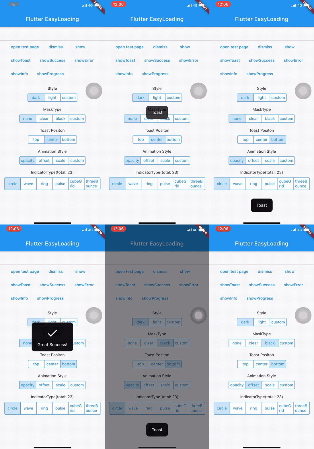
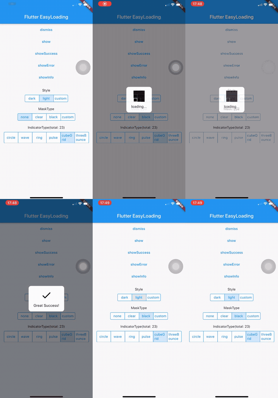
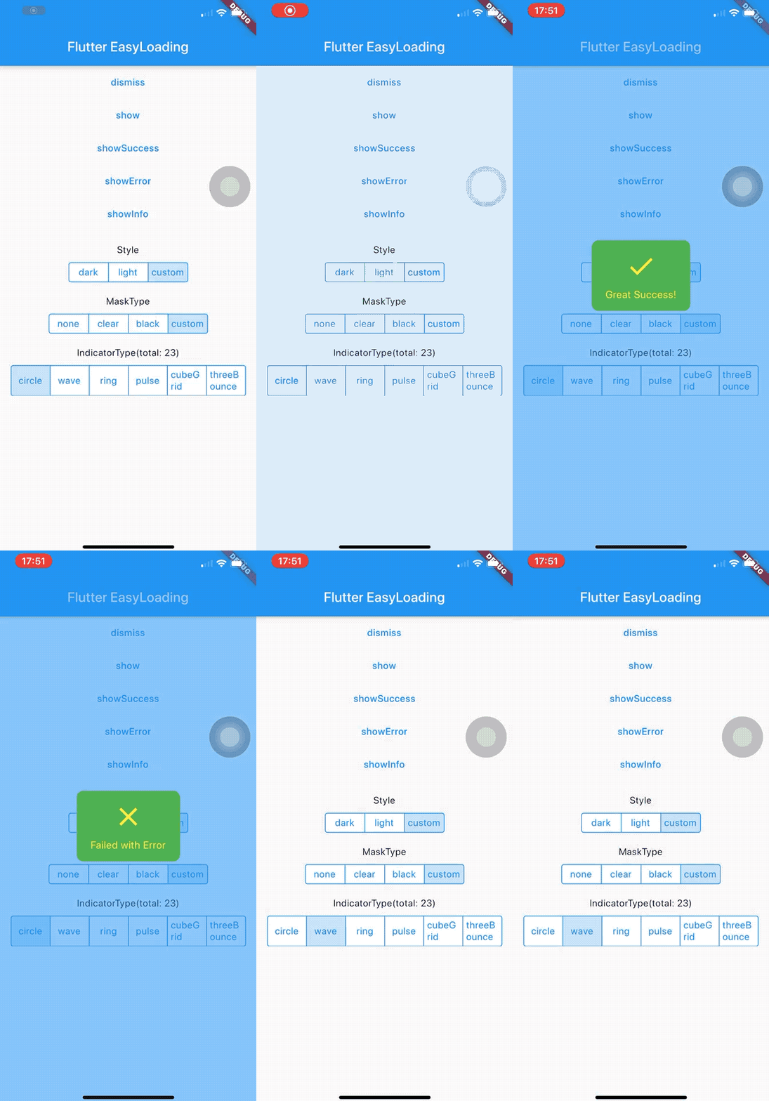
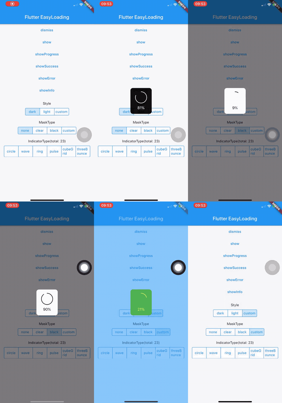
Open the interactive Flutter EasyLoading preview
Read the 4.0 migration guide before upgrading from 3.x.
flutter pub add flutter_easyloading
Or add the dependency manually:
dependencies:
  flutter_easyloading: ^4.0.2
import 'package:flutter_easyloading/flutter_easyloading.dart';
Install one EasyLoading Host at the root MaterialApp or CupertinoApp:
MaterialApp(
  builder: EasyLoading.init(),
  home: const HomePage(),
);
Display and dismiss content from anywhere after the Host is mounted:
await EasyLoading.show(status: 'Loading...');
await EasyLoading.showProgress(0.5, status: 'Downloading...');

await EasyLoading.showSuccess('Completed');
await EasyLoading.showError('Request failed');
await EasyLoading.showInfo('Update available');
await EasyLoading.showToast('Saved');

await EasyLoading.dismiss();
All display and dismissal methods return Future<void> and can be awaited.
If the application already has a root builder, compose it through init:
MaterialApp(
  builder: EasyLoading.init(
    builder: (context, child) => ExistingRoot(child: child),
  ),
  home: const HomePage(),
);
| API | Returns | Description |
|---|---|---|
EasyLoading() | EasyLoading | Returns the shared configuration instance. |
EasyLoading.instance | EasyLoading | Accesses the shared configuration instance. |
EasyLoading.isShow | bool | Reports whether an EasyLoading overlay is active. |
EasyLoading.init({builder}) | TransitionBuilder | Creates the application-level Host builder and optionally composes another builder. |
FlutterEasyLoading(child: child) | FlutterEasyLoading | Creates the Host widget directly. Most applications should use EasyLoading.init(). |
| API | Parameters | Description |
|---|---|---|
EasyLoading.show(...) | status, indicator, maskType, dismissOnTap, duration, options | Shows or updates an indeterminate loading indicator. |
EasyLoading.showProgress(value, ...) | status, maskType, indicator, duration, dismissOnTap, options | Shows or updates determinate progress from 0.0 to 1.0. |
EasyLoading.showSuccess(status, ...) | duration, maskType, dismissOnTap, options | Shows a success result. |
EasyLoading.showError(status, ...) | duration, maskType, dismissOnTap, options | Shows an error result. |
EasyLoading.showInfo(status, ...) | duration, maskType, dismissOnTap, options | Shows an information result. |
EasyLoading.showToast(status, ...) | duration, toastPosition, maskType, dismissOnTap, options | Shows a text-only toast. |
EasyLoading.showCustom(content, ...) | duration, maskType, dismissOnTap, options | Shows arbitrary widget content. |
EasyLoading.dismiss({animation}) | animation defaults to true | Dismisses the active overlay. |
| API | Description |
|---|---|
EasyLoading.addStatusCallback(callback) | Adds an EasyLoadingStatusCallback. |
EasyLoading.removeCallback(callback) | Removes one status callback. |
EasyLoading.removeAllCallbacks() | Removes every status callback. |
EasyLoading.addDismissCallback(callback) | Adds an EasyLoadingDismissCallback. |
EasyLoading.removeDismissCallback(callback) | Removes one dismissal callback. |
EasyLoading.removeAllDismissCallbacks() | Removes every dismissal callback. |
void onStatus(EasyLoadingStatus status) {
  // EasyLoadingStatus.show or EasyLoadingStatus.dismiss
}

void onDismiss(EasyLoadingDismissReason reason) {
  // programmatic, tap, timeout, or hostDetached
}

EasyLoading.addStatusCallback(onStatus);
EasyLoading.addDismissCallback(onDismiss);

// Remove callbacks when their owner is disposed.
EasyLoading.removeCallback(onStatus);
EasyLoading.removeDismissCallback(onDismiss);
Set global defaults once during application startup:
EasyLoading.instance
  ..loadingStyle = EasyLoadingStyle.dark
  ..indicatorType = EasyLoadingIndicatorType.fadingCircle
  ..maskType = EasyLoadingMaskType.none
  ..toastPosition = EasyLoadingToastPosition.bottom
  ..displayDuration = const Duration(seconds: 2)
  ..animationDuration = const Duration(milliseconds: 200);
| Property | Type | Default | Description |
|---|---|---|---|
loadingStyle | EasyLoadingStyle | dark | Panel color style. |
indicatorType | EasyLoadingIndicatorType | fadingCircle | Built-in loading indicator. |
maskType | EasyLoadingMaskType | none | Default barrier style and interaction mode. |
toastPosition | EasyLoadingToastPosition | center | Default toast placement. |
animationStyle | EasyLoadingAnimationStyle | opacity | Panel transition style. |
displayDuration | Duration | 2000 ms | Default result and toast duration. |
animationDuration | Duration | 200 ms | Presentation and dismissal transition duration. |
userInteractions | bool? | null | Optional override for input reaching the application below the overlay. |
dismissOnTap | bool? | null (false) | Default tap-to-dismiss override. |
| Property | Type | Default | Description |
|---|---|---|---|
textAlign | TextAlign | center | Status text alignment. |
contentPadding | EdgeInsets | vertical: 15, horizontal: 20 | Panel content padding. |
textPadding | EdgeInsets | bottom: 10 | Space between the indicator and status text. |
indicatorSize | double | 40 | Built-in indicator width and height. |
radius | double | 5 | Panel corner radius. |
fontSize | double | 15 | Status font size when textStyle is not set. |
progressWidth | double | 2 | Determinate progress stroke width. |
lineWidth | double | 4 | Stroke width for supported built-in indicators. |
textStyle | TextStyle? | null | Complete status text style. |
| Property | Type | Default | Description |
|---|---|---|---|
textColor | Color? | null | Status color for EasyLoadingStyle.custom. |
indicatorColor | Color? | null | Indicator color for EasyLoadingStyle.custom. |
progressColor | Color? | null | Progress color for EasyLoadingStyle.custom. |
backgroundColor | Color? | null | Panel color for EasyLoadingStyle.custom. |
boxShadow | List<BoxShadow>? | null | Panel shadows for EasyLoadingStyle.custom. |
maskColor | Color? | null | Barrier color for EasyLoadingMaskType.custom. |
| Property | Type | Default | Description |
|---|---|---|---|
customAnimation | EasyLoadingAnimation? | null | Transition used by EasyLoadingAnimationStyle.custom. |
indicatorWidget | Widget? | null | Global replacement for the loading indicator. |
successWidget | Widget? | null | Global replacement for the success icon. |
errorWidget | Widget? | null | Global replacement for the error icon. |
infoWidget | Widget? | null | Global replacement for the information icon. |
Custom modes require their corresponding values:
EasyLoadingStyle.custom: backgroundColor, indicatorColor, and textColor; progress also requires progressColor.EasyLoadingMaskType.custom: maskColor.EasyLoadingAnimationStyle.custom: customAnimation.EasyLoadingOptions is an immutable snapshot for one display call. Every field
is optional and inherits the corresponding global value when omitted.
| Group | Supported fields |
|---|---|
| Appearance | loadingStyle, indicatorType, animationStyle, backgroundColor, boxShadow |
| Indicator and progress | indicatorSize, indicatorColor, progressColor, progressWidth, lineWidth |
| Text | textAlign, textStyle, textColor, fontSize, textPadding |
| Layout | alignment, constraints, contentPadding, radius |
| Animation | animationDuration, customAnimation |
| Mask and interaction | maskColor, userInteractions |
maskType, dismissOnTap, and duration remain direct method parameters.
toastPosition is a direct parameter of showToast.
await EasyLoading.show(
  status: 'Uploading',
  maskType: EasyLoadingMaskType.black,
  duration: const Duration(seconds: 10),
  options: const EasyLoadingOptions(
    loadingStyle: EasyLoadingStyle.auto,
    alignment: AlignmentDirectional.topEnd,
    constraints: BoxConstraints(maxWidth: 320),
    indicatorType: EasyLoadingIndicatorType.ring,
  ),
);
| Type | Values or purpose |
|---|---|
EasyLoadingStyle | light, dark, custom, auto |
EasyLoadingToastPosition | top, center, bottom |
EasyLoadingAnimationStyle | opacity, offset, scale, custom |
EasyLoadingMaskType | none, clear, black, custom |
EasyLoadingIndicatorType | 30 built-in indicators listed below. |
EasyLoadingStatus | show, dismiss |
EasyLoadingDismissReason | programmatic, tap, timeout, hostDetached |
EasyLoadingStatusCallback | void Function(EasyLoadingStatus status) |
EasyLoadingDismissCallback | void Function(EasyLoadingDismissReason reason) |
EasyLoadingOptions | Immutable visual and layout overrides for one call. |
EasyLoadingAnimation | Base class for custom transitions; implement buildWidget. |
FlutterEasyLoading | Application-level Host widget created by EasyLoading.init(). |
fadingCircle, circle, threeBounce, chasingDots, wave,
wanderingCubes, rotatingPlain, doubleBounce, fadingFour, fadingCube,
pulse, cubeGrid, rotatingCircle, foldingCube, pumpingHeart,
dualRing, hourGlass, pouringHourGlass, fadingGrid, ring, ripple,
spinningCircle, squareCircle, dancingSquare, pianoWave,
pouringHourGlassRefined, pulsingGrid, spinningLines, threeInOut, and
waveSpinner.
await EasyLoading.showCustom(
  const Material(
    child: Padding(
      padding: EdgeInsets.all(16),
      child: Text('Custom content'),
    ),
  ),
  maskType: EasyLoadingMaskType.black,
  options: const EasyLoadingOptions(
    alignment: AlignmentDirectional.bottomCenter,
    constraints: BoxConstraints(maxWidth: 320),
  ),
);
See the example application's
custom animation for an
EasyLoadingAnimation implementation.
Common init, show..., dismiss, status callback, and
EasyLoading.instance call forms remain valid. Review the SDK baseline and
removed undocumented internals in the 4.0 migration guide.
Flutter EasyLoading is available under the MIT License.
Built-in loading indicators are provided by flutter_spinkit.
133 followers · starred Sep 2020
68 followers · starred Jan 2021
235 followers · starred May 2023
79 followers · starred Oct 2024
✨A clean and lightweight loading/toast widget for Flutter, easy to use without context, support iOS、Android and Web
See the code
🌐 English | 简体中文
A lightweight, customizable loading, progress, result, and toast overlay for
Flutter. Display calls do not require a BuildContext.
BuildContext
Open the interactive Flutter EasyLoading preview
Read the 4.0 migration guide before upgrading from 3.x.
flutter pub add flutter_easyloading
Or add the dependency manually:
dependencies:
  flutter_easyloading: ^4.0.2
import 'package:flutter_easyloading/flutter_easyloading.dart';
Install one EasyLoading Host at the root MaterialApp or CupertinoApp:
MaterialApp(
  builder: EasyLoading.init(),
  home: const HomePage(),
);
Display and dismiss content from anywhere after the Host is mounted:
await EasyLoading.show(status: 'Loading...');
await EasyLoading.showProgress(0.5, status: 'Downloading...');

await EasyLoading.showSuccess('Completed');
await EasyLoading.showError('Request failed');
await EasyLoading.showInfo('Update available');
await EasyLoading.showToast('Saved');

await EasyLoading.dismiss();
All display and dismissal methods return Future<void> and can be awaited.
If the application already has a root builder, compose it through init:
MaterialApp(
  builder: EasyLoading.init(
    builder: (context, child) => ExistingRoot(child: child),
  ),
  home: const HomePage(),
);
| API | Returns | Description |
|---|---|---|
EasyLoading() | EasyLoading | Returns the shared configuration instance. |
EasyLoading.instance | EasyLoading | Accesses the shared configuration instance. |
EasyLoading.isShow | bool | Reports whether an EasyLoading overlay is active. |
EasyLoading.init({builder}) | TransitionBuilder | Creates the application-level Host builder and optionally composes another builder. |
FlutterEasyLoading(child: child) | FlutterEasyLoading | Creates the Host widget directly. Most applications should use EasyLoading.init(). |
| API | Parameters | Description |
|---|---|---|
EasyLoading.show(...) | status, indicator, maskType, dismissOnTap, duration, options | Shows or updates an indeterminate loading indicator. |
EasyLoading.showProgress(value, ...) | status, maskType, indicator, duration, dismissOnTap, options | Shows or updates determinate progress from 0.0 to 1.0. |
EasyLoading.showSuccess(status, ...) | duration, maskType, dismissOnTap, options | Shows a success result. |
EasyLoading.showError(status, ...) | duration, maskType, dismissOnTap, options | Shows an error result. |
EasyLoading.showInfo(status, ...) | duration, maskType, dismissOnTap, options | Shows an information result. |
EasyLoading.showToast(status, ...) | duration, toastPosition, maskType, dismissOnTap, options | Shows a text-only toast. |
EasyLoading.showCustom(content, ...) | duration, maskType, dismissOnTap, options | Shows arbitrary widget content. |
EasyLoading.dismiss({animation}) | animation defaults to true | Dismisses the active overlay. |
| API | Description |
|---|---|
EasyLoading.addStatusCallback(callback) | Adds an EasyLoadingStatusCallback. |
EasyLoading.removeCallback(callback) | Removes one status callback. |
EasyLoading.removeAllCallbacks() | Removes every status callback. |
EasyLoading.addDismissCallback(callback) | Adds an EasyLoadingDismissCallback. |
EasyLoading.removeDismissCallback(callback) | Removes one dismissal callback. |
EasyLoading.removeAllDismissCallbacks() | Removes every dismissal callback. |
void onStatus(EasyLoadingStatus status) {
  // EasyLoadingStatus.show or EasyLoadingStatus.dismiss
}

void onDismiss(EasyLoadingDismissReason reason) {
  // programmatic, tap, timeout, or hostDetached
}

EasyLoading.addStatusCallback(onStatus);
EasyLoading.addDismissCallback(onDismiss);

// Remove callbacks when their owner is disposed.
EasyLoading.removeCallback(onStatus);
EasyLoading.removeDismissCallback(onDismiss);
Set global defaults once during application startup:
EasyLoading.instance
  ..loadingStyle = EasyLoadingStyle.dark
  ..indicatorType = EasyLoadingIndicatorType.fadingCircle
  ..maskType = EasyLoadingMaskType.none
  ..toastPosition = EasyLoadingToastPosition.bottom
  ..displayDuration = const Duration(seconds: 2)
  ..animationDuration = const Duration(milliseconds: 200);
| Property | Type | Default | Description |
|---|---|---|---|
loadingStyle | EasyLoadingStyle | dark | Panel color style. |
indicatorType | EasyLoadingIndicatorType | fadingCircle | Built-in loading indicator. |
maskType | EasyLoadingMaskType | none | Default barrier style and interaction mode. |
toastPosition | EasyLoadingToastPosition | center | Default toast placement. |
animationStyle | EasyLoadingAnimationStyle | opacity | Panel transition style. |
displayDuration | Duration | 2000 ms | Default result and toast duration. |
animationDuration | Duration | 200 ms | Presentation and dismissal transition duration. |
userInteractions | bool? | null | Optional override for input reaching the application below the overlay. |
dismissOnTap | bool? | null (false) | Default tap-to-dismiss override. |
| Property | Type | Default | Description |
|---|---|---|---|
textAlign | TextAlign | center | Status text alignment. |
contentPadding | EdgeInsets | vertical: 15, horizontal: 20 | Panel content padding. |
textPadding | EdgeInsets | bottom: 10 | Space between the indicator and status text. |
indicatorSize | double | 40 | Built-in indicator width and height. |
radius | double | 5 | Panel corner radius. |
fontSize | double | 15 | Status font size when textStyle is not set. |
progressWidth | double | 2 | Determinate progress stroke width. |
lineWidth | double | 4 | Stroke width for supported built-in indicators. |
textStyle | TextStyle? | null | Complete status text style. |
| Property | Type | Default | Description |
|---|---|---|---|
textColor | Color? | null | Status color for EasyLoadingStyle.custom. |
indicatorColor | Color? | null | Indicator color for EasyLoadingStyle.custom. |
progressColor | Color? | null | Progress color for EasyLoadingStyle.custom. |
backgroundColor | Color? | null | Panel color for EasyLoadingStyle.custom. |
boxShadow | List<BoxShadow>? | null | Panel shadows for EasyLoadingStyle.custom. |
maskColor | Color? | null | Barrier color for EasyLoadingMaskType.custom. |
| Property | Type | Default | Description |
|---|---|---|---|
customAnimation | EasyLoadingAnimation? | null | Transition used by EasyLoadingAnimationStyle.custom. |
indicatorWidget | Widget? | null | Global replacement for the loading indicator. |
successWidget | Widget? | null | Global replacement for the success icon. |
errorWidget | Widget? | null | Global replacement for the error icon. |
infoWidget | Widget? | null | Global replacement for the information icon. |
Custom modes require their corresponding values:
EasyLoadingStyle.custom: backgroundColor, indicatorColor, and textColor; progress also requires progressColor.EasyLoadingMaskType.custom: maskColor.EasyLoadingAnimationStyle.custom: customAnimation.EasyLoadingOptions is an immutable snapshot for one display call. Every field
is optional and inherits the corresponding global value when omitted.
| Group | Supported fields |
|---|---|
| Appearance | loadingStyle, indicatorType, animationStyle, backgroundColor, boxShadow |
| Indicator and progress | indicatorSize, indicatorColor, progressColor, progressWidth, lineWidth |
| Text | textAlign, textStyle, textColor, fontSize, textPadding |
| Layout | alignment, constraints, contentPadding, radius |
| Animation | animationDuration, customAnimation |
| Mask and interaction | maskColor, userInteractions |
maskType, dismissOnTap, and duration remain direct method parameters.
toastPosition is a direct parameter of showToast.
await EasyLoading.show(
  status: 'Uploading',
  maskType: EasyLoadingMaskType.black,
  duration: const Duration(seconds: 10),
  options: const EasyLoadingOptions(
    loadingStyle: EasyLoadingStyle.auto,
    alignment: AlignmentDirectional.topEnd,
    constraints: BoxConstraints(maxWidth: 320),
    indicatorType: EasyLoadingIndicatorType.ring,
  ),
);
| Type | Values or purpose |
|---|---|
EasyLoadingStyle | light, dark, custom, auto |
EasyLoadingToastPosition | top, center, bottom |
EasyLoadingAnimationStyle | opacity, offset, scale, custom |
EasyLoadingMaskType | none, clear, black, custom |
EasyLoadingIndicatorType | 30 built-in indicators listed below. |
EasyLoadingStatus | show, dismiss |
EasyLoadingDismissReason | programmatic, tap, timeout, hostDetached |
EasyLoadingStatusCallback | void Function(EasyLoadingStatus status) |
EasyLoadingDismissCallback | void Function(EasyLoadingDismissReason reason) |
EasyLoadingOptions | Immutable visual and layout overrides for one call. |
EasyLoadingAnimation | Base class for custom transitions; implement buildWidget. |
FlutterEasyLoading | Application-level Host widget created by EasyLoading.init(). |
fadingCircle, circle, threeBounce, chasingDots, wave,
wanderingCubes, rotatingPlain, doubleBounce, fadingFour, fadingCube,
pulse, cubeGrid, rotatingCircle, foldingCube, pumpingHeart,
dualRing, hourGlass, pouringHourGlass, fadingGrid, ring, ripple,
spinningCircle, squareCircle, dancingSquare, pianoWave,
pouringHourGlassRefined, pulsingGrid, spinningLines, threeInOut, and
waveSpinner.
await EasyLoading.showCustom(
  const Material(
    child: Padding(
      padding: EdgeInsets.all(16),
      child: Text('Custom content'),
    ),
  ),
  maskType: EasyLoadingMaskType.black,
  options: const EasyLoadingOptions(
    alignment: AlignmentDirectional.bottomCenter,
    constraints: BoxConstraints(maxWidth: 320),
  ),
);
See the example application's
custom animation for an
EasyLoadingAnimation implementation.
Common init, show..., dismiss, status callback, and
EasyLoading.instance call forms remain valid. Review the SDK baseline and
removed undocumented internals in the 4.0 migration guide.
Flutter EasyLoading is available under the MIT License.
Built-in loading indicators are provided by flutter_spinkit.
133 followers · starred Sep 2020
68 followers · starred Jan 2021
235 followers · starred May 2023
79 followers · starred Oct 2024



