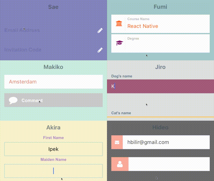
Text inputs with custom label and icon animations for iOS and android. Built with react native and inspired by Codrops.
JavaScript
2,978
106 commits
updated Apr 8, 2024
I've come across with those beautiful text inputs created and blogged by Codrops and wanted to port them to react-native. Some of those text fields are now ready to use in iOS and android thanks to react-native.
There is also a native iOS library called TextFieldEffects which has built some of them in Swift.
I've recently written a blog post about Creating an Animated TextField with React Native. While it isn't directly related to this library, I think you might still find it useful to understand the basics of creating an animated text input with React Native Animated library.
The latest version of this project needs react-native >= 0.55(March 2018 release) due to createRef usage. Go with the latest version:
$ npm install react-native-textinput-effects --save
You can stick with version 0.4 if you have an older react-native version:
$ npm install [email protected] --save
You also need to install react-native-vector-icons if you'd like to use a TextInputEffect component with an icon. Please check out Installation section on that project.
| Prop | Type | Description |
|---|---|---|
label | String | Displayed as placeholder string of the input. |
style | View Style Object | Applied to the root container of the input. |
labelStyle | View Style Object | Applied to the container of the label view. |
inputStyle | Text Style Object | Applied to the TextInput component. |
value | String | This value will be applied to the TextInput and change it's state on every render. Use this prop if you want a Controlled Component. |
defaultValue | String | If you want to initialize the component with a non-empty value, you can supply a defaultValue prop. This prop creates an Uncontrolled Component and is only used during initial render. |
You can also use default TextInput Props. They'll be passed into TextInput component. E.g., use TextInput's onChange prop to be notified on text changes.
<Sae
  onChangeText={(text) => { this.setState({textValue: text}) }
/>
This component needs Icon component from react-native-vector-icons to operate with icons. You should import it before creating a TextInputEffects component.
import Icon from 'react-native-vector-icons/FontAwesome';
| Prop | Type | Description |
|---|---|---|
iconClass | Object | The Icon component class you've imported from react-native-vector-icons. |
iconName | String | Name of the icon that is passed to Icon component. |
iconColor | String | Applied to the Icon component. |
iconSize | Number | Applied to the Icon component. |
See TextInputEffectsExample.js file.
Follow those steps to run the example:
git clone https://github.com/halilb/react-native-textinput-effects && cd react-native-textinput-effects/ExampleYou can also check out the example library without any installation on Appetize.io!
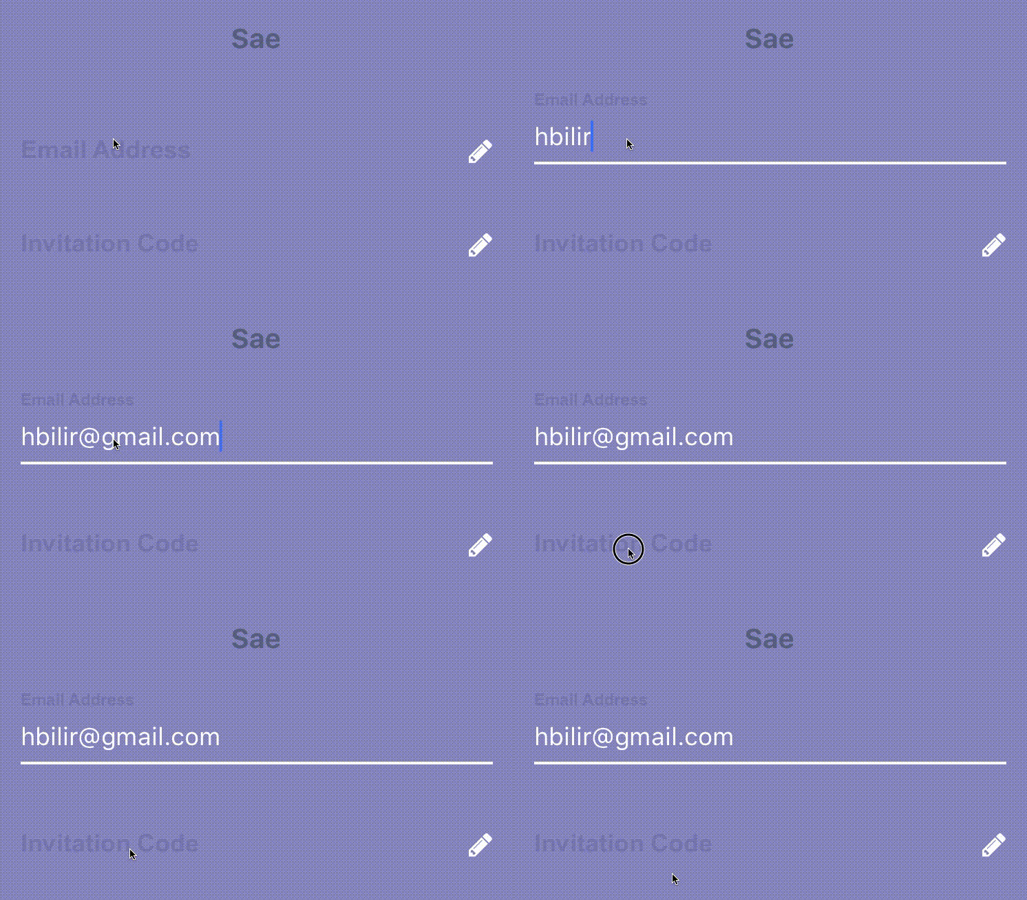
import FontAwesomeIcon from 'react-native-vector-icons/FontAwesome';
import { Sae } from 'react-native-textinput-effects';

const saeInput = (
  <Sae
    label={'Email Address'}
    iconClass={FontAwesomeIcon}
    iconName={'pencil'}
    iconColor={'white'}
    inputPadding={16}
    labelHeight={24}
    // active border height
    borderHeight={2}
    // TextInput props
    autoCapitalize={'none'}
    autoCorrect={false}
  />
);
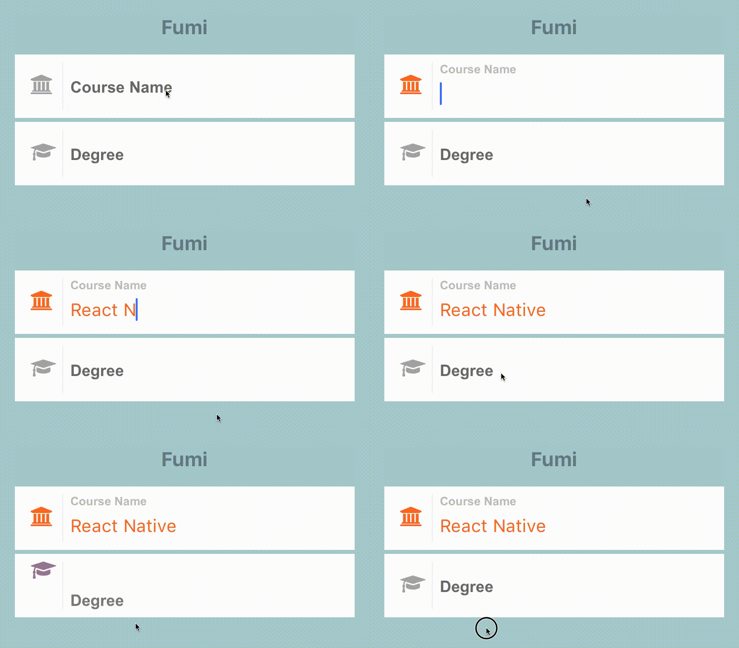
import FontAwesomeIcon from 'react-native-vector-icons/FontAwesome';
import { Fumi } from 'react-native-textinput-effects';

const fumiInput = (
  <Fumi
    label={'Course Name'}
    iconClass={FontAwesomeIcon}
    iconName={'university'}
    iconColor={'#f95a25'}
    iconSize={20}
    iconWidth={40}
    inputPadding={16}
  />
);
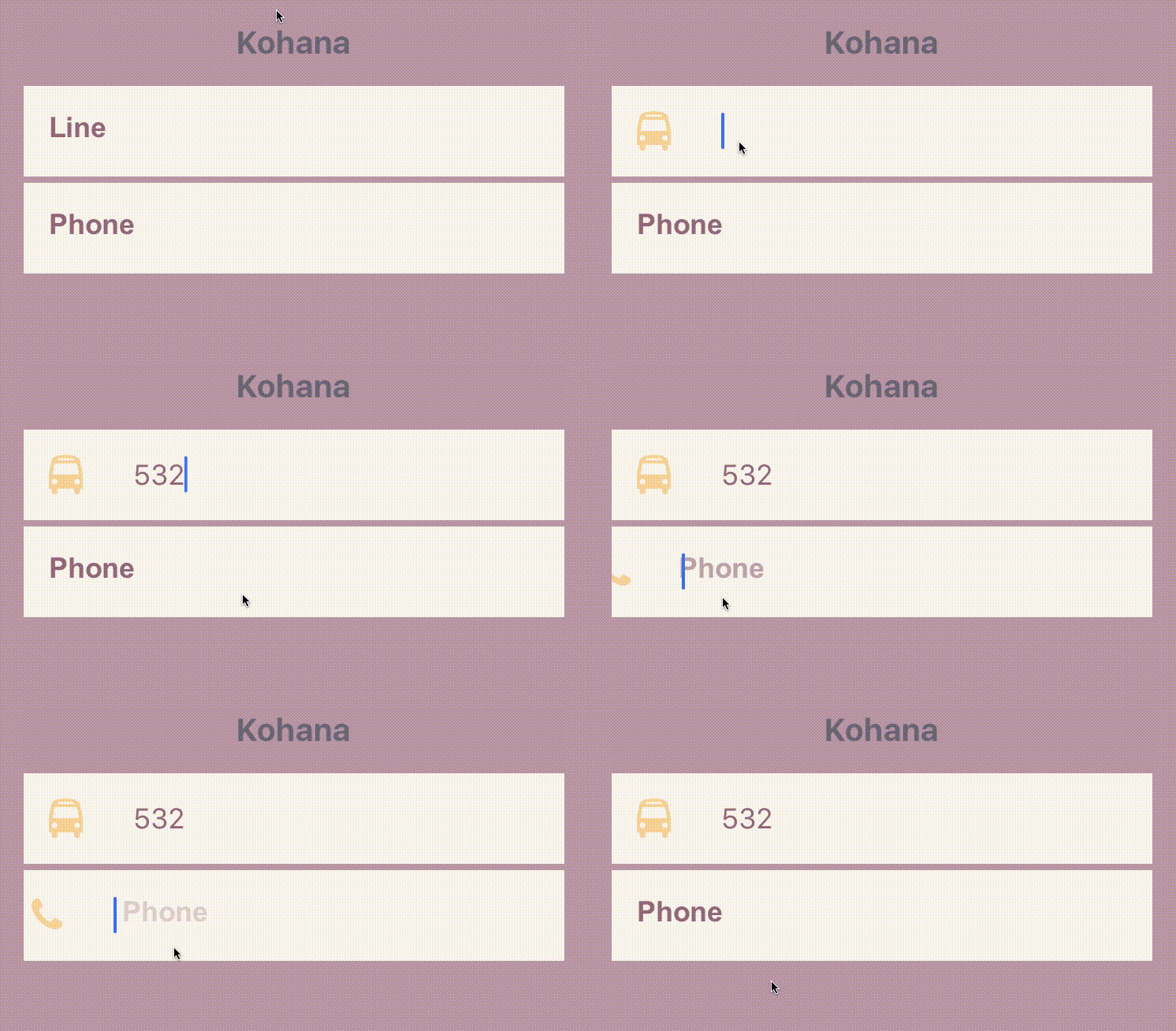
Kohana supports Animated Native Driver. You can use native driver by passing useNativeDriver.
import MaterialsIcon from 'react-native-vector-icons/MaterialIcons';
import { Kohana } from 'react-native-textinput-effects';

const kohanaInput = (
  <Kohana
    style={{ backgroundColor: '#f9f5ed' }}
    label={'Line'}
    iconClass={MaterialsIcon}
    iconName={'directions-bus'}
    iconColor={'#f4d29a'}
    inputPadding={16}
    labelStyle={{ color: '#91627b' }}
    inputStyle={{ color: '#91627b' }}
    labelContainerStyle={{ padding: 20 }}
    iconContainerStyle={{ padding: 20 }}
    useNativeDriver
  />
);
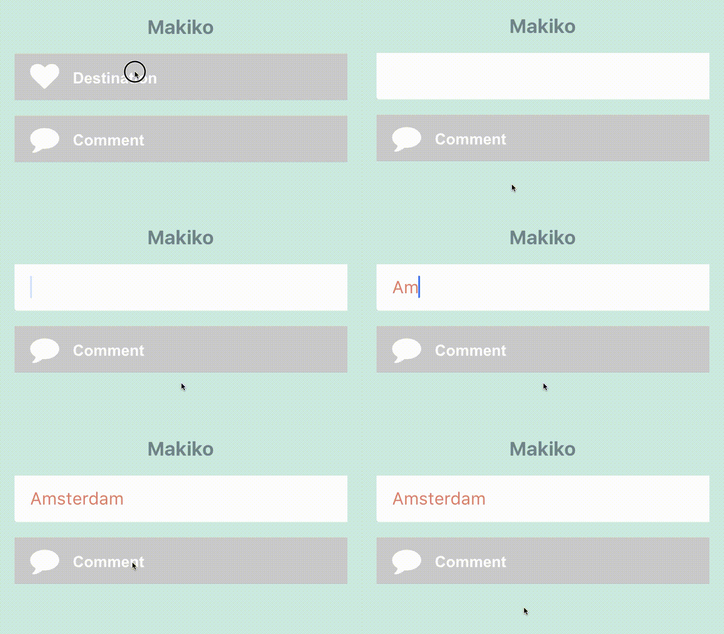
import FontAwesomeIcon from 'react-native-vector-icons/FontAwesome';
import { Makiko } from 'react-native-textinput-effects';

const makikoInput = (
  <Makiko
    label={'Comment'}
    iconClass={FontAwesomeIcon}
    iconName={'comment'}
    iconColor={'white'}
    inputPadding={16}
    inputStyle={{ color: '#db786d' }}
  />
);
Note: Icon component expands and covers the input. So, the icon should not have any blank spaces for the animation experience. This is the limitation for Makiko.
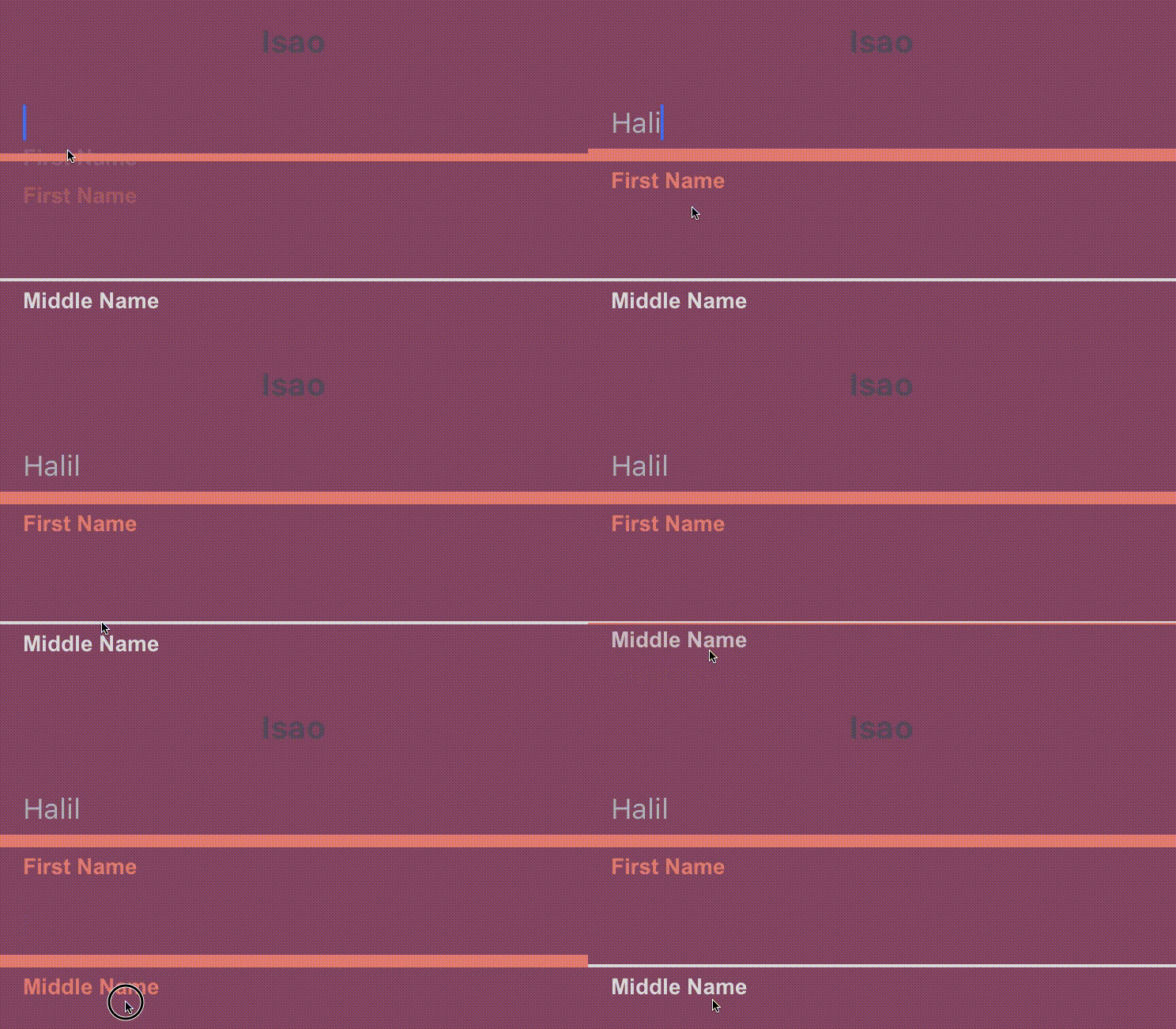
import { Isao } from 'react-native-textinput-effects';

const isaoInput = (
  <Isao
    label={'First Name'}
    // this is applied as active border and label color
    activeColor={'#da7071'}
    // active border height
    borderHeight={8}
    inputPadding={16}
    labelHeight={24}
    // this is applied as passive border and label color
    passiveColor={'#dadada'}
  />
);
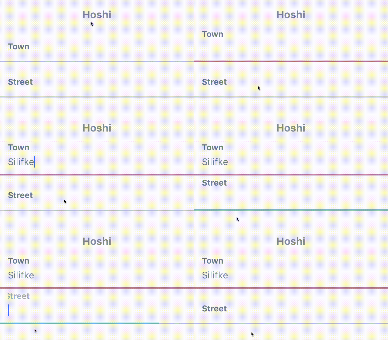
import { Hoshi } from 'react-native-textinput-effects';

const hoshiInput = (
  <Hoshi
    label={'Town'}
    // this is used as active border color
    borderColor={'#b76c94'}
    // active border height
    borderHeight={3}
    inputPadding={16}
    // this is used to set backgroundColor of label mask.
    // please pass the backgroundColor of your TextInput container.
    backgroundColor={'#F9F7F6'}
  />
);
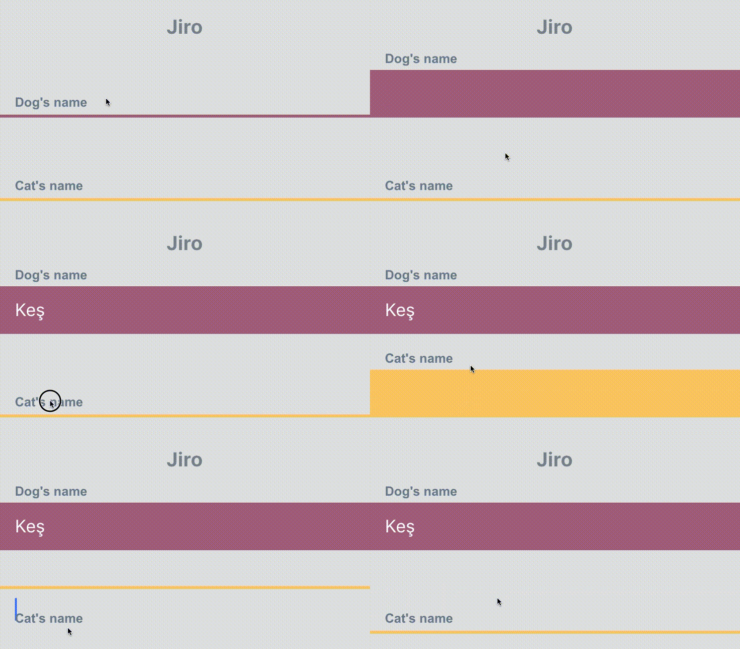
import { Jiro } from 'react-native-textinput-effects';

const jiroInput = (
  <Jiro
    label={'Dog\'s name'}
    // this is used as active and passive border color
    borderColor={'#9b537a'}
    inputPadding={16}
    inputStyle={{ color: 'white' }}
  />
);
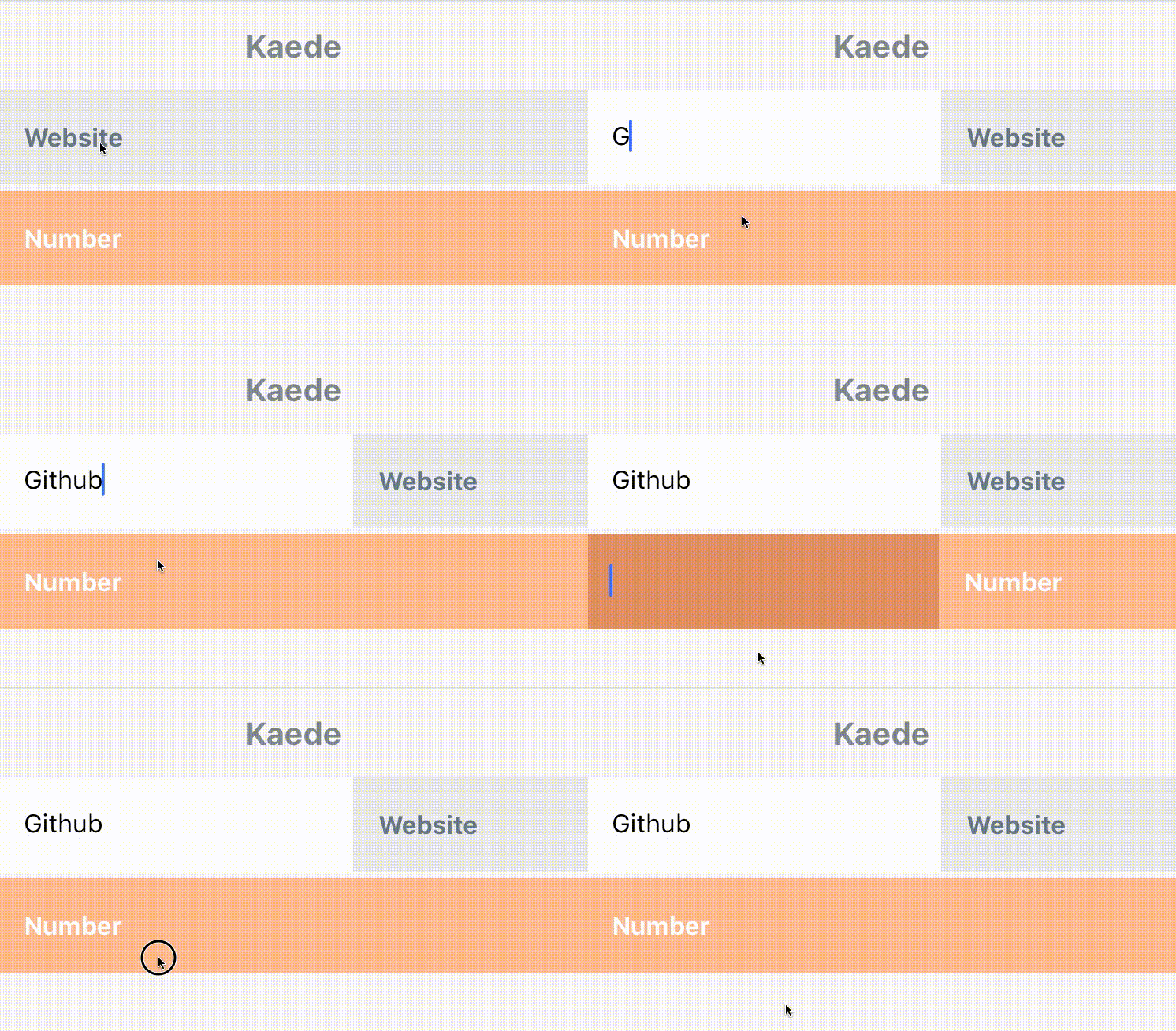
import { Kaede } from 'react-native-textinput-effects';

const kaedeInput = (
  <Kaede
    label={'Website'}
    inputPadding={16}
  />
);
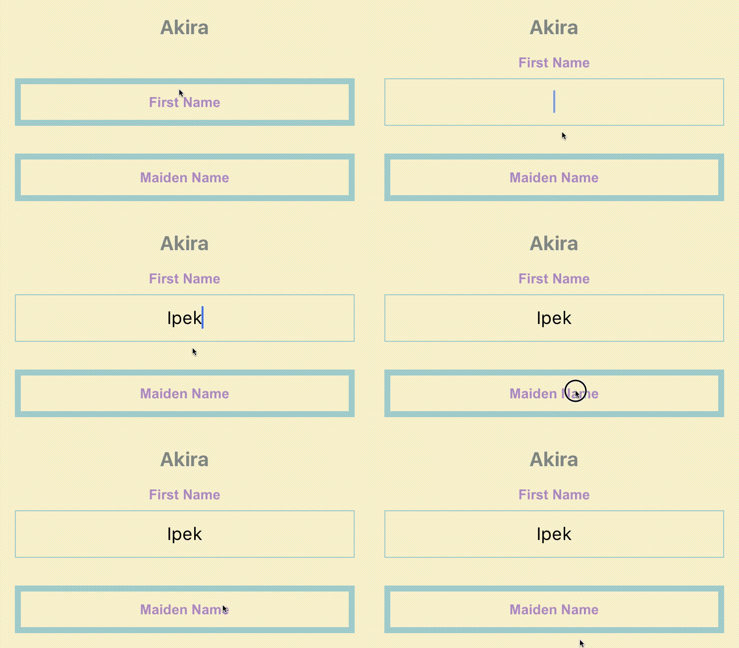
import { Akira } from 'react-native-textinput-effects';

const akiraInput = (
  <Akira
    label={'First Name'}
    // this is used as active and passive border color
    borderColor={'#a5d1cc'}
    inputPadding={16}
    labelHeight={24}
    labelStyle={{ color: '#ac83c4' }}
  />
);
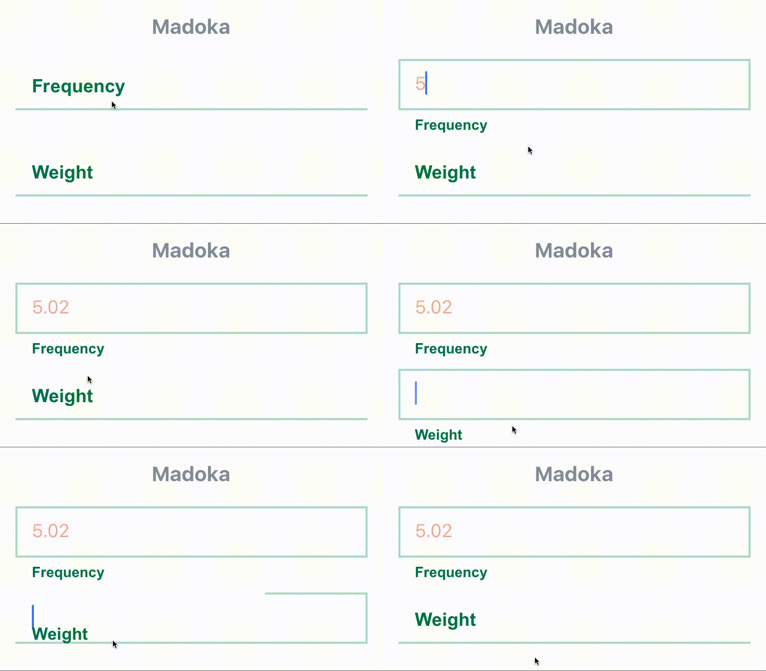
import { Madoka } from 'react-native-textinput-effects';

const madokaInput = (
  <Madoka
    label={'Frequency'}
    // this is used as active and passive border color
    borderColor={'#aee2c9'}
    inputPadding={16}
    labelHeight={24}
    labelStyle={{ color: '#008445' }}
    inputStyle={{ color: '#f4a197' }}
  />
);
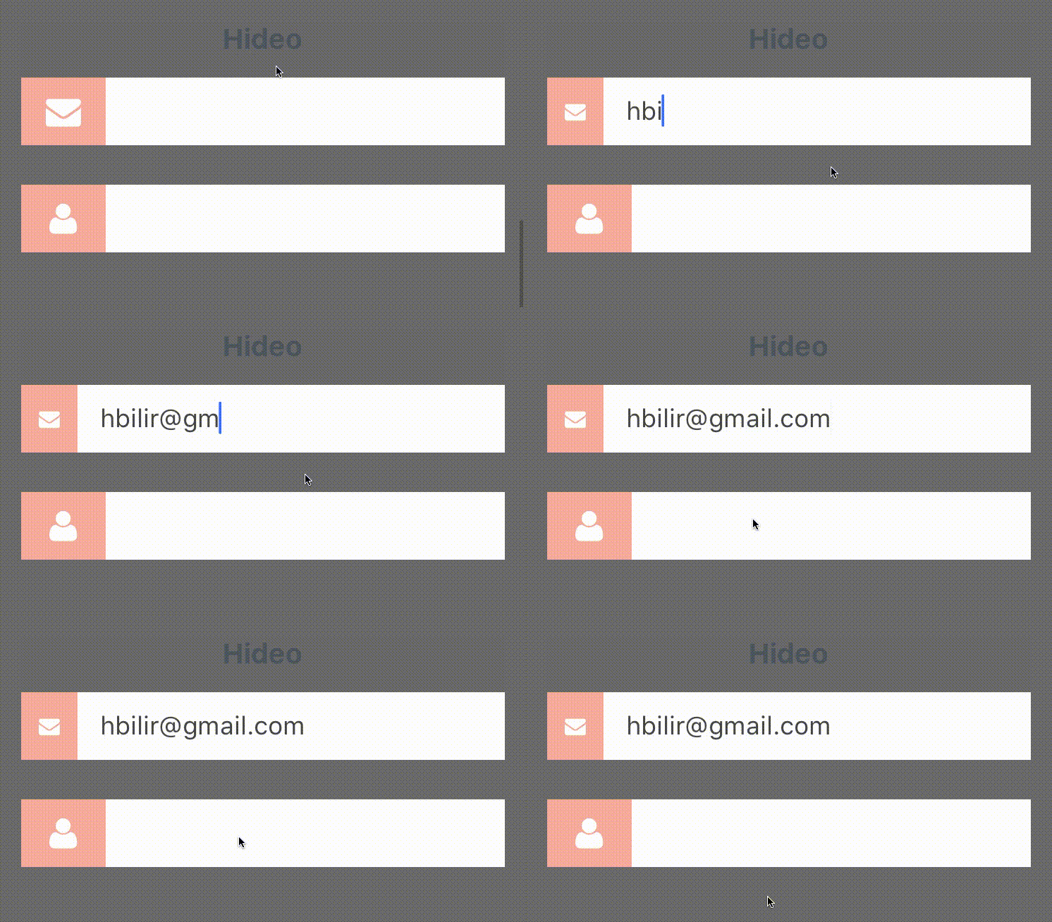
import FontAwesomeIcon from 'react-native-vector-icons/FontAwesome';
import { Hideo } from 'react-native-textinput-effects';

const hideoInput = (
  <Hideo
    iconClass={FontAwesomeIcon}
    iconName={'envelope'}
    iconColor={'white'}
    // this is used as backgroundColor of icon container view.
    iconBackgroundColor={'#f2a59d'}
    inputStyle={{ color: '#464949' }}
  />
);
Overall
Maintained
Code review
Latest release
Releases this year
1,197 followers · starred Jan 2017
34 followers · starred Apr 2018
18 followers · starred May 2019
Text inputs with custom label and icon animations for iOS and android. Built with react native and inspired by Codrops.
JavaScript
2,978
106 commits
updated Apr 8, 2024
I've come across with those beautiful text inputs created and blogged by Codrops and wanted to port them to react-native. Some of those text fields are now ready to use in iOS and android thanks to react-native.
There is also a native iOS library called TextFieldEffects which has built some of them in Swift.
I've recently written a blog post about Creating an Animated TextField with React Native. While it isn't directly related to this library, I think you might still find it useful to understand the basics of creating an animated text input with React Native Animated library.
The latest version of this project needs react-native >= 0.55(March 2018 release) due to createRef usage. Go with the latest version:
$ npm install react-native-textinput-effects --save
You can stick with version 0.4 if you have an older react-native version:
$ npm install [email protected] --save
You also need to install react-native-vector-icons if you'd like to use a TextInputEffect component with an icon. Please check out Installation section on that project.
| Prop | Type | Description |
|---|---|---|
label | String | Displayed as placeholder string of the input. |
style | View Style Object | Applied to the root container of the input. |
labelStyle | View Style Object | Applied to the container of the label view. |
inputStyle | Text Style Object | Applied to the TextInput component. |
value | String | This value will be applied to the TextInput and change it's state on every render. Use this prop if you want a Controlled Component. |
defaultValue | String | If you want to initialize the component with a non-empty value, you can supply a defaultValue prop. This prop creates an Uncontrolled Component and is only used during initial render. |
You can also use default TextInput Props. They'll be passed into TextInput component. E.g., use TextInput's onChange prop to be notified on text changes.
<Sae
  onChangeText={(text) => { this.setState({textValue: text}) }
/>
This component needs Icon component from react-native-vector-icons to operate with icons. You should import it before creating a TextInputEffects component.
import Icon from 'react-native-vector-icons/FontAwesome';
| Prop | Type | Description |
|---|---|---|
iconClass | Object | The Icon component class you've imported from react-native-vector-icons. |
iconName | String | Name of the icon that is passed to Icon component. |
iconColor | String | Applied to the Icon component. |
iconSize | Number | Applied to the Icon component. |
See TextInputEffectsExample.js file.
Follow those steps to run the example:
git clone https://github.com/halilb/react-native-textinput-effects && cd react-native-textinput-effects/ExampleYou can also check out the example library without any installation on Appetize.io!
import FontAwesomeIcon from 'react-native-vector-icons/FontAwesome';
import { Sae } from 'react-native-textinput-effects';

const saeInput = (
  <Sae
    label={'Email Address'}
    iconClass={FontAwesomeIcon}
    iconName={'pencil'}
    iconColor={'white'}
    inputPadding={16}
    labelHeight={24}
    // active border height
    borderHeight={2}
    // TextInput props
    autoCapitalize={'none'}
    autoCorrect={false}
  />
);
import FontAwesomeIcon from 'react-native-vector-icons/FontAwesome';
import { Fumi } from 'react-native-textinput-effects';

const fumiInput = (
  <Fumi
    label={'Course Name'}
    iconClass={FontAwesomeIcon}
    iconName={'university'}
    iconColor={'#f95a25'}
    iconSize={20}
    iconWidth={40}
    inputPadding={16}
  />
);
Kohana supports Animated Native Driver. You can use native driver by passing useNativeDriver.
import MaterialsIcon from 'react-native-vector-icons/MaterialIcons';
import { Kohana } from 'react-native-textinput-effects';

const kohanaInput = (
  <Kohana
    style={{ backgroundColor: '#f9f5ed' }}
    label={'Line'}
    iconClass={MaterialsIcon}
    iconName={'directions-bus'}
    iconColor={'#f4d29a'}
    inputPadding={16}
    labelStyle={{ color: '#91627b' }}
    inputStyle={{ color: '#91627b' }}
    labelContainerStyle={{ padding: 20 }}
    iconContainerStyle={{ padding: 20 }}
    useNativeDriver
  />
);
import FontAwesomeIcon from 'react-native-vector-icons/FontAwesome';
import { Makiko } from 'react-native-textinput-effects';

const makikoInput = (
  <Makiko
    label={'Comment'}
    iconClass={FontAwesomeIcon}
    iconName={'comment'}
    iconColor={'white'}
    inputPadding={16}
    inputStyle={{ color: '#db786d' }}
  />
);
Note: Icon component expands and covers the input. So, the icon should not have any blank spaces for the animation experience. This is the limitation for Makiko.
import { Isao } from 'react-native-textinput-effects';

const isaoInput = (
  <Isao
    label={'First Name'}
    // this is applied as active border and label color
    activeColor={'#da7071'}
    // active border height
    borderHeight={8}
    inputPadding={16}
    labelHeight={24}
    // this is applied as passive border and label color
    passiveColor={'#dadada'}
  />
);
import { Hoshi } from 'react-native-textinput-effects';

const hoshiInput = (
  <Hoshi
    label={'Town'}
    // this is used as active border color
    borderColor={'#b76c94'}
    // active border height
    borderHeight={3}
    inputPadding={16}
    // this is used to set backgroundColor of label mask.
    // please pass the backgroundColor of your TextInput container.
    backgroundColor={'#F9F7F6'}
  />
);
import { Jiro } from 'react-native-textinput-effects';

const jiroInput = (
  <Jiro
    label={'Dog\'s name'}
    // this is used as active and passive border color
    borderColor={'#9b537a'}
    inputPadding={16}
    inputStyle={{ color: 'white' }}
  />
);
import { Kaede } from 'react-native-textinput-effects';

const kaedeInput = (
  <Kaede
    label={'Website'}
    inputPadding={16}
  />
);
import { Akira } from 'react-native-textinput-effects';

const akiraInput = (
  <Akira
    label={'First Name'}
    // this is used as active and passive border color
    borderColor={'#a5d1cc'}
    inputPadding={16}
    labelHeight={24}
    labelStyle={{ color: '#ac83c4' }}
  />
);
import { Madoka } from 'react-native-textinput-effects';

const madokaInput = (
  <Madoka
    label={'Frequency'}
    // this is used as active and passive border color
    borderColor={'#aee2c9'}
    inputPadding={16}
    labelHeight={24}
    labelStyle={{ color: '#008445' }}
    inputStyle={{ color: '#f4a197' }}
  />
);
import FontAwesomeIcon from 'react-native-vector-icons/FontAwesome';
import { Hideo } from 'react-native-textinput-effects';

const hideoInput = (
  <Hideo
    iconClass={FontAwesomeIcon}
    iconName={'envelope'}
    iconColor={'white'}
    // this is used as backgroundColor of icon container view.
    iconBackgroundColor={'#f2a59d'}
    inputStyle={{ color: '#464949' }}
  />
);
Overall
Maintained
Code review
Latest release
Releases this year
1,197 followers · starred Jan 2017
34 followers · starred Apr 2018
18 followers · starred May 2019



