A 60FPS animated tab bar with a variety of cool animation presets 😎
TypeScript
1,852
94 commits
updated Dec 27, 2022


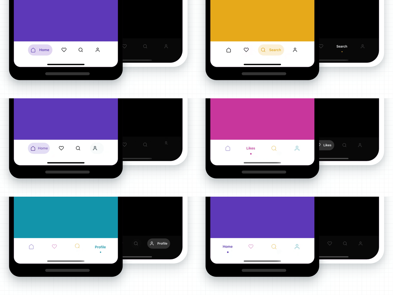
A 60FPS animated tab bar with a variety of cool animation presets 😎
60FPS smooth animation for all presets.React Navigation v4 & v5.TypeScript.yarn add @gorhom/animated-tabbar
# or
npm install @gorhom/animated-tabbar
Also, you need to install react-native-reanimated, react-native-gesture-handler & react-native-svg, and follow their installation instructions.
Originally Animated TabBar worked only with React Navigation, but I notice that it could be use as a standalone component and be more useful for the community.
Now the library export two main components:
AnimatedTabBar ( default ) : the React Navigation integrated tab bar.AnimatedTabBarView: the standalone tab bar.import React, { useState } from 'react';
import { View, Text, StyleSheet } from 'react-native';
import AnimatedTabBar, {TabsConfig, BubbleTabBarItemConfig} from '@gorhom/animated-tabbar';
const tabs: TabsConfig<BubbleTabBarItemConfig> = {
Home: {
labelStyle: {
color: '#5B37B7',
},
icon: {
component: /* ICON COMPONENT */,
activeColor: 'rgba(91,55,183,1)',
inactiveColor: 'rgba(0,0,0,1)',
},
background: {
activeColor: 'rgba(223,215,243,1)',
inactiveColor: 'rgba(223,215,243,0)',
},
},
Profile: {
labelStyle: {
color: '#1194AA',
},
icon: {
component: /* ICON COMPONENT */,
activeColor: 'rgba(17,148,170,1)',
inactiveColor: 'rgba(0,0,0,1)',
},
background: {
activeColor: 'rgba(207,235,239,1)',
inactiveColor: 'rgba(207,235,239,0)',
},
},
};
const styles = StyleSheet.create({
container: {
flex: 1,
justifyContent: 'center',
alignItems: 'center',
backgroundColor: '#999',
},
tabBarContainer: {
borderRadius: 25,
},
});
export default function App() {
const [index, setIndex] = useState(0);
return (
<View style={styles.container}>
<Text>{index}</Text>
<AnimatedTabBarView
tabs={tabs}
itemOuterSpace={{
horizontal: 6,
vertical: 12,
}}
itemInnerSpace={12}
iconSize={20}
style={styles.tabBarContainer}
index={index}
onIndexChange={setIndex}
/>
</View>
)
}
import React from 'react';
import { NavigationContainer } from '@react-navigation/native';
import { createBottomTabNavigator } from '@react-navigation/bottom-tabs';
import AnimatedTabBar, {TabsConfig, BubbleTabBarItemConfig} from '@gorhom/animated-tabbar';

const tabs: TabsConfig<BubbleTabBarItemConfig> = {
  Home: {
    labelStyle: {
      color: '#5B37B7',
    },
    icon: {
      component: /* ICON COMPONENT */,
      activeColor: 'rgba(91,55,183,1)',
      inactiveColor: 'rgba(0,0,0,1)',
    },
    background: {
      activeColor: 'rgba(223,215,243,1)',
      inactiveColor: 'rgba(223,215,243,0)',
    },
  },
  Profile: {
    labelStyle: {
      color: '#1194AA',
    },
    icon: {
      component: /* ICON COMPONENT */,
      activeColor: 'rgba(17,148,170,1)',
      inactiveColor: 'rgba(0,0,0,1)',
    },
    background: {
      activeColor: 'rgba(207,235,239,1)',
      inactiveColor: 'rgba(207,235,239,0)',
    },
  },
};

const Tab = createBottomTabNavigator();

export default function App() {
  return (
    <NavigationContainer>
      <Tab.Navigator
        tabBar={props => (
          <AnimatedTabBar tabs={tabs} {...props} />
        )}
      >
        <Tab.Screen
          name="Home"
          component={HomeScreen}
        />
        <Tab.Screen
          name="Profile"
          component={ProfileScreen}
        />
      </Tab.Navigator>
    </NavigationContainer>
  )
}
import React from 'react';
import { NavigationContainer } from '@react-navigation/native';
import { createBottomTabNavigator } from '@react-navigation/bottom-tabs';
import AnimatedTabBar from '@gorhom/animated-tabbar';

const tabs = {
  Home: { // < Screen name
    labelStyle: {
      color: '#5B37B7',
    },
    icon: {
      component: /* ICON COMPONENT */,
      activeColor: 'rgba(91,55,183,1)',
      inactiveColor: 'rgba(0,0,0,1)',
    },
    background: {
      activeColor: 'rgba(223,215,243,1)',
      inactiveColor: 'rgba(223,215,243,0)',
    },
  },
  Profile: { // < Screen name
    labelStyle: {
      color: '#1194AA',
    },
    icon: {
      component: /* ICON COMPONENT */,
      activeColor: 'rgba(17,148,170,1)',
      inactiveColor: 'rgba(0,0,0,1)',
    },
    background: {
      activeColor: 'rgba(207,235,239,1)',
      inactiveColor: 'rgba(207,235,239,0)',
    },
  },
};

const Tab = createBottomTabNavigator();

export default function App() {
  return (
    <NavigationContainer>
      <Tab.Navigator
        tabBar={props => (
          <AnimatedTabBar tabs={tabs} {...props} />
        )}
      >
        <Tab.Screen
          name="Home"
          component={HomeScreen}
        />
        <Tab.Screen
          name="Profile"
          component={ProfileScreen}
        />
      </Tab.Navigator>
    </NavigationContainer>
  )
}
import React from 'react';
import {createAppContainer} from 'react-navigation';
import {createBottomTabNavigator} from 'react-navigation-tabs';
import {SafeAreaProvider} from 'react-native-safe-area-context';
import AnimatedTabBar, {TabsConfig, BubbleTabBarItemConfig} from '@gorhom/animated-tabbar';

const tabs: TabsConfig<BubbleTabConfig> = {
  Home: {
    labelStyle: {
      color: '#5B37B7',
    },
    icon: {
      component: /* ICON COMPONENT */,
      activeColor: 'rgba(91,55,183,1)',
      inactiveColor: 'rgba(0,0,0,1)',
    },
    background: {
      activeColor: 'rgba(223,215,243,1)',
      inactiveColor: 'rgba(223,215,243,0)',
    },
  },
  Profile: {
    labelStyle: {
      color: '#1194AA',
    },
    icon: {
      component: /* ICON COMPONENT */,
      activeColor: 'rgba(17,148,170,1)',
      inactiveColor: 'rgba(0,0,0,1)',
    },
    background: {
      activeColor: 'rgba(207,235,239,1)',
      inactiveColor: 'rgba(207,235,239,0)',
    },
  },
};

const TabNavigator = createBottomTabNavigator(
  {
    Home: HomeScreen,
    Profile: ProfileScreen,
  },
  {
    tabBarComponent: props => <AnimatedTabBar tabs={tabs} {...props} />,
  },
);

const AppContainer = createAppContainer(TabNavigator);

export default () => (
  <SafeAreaProvider>
    <AppContainer />
  </SafeAreaProvider>
);
To configure animated icons, please have a look at Animated Icons.
| name | description | required | type | default |
|---|---|---|---|---|
preset | Animation preset, currently options are ['bubble', 'flashy', 'material']. | NO | PresetEnum | 'bubble' |
tabs | Tabs configurations. A generic dictionary of selected preset tab config. | YES | TabsConfig<T> | |
style | View style to be applied to tab bar container, default value will be based on selected preset. | NO | StyleProp | |
duration | Animation duration, default value will be based on selected preset. | NO | number | |
easing | Animation easing function, default value will be based on selected preset. | NO | EasingFunction | |
itemInnerSpace | Tab item inner space to be added to the tab item, default value will be based on selected preset. | NO | number | Space | |
itemOuterSpace | Tab item outer space to be added to the tab item, default value will be based on selected preset. | NO | number | Space | |
itemContainerWidth | Tab item width stretch strategy, default value will be based on selected preset. | NO | 'auto' | 'fill' | |
iconSize | Tab item icon size, default value will be based on selected preset. | NO | number | |
isRTL | Tab bar layout and animation direction. | NO | boolean | false |
onLongPress | Callback on item long press, by default it is integrated with React Navigation. | NO | (index: number) => void | noop |
Some presets will have its own configurations - like material - which they will be added the root view props.
notice here we added animation, inactiveOpacity & inactiveScale to the root view.
import React from 'react';
import { NavigationContainer } from '@react-navigation/native';
import { createBottomTabNavigator } from '@react-navigation/bottom-tabs';
import AnimatedTabBar, {TabsConfig, MaterialTabBarItemConfig} from '@gorhom/animated-tabbar';

const tabs: TabsConfig<MaterialTabBarItemConfig> = {
Home: {
  icon: {
    component: /* ICON COMPONENT */,
    color: 'rgba(255,255,255,1)',
  },
  ripple: {
    color: '#5B37B7',
  },
},
Profile: {
  icon: {
    component: /* ICON COMPONENT */,
    color: 'rgba(255,255,255,1)',
  },
  ripple: {
    color: '#1194AA',
  },
},
};

const Tab = createBottomTabNavigator();

export default function App() {
return (
  <NavigationContainer>
    <Tab.Navigator
      tabBar={props => (
        <AnimatedTabBar
          preset='material'
          tabs={tabs}
          animation="iconWithLabelOnFocus"
          inactiveOpacity={0.25}
          inactiveScale={0.5}
          {...props}
        />
      )}
    >
      <Tab.Screen
        name="Home"
        component={HomeScreen}
      />
      <Tab.Screen
        name="Profile"
        component={ProfileScreen}
      />
    </Tab.Navigator>
  </NavigationContainer>
)
}
Originally Animated TabBar started with Bubble as the only animation preset embedded. However, I felt the library structure could include many other variety of animation presets.
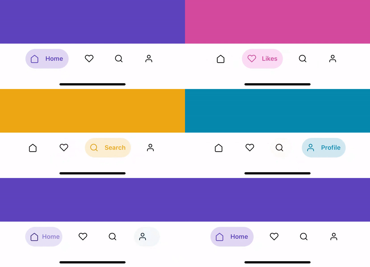
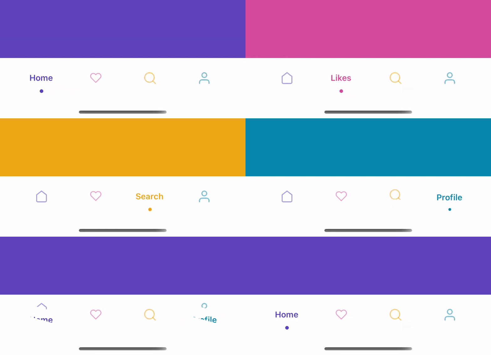
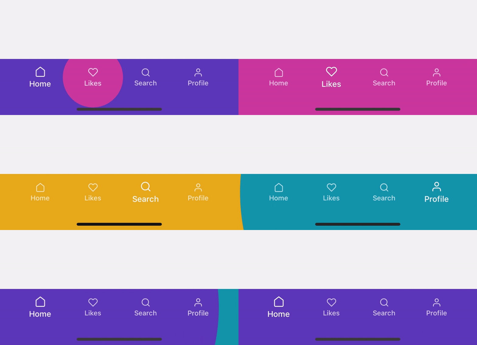
Due to extend the library functionality, I had to rename existing interfaces as following:
BubbleTabConfig to BubbleTabBarItemConfigBubbleTabIconProps to BubbleTabBarIconPropsFlashyTabConfig to FlashyTabBarItemConfigFlashyTabIconProps to FlashyTabBarIconPropsTo keep this library maintained and up-to-date please consider sponsoring it on GitHub. Or if you are looking for a private support or help in customizing the experience, then reach out to me on Twitter @gorhom.

Overall
Maintained
Code review
Latest release
Releases this year
1,117 followers · starred May 2025
150 followers · starred Apr 2020
13 followers · starred Sep 2022
23 followers · starred Apr 2021
A 60FPS animated tab bar with a variety of cool animation presets 😎
TypeScript
1,852
94 commits
updated Dec 27, 2022
A 60FPS animated tab bar with a variety of cool animation presets 😎
60FPS smooth animation for all presets.React Navigation v4 & v5.TypeScript.yarn add @gorhom/animated-tabbar
# or
npm install @gorhom/animated-tabbar
Also, you need to install react-native-reanimated, react-native-gesture-handler & react-native-svg, and follow their installation instructions.
Originally Animated TabBar worked only with React Navigation, but I notice that it could be use as a standalone component and be more useful for the community.
Now the library export two main components:
AnimatedTabBar ( default ) : the React Navigation integrated tab bar.AnimatedTabBarView: the standalone tab bar.import React, { useState } from 'react';
import { View, Text, StyleSheet } from 'react-native';
import AnimatedTabBar, {TabsConfig, BubbleTabBarItemConfig} from '@gorhom/animated-tabbar';
const tabs: TabsConfig<BubbleTabBarItemConfig> = {
Home: {
labelStyle: {
color: '#5B37B7',
},
icon: {
component: /* ICON COMPONENT */,
activeColor: 'rgba(91,55,183,1)',
inactiveColor: 'rgba(0,0,0,1)',
},
background: {
activeColor: 'rgba(223,215,243,1)',
inactiveColor: 'rgba(223,215,243,0)',
},
},
Profile: {
labelStyle: {
color: '#1194AA',
},
icon: {
component: /* ICON COMPONENT */,
activeColor: 'rgba(17,148,170,1)',
inactiveColor: 'rgba(0,0,0,1)',
},
background: {
activeColor: 'rgba(207,235,239,1)',
inactiveColor: 'rgba(207,235,239,0)',
},
},
};
const styles = StyleSheet.create({
container: {
flex: 1,
justifyContent: 'center',
alignItems: 'center',
backgroundColor: '#999',
},
tabBarContainer: {
borderRadius: 25,
},
});
export default function App() {
const [index, setIndex] = useState(0);
return (
<View style={styles.container}>
<Text>{index}</Text>
<AnimatedTabBarView
tabs={tabs}
itemOuterSpace={{
horizontal: 6,
vertical: 12,
}}
itemInnerSpace={12}
iconSize={20}
style={styles.tabBarContainer}
index={index}
onIndexChange={setIndex}
/>
</View>
)
}
import React from 'react';
import { NavigationContainer } from '@react-navigation/native';
import { createBottomTabNavigator } from '@react-navigation/bottom-tabs';
import AnimatedTabBar, {TabsConfig, BubbleTabBarItemConfig} from '@gorhom/animated-tabbar';

const tabs: TabsConfig<BubbleTabBarItemConfig> = {
  Home: {
    labelStyle: {
      color: '#5B37B7',
    },
    icon: {
      component: /* ICON COMPONENT */,
      activeColor: 'rgba(91,55,183,1)',
      inactiveColor: 'rgba(0,0,0,1)',
    },
    background: {
      activeColor: 'rgba(223,215,243,1)',
      inactiveColor: 'rgba(223,215,243,0)',
    },
  },
  Profile: {
    labelStyle: {
      color: '#1194AA',
    },
    icon: {
      component: /* ICON COMPONENT */,
      activeColor: 'rgba(17,148,170,1)',
      inactiveColor: 'rgba(0,0,0,1)',
    },
    background: {
      activeColor: 'rgba(207,235,239,1)',
      inactiveColor: 'rgba(207,235,239,0)',
    },
  },
};

const Tab = createBottomTabNavigator();

export default function App() {
  return (
    <NavigationContainer>
      <Tab.Navigator
        tabBar={props => (
          <AnimatedTabBar tabs={tabs} {...props} />
        )}
      >
        <Tab.Screen
          name="Home"
          component={HomeScreen}
        />
        <Tab.Screen
          name="Profile"
          component={ProfileScreen}
        />
      </Tab.Navigator>
    </NavigationContainer>
  )
}
import React from 'react';
import { NavigationContainer } from '@react-navigation/native';
import { createBottomTabNavigator } from '@react-navigation/bottom-tabs';
import AnimatedTabBar from '@gorhom/animated-tabbar';

const tabs = {
  Home: { // < Screen name
    labelStyle: {
      color: '#5B37B7',
    },
    icon: {
      component: /* ICON COMPONENT */,
      activeColor: 'rgba(91,55,183,1)',
      inactiveColor: 'rgba(0,0,0,1)',
    },
    background: {
      activeColor: 'rgba(223,215,243,1)',
      inactiveColor: 'rgba(223,215,243,0)',
    },
  },
  Profile: { // < Screen name
    labelStyle: {
      color: '#1194AA',
    },
    icon: {
      component: /* ICON COMPONENT */,
      activeColor: 'rgba(17,148,170,1)',
      inactiveColor: 'rgba(0,0,0,1)',
    },
    background: {
      activeColor: 'rgba(207,235,239,1)',
      inactiveColor: 'rgba(207,235,239,0)',
    },
  },
};

const Tab = createBottomTabNavigator();

export default function App() {
  return (
    <NavigationContainer>
      <Tab.Navigator
        tabBar={props => (
          <AnimatedTabBar tabs={tabs} {...props} />
        )}
      >
        <Tab.Screen
          name="Home"
          component={HomeScreen}
        />
        <Tab.Screen
          name="Profile"
          component={ProfileScreen}
        />
      </Tab.Navigator>
    </NavigationContainer>
  )
}
import React from 'react';
import {createAppContainer} from 'react-navigation';
import {createBottomTabNavigator} from 'react-navigation-tabs';
import {SafeAreaProvider} from 'react-native-safe-area-context';
import AnimatedTabBar, {TabsConfig, BubbleTabBarItemConfig} from '@gorhom/animated-tabbar';

const tabs: TabsConfig<BubbleTabConfig> = {
  Home: {
    labelStyle: {
      color: '#5B37B7',
    },
    icon: {
      component: /* ICON COMPONENT */,
      activeColor: 'rgba(91,55,183,1)',
      inactiveColor: 'rgba(0,0,0,1)',
    },
    background: {
      activeColor: 'rgba(223,215,243,1)',
      inactiveColor: 'rgba(223,215,243,0)',
    },
  },
  Profile: {
    labelStyle: {
      color: '#1194AA',
    },
    icon: {
      component: /* ICON COMPONENT */,
      activeColor: 'rgba(17,148,170,1)',
      inactiveColor: 'rgba(0,0,0,1)',
    },
    background: {
      activeColor: 'rgba(207,235,239,1)',
      inactiveColor: 'rgba(207,235,239,0)',
    },
  },
};

const TabNavigator = createBottomTabNavigator(
  {
    Home: HomeScreen,
    Profile: ProfileScreen,
  },
  {
    tabBarComponent: props => <AnimatedTabBar tabs={tabs} {...props} />,
  },
);

const AppContainer = createAppContainer(TabNavigator);

export default () => (
  <SafeAreaProvider>
    <AppContainer />
  </SafeAreaProvider>
);
To configure animated icons, please have a look at Animated Icons.
| name | description | required | type | default |
|---|---|---|---|---|
preset | Animation preset, currently options are ['bubble', 'flashy', 'material']. | NO | PresetEnum | 'bubble' |
tabs | Tabs configurations. A generic dictionary of selected preset tab config. | YES | TabsConfig<T> | |
style | View style to be applied to tab bar container, default value will be based on selected preset. | NO | StyleProp | |
duration | Animation duration, default value will be based on selected preset. | NO | number | |
easing | Animation easing function, default value will be based on selected preset. | NO | EasingFunction | |
itemInnerSpace | Tab item inner space to be added to the tab item, default value will be based on selected preset. | NO | number | Space | |
itemOuterSpace | Tab item outer space to be added to the tab item, default value will be based on selected preset. | NO | number | Space | |
itemContainerWidth | Tab item width stretch strategy, default value will be based on selected preset. | NO | 'auto' | 'fill' | |
iconSize | Tab item icon size, default value will be based on selected preset. | NO | number | |
isRTL | Tab bar layout and animation direction. | NO | boolean | false |
onLongPress | Callback on item long press, by default it is integrated with React Navigation. | NO | (index: number) => void | noop |
Some presets will have its own configurations - like material - which they will be added the root view props.
notice here we added animation, inactiveOpacity & inactiveScale to the root view.
import React from 'react';
import { NavigationContainer } from '@react-navigation/native';
import { createBottomTabNavigator } from '@react-navigation/bottom-tabs';
import AnimatedTabBar, {TabsConfig, MaterialTabBarItemConfig} from '@gorhom/animated-tabbar';

const tabs: TabsConfig<MaterialTabBarItemConfig> = {
Home: {
  icon: {
    component: /* ICON COMPONENT */,
    color: 'rgba(255,255,255,1)',
  },
  ripple: {
    color: '#5B37B7',
  },
},
Profile: {
  icon: {
    component: /* ICON COMPONENT */,
    color: 'rgba(255,255,255,1)',
  },
  ripple: {
    color: '#1194AA',
  },
},
};

const Tab = createBottomTabNavigator();

export default function App() {
return (
  <NavigationContainer>
    <Tab.Navigator
      tabBar={props => (
        <AnimatedTabBar
          preset='material'
          tabs={tabs}
          animation="iconWithLabelOnFocus"
          inactiveOpacity={0.25}
          inactiveScale={0.5}
          {...props}
        />
      )}
    >
      <Tab.Screen
        name="Home"
        component={HomeScreen}
      />
      <Tab.Screen
        name="Profile"
        component={ProfileScreen}
      />
    </Tab.Navigator>
  </NavigationContainer>
)
}
Originally Animated TabBar started with Bubble as the only animation preset embedded. However, I felt the library structure could include many other variety of animation presets.
Due to extend the library functionality, I had to rename existing interfaces as following:
BubbleTabConfig to BubbleTabBarItemConfigBubbleTabIconProps to BubbleTabBarIconPropsFlashyTabConfig to FlashyTabBarItemConfigFlashyTabIconProps to FlashyTabBarIconPropsTo keep this library maintained and up-to-date please consider sponsoring it on GitHub. Or if you are looking for a private support or help in customizing the experience, then reach out to me on Twitter @gorhom.
Overall
Maintained
Code review
Latest release
Releases this year
1,117 followers · starred May 2025
150 followers · starred Apr 2020
13 followers · starred Sep 2022
23 followers · starred Apr 2021