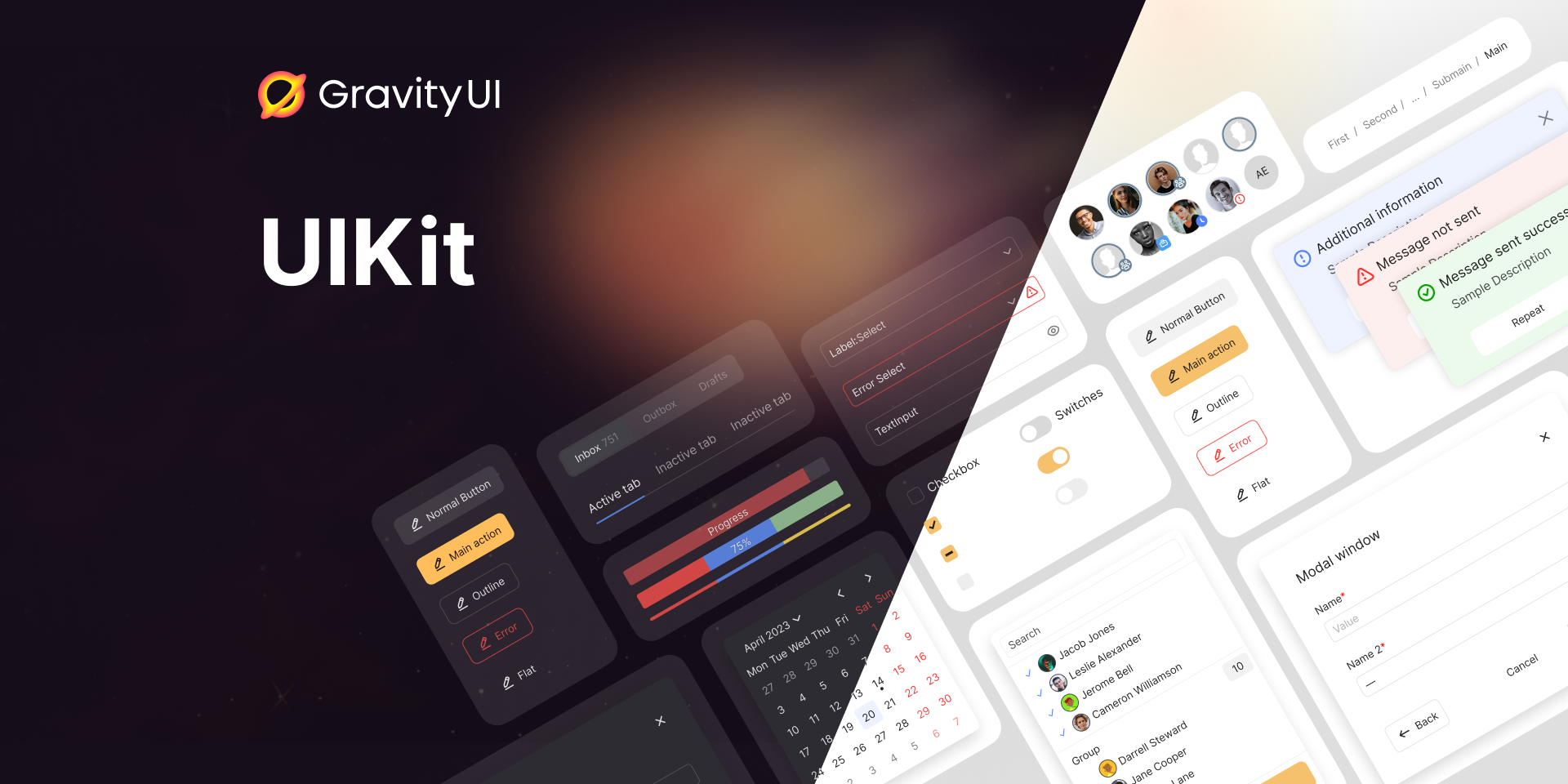
A set of flexible, highly practical, and efficient React components for creating rich web applications. Part of the Gravity UI design system.

 Website
 Documentation
 Figma
Figma 
 Themer
 Storybook
 Community
UIKit is the foundational package of the Gravity UI design system — a battle-tested set of 70+ React components built for production web applications. It handles the hard parts: theming, accessibility, RTL layout, server-side rendering, and internationalization, so you can focus on building your product.
Key features:
Browse the full component catalog in Storybook or the documentation.
React 16.14, 17, 18, or 19 must be installed in your project.
npm install @gravity-ui/uikit
Import components directly from the package:
import {Button} from '@gravity-ui/uikit';

const SubmitButton = (
  <Button view="action" size="l">
    Submit
  </Button>
);
Include the base styles and fonts once at the top of your app entry point:
// index.js
import '@gravity-ui/uikit/styles/fonts.css';
import '@gravity-ui/uikit/styles/styles.css';
A SCSS mixins file with useful helpers is also available for use in your own stylesheets.
Read more:
git clone [email protected]:gravity-ui/uikit.git
cd uikit
npm ci
npm run start   # launches Storybook at http://localhost:7007
Other useful commands:
npm test              # run unit tests
npm run lint          # lint JS, SCSS, and Markdown
npm run typecheck     # TypeScript type-check
npm run playwright    # run visual regression tests
Contributions are welcome! Please read CONTRIBUTING.md before submitting a pull request. For detailed PR guidelines see contribute/pull-request.md.
We have 
Join the community on Telegram for questions and discussion.
Distributed under the MIT License. See LICENSE for details.
The base React component and design-token library for Gravity UI apps — controls, inputs, overlays, layout, and theming that every other @gravity-ui package builds on.
ThemeProvider, design tokens, and CSS variables the rest of the @gravity-ui/* ecosystem expects to be present.Table component (selection, sorting, row actions).@gravity-ui/table, a separate headless package. It is not the same as uikit's Table component.@gravity-ui/charts (@gravity-ui/chartkit is the legacy wrapper).@gravity-ui/navigation.@gravity-ui/date-components.@gravity-ui/icons; uikit only ships the Icon renderer.Button styling prop is view, not variant or colorThemeProvider and import @gravity-ui/uikit/styles/styles.css (plus fonts.css) once at the entry point — both are required.Icon has no name prop. Pass an imported icon component through data: import {Gear} from '@gravity-ui/icons'; <Icon data={Gear} size={16} />.theme values are light | dark | light-hc | dark-hc. There is no theme="default".Agent-readable documentation for the installed version is located in node_modules/@gravity-ui/uikit/build/docs/INDEX.md.
If you find UIKit useful, please consider giving it a ⭐ on GitHub — it helps others discover the project.
108 followers · starred May 2023
106 followers · starred Mar 2023
72 followers · starred Mar 2024
18 followers · starred Feb 2023
A set of flexible, highly practical, and efficient React components for creating rich web applications. Part of the Gravity UI design system.
Website Documentation Figma Themer Storybook CommunityUIKit is the foundational package of the Gravity UI design system — a battle-tested set of 70+ React components built for production web applications. It handles the hard parts: theming, accessibility, RTL layout, server-side rendering, and internationalization, so you can focus on building your product.
Key features:
Browse the full component catalog in Storybook or the documentation.
React 16.14, 17, 18, or 19 must be installed in your project.
npm install @gravity-ui/uikit
Import components directly from the package:
import {Button} from '@gravity-ui/uikit';

const SubmitButton = (
  <Button view="action" size="l">
    Submit
  </Button>
);
Include the base styles and fonts once at the top of your app entry point:
// index.js
import '@gravity-ui/uikit/styles/fonts.css';
import '@gravity-ui/uikit/styles/styles.css';
A SCSS mixins file with useful helpers is also available for use in your own stylesheets.
Read more:
git clone [email protected]:gravity-ui/uikit.git
cd uikit
npm ci
npm run start   # launches Storybook at http://localhost:7007
Other useful commands:
npm test              # run unit tests
npm run lint          # lint JS, SCSS, and Markdown
npm run typecheck     # TypeScript type-check
npm run playwright    # run visual regression tests
Contributions are welcome! Please read CONTRIBUTING.md before submitting a pull request. For detailed PR guidelines see contribute/pull-request.md.
We have
Join the community on Telegram for questions and discussion.
Distributed under the MIT License. See LICENSE for details.
The base React component and design-token library for Gravity UI apps — controls, inputs, overlays, layout, and theming that every other @gravity-ui package builds on.
ThemeProvider, design tokens, and CSS variables the rest of the @gravity-ui/* ecosystem expects to be present.Table component (selection, sorting, row actions).@gravity-ui/table, a separate headless package. It is not the same as uikit's Table component.@gravity-ui/charts (@gravity-ui/chartkit is the legacy wrapper).@gravity-ui/navigation.@gravity-ui/date-components.@gravity-ui/icons; uikit only ships the Icon renderer.Button styling prop is view, not variant or colorThemeProvider and import @gravity-ui/uikit/styles/styles.css (plus fonts.css) once at the entry point — both are required.Icon has no name prop. Pass an imported icon component through data: import {Gear} from '@gravity-ui/icons'; <Icon data={Gear} size={16} />.theme values are light | dark | light-hc | dark-hc. There is no theme="default".Agent-readable documentation for the installed version is located in node_modules/@gravity-ui/uikit/build/docs/INDEX.md.
If you find UIKit useful, please consider giving it a ⭐ on GitHub — it helps others discover the project.
108 followers · starred May 2023
106 followers · starred Mar 2023
72 followers · starred Mar 2024
18 followers · starred Feb 2023