React live 3D mockup components
See the code



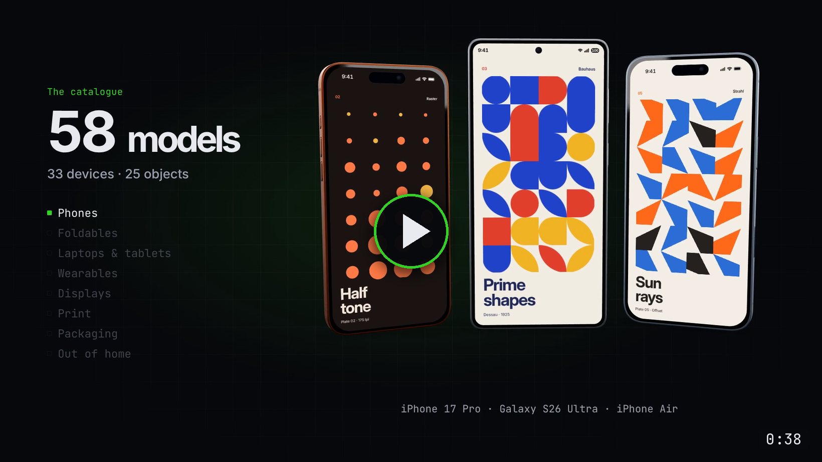
▶ Watch the 38-second film - every frame of it rendered with react-3d-mockups and Remotion
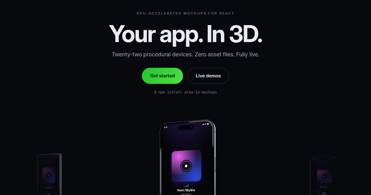
GPU-accelerated 3D device mockups for React - drop any content onto the screen of a 3D phone and it renders live: real DOM on the glass, vector crisp at any angle, videos playing, iframes loading. The mockups are decorative - you rotate and zoom them, and the hardware masks the screen pixel for pixel.
In active development. The API may change over the next few weeks. Breaking changes are listed in the changelog with what to change; pin an exact version (
npm install --save-exact react-3d-mockups) if you need it to stay put.
Built on three.js and react-three-fiber. Every model is generated procedurally at runtime - no 3D asset files to load or host. The device lineup is 33 strong: the Galaxy S26 line, two foldable generations (Z Fold 7 and Z Flip 7, the wide Z Fold 8, the Z Fold 8 Ultra and Z Flip 8) and Apple's foldable iPhone Duo, the iPhone 17 family and the iPhone 18 Pros, MacBook Air, Pro and Neo, the iPad and Galaxy Tab families, three Apple Watches (Series 11, Series 12 and the titanium Ultra 4) and three Galaxy Watches (8, 9 and the titanium Ultra 2) on full wristbands, and a 27" desktop display. Beyond devices, the same live-surface API covers everyday objects - books, magazines, brochures, business cards, ID badges, credit cards (EMV chip, embossed number and name), packaging (product box, mailer box, gable-top milk carton, shopping bag), custom-size panels and boxes at any millimeter dimensions, posters, vinyl records, out-of-home formats (billboard, bus shelter, double-sided DOOH totem, A-frame, roll-up banner, storefront), a TV in three designs from 32" to 98", and wrap-ready vehicles (transit bus, cargo van, 53 ft semi trailer): 58 models in all (33 devices, 25 objects).
'use client'

import { GalaxyMockup } from 'react-3d-mockups'

export function Hero() {
  return (
    // The mockup fills its parent, so give the parent a height.
    <div style={{ height: 560 }}>
      <GalaxyMockup autoRotate float>
        {/* Any React node, iframe or video. */}
        <div
          style={{
            height: '100%',
            display: 'grid',
            placeItems: 'center',
            background: '#111',
            color: '#fff',
            fontSize: 32,
          }}
        >
          Hello
        </div>
      </GalaxyMockup>
    </div>
  )
}
Documentation and live demos → Every device and object has its own page with a live prop explorer.
| Path | npm name | What it is |
|---|---|---|
packages/react | react-3d-mockups | The published npm package - the whole library |
apps/docs | - | Next.js docs & live demos site |
Inside the package, src/core holds the specs, geometry math and screen/stage
behavior, depends on three and never imports React; the rest of src is the
react-three-fiber layer that renders it. Keeping the numbers out of the components is
what makes each mockup measurable and unit-testable without a renderer. See
ARCHITECTURE.md for the layering rule.
Uses npm workspaces. Node 22+ required (wrangler, concurrently and vitest all
floor there). This is the toolchain for working on the repo - the published
package declares no engines and runs in the browser.
npm install        # installs all workspaces + builds the package (prepare hook)
npm run dev        # package in watch mode + docs at http://localhost:3000
npm run build      # builds the package, then the docs site as a Worker bundle
npm run typecheck  # typechecks both workspaces
npm run test       # core unit tests (no DOM, no WebGL)
npm run devices:check  # the sizes and counts the docs quote, against the library
npm run size:check     # what importing each mockup costs, against the documented table
npm run visual     # visual regression vs baselines (needs `npm run dev` running)
npm run bench      # performance behaviour vs budgets (needs a running site)
See CONTRIBUTING.md for what each check catches; they overlap less than they look.
main; the tag and GitHub Release follow
automatically. The steps are in CONTRIBUTING.md.area.is apex -
is in apps/docs/DEPLOYMENT.md.React live 3D mockup components
See the code
▶ Watch the 38-second film - every frame of it rendered with react-3d-mockups and Remotion
GPU-accelerated 3D device mockups for React - drop any content onto the screen of a 3D phone and it renders live: real DOM on the glass, vector crisp at any angle, videos playing, iframes loading. The mockups are decorative - you rotate and zoom them, and the hardware masks the screen pixel for pixel.
In active development. The API may change over the next few weeks. Breaking changes are listed in the changelog with what to change; pin an exact version (
npm install --save-exact react-3d-mockups) if you need it to stay put.
Built on three.js and react-three-fiber. Every model is generated procedurally at runtime - no 3D asset files to load or host. The device lineup is 33 strong: the Galaxy S26 line, two foldable generations (Z Fold 7 and Z Flip 7, the wide Z Fold 8, the Z Fold 8 Ultra and Z Flip 8) and Apple's foldable iPhone Duo, the iPhone 17 family and the iPhone 18 Pros, MacBook Air, Pro and Neo, the iPad and Galaxy Tab families, three Apple Watches (Series 11, Series 12 and the titanium Ultra 4) and three Galaxy Watches (8, 9 and the titanium Ultra 2) on full wristbands, and a 27" desktop display. Beyond devices, the same live-surface API covers everyday objects - books, magazines, brochures, business cards, ID badges, credit cards (EMV chip, embossed number and name), packaging (product box, mailer box, gable-top milk carton, shopping bag), custom-size panels and boxes at any millimeter dimensions, posters, vinyl records, out-of-home formats (billboard, bus shelter, double-sided DOOH totem, A-frame, roll-up banner, storefront), a TV in three designs from 32" to 98", and wrap-ready vehicles (transit bus, cargo van, 53 ft semi trailer): 58 models in all (33 devices, 25 objects).
'use client'

import { GalaxyMockup } from 'react-3d-mockups'

export function Hero() {
  return (
    // The mockup fills its parent, so give the parent a height.
    <div style={{ height: 560 }}>
      <GalaxyMockup autoRotate float>
        {/* Any React node, iframe or video. */}
        <div
          style={{
            height: '100%',
            display: 'grid',
            placeItems: 'center',
            background: '#111',
            color: '#fff',
            fontSize: 32,
          }}
        >
          Hello
        </div>
      </GalaxyMockup>
    </div>
  )
}
Documentation and live demos → Every device and object has its own page with a live prop explorer.
| Path | npm name | What it is |
|---|---|---|
packages/react | react-3d-mockups | The published npm package - the whole library |
apps/docs | - | Next.js docs & live demos site |
Inside the package, src/core holds the specs, geometry math and screen/stage
behavior, depends on three and never imports React; the rest of src is the
react-three-fiber layer that renders it. Keeping the numbers out of the components is
what makes each mockup measurable and unit-testable without a renderer. See
ARCHITECTURE.md for the layering rule.
Uses npm workspaces. Node 22+ required (wrangler, concurrently and vitest all
floor there). This is the toolchain for working on the repo - the published
package declares no engines and runs in the browser.
npm install        # installs all workspaces + builds the package (prepare hook)
npm run dev        # package in watch mode + docs at http://localhost:3000
npm run build      # builds the package, then the docs site as a Worker bundle
npm run typecheck  # typechecks both workspaces
npm run test       # core unit tests (no DOM, no WebGL)
npm run devices:check  # the sizes and counts the docs quote, against the library
npm run size:check     # what importing each mockup costs, against the documented table
npm run visual     # visual regression vs baselines (needs `npm run dev` running)
npm run bench      # performance behaviour vs budgets (needs a running site)
See CONTRIBUTING.md for what each check catches; they overlap less than they look.
main; the tag and GitHub Release follow
automatically. The steps are in CONTRIBUTING.md.area.is apex -
is in apps/docs/DEPLOYMENT.md.


