
Filled and duotone versions of Lucide icons, for React. Not affiliated with or endorsed by Lucide.
See the codeSee what people are saying
README
lucide-extended-react
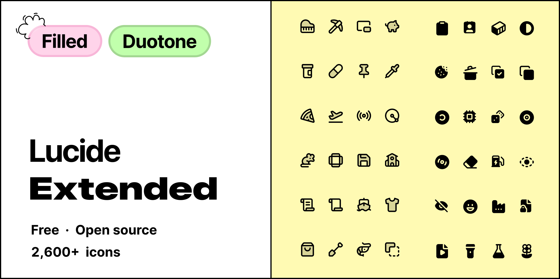
Filled and duotone versions of Lucide icons, for React.
Browse the icons · Figma · npm
Not affiliated with or endorsed by Lucide.
Install
npm install lucide-extended-react
Keep lucide-react for the outlines. React 18 or later. ESM only.
Usage
import { HeartFilled, HeartDuotone } from 'lucide-extended-react'

export function Example() {
  return (
    <>
      <HeartFilled />
      <HeartDuotone size={32} color="crimson" />
    </>
  )
}
Each icon has its own file too:
import HeartFilled from 'lucide-extended-react/heart-filled'
import HeartDuotone from 'lucide-extended-react/heart-duotone'
Only the icons you import end up in the bundle (tree-shakeable).
Next to lucide-react
import { Heart } from 'lucide-react'
import { HeartFilled } from 'lucide-extended-react'

export function LikeButton({ liked }: { liked: boolean }) {
  return liked ? <HeartFilled color="crimson" /> : <Heart />
}
Some Lucide icons have no filled or duotone version yet. Where the props differ from Lucide's, the table says so.
Props
Icons take the usual SVG attributes (className, style, onClick, aria-label, and so on), plus:
| Prop | Type | Default | Applies to | Description |
|---|---|---|---|---|
size | number | string | 24 | all | Width and height. |
color | string | 'currentColor' | all | Fill on filled icons. Outline on duotone icons. |
secondaryColor | string | the value of color | duotone | Colour of the backing shape. |
secondaryOpacity | number | string | 0.15 | duotone | Opacity of that shape. |
strokeWidth and absoluteStrokeWidth are accepted, so Lucide-shaped props type-check. Both are ignored. Duotone outlines stay at 2.
Filled icons have no secondaryColor or secondaryOpacity.
ref goes to the <svg>. Every icon has the classes applifted-icon and applifted-icon-<name>, for example applifted-icon-heart-filled.
Accessibility
Icons are decorative by default, with aria-hidden="true". Pass aria-label or aria-labelledby when an icon needs a name. aria-hidden is then left off.
<HeartFilled aria-label="Liked" />
Naming
The Lucide name in PascalCase, then Filled or Duotone.
| Lucide name | Filled | Duotone | Deep import |
|---|---|---|---|
heart | HeartFilled | HeartDuotone | lucide-extended-react/heart-filled |
circle-check | CircleCheckFilled | CircleCheckDuotone | lucide-extended-react/circle-check-duotone |
Icons
- 1,387 filled
- 1,242 duotone
Not every Lucide icon has both styles yet, so the counts differ. An icon can have one style without the other.
Browse and search them all, and download any icon as an SVG. The same icons are in the Figma file on Figma Community.
For agents
Search icons.json before choosing a component. It is the full catalogue, so search it rather than reading it from top to bottom. Each entry has the Lucide name, a label, tags, categories, aliases, useCases, and the variants this package ships (filled, duotone). components gives the exact export for each variant.
heart is HeartFilled and HeartDuotone. An icon can have one variant without the other. If the requested variant is missing, say so.
The same file is included in the published package.
Planned
- A powerful search
- A Raycast extension
Licence
The shapes are derived from Lucide (ISC). Some of those are derived from Feather (MIT). Both notices are in the licence.
Contributing
Icons are added as SVGs. The steps are in CONTRIBUTING.md.
Support
If the icons are useful to you, you can buy us a coffee.
Similar repos


Languages
TypeScript
100.0%
Filled and duotone versions of Lucide icons, for React. Not affiliated with or endorsed by Lucide.
See the codeSee what people are saying
README
lucide-extended-react
Filled and duotone versions of Lucide icons, for React.
Browse the icons · Figma · npm
Not affiliated with or endorsed by Lucide.
Install
npm install lucide-extended-react
Keep lucide-react for the outlines. React 18 or later. ESM only.
Usage
import { HeartFilled, HeartDuotone } from 'lucide-extended-react'

export function Example() {
  return (
    <>
      <HeartFilled />
      <HeartDuotone size={32} color="crimson" />
    </>
  )
}
Each icon has its own file too:
import HeartFilled from 'lucide-extended-react/heart-filled'
import HeartDuotone from 'lucide-extended-react/heart-duotone'
Only the icons you import end up in the bundle (tree-shakeable).
Next to lucide-react
import { Heart } from 'lucide-react'
import { HeartFilled } from 'lucide-extended-react'

export function LikeButton({ liked }: { liked: boolean }) {
  return liked ? <HeartFilled color="crimson" /> : <Heart />
}
Some Lucide icons have no filled or duotone version yet. Where the props differ from Lucide's, the table says so.
Props
Icons take the usual SVG attributes (className, style, onClick, aria-label, and so on), plus:
| Prop | Type | Default | Applies to | Description |
|---|---|---|---|---|
size | number | string | 24 | all | Width and height. |
color | string | 'currentColor' | all | Fill on filled icons. Outline on duotone icons. |
secondaryColor | string | the value of color | duotone | Colour of the backing shape. |
secondaryOpacity | number | string | 0.15 | duotone | Opacity of that shape. |
strokeWidth and absoluteStrokeWidth are accepted, so Lucide-shaped props type-check. Both are ignored. Duotone outlines stay at 2.
Filled icons have no secondaryColor or secondaryOpacity.
ref goes to the <svg>. Every icon has the classes applifted-icon and applifted-icon-<name>, for example applifted-icon-heart-filled.
Accessibility
Icons are decorative by default, with aria-hidden="true". Pass aria-label or aria-labelledby when an icon needs a name. aria-hidden is then left off.
<HeartFilled aria-label="Liked" />
Naming
The Lucide name in PascalCase, then Filled or Duotone.
| Lucide name | Filled | Duotone | Deep import |
|---|---|---|---|
heart | HeartFilled | HeartDuotone | lucide-extended-react/heart-filled |
circle-check | CircleCheckFilled | CircleCheckDuotone | lucide-extended-react/circle-check-duotone |
Icons
- 1,387 filled
- 1,242 duotone
Not every Lucide icon has both styles yet, so the counts differ. An icon can have one style without the other.
Browse and search them all, and download any icon as an SVG. The same icons are in the Figma file on Figma Community.
For agents
Search icons.json before choosing a component. It is the full catalogue, so search it rather than reading it from top to bottom. Each entry has the Lucide name, a label, tags, categories, aliases, useCases, and the variants this package ships (filled, duotone). components gives the exact export for each variant.
heart is HeartFilled and HeartDuotone. An icon can have one variant without the other. If the requested variant is missing, say so.
The same file is included in the published package.
Planned
- A powerful search
- A Raycast extension
Licence
The shapes are derived from Lucide (ISC). Some of those are derived from Feather (MIT). Both notices are in the licence.
Contributing
Icons are added as SVGs. The steps are in CONTRIBUTING.md.
Support
If the icons are useful to you, you can buy us a coffee.
Similar repos
Languages
TypeScript
100.0%