
See what people are saying
README
StateGlyph





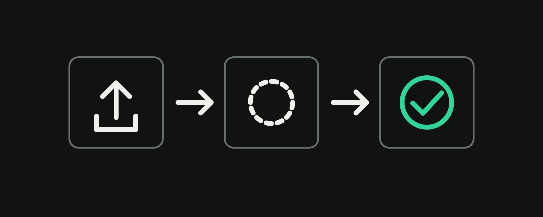
StateGlyph is an open-source collection of typed React icons that communicate
what an interface is doing, not only what an action looks like. Each component
has named states such as idle, loading, and success, with accessible
labels and predictable TypeScript props.
The first release contains 31 icons across async actions, media, navigation, feedback, forms, commerce, and notifications. The icons use the open-source Lucide icon set as their visual foundation.
StateGlyph is currently an early
0.1.0release. The API may evolve before version1.0.0.
Documentation · Browse icon definitions · Contributing
Why StateGlyph?
- One component, many states. Keep idle, loading, success, error, and toggle glyphs behind one stable, typed component API.
- Accessible by design. Icons are decorative by default and can expose state-aware labels when they carry meaning.
- Use it your way. Import tree-shakeable React components or copy self-contained source into your project with the CLI.
- Open foundations. Every definition records its source icons and license metadata.
Install the React package
npm install @stateglyph/react
Import from the main package:
import { UploadStateIcon } from "@stateglyph/react";

export function UploadButton() {
  return <UploadStateIcon state="uploading" />;
}
Or import one icon directly:
import { UploadStateIcon } from "@stateglyph/react/upload";
StateGlyph components are decorative by default. Give an icon an accessible name when it communicates information that is not already written nearby:
<UploadStateIcon state="success" decorative={false} label="Upload complete" />
Copy components with the CLI
The CLI copies editable components into your own project. This is useful when you want to own the source instead of installing the React package.
npx @stateglyph/cli list
npx @stateglyph/cli add upload
npx @stateglyph/cli add upload save --dir src/components/stateglyph
npx @stateglyph/cli add all
Generated components require react and lucide-react in the receiving
project. Existing files are preserved unless you pass --force.
Packages
| Package | Purpose |
|---|---|
@stateglyph/react | Ready-to-use React components |
@stateglyph/core | Framework-independent icon definitions and metadata |
@stateglyph/cli | Copy-and-own component generator |
@stateglyph/transitions | Optional CSS transitions with reduced-motion support |
To enable the transition declared by each icon definition, install the optional
package and import its stylesheet once. It includes crossfade, scale-fade,
rotate, slide, and morph, plus continuous loading-state rotation and a
reduced-motion fallback:
import "@stateglyph/transitions/styles.css";
Bundle size
A direct per-icon entry such as @stateglyph/react/upload adds approximately
1.4 kB gzipped of StateGlyph wrapper code before your bundler processes the
selected Lucide glyph. Direct entries and the main package are tree-shakeable.
Local development
This repository is an npm workspace monorepo using TypeScript, Next.js, Tailwind CSS, tsup, and Vitest.
npm install
npm run dev
Before opening a pull request, run:
npm run lint
npm run typecheck
npm test
npm run build
See CONTRIBUTING.md for the contribution workflow.
License
StateGlyph is available under the MIT License. The underlying Lucide icons are available under the ISC License.
Contributors

24 commits
Similar repos


Languages
TypeScript
90.5%
JavaScript
8.0%
CSS
1.6%
See what people are saying
README
StateGlyph
StateGlyph is an open-source collection of typed React icons that communicate
what an interface is doing, not only what an action looks like. Each component
has named states such as idle, loading, and success, with accessible
labels and predictable TypeScript props.
The first release contains 31 icons across async actions, media, navigation, feedback, forms, commerce, and notifications. The icons use the open-source Lucide icon set as their visual foundation.
StateGlyph is currently an early
0.1.0release. The API may evolve before version1.0.0.
Documentation · Browse icon definitions · Contributing
Why StateGlyph?
- One component, many states. Keep idle, loading, success, error, and toggle glyphs behind one stable, typed component API.
- Accessible by design. Icons are decorative by default and can expose state-aware labels when they carry meaning.
- Use it your way. Import tree-shakeable React components or copy self-contained source into your project with the CLI.
- Open foundations. Every definition records its source icons and license metadata.
Install the React package
npm install @stateglyph/react
Import from the main package:
import { UploadStateIcon } from "@stateglyph/react";

export function UploadButton() {
  return <UploadStateIcon state="uploading" />;
}
Or import one icon directly:
import { UploadStateIcon } from "@stateglyph/react/upload";
StateGlyph components are decorative by default. Give an icon an accessible name when it communicates information that is not already written nearby:
<UploadStateIcon state="success" decorative={false} label="Upload complete" />
Copy components with the CLI
The CLI copies editable components into your own project. This is useful when you want to own the source instead of installing the React package.
npx @stateglyph/cli list
npx @stateglyph/cli add upload
npx @stateglyph/cli add upload save --dir src/components/stateglyph
npx @stateglyph/cli add all
Generated components require react and lucide-react in the receiving
project. Existing files are preserved unless you pass --force.
Packages
| Package | Purpose |
|---|---|
@stateglyph/react | Ready-to-use React components |
@stateglyph/core | Framework-independent icon definitions and metadata |
@stateglyph/cli | Copy-and-own component generator |
@stateglyph/transitions | Optional CSS transitions with reduced-motion support |
To enable the transition declared by each icon definition, install the optional
package and import its stylesheet once. It includes crossfade, scale-fade,
rotate, slide, and morph, plus continuous loading-state rotation and a
reduced-motion fallback:
import "@stateglyph/transitions/styles.css";
Bundle size
A direct per-icon entry such as @stateglyph/react/upload adds approximately
1.4 kB gzipped of StateGlyph wrapper code before your bundler processes the
selected Lucide glyph. Direct entries and the main package are tree-shakeable.
Local development
This repository is an npm workspace monorepo using TypeScript, Next.js, Tailwind CSS, tsup, and Vitest.
npm install
npm run dev
Before opening a pull request, run:
npm run lint
npm run typecheck
npm test
npm run build
See CONTRIBUTING.md for the contribution workflow.
License
StateGlyph is available under the MIT License. The underlying Lucide icons are available under the ISC License.
Similar repos
Contributors
24 commits
Languages
TypeScript
90.5%
JavaScript
8.0%
CSS
1.6%