Useful for showing text or custom view tags in a vertical or horizontal scrollable view and support Autolayout at the same time. It is highly customizable that most features of the text tag can be configured. 标签流显示控件,同时支持文字或自定义View
Swift
1,895
189 commits
updated Jun 24, 2026


TTGTagCollectionView is a Swift-first iOS tag layout component. Use it for filter chips, topic labels, search facets, dense table cells, custom tag views, and any UI that needs predictable wrapping or horizontal tag rows.
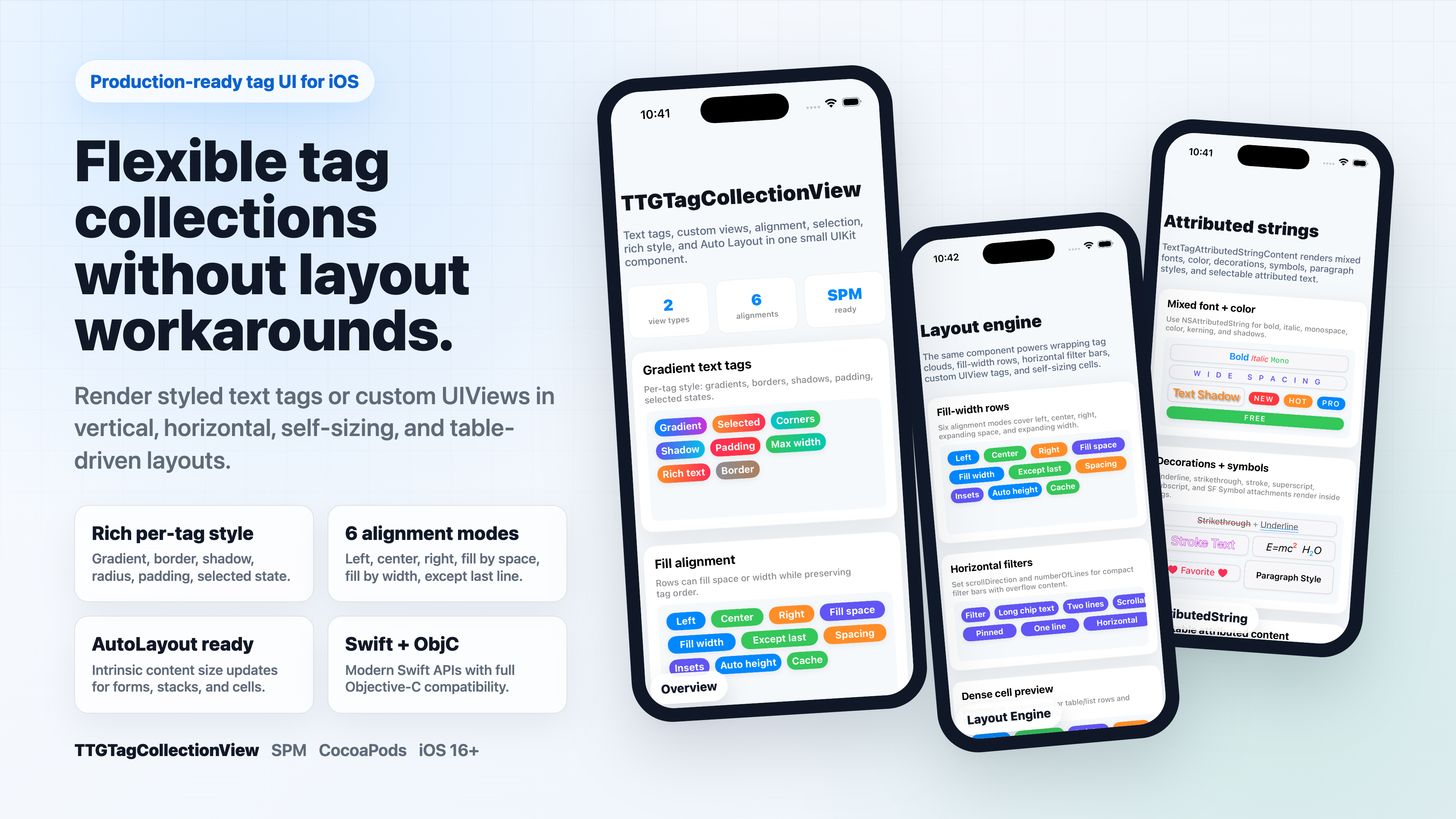
TextTagCollectionView for styled text, TagCollectionView for arbitrary UIView content.preferredMaxLayoutWidth for stack views, forms, and self-sizing cells.In Xcode, choose File -> Add Package Dependencies and enter:
https://github.com/zekunyan/TTGTagCollectionView.git
Or add it to Package.swift:
dependencies: [
    .package(url: "https://github.com/zekunyan/TTGTagCollectionView.git", from: "3.3.0")
]
pod 'TTGTagCollectionView'
The screenshots below are generated from the Swift example app running in an iOS Simulator.
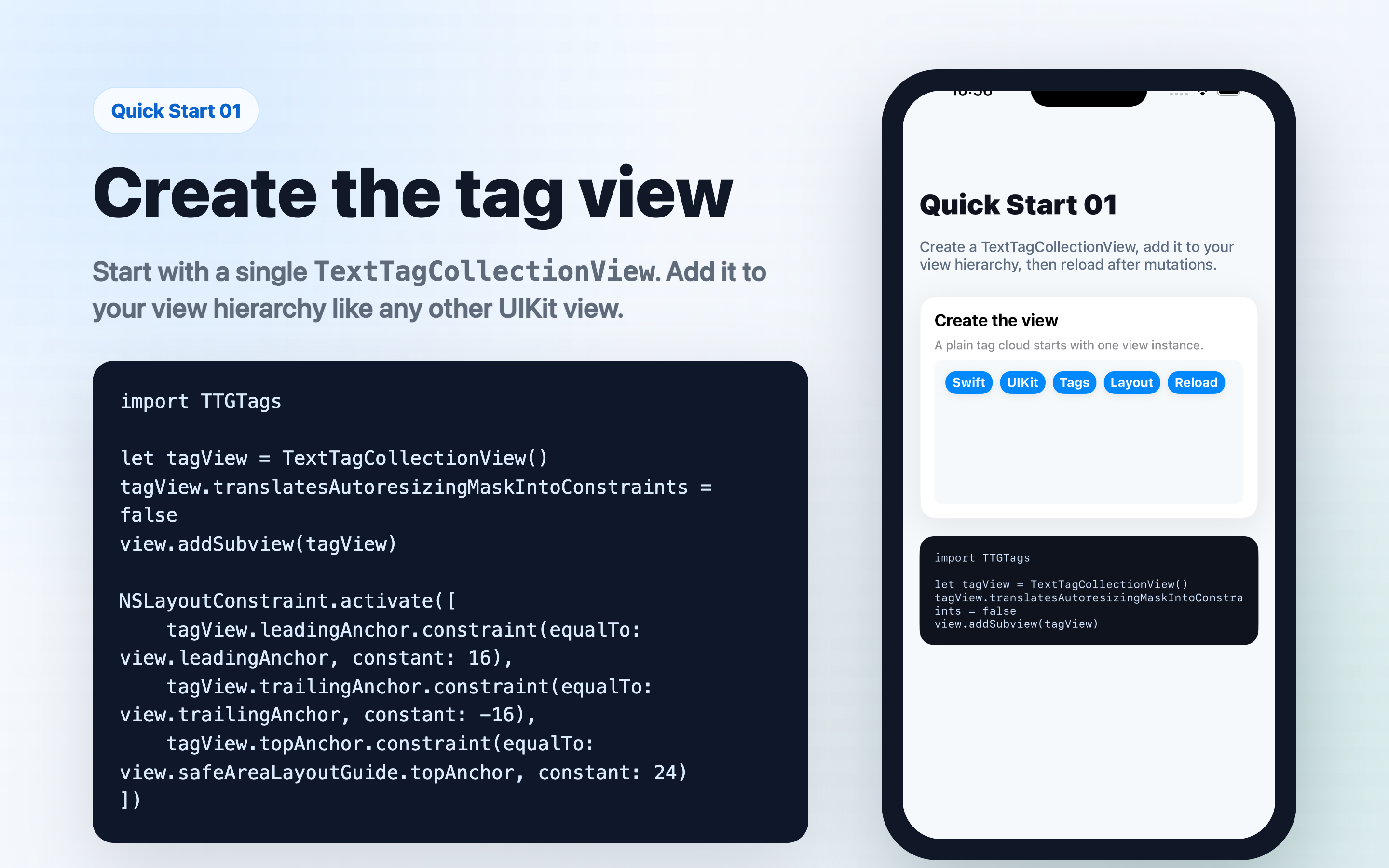
import TTGTags

let tagView = TextTagCollectionView()
tagView.translatesAutoresizingMaskIntoConstraints = false
view.addSubview(tagView)

NSLayoutConstraint.activate([
    tagView.leadingAnchor.constraint(equalTo: view.leadingAnchor, constant: 16),
    tagView.trailingAnchor.constraint(equalTo: view.trailingAnchor, constant: -16),
    tagView.topAnchor.constraint(equalTo: view.safeAreaLayoutGuide.topAnchor, constant: 24)
])
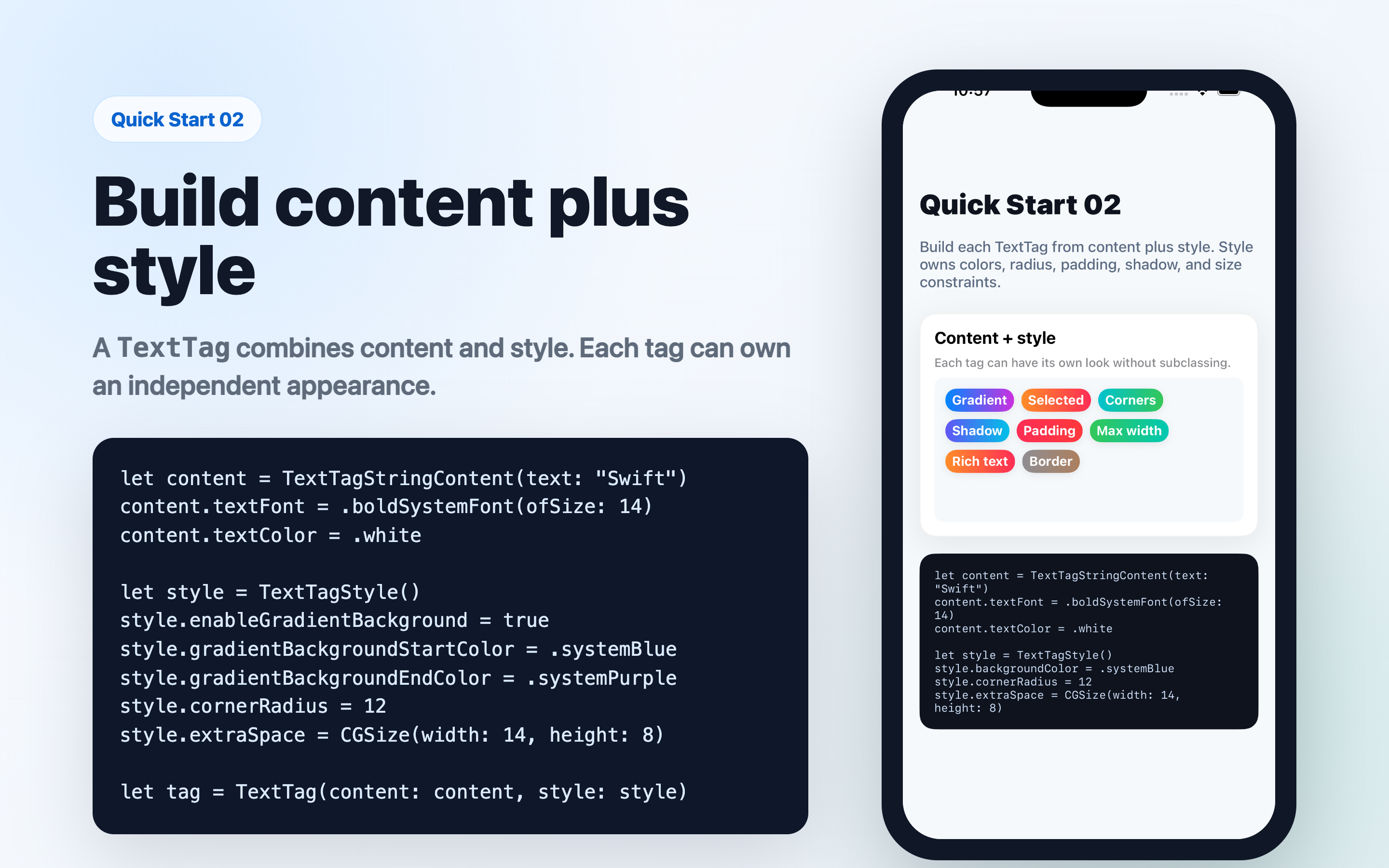
Each TextTag is built from content and style. The same model also carries selection state, accessibility metadata, and optional attachment data.
let content = TextTagStringContent(text: "Swift")
content.textFont = .boldSystemFont(ofSize: 14)
content.textColor = .white

let style = TextTagStyle()
style.enableGradientBackground = true
style.gradientBackgroundStartColor = .systemBlue
style.gradientBackgroundEndColor = .systemPurple
style.cornerRadius = 12
style.extraSpace = CGSize(width: 14, height: 8)

let tag = TextTag(content: content, style: style)
tagView.add(tag: tag)
tagView.reload()
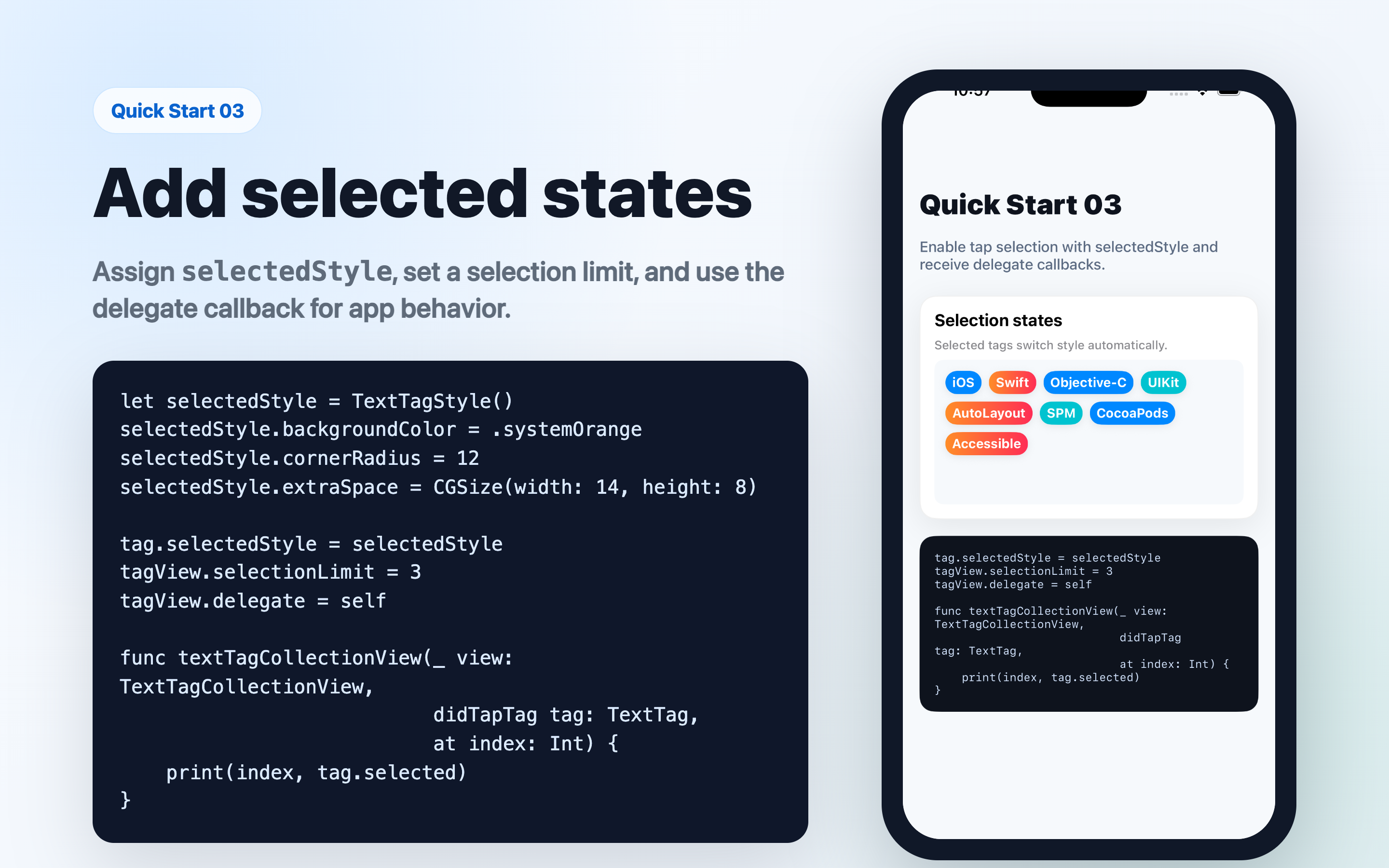
selectedStyle is applied automatically when a tag is selected. Use selectionLimit and the delegate callbacks for app-specific behavior.
let selectedStyle = TextTagStyle()
selectedStyle.backgroundColor = .systemOrange
selectedStyle.cornerRadius = 12
selectedStyle.extraSpace = CGSize(width: 14, height: 8)

tag.selectedStyle = selectedStyle
tagView.selectionLimit = 3
tagView.delegate = self
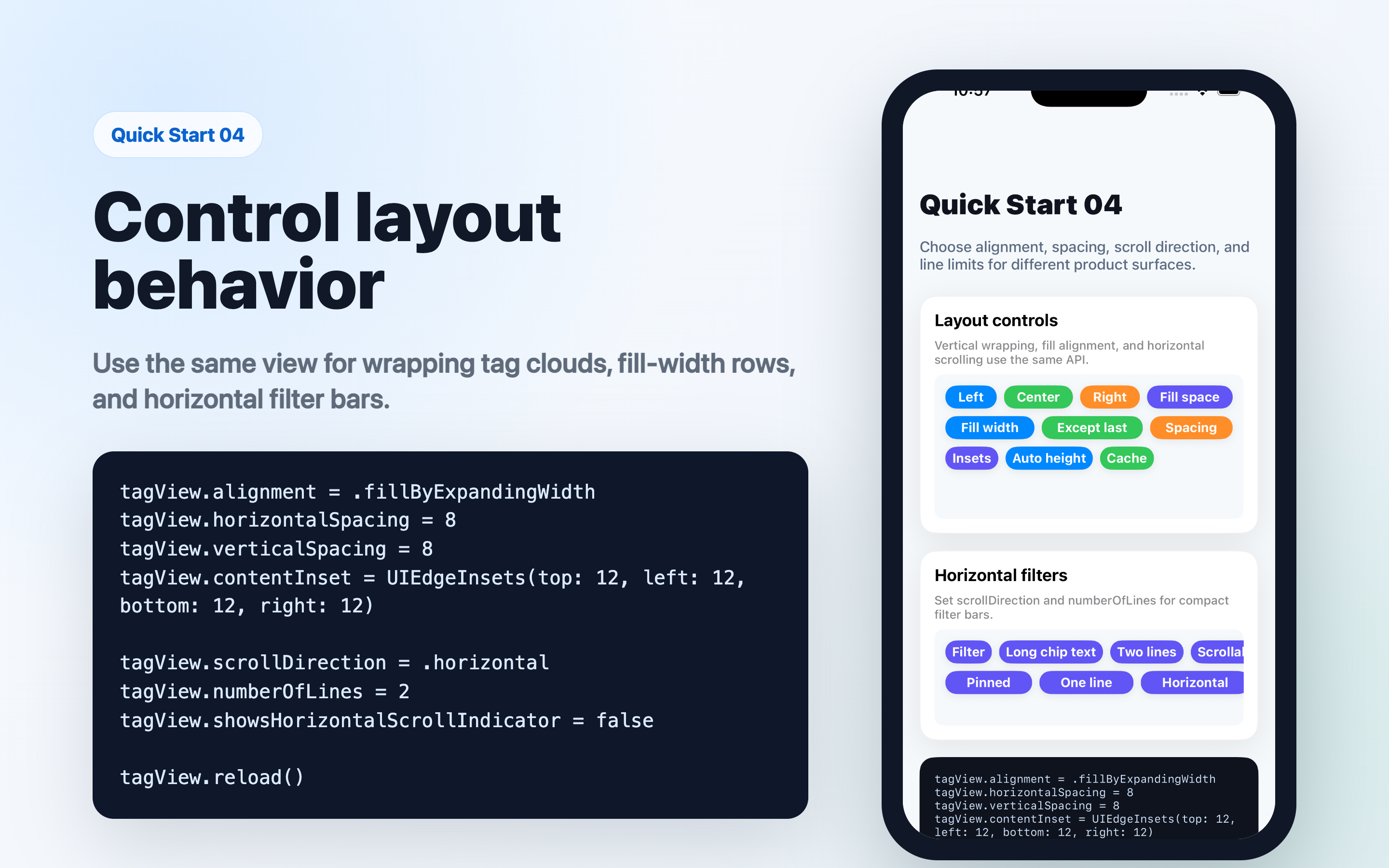
Use the same view for normal wrapping tag clouds, fill-width rows, or horizontal filter bars.
tagView.alignment = .fillByExpandingWidth
tagView.horizontalSpacing = 8
tagView.verticalSpacing = 8
tagView.contentInset = UIEdgeInsets(top: 12, left: 12, bottom: 12, right: 12)

tagView.scrollDirection = .horizontal
tagView.numberOfLines = 2
tagView.showsHorizontalScrollIndicator = false

tagView.reload()
#import <TTGTags/TTGTags-Swift.h>

TTGTextTagCollectionView *tagView = [[TTGTextTagCollectionView alloc] initWithFrame:self.view.bounds];
[self.view addSubview:tagView];

TTGTextTagStringContent *content = [TTGTextTagStringContent contentWithText:@"Hello"];
TTGTextTagStyle *style = [TTGTextTagStyle new];
style.backgroundColor = UIColor.systemBlueColor;
style.cornerRadius = 10;
style.extraSpace = CGSizeMake(12, 8);

TTGTextTag *tag = [TTGTextTag tagWithContent:content style:style];
[tagView addTag:tag];
[tagView reload];
Understanding these 4 building blocks will help you use the library effectively:
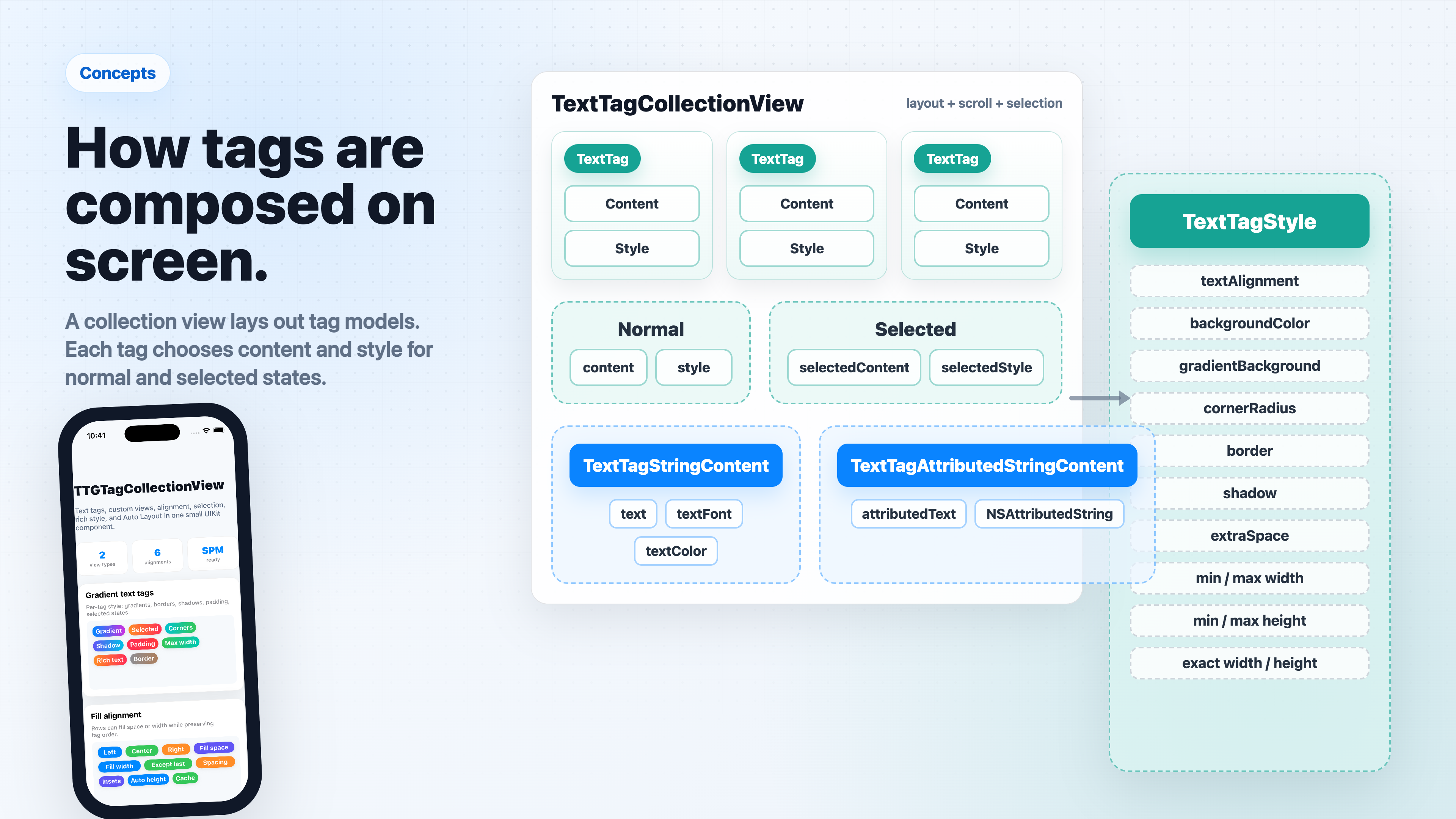
| Concept | Class | Role |
|---|---|---|
| Tag | TextTag | Data model: holds content, style, selection state, and an optional attachment |
| Content | TextTagStringContent / TextTagAttributedStringContent | What text to display, with font and color |
| Style | TextTagStyle | Visual appearance: background, gradient, corners, border, shadow, size |
| Collection View | TextTagCollectionView / TagCollectionView | Container that lays out tags with alignment, spacing, and scroll |
Key rule: always call
reload()after adding, removing, or updating tags.
node Resources/render_readme_images.mjs.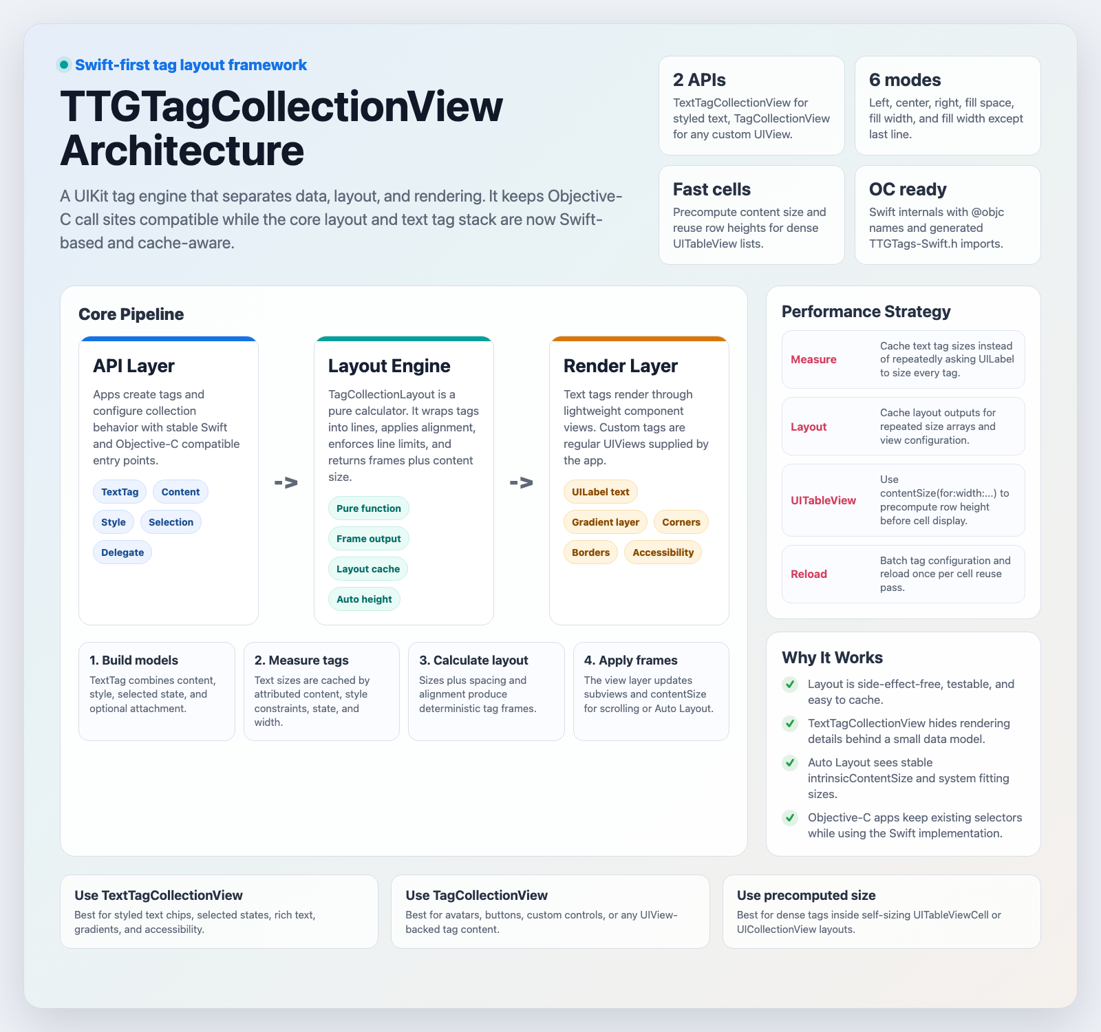
The architecture poster is generated from Resources/architecture_poster.html. It summarizes the Swift-first architecture, Objective-C compatibility layer, pure layout engine, rendering flow, and the cache-aware path used for dense tag lists.
tagView.delegate = self

// TextTagCollectionViewDelegate
func textTagCollectionView(_ collectionView: TextTagCollectionView,
                           canTapTag tag: TextTag, at index: Int) -> Bool { true }

func textTagCollectionView(_ collectionView: TextTagCollectionView,
                           didTapTag tag: TextTag, at index: Int) {
    print("tapped: \(tag.rightfulContent.contentAttributedString.string), selected: \(tag.selected)")
}

func textTagCollectionView(_ collectionView: TextTagCollectionView,
                           canSwipeSelectTag tag: TextTag, at index: Int) -> Bool { true }

func textTagCollectionView(_ collectionView: TextTagCollectionView,
                           didSwipeSelectTag tag: TextTag, at index: Int) {
    print("swipe selected: \(index)")
}

func textTagCollectionView(_ collectionView: TextTagCollectionView,
                           updateContentSize contentSize: CGSize) {
    // e.g. update a height constraint
}
// Plain text
let c1 = TextTagStringContent(text: "Hello")
c1.textFont  = .systemFont(ofSize: 14)
c1.textColor = .darkText

// Rich text via NSAttributedString
let attrs: [NSAttributedString.Key: Any] = [
    .foregroundColor: UIColor.systemRed,
    .font: UIFont.boldSystemFont(ofSize: 16)
]
let c2 = TextTagAttributedStringContent(
    attributedText: NSAttributedString(string: "Rich", attributes: attrs)
)
let style = TextTagStyle()

// Background
style.backgroundColor = .systemBlue
style.textAlignment = .center
style.numberOfLines = 1                  // 0 = unlimited multiline
style.lineBreakMode = .byTruncatingTail

// Gradient background
style.enableGradientBackground        = true
style.gradientBackgroundStartColor    = .systemBlue
style.gradientBackgroundEndColor      = .systemPurple
style.gradientBackgroundStartPoint    = CGPoint(x: 0, y: 0.5)
style.gradientBackgroundEndPoint      = CGPoint(x: 1, y: 0.5)

// Corner (all corners by default; set individual flags for per-corner control)
style.cornerRadius      = 14
style.cornerTopLeft     = true
style.cornerTopRight    = true
style.cornerBottomLeft  = false
style.cornerBottomRight = false

// Border
style.borderWidth = 1
style.borderColor = .white

// Shadow
style.shadowColor   = .black
style.shadowOffset  = CGSize(width: 2, height: 2)
style.shadowRadius  = 2
style.shadowOpacity = 0.3

// Size
style.extraSpace  = CGSize(width: 12, height: 6)  // padding
style.minWidth    = 60      // 0 = no limit
style.maxWidth    = 200
style.exactWidth  = 0       // 0 = auto
style.exactHeight = 32
tagView.scrollDirection  = .vertical     // .vertical (default) or .horizontal
tagView.alignment        = .left         // see Alignment below
tagView.horizontalDistribution = .rowMajor
tagView.contentVerticalAlignment = .top
tagView.numberOfLines    = 0             // 0 = unlimited
tagView.selectionLimit   = 3             // 0 = unlimited
tagView.horizontalSpacing = 8
tagView.verticalSpacing   = 8
tagView.contentInset      = UIEdgeInsets(top: 8, left: 8, bottom: 8, right: 8)

// AutoLayout manual height
tagView.manualCalculateHeight   = true
tagView.preferredMaxLayoutWidth = 320

// Tap callbacks (no delegate needed)
tagView.onTapBlankArea = { point in print("tapped blank at \(point)") }
tagView.onTapAllArea   = { point in print("tapped anywhere at \(point)") }
| Swift | Description |
|---|---|
.left | Left-aligned (default) |
.center | Center-aligned |
.right | Right-aligned |
.fillByExpandingSpace | Expand spacing between tags to fill each row |
.fillByExpandingWidth | Expand each tag's width to fill each row |
.fillByExpandingWidthExceptLastLine | Same as above but skip the last row |
// Natural reading order in horizontal multi-line rows (default in 3.1)
tagView.scrollDirection = .horizontal
tagView.numberOfLines = 2
tagView.horizontalDistribution = .rowMajor

// Preserve the old round-robin column-first behavior when needed
tagView.horizontalDistribution = .columnMajor

// Center content inside a fixed-height tag surface
tagView.contentVerticalAlignment = .center
let content = TextTagStringContent(text: "Long filter label that can wrap")
let style = TextTagStyle()
style.numberOfLines = 0
style.maxWidth = 180
style.lineBreakMode = .byWordWrapping

let tag = TextTag(content: content, style: style)
let tag = TextTag()

// Content & style for normal / selected state
tag.content         = TextTagStringContent(text: "Label")
tag.style           = TextTagStyle()
tag.selectedContent = TextTagStringContent(text: "Selected")   // optional, falls back to content copy
tag.selectedStyle   = TextTagStyle()                           // optional, falls back to style copy

// Selection
tag.selected = false
tag.onSelectStateChanged = { selected in print(selected) }

// Attach any object
tag.attachment = myModel

// Accessibility
tag.enableAutoDetectAccessibility = true   // auto sets label + traits from content
// or manually:
tag.isAccessibilityElement  = true
tag.accessibilityLabel      = "My tag"
tag.accessibilityHint       = "Double tap to select"
tag.accessibilityTraits     = .button

// Current active content / style (respects selected state)
let activeContent = tag.rightfulContent
let activeStyle   = tag.rightfulStyle
// Add
tagView.add(tag: tag)
tagView.add(tags: [tag1, tag2])

// Insert
tagView.insert(tag: tag, at: 0)
tagView.insert(tags: [tag1, tag2], at: 2)

// Update
tagView.updateTag(at: 0, selected: true)
tagView.updateTag(at: 0, with: newTag)
tagView.updateTag(byId: tag.tagId, selected: true)
tagView.updateTag(byId: tag.tagId, with: newTag)

// Remove
tagView.remove(tag: tag)
tagView.removeTag(byId: tag.tagId)
tagView.removeTag(at: 0)
tagView.removeAllTags()

// Move (auto reloads)
tagView.moveTag(at: 0, to: 3)
tagView.moveTag(byId: tag.tagId, to: 1)

// Query
let tag  = tagView.getTag(at: 0)
let sameTag = tagView.getTag(byId: tagId)
let index = tagView.indexOfTag(byId: tagId)
let tags = tagView.getTags(in: NSRange(location: 0, length: 3))
let all      = tagView.allTags()
let selected = tagView.allSelectedTags()
let unselected = tagView.allNotSelectedTags()

// Reload (required after any mutation)
tagView.reload()
let index = tagView.indexOfTag(at: touchPoint) // NSNotFound if missed
tagView.scrollToTag(at: 12, position: .center, animated: true)
tagView.scrollToTag(byId: tag.tagId, position: .end, animated: true)
TextTagCollectionView can select tags as the user's finger moves across them. Swipe selection is opt-in, selects only unselected tags, and respects selectionLimit.
tagView.enableSwipeSelection = true
tagView.selectionLimit = 6
tagView.delegate = self

func textTagCollectionView(_ collectionView: TextTagCollectionView,
                           canSwipeSelectTag tag: TextTag,
                           at index: Int) -> Bool {
    return true
}

func textTagCollectionView(_ collectionView: TextTagCollectionView,
                           didSwipeSelectTag tag: TextTag,
                           at index: Int) {
    print("swipe selected \(index)")
}
tagView.enableSwipeSelection = YES;
tagView.selectionLimit = 6;
TextTagCollectionView can reorder text tags with a long-press drag gesture. Drag-to-delete is opt-in and shows a bottom delete zone while dragging.
tagView.enableTagReordering = true
tagView.enableDragToDelete = true
tagView.enableTagSelection = false
tagView.delegate = self

// Optional delete-zone styling
tagView.dragDeleteZoneHeight = 52
tagView.dragDeleteZoneInsets = UIEdgeInsets(top: 0, left: 18, bottom: 12, right: 18)
tagView.dragDeleteZoneCornerRadius = 16
tagView.dragDeleteZoneBackgroundColor = UIColor.systemGray.withAlphaComponent(0.92)
tagView.dragDeleteZoneHighlightedBackgroundColor = UIColor.systemPink.withAlphaComponent(0.96)
tagView.dragDeleteZoneText = "Drop tag to remove"
tagView.dragDeleteZoneTextColor = .white
tagView.dragDeleteZoneFont = .systemFont(ofSize: 15, weight: .semibold)
tagView.dragDeleteZoneImage = UIImage(systemName: "trash.fill")
tagView.dragDeleteZoneImageTintColor = .white
func textTagCollectionView(_ collectionView: TextTagCollectionView,
                           canMoveTag tag: TextTag,
                           fromIndex: Int,
                           toIndex: Int) -> Bool {
    return true
}

func textTagCollectionView(_ collectionView: TextTagCollectionView,
                           didMoveTag tag: TextTag,
                           fromIndex: Int,
                           toIndex: Int) {
    print("moved \(fromIndex) -> \(toIndex)")
}

func textTagCollectionView(_ collectionView: TextTagCollectionView,
                           canDeleteTag tag: TextTag,
                           at index: Int) -> Bool {
    return true
}

func textTagCollectionView(_ collectionView: TextTagCollectionView,
                           didDeleteTag tag: TextTag,
                           at index: Int) {
    print("deleted \(index)")
}
Objective-C uses the same API through TTGTags-Swift.h:
tagView.enableTagReordering = YES;
tagView.enableDragToDelete = YES;
[tagView moveTagAtIndex:0 toIndex:3];
[tagView moveTagById:tag.tagId toIndex:1];

tagView.dragDeleteZoneHeight = 52;
tagView.dragDeleteZoneInsets = UIEdgeInsetsMake(0, 18, 12, 18);
tagView.dragDeleteZoneBackgroundColor = [UIColor.systemGrayColor colorWithAlphaComponent:0.92];
tagView.dragDeleteZoneHighlightedBackgroundColor = [UIColor.systemPinkColor colorWithAlphaComponent:0.96];
tagView.dragDeleteZoneText = @"Drop tag to remove";
tagView.dragDeleteZoneImage = [UIImage systemImageNamed:@"trash.fill"];
Use TagCollectionView when your tags are arbitrary UIView subclasses instead of text.
tagCollectionView.dataSource = self
tagCollectionView.delegate   = self

// TagCollectionViewDataSource
func numberOfTags(in tagCollectionView: TagCollectionView) -> Int { items.count }

func tagCollectionView(_ tagCollectionView: TagCollectionView,
                       tagViewFor index: Int) -> UIView { myViews[index] }

// TagCollectionViewDelegate
func tagCollectionView(_ tagCollectionView: TagCollectionView,
                       sizeForTagAt index: Int) -> CGSize { myViews[index].frame.size }

func tagCollectionView(_ tagCollectionView: TagCollectionView,
                       didSelectTag tagView: UIView, at index: Int) {
    print("selected \(index)")
}

func tagCollectionView(_ tagCollectionView: TagCollectionView,
                       updateContentSize contentSize: CGSize) { }

// Reload
tagCollectionView.reload()
All layout and spacing properties (scrollDirection, alignment, horizontalDistribution, contentVerticalAlignment, numberOfLines, horizontalSpacing, verticalSpacing, contentInset, manualCalculateHeight, preferredMaxLayoutWidth) are identical to TextTagCollectionView.
TTGTagCollectionView keeps layout deterministic and cache-friendly:
TagCollectionLayout is a pure calculator: the same tag sizes and configuration produce the same frames and content size.TextTagCollectionView caches text tag measurements by attributed content, style constraints, selected state, and available width.TextTagCollectionView.contentSize(for:width:...) lets table/list screens precompute row height without creating or laying out a cell.reload() once per reuse pass.For smooth scrolling, build tag models once, cache the row height by table width, and configure the cell in one pass:
let tagSize = TextTagCollectionView.contentSize(
    for: tags,
    width: availableTagWidth,
    scrollDirection: .vertical,
    alignment: .fillByExpandingWidth,
    horizontalDistribution: .rowMajor,
    numberOfLines: 0,
    horizontalSpacing: 8,
    verticalSpacing: 8,
    contentInset: UIEdgeInsets(top: 4, left: 0, bottom: 4, right: 0)
)

let rowHeight = titleHeight + tagSize.height + verticalPadding
Objective-C uses the same API through TTGTags-Swift.h:
CGSize tagSize = [TTGTextTagCollectionView contentSizeForTags:tags
                                                        width:availableTagWidth
                                              scrollDirection:TTGTagCollectionScrollDirectionVertical
                                                    alignment:TTGTagCollectionAlignmentFillByExpandingWidth
                                       horizontalDistribution:TTGTagCollectionHorizontalDistributionRowMajor
                                                numberOfLines:0
                                            horizontalSpacing:8
                                              verticalSpacing:8
                                                 contentInset:UIEdgeInsetsMake(4, 0, 4, 0)];
When data changes globally or you need to benchmark a cold path, clear both caches:
TextTagCollectionView.clearMeasurementCache()
reload() after adding, removing, or updating tags.moveTag(at:to:) and moveTag(byId:to:) reload automatically.canDeleteTag to block protected tags or the last remaining tag.UITableViewCell, prefer precomputing row height with TextTagCollectionView.contentSize(for:width:...) and reusing the result by table width.reload() once. Avoid repeated updateTag(...) calls during cell reuse.manualCalculateHeight = true + preferredMaxLayoutWidth when the view's width is not yet determined at layout time.Sources/TTGTags/
├── Model/
│ ├── TextTag.swift # Tag data model (id, content, style, selection)
│ ├── TextTagContent.swift # Abstract content base class
│ ├── TextTagStringContent.swift # Plain text content
│ └── TextTagAttributedStringContent.swift # NSAttributedString content
├── Style/
│ └── TextTagStyle.swift # Visual style (background, border, shadow, corner, size)
├── Layout/
│ └── TagCollectionLayout.swift # Pure layout calculator (no UIKit side effects)
└── View/
├── TagCollectionView.swift # Custom-view tag collection
├── TextTagCollectionView.swift # Text tag collection
└── Internal/
├── TextTagComponentView.swift # Per-tag rendering view
└── TextTagGradientLabel.swift # CAGradientLayer-backed label
Tests/TTGTagsTests/
├── TagCollectionLayoutTests.swift
├── TextTagTests.swift
└── TextTagContentTests.swift
Version 3.0 rewrites all core sources in Swift. Objective-C class names, selectors, and enum cases are fully preserved via @objc(TTGXxx) aliases — existing OC call sites need only one change: replace the old .h imports with the Swift generated umbrella header.
One-line OC migration:
// Before (2.x)
#import <TTGTags/TTGTextTagCollectionView.h>

// After (3.0+)
#import <TTGTags/TTGTags-Swift.h>
| 2.x / Objective-C | 3.0 Swift |
|---|---|
TTGTagCollectionView | TagCollectionView |
TTGTextTagCollectionView | TextTagCollectionView |
TTGTextTag | TextTag |
TTGTextTagStyle | TextTagStyle |
TTGTextTagContent | TextTagContent |
TTGTextTagStringContent | TextTagStringContent |
TTGTextTagAttributedStringContent | TextTagAttributedStringContent |
TTGTagCollectionAlignment | TagCollectionAlignment |
TTGTagCollectionScrollDirection | TagCollectionScrollDirection |
[tag getRightfulContent] | tag.rightfulContent |
[tag getRightfulStyle] | tag.rightfulStyle |
[content getContentAttributedString] | content.contentAttributedString |
[tagView addTag:] | tagView.add(tag:) |
[tagView insertTag:atIndex:] | tagView.insert(tag:at:) |
[tagView removeTagAtIndex:] | tagView.removeTag(at:) |
[tagView getTagAtIndex:] | tagView.getTag(at:) |
[tagView updateTagAtIndex:selected:] | tagView.updateTag(at:selected:) |
tagId auto-increment is now thread-safe (NSLock)UIRectCorner bitmask bug fixedTagCollectionLayout extracted (fully unit-tested)TextTagCollectionView.contentSize(for:width:...) added for precomputing list row heightTests/TTGTagsTests).rowMajor, matching natural reading order..columnMajor keeps the previous round-robin horizontal distribution when apps need it.contentVerticalAlignment can place short tag content at the top, center, or bottom of a fixed-height tag view.TextTagStyle.numberOfLines and lineBreakMode enable multiline text tags with maxWidth or container-width constraints.getTag(byId:), indexOfTag(byId:), updateTag(byId:...), and scrollToTag(byId:...) make id-driven updates straightforward.scrollToTag(at:position:animated:) supports .nearest, .start, .center, and .end.enableTagReordering enables long-press drag reordering for TextTagCollectionView.enableDragToDelete shows a bottom delete zone while dragging.dragDeleteZoneHeight, dragDeleteZoneInsets, colors, text, font, image, and tint properties customize the delete zone without replacing its view.moveTag(at:to:) and moveTag(byId:to:) support programmatic reordering.canMoveTag / didMoveTag and canDeleteTag / didDeleteTag cover reorder and delete decisions.TagCloudView does not expose reordering yet because it rebuilds tags from value input on each update; use UIKit TextTagCollectionView for reorder/delete workflows.enableSwipeSelection enables finger-swipe selection for TextTagCollectionView.canSwipeSelectTag / didSwipeSelectTag cover swipe selection decisions and results.canTapTag when canSwipeSelectTag is not implemented, so existing selection gates still apply.zekunyan — zekunyan@163.com
TTGTagCollectionView is available under the MIT license. See the LICENSE file for more info.
590 followers · starred Oct 2020
12 followers · starred Mar 2017
58 followers · starred Feb 2020
353 followers · starred Jan 2019
Useful for showing text or custom view tags in a vertical or horizontal scrollable view and support Autolayout at the same time. It is highly customizable that most features of the text tag can be configured. 标签流显示控件,同时支持文字或自定义View
Swift
1,895
189 commits
updated Jun 24, 2026
TTGTagCollectionView is a Swift-first iOS tag layout component. Use it for filter chips, topic labels, search facets, dense table cells, custom tag views, and any UI that needs predictable wrapping or horizontal tag rows.
TextTagCollectionView for styled text, TagCollectionView for arbitrary UIView content.preferredMaxLayoutWidth for stack views, forms, and self-sizing cells.In Xcode, choose File -> Add Package Dependencies and enter:
https://github.com/zekunyan/TTGTagCollectionView.git
Or add it to Package.swift:
dependencies: [
    .package(url: "https://github.com/zekunyan/TTGTagCollectionView.git", from: "3.3.0")
]
pod 'TTGTagCollectionView'
The screenshots below are generated from the Swift example app running in an iOS Simulator.
import TTGTags

let tagView = TextTagCollectionView()
tagView.translatesAutoresizingMaskIntoConstraints = false
view.addSubview(tagView)

NSLayoutConstraint.activate([
    tagView.leadingAnchor.constraint(equalTo: view.leadingAnchor, constant: 16),
    tagView.trailingAnchor.constraint(equalTo: view.trailingAnchor, constant: -16),
    tagView.topAnchor.constraint(equalTo: view.safeAreaLayoutGuide.topAnchor, constant: 24)
])
Each TextTag is built from content and style. The same model also carries selection state, accessibility metadata, and optional attachment data.
let content = TextTagStringContent(text: "Swift")
content.textFont = .boldSystemFont(ofSize: 14)
content.textColor = .white

let style = TextTagStyle()
style.enableGradientBackground = true
style.gradientBackgroundStartColor = .systemBlue
style.gradientBackgroundEndColor = .systemPurple
style.cornerRadius = 12
style.extraSpace = CGSize(width: 14, height: 8)

let tag = TextTag(content: content, style: style)
tagView.add(tag: tag)
tagView.reload()
selectedStyle is applied automatically when a tag is selected. Use selectionLimit and the delegate callbacks for app-specific behavior.
let selectedStyle = TextTagStyle()
selectedStyle.backgroundColor = .systemOrange
selectedStyle.cornerRadius = 12
selectedStyle.extraSpace = CGSize(width: 14, height: 8)

tag.selectedStyle = selectedStyle
tagView.selectionLimit = 3
tagView.delegate = self
Use the same view for normal wrapping tag clouds, fill-width rows, or horizontal filter bars.
tagView.alignment = .fillByExpandingWidth
tagView.horizontalSpacing = 8
tagView.verticalSpacing = 8
tagView.contentInset = UIEdgeInsets(top: 12, left: 12, bottom: 12, right: 12)

tagView.scrollDirection = .horizontal
tagView.numberOfLines = 2
tagView.showsHorizontalScrollIndicator = false

tagView.reload()
#import <TTGTags/TTGTags-Swift.h>

TTGTextTagCollectionView *tagView = [[TTGTextTagCollectionView alloc] initWithFrame:self.view.bounds];
[self.view addSubview:tagView];

TTGTextTagStringContent *content = [TTGTextTagStringContent contentWithText:@"Hello"];
TTGTextTagStyle *style = [TTGTextTagStyle new];
style.backgroundColor = UIColor.systemBlueColor;
style.cornerRadius = 10;
style.extraSpace = CGSizeMake(12, 8);

TTGTextTag *tag = [TTGTextTag tagWithContent:content style:style];
[tagView addTag:tag];
[tagView reload];
Understanding these 4 building blocks will help you use the library effectively:
| Concept | Class | Role |
|---|---|---|
| Tag | TextTag | Data model: holds content, style, selection state, and an optional attachment |
| Content | TextTagStringContent / TextTagAttributedStringContent | What text to display, with font and color |
| Style | TextTagStyle | Visual appearance: background, gradient, corners, border, shadow, size |
| Collection View | TextTagCollectionView / TagCollectionView | Container that lays out tags with alignment, spacing, and scroll |
Key rule: always call
reload()after adding, removing, or updating tags.
node Resources/render_readme_images.mjs.
The architecture poster is generated from Resources/architecture_poster.html. It summarizes the Swift-first architecture, Objective-C compatibility layer, pure layout engine, rendering flow, and the cache-aware path used for dense tag lists.
tagView.delegate = self

// TextTagCollectionViewDelegate
func textTagCollectionView(_ collectionView: TextTagCollectionView,
                           canTapTag tag: TextTag, at index: Int) -> Bool { true }

func textTagCollectionView(_ collectionView: TextTagCollectionView,
                           didTapTag tag: TextTag, at index: Int) {
    print("tapped: \(tag.rightfulContent.contentAttributedString.string), selected: \(tag.selected)")
}

func textTagCollectionView(_ collectionView: TextTagCollectionView,
                           canSwipeSelectTag tag: TextTag, at index: Int) -> Bool { true }

func textTagCollectionView(_ collectionView: TextTagCollectionView,
                           didSwipeSelectTag tag: TextTag, at index: Int) {
    print("swipe selected: \(index)")
}

func textTagCollectionView(_ collectionView: TextTagCollectionView,
                           updateContentSize contentSize: CGSize) {
    // e.g. update a height constraint
}
// Plain text
let c1 = TextTagStringContent(text: "Hello")
c1.textFont  = .systemFont(ofSize: 14)
c1.textColor = .darkText

// Rich text via NSAttributedString
let attrs: [NSAttributedString.Key: Any] = [
    .foregroundColor: UIColor.systemRed,
    .font: UIFont.boldSystemFont(ofSize: 16)
]
let c2 = TextTagAttributedStringContent(
    attributedText: NSAttributedString(string: "Rich", attributes: attrs)
)
let style = TextTagStyle()

// Background
style.backgroundColor = .systemBlue
style.textAlignment = .center
style.numberOfLines = 1                  // 0 = unlimited multiline
style.lineBreakMode = .byTruncatingTail

// Gradient background
style.enableGradientBackground        = true
style.gradientBackgroundStartColor    = .systemBlue
style.gradientBackgroundEndColor      = .systemPurple
style.gradientBackgroundStartPoint    = CGPoint(x: 0, y: 0.5)
style.gradientBackgroundEndPoint      = CGPoint(x: 1, y: 0.5)

// Corner (all corners by default; set individual flags for per-corner control)
style.cornerRadius      = 14
style.cornerTopLeft     = true
style.cornerTopRight    = true
style.cornerBottomLeft  = false
style.cornerBottomRight = false

// Border
style.borderWidth = 1
style.borderColor = .white

// Shadow
style.shadowColor   = .black
style.shadowOffset  = CGSize(width: 2, height: 2)
style.shadowRadius  = 2
style.shadowOpacity = 0.3

// Size
style.extraSpace  = CGSize(width: 12, height: 6)  // padding
style.minWidth    = 60      // 0 = no limit
style.maxWidth    = 200
style.exactWidth  = 0       // 0 = auto
style.exactHeight = 32
tagView.scrollDirection  = .vertical     // .vertical (default) or .horizontal
tagView.alignment        = .left         // see Alignment below
tagView.horizontalDistribution = .rowMajor
tagView.contentVerticalAlignment = .top
tagView.numberOfLines    = 0             // 0 = unlimited
tagView.selectionLimit   = 3             // 0 = unlimited
tagView.horizontalSpacing = 8
tagView.verticalSpacing   = 8
tagView.contentInset      = UIEdgeInsets(top: 8, left: 8, bottom: 8, right: 8)

// AutoLayout manual height
tagView.manualCalculateHeight   = true
tagView.preferredMaxLayoutWidth = 320

// Tap callbacks (no delegate needed)
tagView.onTapBlankArea = { point in print("tapped blank at \(point)") }
tagView.onTapAllArea   = { point in print("tapped anywhere at \(point)") }
| Swift | Description |
|---|---|
.left | Left-aligned (default) |
.center | Center-aligned |
.right | Right-aligned |
.fillByExpandingSpace | Expand spacing between tags to fill each row |
.fillByExpandingWidth | Expand each tag's width to fill each row |
.fillByExpandingWidthExceptLastLine | Same as above but skip the last row |
// Natural reading order in horizontal multi-line rows (default in 3.1)
tagView.scrollDirection = .horizontal
tagView.numberOfLines = 2
tagView.horizontalDistribution = .rowMajor

// Preserve the old round-robin column-first behavior when needed
tagView.horizontalDistribution = .columnMajor

// Center content inside a fixed-height tag surface
tagView.contentVerticalAlignment = .center
let content = TextTagStringContent(text: "Long filter label that can wrap")
let style = TextTagStyle()
style.numberOfLines = 0
style.maxWidth = 180
style.lineBreakMode = .byWordWrapping

let tag = TextTag(content: content, style: style)
let tag = TextTag()

// Content & style for normal / selected state
tag.content         = TextTagStringContent(text: "Label")
tag.style           = TextTagStyle()
tag.selectedContent = TextTagStringContent(text: "Selected")   // optional, falls back to content copy
tag.selectedStyle   = TextTagStyle()                           // optional, falls back to style copy

// Selection
tag.selected = false
tag.onSelectStateChanged = { selected in print(selected) }

// Attach any object
tag.attachment = myModel

// Accessibility
tag.enableAutoDetectAccessibility = true   // auto sets label + traits from content
// or manually:
tag.isAccessibilityElement  = true
tag.accessibilityLabel      = "My tag"
tag.accessibilityHint       = "Double tap to select"
tag.accessibilityTraits     = .button

// Current active content / style (respects selected state)
let activeContent = tag.rightfulContent
let activeStyle   = tag.rightfulStyle
// Add
tagView.add(tag: tag)
tagView.add(tags: [tag1, tag2])

// Insert
tagView.insert(tag: tag, at: 0)
tagView.insert(tags: [tag1, tag2], at: 2)

// Update
tagView.updateTag(at: 0, selected: true)
tagView.updateTag(at: 0, with: newTag)
tagView.updateTag(byId: tag.tagId, selected: true)
tagView.updateTag(byId: tag.tagId, with: newTag)

// Remove
tagView.remove(tag: tag)
tagView.removeTag(byId: tag.tagId)
tagView.removeTag(at: 0)
tagView.removeAllTags()

// Move (auto reloads)
tagView.moveTag(at: 0, to: 3)
tagView.moveTag(byId: tag.tagId, to: 1)

// Query
let tag  = tagView.getTag(at: 0)
let sameTag = tagView.getTag(byId: tagId)
let index = tagView.indexOfTag(byId: tagId)
let tags = tagView.getTags(in: NSRange(location: 0, length: 3))
let all      = tagView.allTags()
let selected = tagView.allSelectedTags()
let unselected = tagView.allNotSelectedTags()

// Reload (required after any mutation)
tagView.reload()
let index = tagView.indexOfTag(at: touchPoint) // NSNotFound if missed
tagView.scrollToTag(at: 12, position: .center, animated: true)
tagView.scrollToTag(byId: tag.tagId, position: .end, animated: true)
TextTagCollectionView can select tags as the user's finger moves across them. Swipe selection is opt-in, selects only unselected tags, and respects selectionLimit.
tagView.enableSwipeSelection = true
tagView.selectionLimit = 6
tagView.delegate = self

func textTagCollectionView(_ collectionView: TextTagCollectionView,
                           canSwipeSelectTag tag: TextTag,
                           at index: Int) -> Bool {
    return true
}

func textTagCollectionView(_ collectionView: TextTagCollectionView,
                           didSwipeSelectTag tag: TextTag,
                           at index: Int) {
    print("swipe selected \(index)")
}
tagView.enableSwipeSelection = YES;
tagView.selectionLimit = 6;
TextTagCollectionView can reorder text tags with a long-press drag gesture. Drag-to-delete is opt-in and shows a bottom delete zone while dragging.
tagView.enableTagReordering = true
tagView.enableDragToDelete = true
tagView.enableTagSelection = false
tagView.delegate = self

// Optional delete-zone styling
tagView.dragDeleteZoneHeight = 52
tagView.dragDeleteZoneInsets = UIEdgeInsets(top: 0, left: 18, bottom: 12, right: 18)
tagView.dragDeleteZoneCornerRadius = 16
tagView.dragDeleteZoneBackgroundColor = UIColor.systemGray.withAlphaComponent(0.92)
tagView.dragDeleteZoneHighlightedBackgroundColor = UIColor.systemPink.withAlphaComponent(0.96)
tagView.dragDeleteZoneText = "Drop tag to remove"
tagView.dragDeleteZoneTextColor = .white
tagView.dragDeleteZoneFont = .systemFont(ofSize: 15, weight: .semibold)
tagView.dragDeleteZoneImage = UIImage(systemName: "trash.fill")
tagView.dragDeleteZoneImageTintColor = .white
func textTagCollectionView(_ collectionView: TextTagCollectionView,
                           canMoveTag tag: TextTag,
                           fromIndex: Int,
                           toIndex: Int) -> Bool {
    return true
}

func textTagCollectionView(_ collectionView: TextTagCollectionView,
                           didMoveTag tag: TextTag,
                           fromIndex: Int,
                           toIndex: Int) {
    print("moved \(fromIndex) -> \(toIndex)")
}

func textTagCollectionView(_ collectionView: TextTagCollectionView,
                           canDeleteTag tag: TextTag,
                           at index: Int) -> Bool {
    return true
}

func textTagCollectionView(_ collectionView: TextTagCollectionView,
                           didDeleteTag tag: TextTag,
                           at index: Int) {
    print("deleted \(index)")
}
Objective-C uses the same API through TTGTags-Swift.h:
tagView.enableTagReordering = YES;
tagView.enableDragToDelete = YES;
[tagView moveTagAtIndex:0 toIndex:3];
[tagView moveTagById:tag.tagId toIndex:1];

tagView.dragDeleteZoneHeight = 52;
tagView.dragDeleteZoneInsets = UIEdgeInsetsMake(0, 18, 12, 18);
tagView.dragDeleteZoneBackgroundColor = [UIColor.systemGrayColor colorWithAlphaComponent:0.92];
tagView.dragDeleteZoneHighlightedBackgroundColor = [UIColor.systemPinkColor colorWithAlphaComponent:0.96];
tagView.dragDeleteZoneText = @"Drop tag to remove";
tagView.dragDeleteZoneImage = [UIImage systemImageNamed:@"trash.fill"];
Use TagCollectionView when your tags are arbitrary UIView subclasses instead of text.
tagCollectionView.dataSource = self
tagCollectionView.delegate   = self

// TagCollectionViewDataSource
func numberOfTags(in tagCollectionView: TagCollectionView) -> Int { items.count }

func tagCollectionView(_ tagCollectionView: TagCollectionView,
                       tagViewFor index: Int) -> UIView { myViews[index] }

// TagCollectionViewDelegate
func tagCollectionView(_ tagCollectionView: TagCollectionView,
                       sizeForTagAt index: Int) -> CGSize { myViews[index].frame.size }

func tagCollectionView(_ tagCollectionView: TagCollectionView,
                       didSelectTag tagView: UIView, at index: Int) {
    print("selected \(index)")
}

func tagCollectionView(_ tagCollectionView: TagCollectionView,
                       updateContentSize contentSize: CGSize) { }

// Reload
tagCollectionView.reload()
All layout and spacing properties (scrollDirection, alignment, horizontalDistribution, contentVerticalAlignment, numberOfLines, horizontalSpacing, verticalSpacing, contentInset, manualCalculateHeight, preferredMaxLayoutWidth) are identical to TextTagCollectionView.
TTGTagCollectionView keeps layout deterministic and cache-friendly:
TagCollectionLayout is a pure calculator: the same tag sizes and configuration produce the same frames and content size.TextTagCollectionView caches text tag measurements by attributed content, style constraints, selected state, and available width.TextTagCollectionView.contentSize(for:width:...) lets table/list screens precompute row height without creating or laying out a cell.reload() once per reuse pass.For smooth scrolling, build tag models once, cache the row height by table width, and configure the cell in one pass:
let tagSize = TextTagCollectionView.contentSize(
    for: tags,
    width: availableTagWidth,
    scrollDirection: .vertical,
    alignment: .fillByExpandingWidth,
    horizontalDistribution: .rowMajor,
    numberOfLines: 0,
    horizontalSpacing: 8,
    verticalSpacing: 8,
    contentInset: UIEdgeInsets(top: 4, left: 0, bottom: 4, right: 0)
)

let rowHeight = titleHeight + tagSize.height + verticalPadding
Objective-C uses the same API through TTGTags-Swift.h:
CGSize tagSize = [TTGTextTagCollectionView contentSizeForTags:tags
                                                        width:availableTagWidth
                                              scrollDirection:TTGTagCollectionScrollDirectionVertical
                                                    alignment:TTGTagCollectionAlignmentFillByExpandingWidth
                                       horizontalDistribution:TTGTagCollectionHorizontalDistributionRowMajor
                                                numberOfLines:0
                                            horizontalSpacing:8
                                              verticalSpacing:8
                                                 contentInset:UIEdgeInsetsMake(4, 0, 4, 0)];
When data changes globally or you need to benchmark a cold path, clear both caches:
TextTagCollectionView.clearMeasurementCache()
reload() after adding, removing, or updating tags.moveTag(at:to:) and moveTag(byId:to:) reload automatically.canDeleteTag to block protected tags or the last remaining tag.UITableViewCell, prefer precomputing row height with TextTagCollectionView.contentSize(for:width:...) and reusing the result by table width.reload() once. Avoid repeated updateTag(...) calls during cell reuse.manualCalculateHeight = true + preferredMaxLayoutWidth when the view's width is not yet determined at layout time.Sources/TTGTags/
├── Model/
│ ├── TextTag.swift # Tag data model (id, content, style, selection)
│ ├── TextTagContent.swift # Abstract content base class
│ ├── TextTagStringContent.swift # Plain text content
│ └── TextTagAttributedStringContent.swift # NSAttributedString content
├── Style/
│ └── TextTagStyle.swift # Visual style (background, border, shadow, corner, size)
├── Layout/
│ └── TagCollectionLayout.swift # Pure layout calculator (no UIKit side effects)
└── View/
├── TagCollectionView.swift # Custom-view tag collection
├── TextTagCollectionView.swift # Text tag collection
└── Internal/
├── TextTagComponentView.swift # Per-tag rendering view
└── TextTagGradientLabel.swift # CAGradientLayer-backed label
Tests/TTGTagsTests/
├── TagCollectionLayoutTests.swift
├── TextTagTests.swift
└── TextTagContentTests.swift
Version 3.0 rewrites all core sources in Swift. Objective-C class names, selectors, and enum cases are fully preserved via @objc(TTGXxx) aliases — existing OC call sites need only one change: replace the old .h imports with the Swift generated umbrella header.
One-line OC migration:
// Before (2.x)
#import <TTGTags/TTGTextTagCollectionView.h>

// After (3.0+)
#import <TTGTags/TTGTags-Swift.h>
| 2.x / Objective-C | 3.0 Swift |
|---|---|
TTGTagCollectionView | TagCollectionView |
TTGTextTagCollectionView | TextTagCollectionView |
TTGTextTag | TextTag |
TTGTextTagStyle | TextTagStyle |
TTGTextTagContent | TextTagContent |
TTGTextTagStringContent | TextTagStringContent |
TTGTextTagAttributedStringContent | TextTagAttributedStringContent |
TTGTagCollectionAlignment | TagCollectionAlignment |
TTGTagCollectionScrollDirection | TagCollectionScrollDirection |
[tag getRightfulContent] | tag.rightfulContent |
[tag getRightfulStyle] | tag.rightfulStyle |
[content getContentAttributedString] | content.contentAttributedString |
[tagView addTag:] | tagView.add(tag:) |
[tagView insertTag:atIndex:] | tagView.insert(tag:at:) |
[tagView removeTagAtIndex:] | tagView.removeTag(at:) |
[tagView getTagAtIndex:] | tagView.getTag(at:) |
[tagView updateTagAtIndex:selected:] | tagView.updateTag(at:selected:) |
tagId auto-increment is now thread-safe (NSLock)UIRectCorner bitmask bug fixedTagCollectionLayout extracted (fully unit-tested)TextTagCollectionView.contentSize(for:width:...) added for precomputing list row heightTests/TTGTagsTests).rowMajor, matching natural reading order..columnMajor keeps the previous round-robin horizontal distribution when apps need it.contentVerticalAlignment can place short tag content at the top, center, or bottom of a fixed-height tag view.TextTagStyle.numberOfLines and lineBreakMode enable multiline text tags with maxWidth or container-width constraints.getTag(byId:), indexOfTag(byId:), updateTag(byId:...), and scrollToTag(byId:...) make id-driven updates straightforward.scrollToTag(at:position:animated:) supports .nearest, .start, .center, and .end.enableTagReordering enables long-press drag reordering for TextTagCollectionView.enableDragToDelete shows a bottom delete zone while dragging.dragDeleteZoneHeight, dragDeleteZoneInsets, colors, text, font, image, and tint properties customize the delete zone without replacing its view.moveTag(at:to:) and moveTag(byId:to:) support programmatic reordering.canMoveTag / didMoveTag and canDeleteTag / didDeleteTag cover reorder and delete decisions.TagCloudView does not expose reordering yet because it rebuilds tags from value input on each update; use UIKit TextTagCollectionView for reorder/delete workflows.enableSwipeSelection enables finger-swipe selection for TextTagCollectionView.canSwipeSelectTag / didSwipeSelectTag cover swipe selection decisions and results.canTapTag when canSwipeSelectTag is not implemented, so existing selection gates still apply.zekunyan — zekunyan@163.com
TTGTagCollectionView is available under the MIT license. See the LICENSE file for more info.
590 followers · starred Oct 2020
12 followers · starred Mar 2017
58 followers · starred Feb 2020
353 followers · starred Jan 2019



