Archived — Spark Joy now lives on Forge.
See the code
Easy ways to add design flair, user delight, and whimsy to your product!
The Spark Joy philosophy is explained in further detail in my book, check it out if you'd like to explore how this approach applies to a lot more than design utilities.
Table of Contents
Keep it simple: https://jgthms.com/web-design-in-4-minutes/
HTML/CSS nice templates
bigger learning curve, may have js, but more OOTB)
lighter, no js. preview some of these with https://sites.yax.com/, https://www.cssbed.com/, https://dohliam.github.io/dropin-minimal-css/ and https://github.com/dbohdan/classless-css
Superlight: 100 bytes of css to look great nearly everywhere
html {
  max-width: 60ch;
  padding: 1.5rem;
  margin: auto;
  line-height: 1.5rem;
  font-size: 24px;
}
see also http://bettermotherfuckingwebsite.com/
focus is fun
focus is brutalism
focus is fun/nostalgia
focus in futurism
Instead of using a framework, consider not using one.
more control in exchange for more work on your part.
Good idea to have an elevation system in place. Material's is pretty good: https://material.io/design/environment/elevation.html
| Component | Default elevation values (dp) |
|---|---|
| Dialog | 24 |
| Modal bottom sheet Modal side sheet | 16 |
| Navigation drawer | 16 |
| Floating action button (FAB - pressed) | 12 |
| Standard bottom sheet Standard side sheet | 8 |
| Bottom navigation bar | 8 |
| Bottom app bar | 8 |
| Menus and sub menus | 8 |
| Card (when picked up) | 8 |
| Contained button (pressed state) | 8 |
| Floating action button (FAB - resting elevation) Snackbar | 6 |
| Top app bar (scrolled state) | 4 |
| Top app bar (resting elevation) | 0 or 4 |
| Refresh indicator Search bar (scrolled state) | 3 |
| Contained button (resting elevation) | 2 |
| Search bar (resting elevation) | 1 |
| Card (resting elevation) | 1 |
| Switch | 1 |
| Text button | 0 |
| Standard side sheet | 0 |
More notes on FAB implementation- https://youtu.be/RXopH5t2Kww
More. Spacing. Please.
When in doubt, use Material Layout: https://material.io/design/layout/responsive-layout-grid.html#breakpoints
| Screen size | Margin | Body | Layout columns |
|---|---|---|---|
| Extra-small (phone) | |||
| 0-599dp | 16dp | Scaling | 4 |
| Small (tablet) | |||
| 600-904 | 32dp | Scaling | 8 |
| 905-1239 | Scaling | 840dp | 12 |
| Medium (laptop) | |||
| 1240-1439 | 200dp | Scaling | 12 |
| Large (desktop) | |||
| 1440+ | Scaling | 1040 | 12 |
A nice bleed lets you put emphasis on things selectively.
You want a normal width, a popout width, and a "full bleed" width. Optional for an intermediate one.
This is the best version of bleed implementation https://ryanmulligan.dev/blog/layout-breakouts/ (borrows from https://joshwcomeau.com/css/full-bleed/)
This is adapted to be responsive
<style>
	/* https://ryanmulligan.dev/blog/layout-breakouts/ */
	.swyxcontent {
		--gap: clamp(1rem, 6vw, 3rem);
		--full: minmax(var(--gap), 1fr);
		--content: min(65ch, 100% - var(--gap) * 2);
		--popout: minmax(0, 2rem);
		--feature: minmax(0, 5rem);

		display: grid;
		grid-template-columns:
			[full-start]
			[feature-start]
			[popout-start]
			[content-start] var(--content) [content-end]
			[feature-end]
			[popout-end]
			[feature-end]
			[full-end]
	}

	@media (min-width: 640px) {
		.swyxcontent {
			grid-template-columns:
				[full-start] var(--full)
				[feature-start] var(--feature)
				[popout-start] var(--popout)
				[content-start] var(--content) [content-end]
				var(--popout) [popout-end]
				var(--feature) [feature-end]
				var(--full) [full-end];
		}
	}

	:global(.swyxcontent > *) {
		grid-column: content;
	}

	article :global(pre) {
		grid-column: feature;
	}
</style>
Then you can selectively use the popout, feature, and full classes as needed
.content > * {
  grid-column: content;
}
.popout {
  grid-column: popout;
}
.feature {
  grid-column: feature;
}
.full {
  grid-column: full;
}
typography matters! https://twitter.com/kvncnls/status/1399077512014086150?s=21
font-family: -apple-system, BlinkMacSystemFont, "Segoe UI", Roboto, Helvetica, Arial, sans-serif, "Apple Color Emoji", "Noto Color Emoji", "Segoe UI Emoji", "Segoe UI Symbol";font-family: -apple-system, BlinkMacSystemFont, 'Segoe UI', Roboto, Oxygen, Ubuntu, Cantarell, 'Open Sans', 'Helvetica Neue', sans-seriffont-family: -apple-system, BlinkMacSystemFont, Segoe UI, Helvetica, Arial, sans-serif;font-family: -apple-system, BlinkMacSystemFont, "Segoe UI", "Roboto", "Oxygen", "Ubuntu", "Helvetica Neue", Arial, sans-serif;font-family: ‘system-ui’, sans-serif;
@ff-sans:
  -apple-system, BlinkMacSystemFont, // San Francisco on macOS and iOS
  "Segoe UI",                        // Windows
  "Liberation Sans",                 // Linux
  sans-serif;                        // The final fallback for rendering in sans-serif.
@ff-serif: Georgia, Cambria, "Times New Roman", Times, serif;
@ff-mono:
  ui-monospace,                     // San Francisco Mono on macOS and iOS
  "Cascadia Mono", "Segoe UI Mono", // Newer Windows monospace fonts that are optionally installed. Most likely to be rendered in Consolas
  "Liberation Mono",                // Linux
  Menlo, Monaco, Consolas,          // A few sensible system font choices
  monospace;                        // The final fallback for rendering in monospace.
  html {
    font-family:
      system-ui,
      /* macOS 10.11-10.12 */ -apple-system,
      /* Windows 6+ */ Segoe UI,
      /* Android 4+ */ Roboto,
      /* Ubuntu 10.10+ */ Ubuntu,
      /* Gnome 3+ */ Cantarell,
      /* KDE Plasma 5+ */ Noto Sans,
      /* fallback */ sans-serif,
      /* macOS emoji */ "Apple Color Emoji",
      /* Windows emoji */ "Segoe UI Emoji",
      /* Windows emoji */ "Segoe UI Symbol",
      /* Linux emoji */ "Noto Color Emoji";
  }
  code, kbd, pre, samp {
    font-family:
      /* macOS 10.10+ */ Menlo,
      /* Windows 6+ */ Consolas,
      /* Android 4+ */ Roboto Mono,
      /* Ubuntu 10.10+ */ Ubuntu Monospace,
      /* KDE Plasma 5+ */ Noto Mono,
      /* KDE Plasma 4+ */ Oxygen Mono,
      /* Linux/OpenOffice fallback */ Liberation Mono,
      /* fallback */ monospace;
  }
“avenir next”, “avenir”, “proxima-nova”See also Modern Font Stacks - discussion
font-family: system-ui, -apple-system, sans-serif; ([has issues on old browsers + asian langauges](url - github and bootstrap have removed it fwiw))font-family: -apple-system, BlinkMacSystemFont, avenir next, avenir, segoe ui, helvetica neue, helvetica, Ubuntu, roboto, noto, arial, sans-serif;font-family: Iowan Old Style, Apple Garamond, Baskerville, Times New Roman, Droid Serif, Times, Source Serif Pro, serif, Apple Color Emoji, Segoe UI Emoji, Segoe UI Symbol;font-family: Menlo, Consolas, Monaco, Liberation Mono, Lucida Console, monospace;Freight Text, Adobe Garamond, PT SerifProxima SoftFreight Sans, Inter, Proxima NovaDIN, Industryyou can learn more about proofing premium fonts here https://www.typography.com/blog/text-for-proofing-fonts
https://iainbean.com/posts/2021/5-steps-to-faster-web-fonts/
Everything Harry Roberts writes
<!--
   - 1. Preemptively warm up the fonts’ origin.
   -
   - 2. Initiate a high-priority, asynchronous fetch for the CSS file. Works in
   -    most modern browsers.
   -
   - 3. Initiate a low-priority, asynchronous fetch that gets applied to the page
   -    only after it’s arrived. Works in all browsers with JavaScript enabled.
   -
   - 4. In the unlikely event that a visitor has intentionally disabled
   -    JavaScript, fall back to the original method. The good news is that,
   -    although this is a render-blocking request, it can still make use of the
   -    preconnect which makes it marginally faster than the default.
   -->

<!-- [1] -->
<link rel="preconnect" href="https://fonts.gstatic.com" crossorigin />

<!-- [2] -->
<link rel="preload" as="style" href="$CSS&display=swap" />

<!-- [3] -->
<link
  rel="stylesheet"
  href="$CSS&display=swap"
  media="print"
  onload="this.media='all'"
/>

<!-- [4] -->
<noscript>
  <link rel="stylesheet" href="$CSS&display=swap" />
</noscript>
font-display: optional may be good
don't load fonts if prefers-reduced-data see Kilian Valkhof
https://www.thegoodlineheight.com
Don't forget setting max-width - betweeen 60-75chars is good.
You may wish to use max-width: 60ch on content. Note on the ch unit not being EXACTLY 60 chars
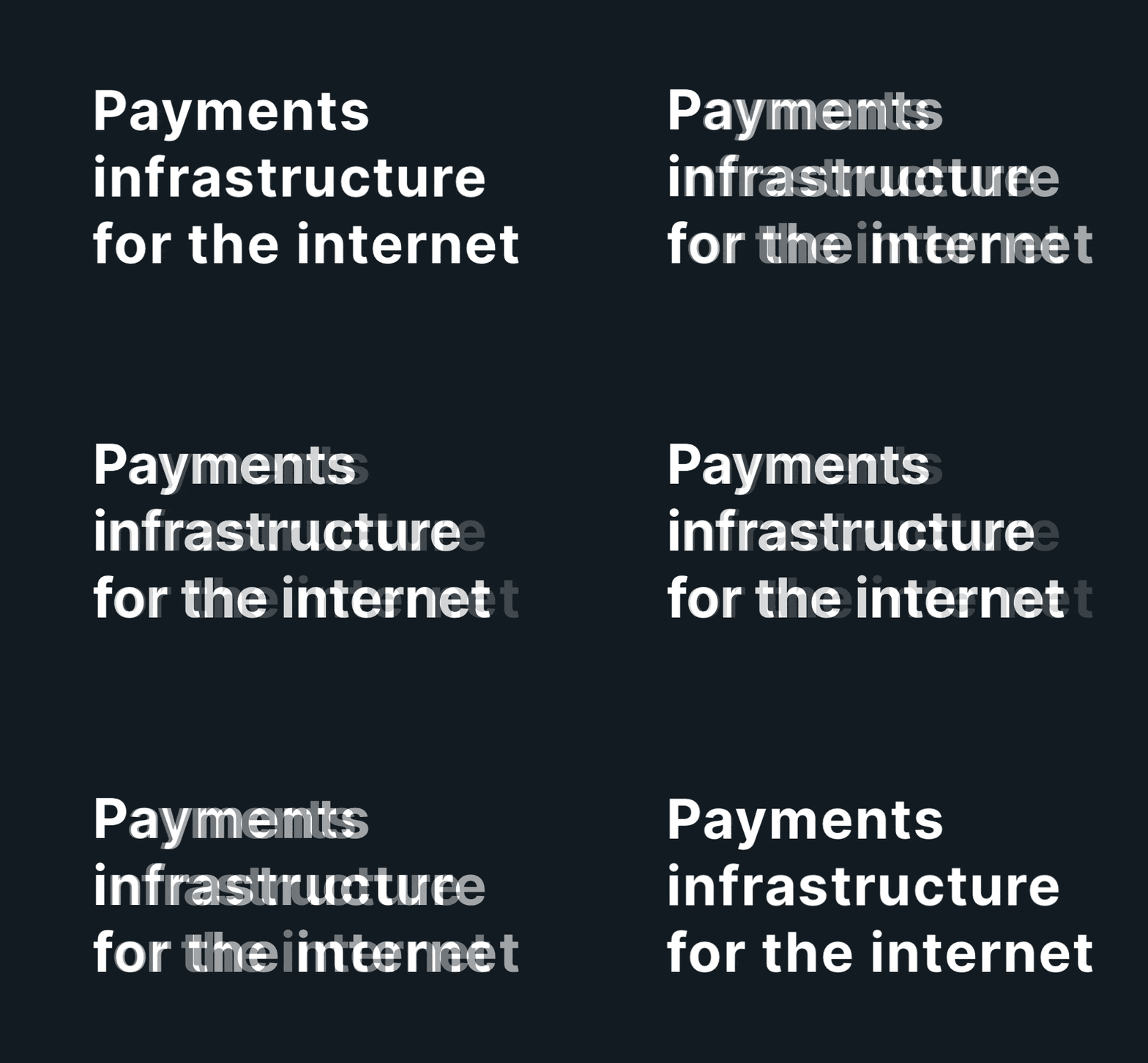
When you use allcaps section titles, set the tracking (letting-spacing) a little wider. (Example from Steve Schoger)
clamp: font-size: clamp(1.125rem, 1rem + 2vw, 1.5rem)
font-size: clamp(2rem, calc(2rem + 1.2vw), 3rem);font-size: calc(1rem + 2px + ((100vw - 550px) / 250)) - you can fit text to screen widthvw has known a11y issues: Preserve Zooming. Sara Soueidan recommends wrapping with calc, e.g. font-size: calc(16px + .3vw);hanging-punctuation property in CSS https://news.ycombinator.com/item?id=38441747If building a collaborative design tool that offers font choice, see how Figma does it https://youtu.be/kVD-sjtFoEI
Pick a primary "brand" color to match your personality. DO NOT OVERUSE IT.
You can also have a grey for secondary content, and lighter grey for tertiary content.
Don't use system default/named colors, too brutal. Soften it a bit. "Never use black" has been proposed as a rule, but this is debated.
Here's a more complete primer on color personalities with more examples.
Mind accessibility. 1 in 12 men and 1 in 200 women have color blindness. Make sure to check that important distinctions can be perceived.
Monotone:
Multicolor:
Example yellowish palette:
Examples: https://dev.to/dcodeyt/add-dark-mode-to-your-websites-with-css-5bh4
Note - THIS IS DISPUTED!!! Even Slack's impl has separate light and dark theming.
The problem is "primary" isn't a color, it's a measure of contrast in the current context. On the same page you might have a white panel with a black button and a black panel with a white button, and both of those buttons are "primary" even though they are different colors. - Adam Wathan
One liner dark mode (careful about perf!): filter: invert(100%) hue-rotate(180deg); - more filters here
https://workos.com/blog/5-lessons-we-learned-adding-dark-mode-to-our-platform?ref=sidebar
Note: Default gradients often have "hard edges" that are too rough. (example, example). Add a third color stop in the middle and boost saturation. You can use esaing gradients in future.
Not tools but still important so here they are
JustinMezzell on Color - advanced stuff on picking color tone/temperature. Basic version by Steve Schoger
Reasoning about Color some light reading on color spaces and transforms (eg "pastelize" operation)
big list of color names: https://github.com/meodai/color-names
(way too detailed) history and guide to color pickers https://bottosson.github.io/posts/colorpicker/
Dataviz is a special category since it's not just design, but information. Credit to Teej's thread.
Not just for background backgrounds - applying gradients and background images to text is super underrated. Examples:
Background Radial Bursts behind images:
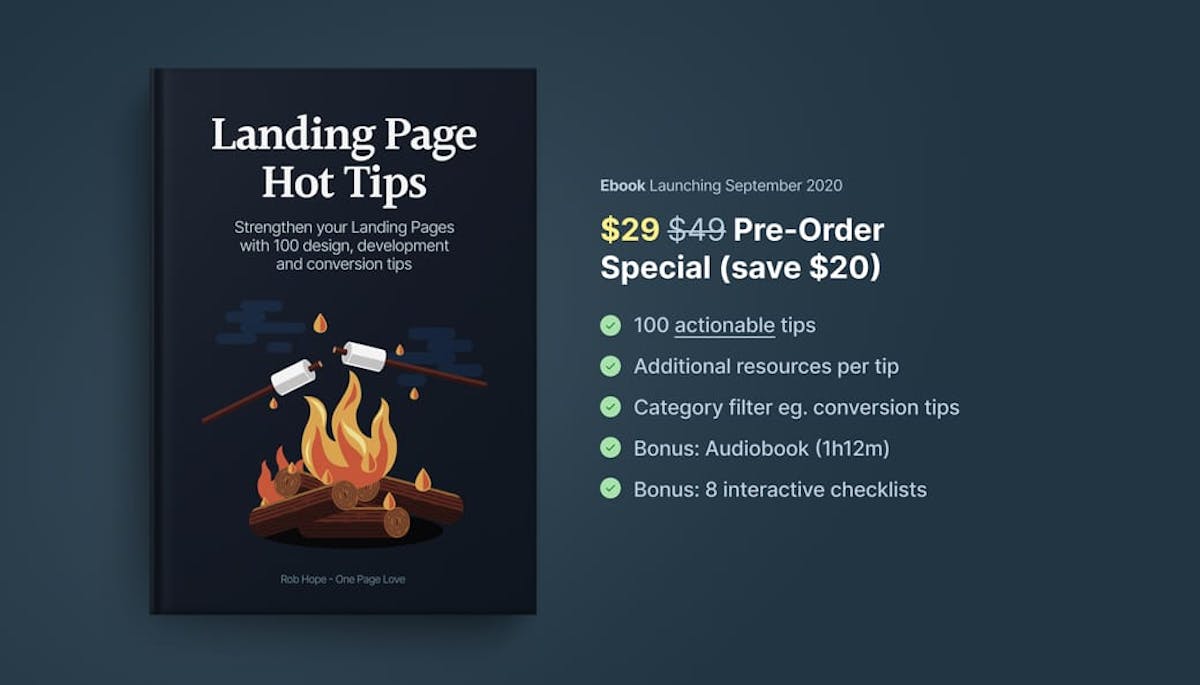
Make sure to see the Color Gradients section to generate gradients
background-image: linear-gradient(
  120deg,
  hsl(200 50% 90%) 0%,
  hsl(200 100% 90%) 100%
);
Linear gradients can be "eased" to be smoother: https://css-tricks.com/easing-linear-gradients/
Don't forget them!
<link rel="icon" href="/favicon.ico" /><!-- 32×32 -->
<link rel="icon" href="/icon.svg" type="image/svg+xml" />
<link rel="apple-touch-icon" href="/apple-touch-icon.png" /><!-- 180×180 -->
<link rel="manifest" href="/manifest.webmanifest" />
// manifest.webmanifest
{
  "icons": [
    { "src": "/192.png", "type": "image/png", "sizes": "192x192" },
    { "src": "/512.png", "type": "image/png", "sizes": "512x512" }
  ]
}
🌟 Favicon InBrowser.App - A modern pure-frontend favicon generator. Support SVG, maskable and dark mode. Optimize PNG and SVG outputs.
Real Favicon generator - pop in an image, get back a favicon! The most comprehensive one for all platforms (Windows, iOS, Android)
Favicon.io - Generate a favicon from text, from an image, or from an emoji. Download in .ico and .png formats
FontIcon - Generate favicons and images from Font Awesome icons
Favicon Generator - another one
https://textmoji.app/ small text icons meant for Slack but also can use for faviconning
SVG Favicon maker - supports emojis and 2 letter favicons with custom fonts
SVG favicons are modifiable by scroll percentage
<link rel=""> tags and opengraphIdeas of things you can include based on my own site.
<link rel="icon" type="image/png" href="/favicon.png" />
<link rel="webmention" href="https://webmention.io/www.swyx.io/webmention" />
<link rel="pingback" href="https://webmention.io/www.swyx.io/xmlrpc" />
<meta name="theme-color" content="#818CF8" />
<title>{frontmatter.title} ∊ swyx.io</title>
<link rel="canonical" href="{canonical}" />
<meta property="og:url" content="{swyxioURL}" />
<meta property="og:type" content="article" />
<meta property="og:title" content="{seoTitle}" />
<meta name="Description" content="{seoDescription}" />
<meta property="og:description" content="{seoDescription}" />
{#if frontmatter.cover_image}
<meta property="og:image" content="{coverImage}" />
{/if} <meta name="twitter:card" content={frontmatter.cover_image ?
'summary_large_image' : 'summary'} />
<meta name="twitter:domain" content="swyx.io" />
<meta name="twitter:creator" content="@swyx" />
<meta name="twitter:title" content="{seoTitle}" />
<meta name="twitter:description" content="{seoDescription}" />
<meta name="twitter:image" content={frontmatter.cover_image ?
frontmatter.cover_image : 'https://www.swyx.io/swyx-ski.jpeg'} />
<meta name="twitter:label1" value="Last updated" content="Last updated" />
<meta name="twitter:data1" value="{metaDate}" content="{metaDate}" />
<meta name="twitter:label2" content="Read Time" />
<meta name="twitter:data2" content="{readTime}" />
other boilerplates to use
Important: Note on icon accessibility. Don't use icon fonts.
<svg aria-hidden="true"><svg role="img"><title>foo</title>...</svg. Pick from Aria roles list.<a href="/" aria-label="Good Label"><svg aria-hidden="true" ... ></svg></a>Note you can put gradients on SVG icons manually https://play.tailwindcss.com/yM2N8GpEUK
You may like: Free Fundamentals of Icon design in 1 hour course by MDS
premium/paid icons
radicaldesignBefore you get to the tools - some good thinking (and lists of tools) on architecture diagrams:
Specifically for BPMN: https://bpmn.io/
useful eg if needs logos
further reading
diagrams https://pypi.org/project/diagrams/Node based GUIs: https://github.com/wbkd/awesome-node-based-uis
Backend entity/ ERD /SQL diagramming
DIY illustration
Mocking your browser/phone
Record your device https://www.screen.studio/
Illo's in context: https://onepagelove.com/tag/illustrations
Learn 3d illo in blender https://polygonrunway.com/
RoughJS Tools
exampels of ascii art in code: https://blog.regehr.org/archives/1653 (HN discussion)
from matrix8967: Some ANSI Color Codes and ASCIInema can carry you a long way. (note: may want to reformat this in future)
Image modification for hover effects: https://photomosh.com/
tips for product tours https://dev.to/highlight/how-to-create-animated-product-stories-2bcd
misc
Do it for you
Tutorials from successful Youtubers
branding color with accents: https://web.dev/accent-color/
html {
  --brand: hotpink;
  scrollbar-color: hotpink Canvas;
}

:root {
  accent-color: var(--brand);
}
:focus-visible {
  outline-color: var(--brand);
}
::selection {
  background-color: var(--brand);
}
.dark ::selection {
  color: #1d1d1d;
} /* if you have a dark mode class */
::marker {
  color: var(--brand);
}

:is(::-webkit-calendar-picker-indicator, ::-webkit-clear-button, ::-webkit-inner-spin-button, ::-webkit-outer-spin-button) {
  color: var(--brand);
}

/* https://css-tricks.com/two-issues-styling-the-details-element-and-how-to-solve-them/ */
details {
  border: 2px solid var(--brand-accent);
  padding: 0.5rem 1rem;
}
details > summary {
  cursor: pointer;
}

details > summary > *:first-child {
  display: inline;
}
meta theme-color https://github.com/sw-yx/swyxkit/issues/19
dont use default number input attributes - do it all in js https://stackoverflow.blog/2022/09/15/why-the-number-input-is-the-worst-input/
multiline capable inline links https://twitter.com/JoshWComeau/status/1481697476327452676?s=20&t=bEY8vX8hmtGmMWQsFmSEcA
tooltips on hover
details/summary css - use details[open] to target https://codepen.io/chriscoyier/pen/wvJmqjY
put scroll margin on everything with an id
[id] {
  scroll-margin-top: 2ex;
}
Link and Button hover effects https://www.youtube.com/watch?v=ceNMP-aQkQ4
Image modification for hover effects: https://photomosh.com/
shrinking header on scroll https://css-tricks.com/how-to-create-a-shrinking-header-on-scroll-without-javascript
https://smolcss.dev/ more simple CSS tricks for responsive elements
prefer click menus over hover menus https://css-tricks.com/in-praise-of-the-unambiguous-click-menu/
how to make settings https://web.dev/building-a-settings-component/
Defensive CSS https://ishadeed.com/article/defensive-css/
breadcrumb dividers: https://twitter.com/_philNelson/status/1512316711856345090?s=20&t=q3Cp0O1KPlxADCw_zUNHDA
Instead of dropdowns, use: (https://learnui.design/blog/4-rules-intuitive-ux.html)
focus:shadow-outline focus:outline-none focus:ring-2 ring-offset-current ring-offset-2focus:shadow-outline focus:outline-noneinput:not(:focus):not(:placeholder-shown):valid for non freakout UXPaid:
Tools:
ul lists and will collapse back to readible lists in the absence of css support, making it accessible to all readers. It is open source and easily configurable according to project needs.<Foldable> from Folding the DOMbox-shadow: 10px 12px 0.5rem rgba(0,0,0,0.5);MAKE SURE TO CHECK OUT https://components.ai
https://twitter.com/JoshWComeau/status/1170358024319492097?s=20
Sarah Drasner picks https://codepen.io/collection/nMgKxJ?cursor=ZD0xJm89MCZwPTEmdj0yNjc5NTQ1
Lea Verou CSS Secrets https://twitter.com/swyx/status/982786353216843776?s=20
CSS 3D Text https://markdotto.com/playground/3d-text/
3D CSS hover effects https://polypane.app/css-3d-transform-examples/
3D CSS text rotation https://x.st/spinning-diagrams-with-css/
collapsible list item tree view https://iamkate.com/code/tree-views/
set cursor to emoji using SVG https://twitter.com/mgechev/status/1354300680807329793?s=20
swipey image grids using SVG https://www.cassie.codes/posts/swipey-image-grids/
animated focus https://twitter.com/argyleink/status/1387072095159406596
@media (prefers-reduced-motion: no-preference) {
  :focus {
    transition: outline-offset 0.25s ease;
    outline-offset: 5px;
  }
}
https://ui.glass/generator/ Get started with this free CSS generator based on the glassmorphism design specifications to quickly design and customize the style properties.
https://glass3d.dev/ https://news.ycombinator.com/item?id=44445238
frosted glass sticky header https://www.joshwcomeau.com/css/backdrop-filter/
-apple-visual-effect: -apple-system-glass-materialglassy glassmorphism codepen, in context
.blur-and-rotate {
  border-radius: 20px;
  backdrop-filter: blur(20px) hue-rotate(120deg);
  -webkit-backdrop-filter: hue-rotate(120deg);
}
Shadows
border-radius: 50px;
background: #f3d2c3;
box-shadow: 20px 20px 22px #cfb3a6, -20px -20px 22px #fff2e0;
mix-blend-mode: screen is really good for SVG icons, with hoverhttps://x.com/emilkowalski/status/2031742178297335879
Make buttons feel responsive | Add 'transform: scale(0.97)' on '¡active'
Element appears from nowhere | Start from 'scale(0.95)', not 'scale(0)'
Shaky/jittery animations | Add 'will-change: transform'
Hover causes flicker | Animate child element, not parent
Popover scales from wrong point I Set 'transform-origin' to trigger location
Sequential tooltips feel slow I Skip delay/animation after first tooltip
Small buttons hard to tap I Use 44px minimum hit area (pseudo-element)
Something still feels off | Add subtle blur (under 20px) to mask it
Hover triggers on mobile | Use '@media (hover: hover) and (pointer: fine)'
Buttons, hover, inputs, and loaders https://cssfx.netlify.com/
general http://animista.net
general https://animejs.com/
https://www.theatrejs.com/ animate DOM elements or WebGL using a convenient visual editor that works along with the code you write.
motion graphics https://github.com/mojs/mojs
https://www.transition.style/ CSS transitions "My favourites are the ones that incorporate some hesitation in the animation, for an added uniqueness"
https://animxyz.com/ Tailwind for animations, since you’re only using HTML classes.
general https://ianlunn.github.io/Hover/
Hover and loaders: https://www.csswand.dev/
Graphic animations: https://lottiefiles.com/
HTML animation? https://tumult.com/hype/ (paid)
Page Transitions with swup https://github.com/swup/swup (css tricks)
css animation without keyframes https://animxyz.com/docs/
collection of css animations https://xsgames.co/animatiss/
https://ericfortis.github.io/web-animations/ Open source plain JS, CSS, HTML, SVG animations
animation introduction & examples https://stackdiary.com/css-animations/
Learn how to use Framer Motion with Sam Selikoff's https://buildui.com/
On tutorials vs contextual tips: https://www.nngroup.com/articles/onboarding-tutorials/
Feature tours
Welcome emails
Makepad
ThreeJS
BabylonJS
free or mock data apis for demos
<img src="https://api.assetroulette.com/random_image"><img src="https://api.assetroulette.com/random_meme"><img src="https://api.assetroulette.com/random_unsplash"><link rel="stylesheet" href="https://api.assetroulette.com/random.css">mock fake user events https://github.com/andresionek91/fake-web-events
https://public-apis.io/ (A Directory of Free Public & Open Rest APIs)
https://github.com/Marak/faker.js - generate fake pdf https://aws.amazon.com/blogs/aws/new-for-aws-lambda-container-image-support/
(top 24 of 124)
4,971 followers · starred Jul 2023
1,937 followers · starred Aug 2020
6,481 followers · starred Feb 2022
3,982 followers · starred Feb 2022
Archived — Spark Joy now lives on Forge.
See the code
Easy ways to add design flair, user delight, and whimsy to your product!
The Spark Joy philosophy is explained in further detail in my book, check it out if you'd like to explore how this approach applies to a lot more than design utilities.
Table of Contents
Keep it simple: https://jgthms.com/web-design-in-4-minutes/
HTML/CSS nice templates
bigger learning curve, may have js, but more OOTB)
lighter, no js. preview some of these with https://sites.yax.com/, https://www.cssbed.com/, https://dohliam.github.io/dropin-minimal-css/ and https://github.com/dbohdan/classless-css
Superlight: 100 bytes of css to look great nearly everywhere
html {
  max-width: 60ch;
  padding: 1.5rem;
  margin: auto;
  line-height: 1.5rem;
  font-size: 24px;
}
see also http://bettermotherfuckingwebsite.com/
focus is fun
focus is brutalism
focus is fun/nostalgia
focus in futurism
Instead of using a framework, consider not using one.
more control in exchange for more work on your part.
Good idea to have an elevation system in place. Material's is pretty good: https://material.io/design/environment/elevation.html
| Component | Default elevation values (dp) |
|---|---|
| Dialog | 24 |
| Modal bottom sheet Modal side sheet | 16 |
| Navigation drawer | 16 |
| Floating action button (FAB - pressed) | 12 |
| Standard bottom sheet Standard side sheet | 8 |
| Bottom navigation bar | 8 |
| Bottom app bar | 8 |
| Menus and sub menus | 8 |
| Card (when picked up) | 8 |
| Contained button (pressed state) | 8 |
| Floating action button (FAB - resting elevation) Snackbar | 6 |
| Top app bar (scrolled state) | 4 |
| Top app bar (resting elevation) | 0 or 4 |
| Refresh indicator Search bar (scrolled state) | 3 |
| Contained button (resting elevation) | 2 |
| Search bar (resting elevation) | 1 |
| Card (resting elevation) | 1 |
| Switch | 1 |
| Text button | 0 |
| Standard side sheet | 0 |
More notes on FAB implementation- https://youtu.be/RXopH5t2Kww
More. Spacing. Please.
When in doubt, use Material Layout: https://material.io/design/layout/responsive-layout-grid.html#breakpoints
| Screen size | Margin | Body | Layout columns |
|---|---|---|---|
| Extra-small (phone) | |||
| 0-599dp | 16dp | Scaling | 4 |
| Small (tablet) | |||
| 600-904 | 32dp | Scaling | 8 |
| 905-1239 | Scaling | 840dp | 12 |
| Medium (laptop) | |||
| 1240-1439 | 200dp | Scaling | 12 |
| Large (desktop) | |||
| 1440+ | Scaling | 1040 | 12 |
A nice bleed lets you put emphasis on things selectively.
You want a normal width, a popout width, and a "full bleed" width. Optional for an intermediate one.
This is the best version of bleed implementation https://ryanmulligan.dev/blog/layout-breakouts/ (borrows from https://joshwcomeau.com/css/full-bleed/)
This is adapted to be responsive
<style>
	/* https://ryanmulligan.dev/blog/layout-breakouts/ */
	.swyxcontent {
		--gap: clamp(1rem, 6vw, 3rem);
		--full: minmax(var(--gap), 1fr);
		--content: min(65ch, 100% - var(--gap) * 2);
		--popout: minmax(0, 2rem);
		--feature: minmax(0, 5rem);

		display: grid;
		grid-template-columns:
			[full-start]
			[feature-start]
			[popout-start]
			[content-start] var(--content) [content-end]
			[feature-end]
			[popout-end]
			[feature-end]
			[full-end]
	}

	@media (min-width: 640px) {
		.swyxcontent {
			grid-template-columns:
				[full-start] var(--full)
				[feature-start] var(--feature)
				[popout-start] var(--popout)
				[content-start] var(--content) [content-end]
				var(--popout) [popout-end]
				var(--feature) [feature-end]
				var(--full) [full-end];
		}
	}

	:global(.swyxcontent > *) {
		grid-column: content;
	}

	article :global(pre) {
		grid-column: feature;
	}
</style>
Then you can selectively use the popout, feature, and full classes as needed
.content > * {
  grid-column: content;
}
.popout {
  grid-column: popout;
}
.feature {
  grid-column: feature;
}
.full {
  grid-column: full;
}
typography matters! https://twitter.com/kvncnls/status/1399077512014086150?s=21
font-family: -apple-system, BlinkMacSystemFont, "Segoe UI", Roboto, Helvetica, Arial, sans-serif, "Apple Color Emoji", "Noto Color Emoji", "Segoe UI Emoji", "Segoe UI Symbol";font-family: -apple-system, BlinkMacSystemFont, 'Segoe UI', Roboto, Oxygen, Ubuntu, Cantarell, 'Open Sans', 'Helvetica Neue', sans-seriffont-family: -apple-system, BlinkMacSystemFont, Segoe UI, Helvetica, Arial, sans-serif;font-family: -apple-system, BlinkMacSystemFont, "Segoe UI", "Roboto", "Oxygen", "Ubuntu", "Helvetica Neue", Arial, sans-serif;font-family: ‘system-ui’, sans-serif;
@ff-sans:
  -apple-system, BlinkMacSystemFont, // San Francisco on macOS and iOS
  "Segoe UI",                        // Windows
  "Liberation Sans",                 // Linux
  sans-serif;                        // The final fallback for rendering in sans-serif.
@ff-serif: Georgia, Cambria, "Times New Roman", Times, serif;
@ff-mono:
  ui-monospace,                     // San Francisco Mono on macOS and iOS
  "Cascadia Mono", "Segoe UI Mono", // Newer Windows monospace fonts that are optionally installed. Most likely to be rendered in Consolas
  "Liberation Mono",                // Linux
  Menlo, Monaco, Consolas,          // A few sensible system font choices
  monospace;                        // The final fallback for rendering in monospace.
  html {
    font-family:
      system-ui,
      /* macOS 10.11-10.12 */ -apple-system,
      /* Windows 6+ */ Segoe UI,
      /* Android 4+ */ Roboto,
      /* Ubuntu 10.10+ */ Ubuntu,
      /* Gnome 3+ */ Cantarell,
      /* KDE Plasma 5+ */ Noto Sans,
      /* fallback */ sans-serif,
      /* macOS emoji */ "Apple Color Emoji",
      /* Windows emoji */ "Segoe UI Emoji",
      /* Windows emoji */ "Segoe UI Symbol",
      /* Linux emoji */ "Noto Color Emoji";
  }
  code, kbd, pre, samp {
    font-family:
      /* macOS 10.10+ */ Menlo,
      /* Windows 6+ */ Consolas,
      /* Android 4+ */ Roboto Mono,
      /* Ubuntu 10.10+ */ Ubuntu Monospace,
      /* KDE Plasma 5+ */ Noto Mono,
      /* KDE Plasma 4+ */ Oxygen Mono,
      /* Linux/OpenOffice fallback */ Liberation Mono,
      /* fallback */ monospace;
  }
“avenir next”, “avenir”, “proxima-nova”See also Modern Font Stacks - discussion
font-family: system-ui, -apple-system, sans-serif; ([has issues on old browsers + asian langauges](url - github and bootstrap have removed it fwiw))font-family: -apple-system, BlinkMacSystemFont, avenir next, avenir, segoe ui, helvetica neue, helvetica, Ubuntu, roboto, noto, arial, sans-serif;font-family: Iowan Old Style, Apple Garamond, Baskerville, Times New Roman, Droid Serif, Times, Source Serif Pro, serif, Apple Color Emoji, Segoe UI Emoji, Segoe UI Symbol;font-family: Menlo, Consolas, Monaco, Liberation Mono, Lucida Console, monospace;Freight Text, Adobe Garamond, PT SerifProxima SoftFreight Sans, Inter, Proxima NovaDIN, Industryyou can learn more about proofing premium fonts here https://www.typography.com/blog/text-for-proofing-fonts
https://iainbean.com/posts/2021/5-steps-to-faster-web-fonts/
Everything Harry Roberts writes
<!--
   - 1. Preemptively warm up the fonts’ origin.
   -
   - 2. Initiate a high-priority, asynchronous fetch for the CSS file. Works in
   -    most modern browsers.
   -
   - 3. Initiate a low-priority, asynchronous fetch that gets applied to the page
   -    only after it’s arrived. Works in all browsers with JavaScript enabled.
   -
   - 4. In the unlikely event that a visitor has intentionally disabled
   -    JavaScript, fall back to the original method. The good news is that,
   -    although this is a render-blocking request, it can still make use of the
   -    preconnect which makes it marginally faster than the default.
   -->

<!-- [1] -->
<link rel="preconnect" href="https://fonts.gstatic.com" crossorigin />

<!-- [2] -->
<link rel="preload" as="style" href="$CSS&display=swap" />

<!-- [3] -->
<link
  rel="stylesheet"
  href="$CSS&display=swap"
  media="print"
  onload="this.media='all'"
/>

<!-- [4] -->
<noscript>
  <link rel="stylesheet" href="$CSS&display=swap" />
</noscript>
font-display: optional may be good
don't load fonts if prefers-reduced-data see Kilian Valkhof
https://www.thegoodlineheight.com
Don't forget setting max-width - betweeen 60-75chars is good.
You may wish to use max-width: 60ch on content. Note on the ch unit not being EXACTLY 60 chars
When you use allcaps section titles, set the tracking (letting-spacing) a little wider. (Example from Steve Schoger)
clamp: font-size: clamp(1.125rem, 1rem + 2vw, 1.5rem)
font-size: clamp(2rem, calc(2rem + 1.2vw), 3rem);font-size: calc(1rem + 2px + ((100vw - 550px) / 250)) - you can fit text to screen widthvw has known a11y issues: Preserve Zooming. Sara Soueidan recommends wrapping with calc, e.g. font-size: calc(16px + .3vw);hanging-punctuation property in CSS https://news.ycombinator.com/item?id=38441747If building a collaborative design tool that offers font choice, see how Figma does it https://youtu.be/kVD-sjtFoEI
Pick a primary "brand" color to match your personality. DO NOT OVERUSE IT.
You can also have a grey for secondary content, and lighter grey for tertiary content.
Don't use system default/named colors, too brutal. Soften it a bit. "Never use black" has been proposed as a rule, but this is debated.
Here's a more complete primer on color personalities with more examples.
Mind accessibility. 1 in 12 men and 1 in 200 women have color blindness. Make sure to check that important distinctions can be perceived.
Monotone:
Multicolor:
Example yellowish palette:
Examples: https://dev.to/dcodeyt/add-dark-mode-to-your-websites-with-css-5bh4
Note - THIS IS DISPUTED!!! Even Slack's impl has separate light and dark theming.
The problem is "primary" isn't a color, it's a measure of contrast in the current context. On the same page you might have a white panel with a black button and a black panel with a white button, and both of those buttons are "primary" even though they are different colors. - Adam Wathan
One liner dark mode (careful about perf!): filter: invert(100%) hue-rotate(180deg); - more filters here
https://workos.com/blog/5-lessons-we-learned-adding-dark-mode-to-our-platform?ref=sidebar
Note: Default gradients often have "hard edges" that are too rough. (example, example). Add a third color stop in the middle and boost saturation. You can use esaing gradients in future.
Not tools but still important so here they are
JustinMezzell on Color - advanced stuff on picking color tone/temperature. Basic version by Steve Schoger
Reasoning about Color some light reading on color spaces and transforms (eg "pastelize" operation)
big list of color names: https://github.com/meodai/color-names
(way too detailed) history and guide to color pickers https://bottosson.github.io/posts/colorpicker/
Dataviz is a special category since it's not just design, but information. Credit to Teej's thread.
Not just for background backgrounds - applying gradients and background images to text is super underrated. Examples:
Background Radial Bursts behind images:
Make sure to see the Color Gradients section to generate gradients
background-image: linear-gradient(
  120deg,
  hsl(200 50% 90%) 0%,
  hsl(200 100% 90%) 100%
);
Linear gradients can be "eased" to be smoother: https://css-tricks.com/easing-linear-gradients/
Don't forget them!
<link rel="icon" href="/favicon.ico" /><!-- 32×32 -->
<link rel="icon" href="/icon.svg" type="image/svg+xml" />
<link rel="apple-touch-icon" href="/apple-touch-icon.png" /><!-- 180×180 -->
<link rel="manifest" href="/manifest.webmanifest" />
// manifest.webmanifest
{
  "icons": [
    { "src": "/192.png", "type": "image/png", "sizes": "192x192" },
    { "src": "/512.png", "type": "image/png", "sizes": "512x512" }
  ]
}
🌟 Favicon InBrowser.App - A modern pure-frontend favicon generator. Support SVG, maskable and dark mode. Optimize PNG and SVG outputs.
Real Favicon generator - pop in an image, get back a favicon! The most comprehensive one for all platforms (Windows, iOS, Android)
Favicon.io - Generate a favicon from text, from an image, or from an emoji. Download in .ico and .png formats
FontIcon - Generate favicons and images from Font Awesome icons
Favicon Generator - another one
https://textmoji.app/ small text icons meant for Slack but also can use for faviconning
SVG Favicon maker - supports emojis and 2 letter favicons with custom fonts
SVG favicons are modifiable by scroll percentage
<link rel=""> tags and opengraphIdeas of things you can include based on my own site.
<link rel="icon" type="image/png" href="/favicon.png" />
<link rel="webmention" href="https://webmention.io/www.swyx.io/webmention" />
<link rel="pingback" href="https://webmention.io/www.swyx.io/xmlrpc" />
<meta name="theme-color" content="#818CF8" />
<title>{frontmatter.title} ∊ swyx.io</title>
<link rel="canonical" href="{canonical}" />
<meta property="og:url" content="{swyxioURL}" />
<meta property="og:type" content="article" />
<meta property="og:title" content="{seoTitle}" />
<meta name="Description" content="{seoDescription}" />
<meta property="og:description" content="{seoDescription}" />
{#if frontmatter.cover_image}
<meta property="og:image" content="{coverImage}" />
{/if} <meta name="twitter:card" content={frontmatter.cover_image ?
'summary_large_image' : 'summary'} />
<meta name="twitter:domain" content="swyx.io" />
<meta name="twitter:creator" content="@swyx" />
<meta name="twitter:title" content="{seoTitle}" />
<meta name="twitter:description" content="{seoDescription}" />
<meta name="twitter:image" content={frontmatter.cover_image ?
frontmatter.cover_image : 'https://www.swyx.io/swyx-ski.jpeg'} />
<meta name="twitter:label1" value="Last updated" content="Last updated" />
<meta name="twitter:data1" value="{metaDate}" content="{metaDate}" />
<meta name="twitter:label2" content="Read Time" />
<meta name="twitter:data2" content="{readTime}" />
other boilerplates to use
Important: Note on icon accessibility. Don't use icon fonts.
<svg aria-hidden="true"><svg role="img"><title>foo</title>...</svg. Pick from Aria roles list.<a href="/" aria-label="Good Label"><svg aria-hidden="true" ... ></svg></a>Note you can put gradients on SVG icons manually https://play.tailwindcss.com/yM2N8GpEUK
You may like: Free Fundamentals of Icon design in 1 hour course by MDS
premium/paid icons
radicaldesignBefore you get to the tools - some good thinking (and lists of tools) on architecture diagrams:
Specifically for BPMN: https://bpmn.io/
useful eg if needs logos
further reading
diagrams https://pypi.org/project/diagrams/Node based GUIs: https://github.com/wbkd/awesome-node-based-uis
Backend entity/ ERD /SQL diagramming
DIY illustration
Mocking your browser/phone
Record your device https://www.screen.studio/
Illo's in context: https://onepagelove.com/tag/illustrations
Learn 3d illo in blender https://polygonrunway.com/
RoughJS Tools
exampels of ascii art in code: https://blog.regehr.org/archives/1653 (HN discussion)
from matrix8967: Some ANSI Color Codes and ASCIInema can carry you a long way. (note: may want to reformat this in future)
Image modification for hover effects: https://photomosh.com/
tips for product tours https://dev.to/highlight/how-to-create-animated-product-stories-2bcd
misc
Do it for you
Tutorials from successful Youtubers
branding color with accents: https://web.dev/accent-color/
html {
  --brand: hotpink;
  scrollbar-color: hotpink Canvas;
}

:root {
  accent-color: var(--brand);
}
:focus-visible {
  outline-color: var(--brand);
}
::selection {
  background-color: var(--brand);
}
.dark ::selection {
  color: #1d1d1d;
} /* if you have a dark mode class */
::marker {
  color: var(--brand);
}

:is(::-webkit-calendar-picker-indicator, ::-webkit-clear-button, ::-webkit-inner-spin-button, ::-webkit-outer-spin-button) {
  color: var(--brand);
}

/* https://css-tricks.com/two-issues-styling-the-details-element-and-how-to-solve-them/ */
details {
  border: 2px solid var(--brand-accent);
  padding: 0.5rem 1rem;
}
details > summary {
  cursor: pointer;
}

details > summary > *:first-child {
  display: inline;
}
meta theme-color https://github.com/sw-yx/swyxkit/issues/19
dont use default number input attributes - do it all in js https://stackoverflow.blog/2022/09/15/why-the-number-input-is-the-worst-input/
multiline capable inline links https://twitter.com/JoshWComeau/status/1481697476327452676?s=20&t=bEY8vX8hmtGmMWQsFmSEcA
tooltips on hover
details/summary css - use details[open] to target https://codepen.io/chriscoyier/pen/wvJmqjY
put scroll margin on everything with an id
[id] {
  scroll-margin-top: 2ex;
}
Link and Button hover effects https://www.youtube.com/watch?v=ceNMP-aQkQ4
Image modification for hover effects: https://photomosh.com/
shrinking header on scroll https://css-tricks.com/how-to-create-a-shrinking-header-on-scroll-without-javascript
https://smolcss.dev/ more simple CSS tricks for responsive elements
prefer click menus over hover menus https://css-tricks.com/in-praise-of-the-unambiguous-click-menu/
how to make settings https://web.dev/building-a-settings-component/
Defensive CSS https://ishadeed.com/article/defensive-css/
breadcrumb dividers: https://twitter.com/_philNelson/status/1512316711856345090?s=20&t=q3Cp0O1KPlxADCw_zUNHDA
Instead of dropdowns, use: (https://learnui.design/blog/4-rules-intuitive-ux.html)
focus:shadow-outline focus:outline-none focus:ring-2 ring-offset-current ring-offset-2focus:shadow-outline focus:outline-noneinput:not(:focus):not(:placeholder-shown):valid for non freakout UXPaid:
Tools:
ul lists and will collapse back to readible lists in the absence of css support, making it accessible to all readers. It is open source and easily configurable according to project needs.<Foldable> from Folding the DOMbox-shadow: 10px 12px 0.5rem rgba(0,0,0,0.5);MAKE SURE TO CHECK OUT https://components.ai
https://twitter.com/JoshWComeau/status/1170358024319492097?s=20
Sarah Drasner picks https://codepen.io/collection/nMgKxJ?cursor=ZD0xJm89MCZwPTEmdj0yNjc5NTQ1
Lea Verou CSS Secrets https://twitter.com/swyx/status/982786353216843776?s=20
CSS 3D Text https://markdotto.com/playground/3d-text/
3D CSS hover effects https://polypane.app/css-3d-transform-examples/
3D CSS text rotation https://x.st/spinning-diagrams-with-css/
collapsible list item tree view https://iamkate.com/code/tree-views/
set cursor to emoji using SVG https://twitter.com/mgechev/status/1354300680807329793?s=20
swipey image grids using SVG https://www.cassie.codes/posts/swipey-image-grids/
animated focus https://twitter.com/argyleink/status/1387072095159406596
@media (prefers-reduced-motion: no-preference) {
  :focus {
    transition: outline-offset 0.25s ease;
    outline-offset: 5px;
  }
}
https://ui.glass/generator/ Get started with this free CSS generator based on the glassmorphism design specifications to quickly design and customize the style properties.
https://glass3d.dev/ https://news.ycombinator.com/item?id=44445238
frosted glass sticky header https://www.joshwcomeau.com/css/backdrop-filter/
-apple-visual-effect: -apple-system-glass-materialglassy glassmorphism codepen, in context
.blur-and-rotate {
  border-radius: 20px;
  backdrop-filter: blur(20px) hue-rotate(120deg);
  -webkit-backdrop-filter: hue-rotate(120deg);
}
Shadows
border-radius: 50px;
background: #f3d2c3;
box-shadow: 20px 20px 22px #cfb3a6, -20px -20px 22px #fff2e0;
mix-blend-mode: screen is really good for SVG icons, with hoverhttps://x.com/emilkowalski/status/2031742178297335879
Make buttons feel responsive | Add 'transform: scale(0.97)' on '¡active'
Element appears from nowhere | Start from 'scale(0.95)', not 'scale(0)'
Shaky/jittery animations | Add 'will-change: transform'
Hover causes flicker | Animate child element, not parent
Popover scales from wrong point I Set 'transform-origin' to trigger location
Sequential tooltips feel slow I Skip delay/animation after first tooltip
Small buttons hard to tap I Use 44px minimum hit area (pseudo-element)
Something still feels off | Add subtle blur (under 20px) to mask it
Hover triggers on mobile | Use '@media (hover: hover) and (pointer: fine)'
Buttons, hover, inputs, and loaders https://cssfx.netlify.com/
general http://animista.net
general https://animejs.com/
https://www.theatrejs.com/ animate DOM elements or WebGL using a convenient visual editor that works along with the code you write.
motion graphics https://github.com/mojs/mojs
https://www.transition.style/ CSS transitions "My favourites are the ones that incorporate some hesitation in the animation, for an added uniqueness"
https://animxyz.com/ Tailwind for animations, since you’re only using HTML classes.
general https://ianlunn.github.io/Hover/
Hover and loaders: https://www.csswand.dev/
Graphic animations: https://lottiefiles.com/
HTML animation? https://tumult.com/hype/ (paid)
Page Transitions with swup https://github.com/swup/swup (css tricks)
css animation without keyframes https://animxyz.com/docs/
collection of css animations https://xsgames.co/animatiss/
https://ericfortis.github.io/web-animations/ Open source plain JS, CSS, HTML, SVG animations
animation introduction & examples https://stackdiary.com/css-animations/
Learn how to use Framer Motion with Sam Selikoff's https://buildui.com/
On tutorials vs contextual tips: https://www.nngroup.com/articles/onboarding-tutorials/
Feature tours
Welcome emails
Makepad
ThreeJS
BabylonJS
free or mock data apis for demos
<img src="https://api.assetroulette.com/random_image"><img src="https://api.assetroulette.com/random_meme"><img src="https://api.assetroulette.com/random_unsplash"><link rel="stylesheet" href="https://api.assetroulette.com/random.css">mock fake user events https://github.com/andresionek91/fake-web-events
https://public-apis.io/ (A Directory of Free Public & Open Rest APIs)
https://github.com/Marak/faker.js - generate fake pdf https://aws.amazon.com/blogs/aws/new-for-aws-lambda-container-image-support/
(top 24 of 124)
4,971 followers · starred Jul 2023
1,937 followers · starred Aug 2020
6,481 followers · starred Feb 2022
3,982 followers · starred Feb 2022