jsPDF plugin for generating PDF tables with javascript
See the codeGenerate PDF tables with Javascript
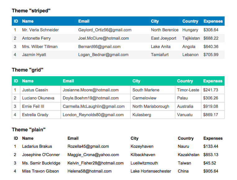
This jsPDF plugin adds the ability to generate PDF tables either by parsing HTML tables or by using Javascript data directly. Check out the demo or examples.
Get jsPDF and this plugin by doing one of these things:
npm install jspdf jspdf-autotableimport { jsPDF } from 'jspdf'
import { autoTable } from 'jspdf-autotable'
const doc = new jsPDF()
// It can parse html:
// <table id="my-table"><!-- ... --></table>
autoTable(doc, { html: '#my-table' })
// Or use javascript directly:
autoTable(doc, {
head: [['Name', 'Email', 'Country']],
body: [
['David', '[email protected]', 'Sweden'],
['Castille', '[email protected]', 'Spain'],
// ...
],
})
doc.save('table.pdf')
You can also use the plugin methods directly on the jsPDF documents:
import { jsPDF } from 'jspdf'
import { applyPlugin } from 'jspdf-autotable'

applyPlugin(jsPDF)

const doc = new jsPDF()
doc.autoTable({ html: '#my-table' })
doc.save('table.pdf')
The third usage option is with downloaded or CDN dist files
<script src="jspdf.min.js"></script>
<script src="jspdf.plugin.autotable.min.js"></script>
<script>
  const doc = new jsPDF()
  doc.autoTable({ html: '#my-table' })
  doc.save('table.pdf')
</script>
Checkout more examples in examples.js which is also the source code for the demo documents.
Below is a list of all options supported in the plugin. All of them are used in the examples.
The only thing required is either the html or body option. If you want more control over the columns you can specify the columns property. If columns are not set they will be automatically computed based on the content of the html content or head, body and foot.
html: string|HTMLTableElement A css selector (for example "#table") or an html table element.head: CellDef[][] For example [['ID', 'Name', 'Country']]body: CellDef[][] For example [['1', 'Simon', 'Sweden'], ['2', 'Karl', 'Norway']]foot: CellDef[][] For example [['ID', 'Name', 'Country']]columns: ColumnDef[] For example [{header: 'ID', dataKey: 'id'}, {header: 'Name', dataKey: 'name'}]. Only use this option if you want more control over the columns. If not specified the columns will be automatically generated based on the content in html or head/body/footincludeHiddenHtml: boolean = false If hidden html with display: none should be included or not when the content comes from an html tableCellDef: string|{content: string, rowSpan: number, colSpan: number, styles: StyleDef}
Note that cell styles can also be set dynamically with hooks.
ColumnDef: string|{header?: string, dataKey: string}
The header property is optional and the values of any content in head will be used if not set. Normally it's easier to use the html or head/body/foot style of initiating a table, but columns can be useful if your body content comes directly from an api or if you would like to specify a dataKey on each column to make it more readable to style specific columns in the hooks or columnStyles.
Usage with colspan, rowspan and inline cell styles:
autoTable(doc, {
  body: [
    [{ content: 'Text', colSpan: 2, rowSpan: 2, styles: { halign: 'center' } }],
  ],
})
theme: 'striped'|'grid'|'plain' = 'striped'styles: StyleDefheadStyles: StyleDefbodyStyles: StyleDeffootStyles: StyleDefalternateRowStyles: StyleDefcolumnStyles: {&columnDataKey: StyleDef} Note that the columnDataKey is normally the index of the column, but could also be the dataKey of a column if content initialized with the columns propertyStyleDef:
font: 'helvetica'|'times'|'courier' = 'helvetica'fontStyle: 'normal'|'bold'|'italic'|'bolditalic' = 'normal'overflow: 'linebreak'|'ellipsize'|'visible'|'hidden' = 'linebreak'fillColor: Color? = nulltextColor: Color? = 20cellWidth: 'auto'|'wrap'|number = 'auto'minCellWidth: number? = 10minCellHeight: number = 0halign: 'left'|'center'|'right' = 'left'valign: 'top'|'middle'|'bottom' = 'top'fontSize: number = 10cellPadding: Padding = 10lineColor: Color = 10lineWidth: border = 0 // If 0, no border is drawnColor:
Either false for transparent, hex string, gray level 0-255 or rbg array e.g. [255, 0, 0]
false|string|number|[number, number, number]
Padding:
Either a number or object {top: number, right: number, bottom: number, left: number}
border:
Either a number or object {top: number, right: number, bottom: number, left: number}
Styles work similar to css and can be overridden by more specific styles. Overriding order:
stylesheadStyles, bodyStyles and footStylesalternateRowStylescolumnStylesStyles for specific cells can also be applied using either the hooks (see hooks section above) or the styles property on the cell definition object (see content section above).
Example usage of column styles (note that the 0 in the columnStyles below should be dataKey if columns option used)
// Example usage with columnStyles,
autoTable(doc, {
  styles: { fillColor: [255, 0, 0] },
  columnStyles: { 0: { halign: 'center', fillColor: [0, 255, 0] } }, // Cells in first column centered and green
  margin: { top: 10 },
  body: [
    ['Sweden', 'Japan', 'Canada'],
    ['Norway', 'China', 'USA'],
    ['Denmark', 'China', 'Mexico'],
  ],
})

// Example usage of columns property. Note that America will not be included even though it exist in the body since there is no column specified for it.
autoTable(doc, {
  columnStyles: { europe: { halign: 'center' } }, // European countries centered
  body: [
    { europe: 'Sweden', america: 'Canada', asia: 'China' },
    { europe: 'Norway', america: 'Mexico', asia: 'Japan' },
  ],
  columns: [
    { header: 'Europe', dataKey: 'europe' },
    { header: 'Asia', dataKey: 'asia' },
  ],
})
useCss: boolean = falsestartY: number = null Where the table should start to be printed (basically a margin top value only for the first page)margin: Margin = 40pageBreak: 'auto'|'avoid'|'always' If set to avoid the plugin will only split a table onto multiple pages if table height is larger than page height.rowPageBreak: 'auto'|'avoid' = 'auto' If set to avoid the plugin will only split a row onto multiple pages if row height is larger than page height.tableWidth: 'auto'|'wrap'|number = 'auto'showHead: 'everyPage'|'firstPage'|'never' = 'everyPage''showFoot: 'everyPage'|'lastPage'|'never' = 'everyPage''tableLineWidth: number = 0tableLineColor: Color = 200 The table line/border colorhorizontalPageBreak: boolean = false To split/break the table into multiple pages if the given table width exceeds the page widthhorizontalPageBreakRepeat: string|number|string[]|number[] To repeat the given column in the split pages, works when horizontalPageBreak = true. The accepted values are column dataKeys, such as 'id', recordId or column indexes, such as 0, 1 or array for multiple columns.horizontalPageBreakBehaviour: 'immediately'|'afterAllRows' = 'afterAllRows' How the horizontal page breaks behave, works when horizontalPageBreak = trueMargin:
Either a number or object {top: number, right: number, bottom: number, left: number}
You can customize the content and styling of the table by using the hooks. See the custom styles example for usage of the hooks.
didParseCell: (HookData) => {} - Called when the plugin finished parsing cell content. Can be used to override content or styles for a specific cell.willDrawCell: (HookData) => {} - Called before a cell or row is drawn. Can be used to call native jspdf styling functions such as doc.setTextColor or change position of text etc before it is drawn.didDrawCell: (HookData) => {} - Called after a cell has been added to the page. Can be used to draw additional cell content such as images with doc.addImage, additional text with doc.addText or other jspdf shapes.willDrawPage: (HookData) => {} - Called before starting to draw on a page. Can be used to add headers or any other content that you want on each page there is an autotable.didDrawPage: (HookData) => {} - Called after the plugin has finished drawing everything on a page. Can be used to add footers with page numbers or any other content that you want on each page there is an autotable.All hooks functions get passed an HookData object with information about the state of the table and cell. For example the position on the page, which page it is on etc.
HookData:
table: TablepageNumber: number The page number specific to this tablesettings: object Parsed user supplied optionsdoc The jsPDF document instance of this tablecursor: { x: number, y: number } To draw each table this plugin keeps a cursor state where the next cell/row should be drawn. You can assign new values to this cursor to dynamically change how the cells and rows are drawn.For cell hooks these properties are also passed:
cell: Cellrow: Rowcolumn: Columnsection: 'head'|'body'|'foot'To see what is included in the Table, Row, Column and Cell types, either log them to the console or take a look at src/models.ts
// Example with an image drawn in each cell in the first column
autoTable(doc, {
  didDrawCell: (data) => {
    if (data.section === 'body' && data.column.index === 0) {
      const base64Img = 'data:image/jpeg;base64,iVBORw0KGgoAAAANS...'
      doc.addImage(base64Img, 'JPEG', data.cell.x + 2, data.cell.y + 2, 10, 10)
    }
  },
})
doc.autoTable({ /* options */ })autoTable(doc, { /* options */ })jsPDF.autoTableSetDefaults({ /* ... */ }) Use for setting global defaults which will be applied for all tablesapplyPlugin(jsPDF) Use for adding the autoTable api to any jsPDF instanceIf you want to know something about the last table that was drawn you can use doc.lastAutoTable. It has a doc.lastAutoTable.finalY property among other things that has the value of the last printed y coordinate on a page. This can be used to draw text, multiple tables or other content after a table.
Contributions are always welcome, especially on open issues. If you have something major you want to add or change, please post an issue about it first to discuss it further. Describe the change you are making and ideally link to related issues. If the pull request is a bug fix it is helpful with examples of what did not work before but works now etc.
The workflow for contributing would be something like this:
npm startDon't include updated build files in the pull request since these are auto created during release.
If you don't use Prettier on autosave, please run yarn run format-all before opening your PR
npm version <semver> and npm run deploy)PR=472 npm run checkout-prnpm version prereleasegit push && git push --tags && npm publish --tag alphaOverall
Maintained
Code review
Latest release
Releases this year
109 followers · starred May 2025
98 followers · starred Jul 2019
185 followers · starred Sep 2014
81 followers · starred Dec 2022
jsPDF plugin for generating PDF tables with javascript
See the codeGenerate PDF tables with Javascript
This jsPDF plugin adds the ability to generate PDF tables either by parsing HTML tables or by using Javascript data directly. Check out the demo or examples.
Get jsPDF and this plugin by doing one of these things:
npm install jspdf jspdf-autotableimport { jsPDF } from 'jspdf'
import { autoTable } from 'jspdf-autotable'
const doc = new jsPDF()
// It can parse html:
// <table id="my-table"><!-- ... --></table>
autoTable(doc, { html: '#my-table' })
// Or use javascript directly:
autoTable(doc, {
head: [['Name', 'Email', 'Country']],
body: [
['David', '[email protected]', 'Sweden'],
['Castille', '[email protected]', 'Spain'],
// ...
],
})
doc.save('table.pdf')
You can also use the plugin methods directly on the jsPDF documents:
import { jsPDF } from 'jspdf'
import { applyPlugin } from 'jspdf-autotable'

applyPlugin(jsPDF)

const doc = new jsPDF()
doc.autoTable({ html: '#my-table' })
doc.save('table.pdf')
The third usage option is with downloaded or CDN dist files
<script src="jspdf.min.js"></script>
<script src="jspdf.plugin.autotable.min.js"></script>
<script>
  const doc = new jsPDF()
  doc.autoTable({ html: '#my-table' })
  doc.save('table.pdf')
</script>
Checkout more examples in examples.js which is also the source code for the demo documents.
Below is a list of all options supported in the plugin. All of them are used in the examples.
The only thing required is either the html or body option. If you want more control over the columns you can specify the columns property. If columns are not set they will be automatically computed based on the content of the html content or head, body and foot.
html: string|HTMLTableElement A css selector (for example "#table") or an html table element.head: CellDef[][] For example [['ID', 'Name', 'Country']]body: CellDef[][] For example [['1', 'Simon', 'Sweden'], ['2', 'Karl', 'Norway']]foot: CellDef[][] For example [['ID', 'Name', 'Country']]columns: ColumnDef[] For example [{header: 'ID', dataKey: 'id'}, {header: 'Name', dataKey: 'name'}]. Only use this option if you want more control over the columns. If not specified the columns will be automatically generated based on the content in html or head/body/footincludeHiddenHtml: boolean = false If hidden html with display: none should be included or not when the content comes from an html tableCellDef: string|{content: string, rowSpan: number, colSpan: number, styles: StyleDef}
Note that cell styles can also be set dynamically with hooks.
ColumnDef: string|{header?: string, dataKey: string}
The header property is optional and the values of any content in head will be used if not set. Normally it's easier to use the html or head/body/foot style of initiating a table, but columns can be useful if your body content comes directly from an api or if you would like to specify a dataKey on each column to make it more readable to style specific columns in the hooks or columnStyles.
Usage with colspan, rowspan and inline cell styles:
autoTable(doc, {
  body: [
    [{ content: 'Text', colSpan: 2, rowSpan: 2, styles: { halign: 'center' } }],
  ],
})
theme: 'striped'|'grid'|'plain' = 'striped'styles: StyleDefheadStyles: StyleDefbodyStyles: StyleDeffootStyles: StyleDefalternateRowStyles: StyleDefcolumnStyles: {&columnDataKey: StyleDef} Note that the columnDataKey is normally the index of the column, but could also be the dataKey of a column if content initialized with the columns propertyStyleDef:
font: 'helvetica'|'times'|'courier' = 'helvetica'fontStyle: 'normal'|'bold'|'italic'|'bolditalic' = 'normal'overflow: 'linebreak'|'ellipsize'|'visible'|'hidden' = 'linebreak'fillColor: Color? = nulltextColor: Color? = 20cellWidth: 'auto'|'wrap'|number = 'auto'minCellWidth: number? = 10minCellHeight: number = 0halign: 'left'|'center'|'right' = 'left'valign: 'top'|'middle'|'bottom' = 'top'fontSize: number = 10cellPadding: Padding = 10lineColor: Color = 10lineWidth: border = 0 // If 0, no border is drawnColor:
Either false for transparent, hex string, gray level 0-255 or rbg array e.g. [255, 0, 0]
false|string|number|[number, number, number]
Padding:
Either a number or object {top: number, right: number, bottom: number, left: number}
border:
Either a number or object {top: number, right: number, bottom: number, left: number}
Styles work similar to css and can be overridden by more specific styles. Overriding order:
stylesheadStyles, bodyStyles and footStylesalternateRowStylescolumnStylesStyles for specific cells can also be applied using either the hooks (see hooks section above) or the styles property on the cell definition object (see content section above).
Example usage of column styles (note that the 0 in the columnStyles below should be dataKey if columns option used)
// Example usage with columnStyles,
autoTable(doc, {
  styles: { fillColor: [255, 0, 0] },
  columnStyles: { 0: { halign: 'center', fillColor: [0, 255, 0] } }, // Cells in first column centered and green
  margin: { top: 10 },
  body: [
    ['Sweden', 'Japan', 'Canada'],
    ['Norway', 'China', 'USA'],
    ['Denmark', 'China', 'Mexico'],
  ],
})

// Example usage of columns property. Note that America will not be included even though it exist in the body since there is no column specified for it.
autoTable(doc, {
  columnStyles: { europe: { halign: 'center' } }, // European countries centered
  body: [
    { europe: 'Sweden', america: 'Canada', asia: 'China' },
    { europe: 'Norway', america: 'Mexico', asia: 'Japan' },
  ],
  columns: [
    { header: 'Europe', dataKey: 'europe' },
    { header: 'Asia', dataKey: 'asia' },
  ],
})
useCss: boolean = falsestartY: number = null Where the table should start to be printed (basically a margin top value only for the first page)margin: Margin = 40pageBreak: 'auto'|'avoid'|'always' If set to avoid the plugin will only split a table onto multiple pages if table height is larger than page height.rowPageBreak: 'auto'|'avoid' = 'auto' If set to avoid the plugin will only split a row onto multiple pages if row height is larger than page height.tableWidth: 'auto'|'wrap'|number = 'auto'showHead: 'everyPage'|'firstPage'|'never' = 'everyPage''showFoot: 'everyPage'|'lastPage'|'never' = 'everyPage''tableLineWidth: number = 0tableLineColor: Color = 200 The table line/border colorhorizontalPageBreak: boolean = false To split/break the table into multiple pages if the given table width exceeds the page widthhorizontalPageBreakRepeat: string|number|string[]|number[] To repeat the given column in the split pages, works when horizontalPageBreak = true. The accepted values are column dataKeys, such as 'id', recordId or column indexes, such as 0, 1 or array for multiple columns.horizontalPageBreakBehaviour: 'immediately'|'afterAllRows' = 'afterAllRows' How the horizontal page breaks behave, works when horizontalPageBreak = trueMargin:
Either a number or object {top: number, right: number, bottom: number, left: number}
You can customize the content and styling of the table by using the hooks. See the custom styles example for usage of the hooks.
didParseCell: (HookData) => {} - Called when the plugin finished parsing cell content. Can be used to override content or styles for a specific cell.willDrawCell: (HookData) => {} - Called before a cell or row is drawn. Can be used to call native jspdf styling functions such as doc.setTextColor or change position of text etc before it is drawn.didDrawCell: (HookData) => {} - Called after a cell has been added to the page. Can be used to draw additional cell content such as images with doc.addImage, additional text with doc.addText or other jspdf shapes.willDrawPage: (HookData) => {} - Called before starting to draw on a page. Can be used to add headers or any other content that you want on each page there is an autotable.didDrawPage: (HookData) => {} - Called after the plugin has finished drawing everything on a page. Can be used to add footers with page numbers or any other content that you want on each page there is an autotable.All hooks functions get passed an HookData object with information about the state of the table and cell. For example the position on the page, which page it is on etc.
HookData:
table: TablepageNumber: number The page number specific to this tablesettings: object Parsed user supplied optionsdoc The jsPDF document instance of this tablecursor: { x: number, y: number } To draw each table this plugin keeps a cursor state where the next cell/row should be drawn. You can assign new values to this cursor to dynamically change how the cells and rows are drawn.For cell hooks these properties are also passed:
cell: Cellrow: Rowcolumn: Columnsection: 'head'|'body'|'foot'To see what is included in the Table, Row, Column and Cell types, either log them to the console or take a look at src/models.ts
// Example with an image drawn in each cell in the first column
autoTable(doc, {
  didDrawCell: (data) => {
    if (data.section === 'body' && data.column.index === 0) {
      const base64Img = 'data:image/jpeg;base64,iVBORw0KGgoAAAANS...'
      doc.addImage(base64Img, 'JPEG', data.cell.x + 2, data.cell.y + 2, 10, 10)
    }
  },
})
doc.autoTable({ /* options */ })autoTable(doc, { /* options */ })jsPDF.autoTableSetDefaults({ /* ... */ }) Use for setting global defaults which will be applied for all tablesapplyPlugin(jsPDF) Use for adding the autoTable api to any jsPDF instanceIf you want to know something about the last table that was drawn you can use doc.lastAutoTable. It has a doc.lastAutoTable.finalY property among other things that has the value of the last printed y coordinate on a page. This can be used to draw text, multiple tables or other content after a table.
Contributions are always welcome, especially on open issues. If you have something major you want to add or change, please post an issue about it first to discuss it further. Describe the change you are making and ideally link to related issues. If the pull request is a bug fix it is helpful with examples of what did not work before but works now etc.
The workflow for contributing would be something like this:
npm startDon't include updated build files in the pull request since these are auto created during release.
If you don't use Prettier on autosave, please run yarn run format-all before opening your PR
npm version <semver> and npm run deploy)PR=472 npm run checkout-prnpm version prereleasegit push && git push --tags && npm publish --tag alphaOverall
Maintained
Code review
Latest release
Releases this year
109 followers · starred May 2025
98 followers · starred Jul 2019
185 followers · starred Sep 2014
81 followers · starred Dec 2022