
README
Pragmasevka Font
Here is comparison with PragmataPro (black, the image taken from Wikipedia):
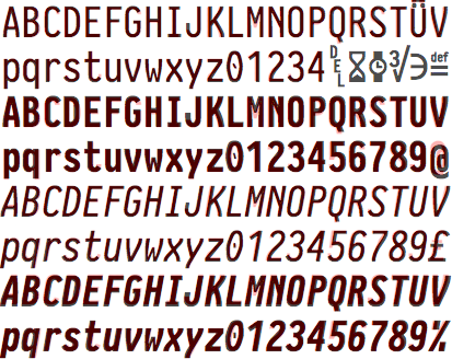
Yes, it's not a carbon copy. But metrics are pretty close.
The story
Do you love PragmataPro as I am? Probabbly you do, if you're reading this.
PragmataPro is awesome. It's condensed enough, but not too much. Its xHeight is spot on. Every character seems to be of the best possible shape for readability. There is no better font if you want to make most out of the screen real estate. But there is a catch: although it worth every penny, PragmataPro is not free.
There were many attemps to achieve same goals as PragmataPro did: condensed with increased xHeight. I can name a few:
But Iosevka stands out of the crowd the most. The sole intention from very beginning of this font was to immitate PragmataPro as closely as possible. And first public versions proves that. But with time the font matured to a framework that able to provide much more than just a copy of very good font.
Till the day we have SS08 stylistic set of Iosevka that mimics PragmataPro. But does it the best possible job?
Improving Iosevka SS08
Investigating public images of text written in PragmataPro and having quite limited time and resources I was able to spot following differences between The Original and SS08:
xHeightofSS08seems to be smaller;- The line height of
SS08seems to be larger; SS08Regular looks a tiny bit thinner;SS08Bold looks noticeably thinner;SS08punctuation marks are consistent with the rest of the font, while PragmataPro has them slightly bolder;- There are slight differences in programming ligatures used;
Luckly Iosevka allows some very sophisticated tweaking, so I have tried my best to improve on "poor man's Pragmata" by fixing these.
I want one
Head to Releases and pick the archive you like: the bare build or Nerd Fonts enabled one.
You can also build it locally by running:
make images && make font
If you want to use the font for web development, as a webfont, please use following instructions (shout out to @aperturerobotics):
# npm
npm install @aptre/pragmasevka

# yarn
yarn add @aptre/pragmasevka

# pnpm
pnpm add @aptre/pragmasevka
Usage
// Import in JS/TS
import '@aptre/pragmasevka';
@import "@aptre/pragmasevka/font.css";

/* Use in CSS */
font-family: 'Pragmasevka', monospace;
Improving it
Let's face it – PragmataPro is perfect. And we all should buy it. And I will go it too exactly that day I would get bored from playing with Iosevka. And meanwhile if you have spotted something that could be improved, please file an issue.
Thank you awesome community!
I have been away from the repo using the font happily day to day, and returning noticed several forks appeared addressing issues starting piling up with time. I went on a Easter Quest collecting all these improvements and bringing it back together. Special thank you:
- @gdubois – for solving issues which would took me hours to figure out!
- @aperturerobotics - for packaging webfont!
Also worth checking
- NRK-Mono - All benefits of JetBrains Mono with more condensed option;
- Iosvmata - More extended version of Pragmasevka;
- Iosevka Tree Lig - Very sane set of choices were made there!
- CommitMono - Overall very boring, but surprisingly very usable font;


Similar repos


Languages
Makefile
69.2%
Python
20.1%
Dockerfile
10.6%
README
Pragmasevka Font
Here is comparison with PragmataPro (black, the image taken from Wikipedia):
Yes, it's not a carbon copy. But metrics are pretty close.
The story
Do you love PragmataPro as I am? Probabbly you do, if you're reading this.
PragmataPro is awesome. It's condensed enough, but not too much. Its xHeight is spot on. Every character seems to be of the best possible shape for readability. There is no better font if you want to make most out of the screen real estate. But there is a catch: although it worth every penny, PragmataPro is not free.
There were many attemps to achieve same goals as PragmataPro did: condensed with increased xHeight. I can name a few:
But Iosevka stands out of the crowd the most. The sole intention from very beginning of this font was to immitate PragmataPro as closely as possible. And first public versions proves that. But with time the font matured to a framework that able to provide much more than just a copy of very good font.
Till the day we have SS08 stylistic set of Iosevka that mimics PragmataPro. But does it the best possible job?
Improving Iosevka SS08
Investigating public images of text written in PragmataPro and having quite limited time and resources I was able to spot following differences between The Original and SS08:
xHeightofSS08seems to be smaller;- The line height of
SS08seems to be larger; SS08Regular looks a tiny bit thinner;SS08Bold looks noticeably thinner;SS08punctuation marks are consistent with the rest of the font, while PragmataPro has them slightly bolder;- There are slight differences in programming ligatures used;
Luckly Iosevka allows some very sophisticated tweaking, so I have tried my best to improve on "poor man's Pragmata" by fixing these.
I want one
Head to Releases and pick the archive you like: the bare build or Nerd Fonts enabled one.
You can also build it locally by running:
make images && make font
If you want to use the font for web development, as a webfont, please use following instructions (shout out to @aperturerobotics):
# npm
npm install @aptre/pragmasevka

# yarn
yarn add @aptre/pragmasevka

# pnpm
pnpm add @aptre/pragmasevka
Usage
// Import in JS/TS
import '@aptre/pragmasevka';
@import "@aptre/pragmasevka/font.css";

/* Use in CSS */
font-family: 'Pragmasevka', monospace;
Improving it
Let's face it – PragmataPro is perfect. And we all should buy it. And I will go it too exactly that day I would get bored from playing with Iosevka. And meanwhile if you have spotted something that could be improved, please file an issue.
Thank you awesome community!
I have been away from the repo using the font happily day to day, and returning noticed several forks appeared addressing issues starting piling up with time. I went on a Easter Quest collecting all these improvements and bringing it back together. Special thank you:
- @gdubois – for solving issues which would took me hours to figure out!
- @aperturerobotics - for packaging webfont!
Also worth checking
- NRK-Mono - All benefits of JetBrains Mono with more condensed option;
- Iosvmata - More extended version of Pragmasevka;
- Iosevka Tree Lig - Very sane set of choices were made there!
- CommitMono - Overall very boring, but surprisingly very usable font;
Similar repos
Languages
Makefile
69.2%
Python
20.1%
Dockerfile
10.6%