Easy, cross-platform credit-card input for your React Native Project! Start accepting payment 💰 in your app today!
TypeScript
1,508
14 commits
updated Nov 10, 2025
Example on Expo Snack - Easy (and good looking) credit-card input for your React Native Project 💳 💳
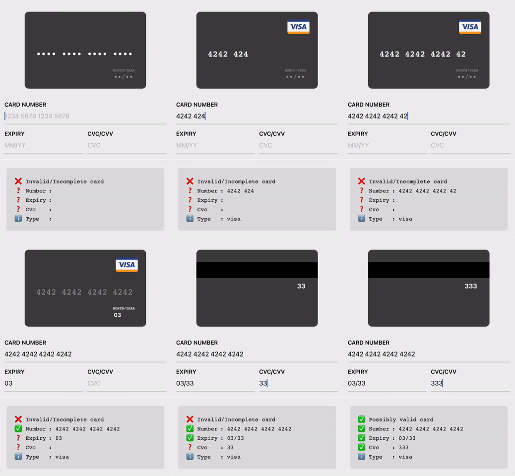

Code:
<CreditCardInput />
// or
<LiteCreditCardInput />
yarn add react-native-credit-card-input
then add these lines in your react-native codebase
import { CreditCardInput, LiteCreditCardInput } from "react-native-credit-card-input";

<CreditCardInput onChange={_onChange} />
// or
<LiteCreditCardInput onChange={_onChange} />

// Note: You'll need to enable LayoutAnimation on android to see LiteCreditCardInput's animations
// UIManager.setLayoutAnimationEnabledExperimental(true);
And then on your onChange handler:
_onChange => form => console.log(form);

// will print:
{
  valid: true, // will be true once all fields are "valid" (time to enable the submit button)
  values: { // will be in the sanitized and formatted form
  	number: "4242 4242",
  	expiry: "06/19",
  	cvc: "300",
  	type: "visa", // will be one of [null, "visa", "master-card", "american-express", "diners-club", "discover", "jcb", "unionpay", "maestro"]
  },
  status: {  // will be one of ["incomplete", "invalid", and "valid"]
	number: "incomplete",
	expiry: "incomplete",
	cvc: "incomplete",
  },
};
Or run it locally
yarn install

yarn example ios
# or
yarn example android
# or
yarn example web
| Prop | Type | Description |
|---|---|---|
autoFocus | boolean | Optional. Specifies if the input should auto-focus. |
style | ViewStyle | Optional. Custom style for the component's container. |
inputStyle | TextStyle | Optional. Custom style for the input fields. |
placeholderColor | string | Optional. Color for the placeholder text. |
placeholders | { number: string; expiry: string; cvc: string; } | Optional. Custom placeholders for the input fields. |
onChange | (formData: CreditCardFormData) => void | Required. Callback function called when form data changes. |
onFocusField | (field: CreditCardFormField) => void | Optional. Callback function called when a field gains focus. |
| Prop | Type | Description |
|---|---|---|
autoFocus | boolean | Optional. Specifies if the input should auto-focus. |
style | ViewStyle | Optional. Custom style for the component's container. |
labelStyle | TextStyle | Optional. Custom style for the labels. |
inputStyle | TextStyle | Optional. Custom style for the input fields. |
placeholderColor | string | Optional. Color for the placeholder text. |
labels | { number: string; expiry: string; cvc: string; } | Optional. Custom labels for the input fields. |
placeholders | { number: string; expiry: string; cvc: string; } | Optional. Custom placeholders for the input fields. |
onChange | (formData: CreditCardFormData) => void | Required. Callback function called when form data changes. |
onFocusField | (field: CreditCardFormField) => void | Optional. Callback function called when a field gains focus. |
| Prop | Type | Description |
|---|---|---|
focusedField | 'name' | 'number' | 'expiry' | 'cvc' | Optional. Specifies which field is currently focused. |
type | CreditCardIssuer | Optional. Specifies the type of the credit card issuer. |
name | string | Optional. The name on the credit card. |
number | string | Optional. The credit card number. |
expiry | string | Optional. The expiry date of the credit card. |
cvc | string | Optional. The CVC code of the credit card. |
placeholders | { number: string; expiry: string; cvc: string; name: string; } | Optional. Custom placeholders for the input fields. |
style | ViewStyle | Optional. Custom style for the component's container. |
fontFamily | string | Optional. Custom font family for the text. |
imageFront | ImageSourcePropType | Optional. Image source for the front of the credit card. |
imageBack | ImageSourcePropType | Optional. Image source for the back of the credit card. |
Overall
Maintained
Code review
Latest release
Releases this year
1,552 followers · starred Mar 2021
189 followers · starred Nov 2019
133 followers · starred Aug 2023
41 followers · starred Sep 2016
Easy, cross-platform credit-card input for your React Native Project! Start accepting payment 💰 in your app today!
TypeScript
1,508
14 commits
updated Nov 10, 2025
Example on Expo Snack - Easy (and good looking) credit-card input for your React Native Project 💳 💳
Code:
<CreditCardInput />
// or
<LiteCreditCardInput />
yarn add react-native-credit-card-input
then add these lines in your react-native codebase
import { CreditCardInput, LiteCreditCardInput } from "react-native-credit-card-input";

<CreditCardInput onChange={_onChange} />
// or
<LiteCreditCardInput onChange={_onChange} />

// Note: You'll need to enable LayoutAnimation on android to see LiteCreditCardInput's animations
// UIManager.setLayoutAnimationEnabledExperimental(true);
And then on your onChange handler:
_onChange => form => console.log(form);

// will print:
{
  valid: true, // will be true once all fields are "valid" (time to enable the submit button)
  values: { // will be in the sanitized and formatted form
  	number: "4242 4242",
  	expiry: "06/19",
  	cvc: "300",
  	type: "visa", // will be one of [null, "visa", "master-card", "american-express", "diners-club", "discover", "jcb", "unionpay", "maestro"]
  },
  status: {  // will be one of ["incomplete", "invalid", and "valid"]
	number: "incomplete",
	expiry: "incomplete",
	cvc: "incomplete",
  },
};
Or run it locally
yarn install

yarn example ios
# or
yarn example android
# or
yarn example web
| Prop | Type | Description |
|---|---|---|
autoFocus | boolean | Optional. Specifies if the input should auto-focus. |
style | ViewStyle | Optional. Custom style for the component's container. |
inputStyle | TextStyle | Optional. Custom style for the input fields. |
placeholderColor | string | Optional. Color for the placeholder text. |
placeholders | { number: string; expiry: string; cvc: string; } | Optional. Custom placeholders for the input fields. |
onChange | (formData: CreditCardFormData) => void | Required. Callback function called when form data changes. |
onFocusField | (field: CreditCardFormField) => void | Optional. Callback function called when a field gains focus. |
| Prop | Type | Description |
|---|---|---|
autoFocus | boolean | Optional. Specifies if the input should auto-focus. |
style | ViewStyle | Optional. Custom style for the component's container. |
labelStyle | TextStyle | Optional. Custom style for the labels. |
inputStyle | TextStyle | Optional. Custom style for the input fields. |
placeholderColor | string | Optional. Color for the placeholder text. |
labels | { number: string; expiry: string; cvc: string; } | Optional. Custom labels for the input fields. |
placeholders | { number: string; expiry: string; cvc: string; } | Optional. Custom placeholders for the input fields. |
onChange | (formData: CreditCardFormData) => void | Required. Callback function called when form data changes. |
onFocusField | (field: CreditCardFormField) => void | Optional. Callback function called when a field gains focus. |
| Prop | Type | Description |
|---|---|---|
focusedField | 'name' | 'number' | 'expiry' | 'cvc' | Optional. Specifies which field is currently focused. |
type | CreditCardIssuer | Optional. Specifies the type of the credit card issuer. |
name | string | Optional. The name on the credit card. |
number | string | Optional. The credit card number. |
expiry | string | Optional. The expiry date of the credit card. |
cvc | string | Optional. The CVC code of the credit card. |
placeholders | { number: string; expiry: string; cvc: string; name: string; } | Optional. Custom placeholders for the input fields. |
style | ViewStyle | Optional. Custom style for the component's container. |
fontFamily | string | Optional. Custom font family for the text. |
imageFront | ImageSourcePropType | Optional. Image source for the front of the credit card. |
imageBack | ImageSourcePropType | Optional. Image source for the back of the credit card. |
Overall
Maintained
Code review
Latest release
Releases this year
1,552 followers · starred Mar 2021
189 followers · starred Nov 2019
133 followers · starred Aug 2023
41 followers · starred Sep 2016



