
See what people are saying
README
react-table-dnd
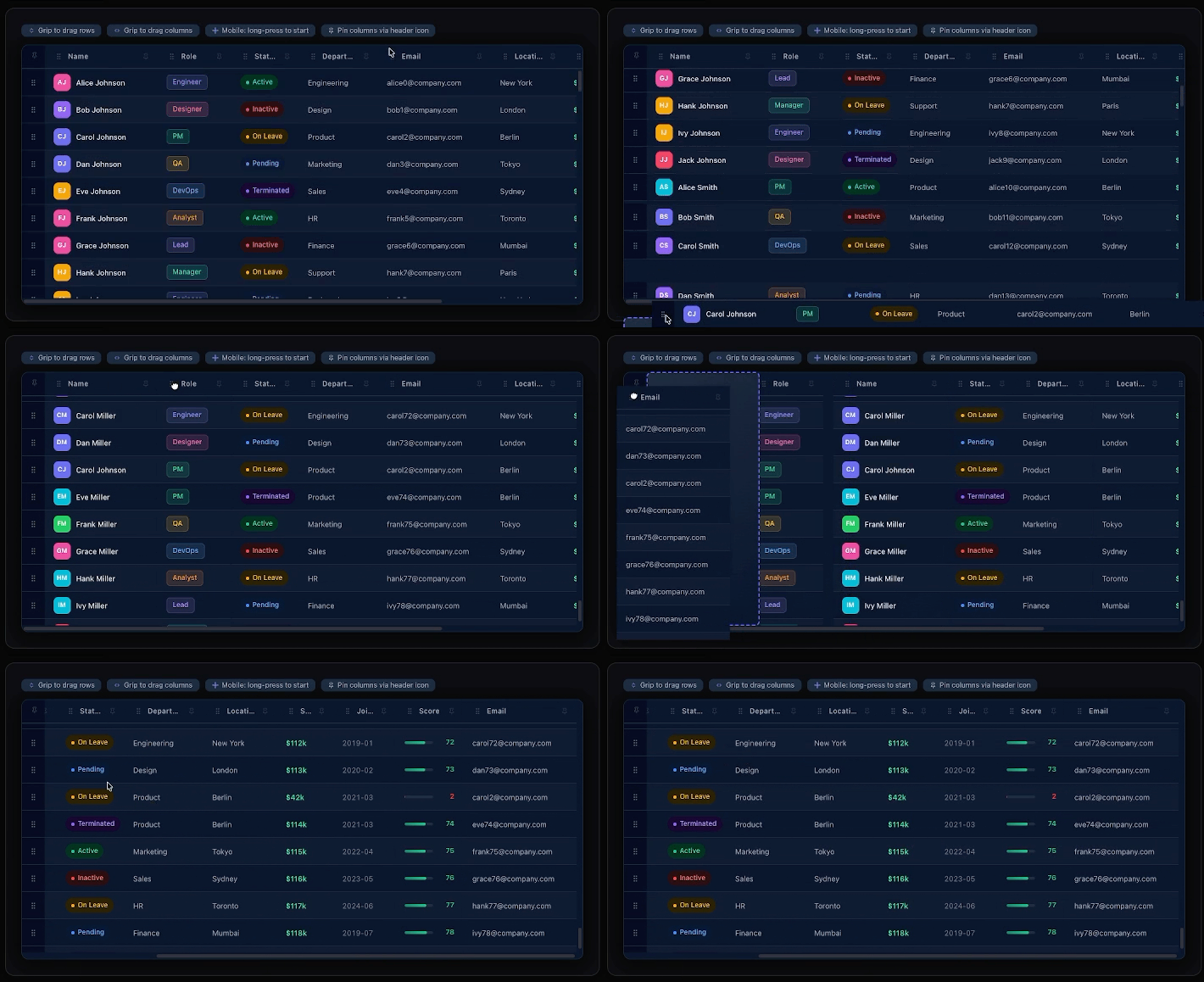
Drag-and-drop row & column reordering for React tables.


Upgrading from 2.x? The v2 README, architecture notes and examples are archived in
docs/v2/. See the changelog for what changed in 3.0.
Features
Reorder rows and columns, drag a multi-row selection as one group, virtual lists of 100,000+ rows, touch, drag handles, locked ranges. No dependencies besides React.
Install
npm install react-table-dnd
Requires
reactandreact-dom>= 18.0.0
Then import the styles once in your app entry (e.g. main.tsx):
import 'react-table-dnd/styles'
Quick Start
import { useState } from "react";
import {
  TableContainer, TableHeader, ColumnCell,
  TableBody, BodyRow, RowCell, moveRowsById,
} from "react-table-dnd";
import "react-table-dnd/styles";

// columns move one at a time: take one item out and put it back at targetIndex
function arrayMove(arr, from, to) {
  const next = [...arr];
  const [item] = next.splice(from, 1);
  next.splice(to, 0, item);
  return next;
}

export default function App() {
  const [cols, setCols] = useState([
    { id: "name", label: "Name", width: 150 },
    { id: "age",  label: "Age",  width: 100 },
    { id: "city", label: "City", width: 160 },
  ]);
  const [rows, setRows] = useState([
    { id: "1", name: "Alice", age: 28, city: "NYC" },
    { id: "2", name: "Bob",   age: 34, city: "LA" },
    { id: "3", name: "Carol", age: 22, city: "SF" },
  ]);

  return (
    <TableContainer
      onDragEnd={(r) => {
        // one row or the whole selection
        if (r.dragType === "row") setRows((prev) => moveRowsById(prev, r.selectedIds, r.insertIndex));
        else setCols((prev) => arrayMove(prev, r.sourceIndex, r.targetIndex));
      }}
    >
      <TableHeader>
        {cols.map((col, i) => (
          <ColumnCell key={col.id} id={col.id} index={i} style={{ width: col.width }}>
            {col.label}
          </ColumnCell>
        ))}
      </TableHeader>
      <TableBody>
        {rows.map((row, ri) => (
          <BodyRow key={row.id} id={row.id} index={ri}>
            {cols.map((col, ci) => (
              <RowCell key={col.id} index={ci}>
                {row[col.id]}
              </RowCell>
            ))}
          </BodyRow>
        ))}
      </TableBody>
    </TableContainer>
  );
}
API
Components
| Component | Props | Description |
|---|---|---|
TableContainer | onDragEnd, onDragStart, onDragOver, onDragCancel, options, renderPlaceholder, selectable, selectedIds, defaultSelectedIds, onSelectionChange, showDragCount, className, style | Root; provides the drag context |
TableHeader | className, style | Header row container |
ColumnCell | id, index, disabled, className, style | Draggable column header cell |
TableBody | className, style | Scrollable body. Its ref is the scroll element for a virtualizer |
BodyRow | id, index, disabled, className, style, styles, selectedClassName, selectedStyle | Draggable row. styles styles the row's outer element (the one a virtual list positions) |
RowCell | index, className, style | Cell within a row |
DragHandle | className, style | Only this element starts a drag |
SelectHandle | className, style | Only this element changes the selection |
Bold props are required. disabled means the row or column cannot be picked up (a row also cannot be selected); others can still be dropped around it (to pin items in place, use the drag ranges in options). Every component passes other HTML attributes (role, aria-*, data-*, title, …) to its element; TableContainer keeps onMouseDown / onTouchStart for itself. Every component's props type is exported: BodyRowProps, TableContainerProps, and so on.
Drag events
Besides onDragEnd, TableContainer takes onDragStart, onDragOver (the drop slot changed) and onDragCancel (Escape, the window lost focus, or released without moving). Every drag calls onDragStart, then either onDragEnd or onDragCancel.
TanStack Table
These components can render a TanStack Table, which keeps the column order while onDragEnd updates it. See the TanStack Table guide for a full example.
Column Width
Pass width inside the style prop on ColumnCell (a number, or a pixel string like "150px"; the default is 50). The RowCells in that column follow it. Columns grow proportionally by default to fill available space. To fix a column at exactly its pixel size, pass the same flex to the ColumnCell and to every RowCell in that column:
{/* default: grows to fill */}
<ColumnCell style={{ width: 150 }}>Name</ColumnCell>

{/* fixed at 150px */}
<ColumnCell style={{ width: 150, flex: "0 0 150px" }}>Name</ColumnCell>
<RowCell index={0} style={{ flex: "0 0 150px" }}>…</RowCell>
Types
// check dragType and TypeScript knows which fields are set
type DragEndResult = RowDragEndResult | ColumnDragEndResult;

interface RowDragEndResult {
  dragType: "row";
  id: string;               // the grabbed row
  sourceIndex: number;       // index of the row you grabbed
  targetIndex: number;       // where the grabbed row lands (a one-item move, as in 2.x)
  selectedIds: string[];     // every row that moved (rows scrolled out of view come last)
  sourceIndices: number[];   // their indices as rendered
  insertIndex: number;       // the slot in the original array: pass it to moveRowsById
}

interface ColumnDragEndResult {
  dragType: "column";
  id: string;               // the grabbed column
  sourceIndex: number;       // arrayMove(columns, sourceIndex, targetIndex)
  targetIndex: number;
}

// what onDragStart and onDragCancel receive
type DragStartInfo =
  | { dragType: "row"; id: string; sourceIndex: number; selectedIds: string[]; sourceIndices: number[] }
  | { dragType: "column"; id: string; sourceIndex: number };
interface DragCancelInfo { dragType: "row" | "column"; id: string; sourceIndex: number }

interface DragRange {
  start?: number;  // first draggable index
  end?: number;    // last draggable index (inclusive)
}
Options
<TableContainer
  options={{
    rowDragRange: { start: 1 },        // lock first row
    columnDragRange: { start: 1, end: 5 }, // lock first col, only 1-5 draggable
  }}
/>
Drag Handle
import { DragHandle } from "react-table-dnd";

<BodyRow id="1" index={0}>
  <RowCell index={0}>
    <DragHandle><GripIcon /></DragHandle>
    Content here
  </RowCell>
</BodyRow>
Multi-select
Turn on selectable and rows select with a click, Ctrl/Cmd+click (toggle) and Shift+click (range); a tap on touch. Dragging a selected row moves the whole selection. With selectable on, a row drag starts after the pointer moves a few pixels, so a click stays a click.
import { TableContainer, moveRowsById } from "react-table-dnd";

const [selected, setSelected] = useState([]);

<TableContainer
  selectable
  selectedIds={selected}            // controlled; omit to let the table keep it
  onSelectionChange={setSelected}   // ids as strings, in table order
  onDragEnd={({ dragType, sourceIndex, targetIndex, selectedIds, insertIndex }) => {
    if (dragType === "column") setCols((prev) => arrayMove(prev, sourceIndex, targetIndex));
    else setRows((prev) => moveRowsById(prev, selectedIds, insertIndex)); // one row or the whole selection
  }}
/>
Selected rows get data-selected="true"; selectedClassName / selectedStyle on BodyRow also work. Checkboxes, touch, virtual tables and locked rows: Multi-select guide.
Custom Placeholder
<TableContainer
  renderPlaceholder={() => (
    <div style={{
      background: "#6366f122",
      border: "2px dashed #6366f1",
      height: "100%",
    }} />
  )}
/>
Styling
Every component accepts className and style. No opinionated styles on cells.
| Inline | Tailwind | styled-components |
|
|
|
Styling hooks
| Selector / variable | What it targets |
|---|---|
[data-selected="true"] | a selected row's [data-rtdnd='tr'] element (or use selectedClassName / selectedStyle) |
[data-drop-target] | the row or column the drop will land on, while dragging (style the [data-rtdnd='tr'] or [data-rtdnd='th'] inside it) |
[data-rtdnd='drag-count'] | the count badge on the group drag card |
[data-rtdnd='drag-stack'] | the two ghost cards under the group drag card |
[data-rtdnd='clone'] | the drag card itself; it carries [data-group-size] while several rows move |
--rtdnd-card-bg | the drag card's colour when several rows move, copied from the row's first cell, the row or the table body, whichever has a solid background; to force one, set it on the card: [data-group-size] { --rtdnd-card-bg: #1e293b !important; } |
Advanced: the store
useTable(), useTableStore(selector) and useTableDispatch() read and update the table's internal store from a component rendered inside TableContainer. They are exported for advanced integrations and marked experimental: the state shape and action types are internal and may change in a minor release. Prefer the props above.
A useTableStore selector must return a primitive or an existing reference ((s) => s.dragged.isDragging, (s) => s.selection), never a new object: (s) => ({ ... }) re-renders forever.
Server-side rendering
The components render on the server; dragging starts on the client after hydration. In the Next.js App Router, put your table in a component that starts with 'use client'. Both ESM (import) and CommonJS (require) entry points are published, with types for each.
Browser support
Current Chrome, Firefox, Safari and Edge, on desktop and mobile.
Contributing
git clone https://github.com/samiodeh1337/react-table-dnd.git
cd react-table-dnd
npm install
npm run dev    # docs site at localhost:5173
npm test       # unit tests (vitest) for the pure drag logic under src/hooks/drag/
npm run lint && npm run format:check
License
Similar repos


Languages
TypeScript
79.0%
JavaScript
17.9%
CSS
1.8%
HTML
1.2%
See what people are saying
README
react-table-dnd
Drag-and-drop row & column reordering for React tables.
Upgrading from 2.x? The v2 README, architecture notes and examples are archived in
docs/v2/. See the changelog for what changed in 3.0.
Features
Reorder rows and columns, drag a multi-row selection as one group, virtual lists of 100,000+ rows, touch, drag handles, locked ranges. No dependencies besides React.
Install
npm install react-table-dnd
Requires
reactandreact-dom>= 18.0.0
Then import the styles once in your app entry (e.g. main.tsx):
import 'react-table-dnd/styles'
Quick Start
import { useState } from "react";
import {
  TableContainer, TableHeader, ColumnCell,
  TableBody, BodyRow, RowCell, moveRowsById,
} from "react-table-dnd";
import "react-table-dnd/styles";

// columns move one at a time: take one item out and put it back at targetIndex
function arrayMove(arr, from, to) {
  const next = [...arr];
  const [item] = next.splice(from, 1);
  next.splice(to, 0, item);
  return next;
}

export default function App() {
  const [cols, setCols] = useState([
    { id: "name", label: "Name", width: 150 },
    { id: "age",  label: "Age",  width: 100 },
    { id: "city", label: "City", width: 160 },
  ]);
  const [rows, setRows] = useState([
    { id: "1", name: "Alice", age: 28, city: "NYC" },
    { id: "2", name: "Bob",   age: 34, city: "LA" },
    { id: "3", name: "Carol", age: 22, city: "SF" },
  ]);

  return (
    <TableContainer
      onDragEnd={(r) => {
        // one row or the whole selection
        if (r.dragType === "row") setRows((prev) => moveRowsById(prev, r.selectedIds, r.insertIndex));
        else setCols((prev) => arrayMove(prev, r.sourceIndex, r.targetIndex));
      }}
    >
      <TableHeader>
        {cols.map((col, i) => (
          <ColumnCell key={col.id} id={col.id} index={i} style={{ width: col.width }}>
            {col.label}
          </ColumnCell>
        ))}
      </TableHeader>
      <TableBody>
        {rows.map((row, ri) => (
          <BodyRow key={row.id} id={row.id} index={ri}>
            {cols.map((col, ci) => (
              <RowCell key={col.id} index={ci}>
                {row[col.id]}
              </RowCell>
            ))}
          </BodyRow>
        ))}
      </TableBody>
    </TableContainer>
  );
}
API
Components
| Component | Props | Description |
|---|---|---|
TableContainer | onDragEnd, onDragStart, onDragOver, onDragCancel, options, renderPlaceholder, selectable, selectedIds, defaultSelectedIds, onSelectionChange, showDragCount, className, style | Root; provides the drag context |
TableHeader | className, style | Header row container |
ColumnCell | id, index, disabled, className, style | Draggable column header cell |
TableBody | className, style | Scrollable body. Its ref is the scroll element for a virtualizer |
BodyRow | id, index, disabled, className, style, styles, selectedClassName, selectedStyle | Draggable row. styles styles the row's outer element (the one a virtual list positions) |
RowCell | index, className, style | Cell within a row |
DragHandle | className, style | Only this element starts a drag |
SelectHandle | className, style | Only this element changes the selection |
Bold props are required. disabled means the row or column cannot be picked up (a row also cannot be selected); others can still be dropped around it (to pin items in place, use the drag ranges in options). Every component passes other HTML attributes (role, aria-*, data-*, title, …) to its element; TableContainer keeps onMouseDown / onTouchStart for itself. Every component's props type is exported: BodyRowProps, TableContainerProps, and so on.
Drag events
Besides onDragEnd, TableContainer takes onDragStart, onDragOver (the drop slot changed) and onDragCancel (Escape, the window lost focus, or released without moving). Every drag calls onDragStart, then either onDragEnd or onDragCancel.
TanStack Table
These components can render a TanStack Table, which keeps the column order while onDragEnd updates it. See the TanStack Table guide for a full example.
Column Width
Pass width inside the style prop on ColumnCell (a number, or a pixel string like "150px"; the default is 50). The RowCells in that column follow it. Columns grow proportionally by default to fill available space. To fix a column at exactly its pixel size, pass the same flex to the ColumnCell and to every RowCell in that column:
{/* default: grows to fill */}
<ColumnCell style={{ width: 150 }}>Name</ColumnCell>

{/* fixed at 150px */}
<ColumnCell style={{ width: 150, flex: "0 0 150px" }}>Name</ColumnCell>
<RowCell index={0} style={{ flex: "0 0 150px" }}>…</RowCell>
Types
// check dragType and TypeScript knows which fields are set
type DragEndResult = RowDragEndResult | ColumnDragEndResult;

interface RowDragEndResult {
  dragType: "row";
  id: string;               // the grabbed row
  sourceIndex: number;       // index of the row you grabbed
  targetIndex: number;       // where the grabbed row lands (a one-item move, as in 2.x)
  selectedIds: string[];     // every row that moved (rows scrolled out of view come last)
  sourceIndices: number[];   // their indices as rendered
  insertIndex: number;       // the slot in the original array: pass it to moveRowsById
}

interface ColumnDragEndResult {
  dragType: "column";
  id: string;               // the grabbed column
  sourceIndex: number;       // arrayMove(columns, sourceIndex, targetIndex)
  targetIndex: number;
}

// what onDragStart and onDragCancel receive
type DragStartInfo =
  | { dragType: "row"; id: string; sourceIndex: number; selectedIds: string[]; sourceIndices: number[] }
  | { dragType: "column"; id: string; sourceIndex: number };
interface DragCancelInfo { dragType: "row" | "column"; id: string; sourceIndex: number }

interface DragRange {
  start?: number;  // first draggable index
  end?: number;    // last draggable index (inclusive)
}
Options
<TableContainer
  options={{
    rowDragRange: { start: 1 },        // lock first row
    columnDragRange: { start: 1, end: 5 }, // lock first col, only 1-5 draggable
  }}
/>
Drag Handle
import { DragHandle } from "react-table-dnd";

<BodyRow id="1" index={0}>
  <RowCell index={0}>
    <DragHandle><GripIcon /></DragHandle>
    Content here
  </RowCell>
</BodyRow>
Multi-select
Turn on selectable and rows select with a click, Ctrl/Cmd+click (toggle) and Shift+click (range); a tap on touch. Dragging a selected row moves the whole selection. With selectable on, a row drag starts after the pointer moves a few pixels, so a click stays a click.
import { TableContainer, moveRowsById } from "react-table-dnd";

const [selected, setSelected] = useState([]);

<TableContainer
  selectable
  selectedIds={selected}            // controlled; omit to let the table keep it
  onSelectionChange={setSelected}   // ids as strings, in table order
  onDragEnd={({ dragType, sourceIndex, targetIndex, selectedIds, insertIndex }) => {
    if (dragType === "column") setCols((prev) => arrayMove(prev, sourceIndex, targetIndex));
    else setRows((prev) => moveRowsById(prev, selectedIds, insertIndex)); // one row or the whole selection
  }}
/>
Selected rows get data-selected="true"; selectedClassName / selectedStyle on BodyRow also work. Checkboxes, touch, virtual tables and locked rows: Multi-select guide.
Custom Placeholder
<TableContainer
  renderPlaceholder={() => (
    <div style={{
      background: "#6366f122",
      border: "2px dashed #6366f1",
      height: "100%",
    }} />
  )}
/>
Styling
Every component accepts className and style. No opinionated styles on cells.
| Inline | Tailwind | styled-components |
|
|
|
Styling hooks
| Selector / variable | What it targets |
|---|---|
[data-selected="true"] | a selected row's [data-rtdnd='tr'] element (or use selectedClassName / selectedStyle) |
[data-drop-target] | the row or column the drop will land on, while dragging (style the [data-rtdnd='tr'] or [data-rtdnd='th'] inside it) |
[data-rtdnd='drag-count'] | the count badge on the group drag card |
[data-rtdnd='drag-stack'] | the two ghost cards under the group drag card |
[data-rtdnd='clone'] | the drag card itself; it carries [data-group-size] while several rows move |
--rtdnd-card-bg | the drag card's colour when several rows move, copied from the row's first cell, the row or the table body, whichever has a solid background; to force one, set it on the card: [data-group-size] { --rtdnd-card-bg: #1e293b !important; } |
Advanced: the store
useTable(), useTableStore(selector) and useTableDispatch() read and update the table's internal store from a component rendered inside TableContainer. They are exported for advanced integrations and marked experimental: the state shape and action types are internal and may change in a minor release. Prefer the props above.
A useTableStore selector must return a primitive or an existing reference ((s) => s.dragged.isDragging, (s) => s.selection), never a new object: (s) => ({ ... }) re-renders forever.
Server-side rendering
The components render on the server; dragging starts on the client after hydration. In the Next.js App Router, put your table in a component that starts with 'use client'. Both ESM (import) and CommonJS (require) entry points are published, with types for each.
Browser support
Current Chrome, Firefox, Safari and Edge, on desktop and mobile.
Contributing
git clone https://github.com/samiodeh1337/react-table-dnd.git
cd react-table-dnd
npm install
npm run dev    # docs site at localhost:5173
npm test       # unit tests (vitest) for the pure drag logic under src/hooks/drag/
npm run lint && npm run format:check
License
Similar repos
Languages
TypeScript
79.0%
JavaScript
17.9%
CSS
1.8%
HTML
1.2%