
Neumorphic containers and text widget primitives to serve as the foundation of your own unique neumorphic designs.
C++
459
48 commits
updated Feb 2, 2024
README
Clay Containers
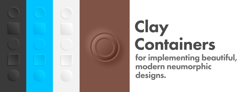
Easily create and customize beautiful, modern neumorphic containers for your Flutter project. These clay containers can become the basis for your own unique neumorphic designs.
Installation
Add clay_containers to your project as a dependency in your pubspec.yaml file. This is a simple Dart plugin, so additional configuration for iOS and Android is not needed.
Examples
Simple ClayContainer
For best results, set the background
color of a surrounding widget to match
the color you will set for your clay
container. Since it is likely you'll reuse this base color
multiple times (especially if you end up doing something fancy)
it's good to set this color to a single value. In the following example it
is set to baseColor.
import 'package:clay_containers/clay_containers.dart';

class MyExampleScreen extends StatelessWidget {
  @override
  Widget build(BuildContext context) {
    Color baseColor = Color(0xFFF2F2F2);

    return Container(
        color: baseColor,
        child: Center(
          child: ClayContainer(
            color: baseColor,
            height: 200,
            width: 200,
          ),
        ),
      );
  }
}

ClayContainer with a ClayText Child.
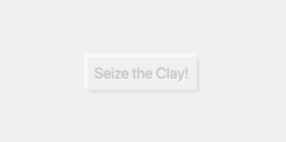
In the previous example the ClayContainer was given height
and width since it has no child. ClayContainer behaves the
same as a normal Container and needs to be either given
height and width or a child to be visible. In the
following example, the ClayContainer will receive a child.
The child it will receive is a ClayText wrapped in some Padding.
ClayContainer(
          color: baseColor,
          child: Padding(
            padding: EdgeInsets.all(20),
            child: ClayText("Seize the Clay!", emboss: true, size: 40),
          ),
        ),
Rounded ClayContainers
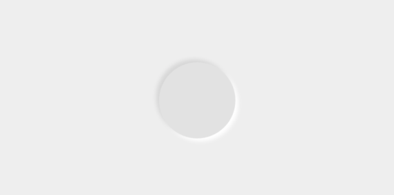
Don't be a square! Use borderRadius to add some flare. If you want a uniform borderRadius you can simply set it directly in the ClayContainer constructor.
ClayContainer(
          color: baseColor,
          height: 150,
          width: 150,
          borderRadius: 50,
        ),

If you want to pass your own custom BorderRadius object, that is available as well: In that case pass it to customBorderRadius.
ClayContainer(
          color: baseColor,
          height: 150,
          width: 150,
          customBorderRadius: BorderRadius.only(
              topRight: Radius.elliptical(150, 150),
              bottomLeft: Radius.circular(50)),
        ),

Embossed ClayContainers
You may have noticed earlier that the ClayText can receive an emboss property. ClayContainers can as well. All clay widgets start in a debossed state by default.
ClayContainer(
          emboss: true,
          color: baseColor,
          height: 150,
          width: 150,
          borderRadius: 50,
        ),
Change Default Spread and Depth
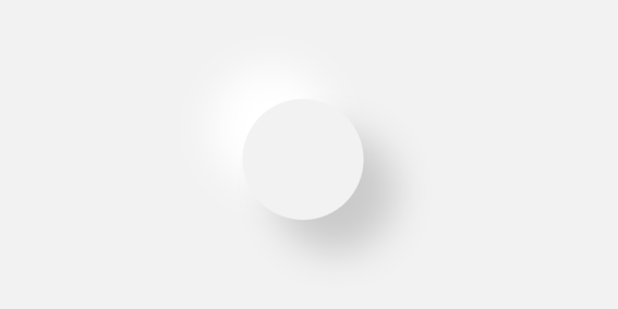
Don't like the default look of the neumorphic effect? Change the base variables. Do whatever you want. I'm not your mom.
ClayContainer(
          color: baseColor,
          height: 150,
          width: 150,
          borderRadius: 75,
          depth: 40,
          spread: 40,
        ),
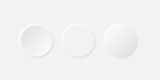
Concave and Convex ClayContainers
Give your ClayContainer a convex or a concave look by passing either CurveType.concave or CurveType.convex to the curveType parameter.
Row(
          mainAxisAlignment: MainAxisAlignment.center,
          children: <Widget>[
            ClayContainer(
              color: baseColor,
              height: 150,
              width: 150,
              borderRadius: 75,
              curveType: CurveType.concave,
            ),
            SizedBox(width: 50),
            ClayContainer(
              color: baseColor,
              height: 150,
              width: 150,
              borderRadius: 75,
              curveType: CurveType.none,
            ),
            SizedBox(width: 50),
            ClayContainer(
              color: baseColor,
              height: 150,
              width: 150,
              borderRadius: 75,
              curveType: CurveType.convex,
            ),
          ],
        ),
Animate It!
You can use a ClayAnimatedContainer to create animations in the same way as you would an AnimatedContainer. An explanation of AnimatedContainers can be found on the Google Developers channel on YouTube.

Theming
You asked for it, you got it. Now you can specify your clay container's properties high up in your widget tree and that theme will apply to every ClayContainer you create under that ClayTheme. Simply introduce the ClayTheme anywhere in your widget tree and pass it a ClayThemeData to it's themeData property.
ClayTheme(
  themeData: const ClayThemeData(
    height: 10,
    width: 20,
    borderRadius: 360,
    textTheme: ClayTextTheme(style: TextStyle()),
    depth: 12,
  ),
  child: (...),
);
Now any clay widget that is a child of this ClayTheme will inherit it's theme.
Also note that ClayTextTheme will handle the theme of your ClayText.
You can override any of these properties to give a specific clay widget custom theming. Simply give that property a value when you create it.
ClayTheme(
  themeData: const ClayThemeData(
    height: 10,
    width: 20,
    borderRadius: 360,
    textTheme: ClayTextTheme(style: TextStyle()),
    depth: 12,
  ),
  child: ClayAnimatedContainer(
      height: 240,
      width: 240,
      child: ClayContainer(
          borderRadius: 10,
      ),
  ),
);
Now, the ClayAnimatedContainer in the code above will have a height and width of 240, ignoring the 10 and 20 height and width respectively passed to the ClayTheme, but the ClayContainer will rather take height and width of 10 and 20 respectively, which is from the ClayTheme, but will override the borderRadius with a 10.
Both the ClayThemeData and the ClayTextTheme have only one default value
color: const Color(0xFFf0f0f0);
Full API Documentation
ClayContainer
Positional Arguments
None.
Named Arguments
- color - This sets the base color for the clay object. Simply setting this to the background color of the parent object will give you a pretty good looking debossed neumorphic effect.
- height - This sets the height of the container.
- width - This sets the width of the container.
- parentColor - This tells the widget to use a different color for the outside emboss/deboss effect, despite whatever is set in the
colorfield. - surfaceColor - This tells the widget to use a different color for the inside of the container, despite whatever is set in the
colorfield. - spread - How far should the emboss/deboss effect spread?
- depth - How strong should the emboss/deboss effect be?
- child - This receives child widgets.
- borderRadius - This receives a number representing a border radius to be applied to all corners of the container.
- customBorderRadius - This receives a
BorderRadiusobject. Setting this object will override whatever is set in theborderRadiusfield. - curveType - This receives a
CurveTypeenum. Use this to set the inside surface to look either convex or concave. - emboss - This is
falseby default. Set this totruein order to make an embossed container.
ClayText
Positional Arguments
- text - This is the text to be displayed.
Named Arguments
- color - This sets the base color for the clay object. Simply setting this to the background color of the parent object will give you a pretty good looking debossed neumorphic effect.
- parentColor - This tells the widget to use a different color for the outside emboss/deboss effect, despite whatever is set in the
colorfield. - textColor - This tells the widget to use a different color for the fill of the text, despite whatever is set in the
colorfield. - spread - How far should the emboss/deboss effect spread?
- depth - How strong should the emboss/deboss effect be?
- emboss - This is
falseby default. Set this totruein order to make an embossed container.
ClayAnimatedContainer
Positional Arguments
None.
Named Arguments
- duration - The duration over which to animate the parameters of this container.
- curve - The curve to apply when animating the parameters of this container.
- Additional parameters are identical to
ClayContainer.
Contributors


Similar repos


Languages
C++
32.9%
Dart
32.0%
CMake
27.7%
HTML
2.6%
Swift
2.5%
C
2.0%
Neumorphic containers and text widget primitives to serve as the foundation of your own unique neumorphic designs.
C++
459
48 commits
updated Feb 2, 2024
README
Clay Containers
Easily create and customize beautiful, modern neumorphic containers for your Flutter project. These clay containers can become the basis for your own unique neumorphic designs.
Installation
Add clay_containers to your project as a dependency in your pubspec.yaml file. This is a simple Dart plugin, so additional configuration for iOS and Android is not needed.
Examples
Simple ClayContainer
For best results, set the background
color of a surrounding widget to match
the color you will set for your clay
container. Since it is likely you'll reuse this base color
multiple times (especially if you end up doing something fancy)
it's good to set this color to a single value. In the following example it
is set to baseColor.
import 'package:clay_containers/clay_containers.dart';

class MyExampleScreen extends StatelessWidget {
  @override
  Widget build(BuildContext context) {
    Color baseColor = Color(0xFFF2F2F2);

    return Container(
        color: baseColor,
        child: Center(
          child: ClayContainer(
            color: baseColor,
            height: 200,
            width: 200,
          ),
        ),
      );
  }
}
ClayContainer with a ClayText Child.
In the previous example the ClayContainer was given height
and width since it has no child. ClayContainer behaves the
same as a normal Container and needs to be either given
height and width or a child to be visible. In the
following example, the ClayContainer will receive a child.
The child it will receive is a ClayText wrapped in some Padding.
ClayContainer(
          color: baseColor,
          child: Padding(
            padding: EdgeInsets.all(20),
            child: ClayText("Seize the Clay!", emboss: true, size: 40),
          ),
        ),
Rounded ClayContainers
Don't be a square! Use borderRadius to add some flare. If you want a uniform borderRadius you can simply set it directly in the ClayContainer constructor.
ClayContainer(
          color: baseColor,
          height: 150,
          width: 150,
          borderRadius: 50,
        ),
If you want to pass your own custom BorderRadius object, that is available as well: In that case pass it to customBorderRadius.
ClayContainer(
          color: baseColor,
          height: 150,
          width: 150,
          customBorderRadius: BorderRadius.only(
              topRight: Radius.elliptical(150, 150),
              bottomLeft: Radius.circular(50)),
        ),
Embossed ClayContainers
You may have noticed earlier that the ClayText can receive an emboss property. ClayContainers can as well. All clay widgets start in a debossed state by default.
ClayContainer(
          emboss: true,
          color: baseColor,
          height: 150,
          width: 150,
          borderRadius: 50,
        ),
Change Default Spread and Depth
Don't like the default look of the neumorphic effect? Change the base variables. Do whatever you want. I'm not your mom.
ClayContainer(
          color: baseColor,
          height: 150,
          width: 150,
          borderRadius: 75,
          depth: 40,
          spread: 40,
        ),
Concave and Convex ClayContainers
Give your ClayContainer a convex or a concave look by passing either CurveType.concave or CurveType.convex to the curveType parameter.
Row(
          mainAxisAlignment: MainAxisAlignment.center,
          children: <Widget>[
            ClayContainer(
              color: baseColor,
              height: 150,
              width: 150,
              borderRadius: 75,
              curveType: CurveType.concave,
            ),
            SizedBox(width: 50),
            ClayContainer(
              color: baseColor,
              height: 150,
              width: 150,
              borderRadius: 75,
              curveType: CurveType.none,
            ),
            SizedBox(width: 50),
            ClayContainer(
              color: baseColor,
              height: 150,
              width: 150,
              borderRadius: 75,
              curveType: CurveType.convex,
            ),
          ],
        ),
Animate It!
You can use a ClayAnimatedContainer to create animations in the same way as you would an AnimatedContainer. An explanation of AnimatedContainers can be found on the Google Developers channel on YouTube.
Theming
You asked for it, you got it. Now you can specify your clay container's properties high up in your widget tree and that theme will apply to every ClayContainer you create under that ClayTheme. Simply introduce the ClayTheme anywhere in your widget tree and pass it a ClayThemeData to it's themeData property.
ClayTheme(
  themeData: const ClayThemeData(
    height: 10,
    width: 20,
    borderRadius: 360,
    textTheme: ClayTextTheme(style: TextStyle()),
    depth: 12,
  ),
  child: (...),
);
Now any clay widget that is a child of this ClayTheme will inherit it's theme.
Also note that ClayTextTheme will handle the theme of your ClayText.
You can override any of these properties to give a specific clay widget custom theming. Simply give that property a value when you create it.
ClayTheme(
  themeData: const ClayThemeData(
    height: 10,
    width: 20,
    borderRadius: 360,
    textTheme: ClayTextTheme(style: TextStyle()),
    depth: 12,
  ),
  child: ClayAnimatedContainer(
      height: 240,
      width: 240,
      child: ClayContainer(
          borderRadius: 10,
      ),
  ),
);
Now, the ClayAnimatedContainer in the code above will have a height and width of 240, ignoring the 10 and 20 height and width respectively passed to the ClayTheme, but the ClayContainer will rather take height and width of 10 and 20 respectively, which is from the ClayTheme, but will override the borderRadius with a 10.
Both the ClayThemeData and the ClayTextTheme have only one default value
color: const Color(0xFFf0f0f0);
Full API Documentation
ClayContainer
Positional Arguments
None.
Named Arguments
- color - This sets the base color for the clay object. Simply setting this to the background color of the parent object will give you a pretty good looking debossed neumorphic effect.
- height - This sets the height of the container.
- width - This sets the width of the container.
- parentColor - This tells the widget to use a different color for the outside emboss/deboss effect, despite whatever is set in the
colorfield. - surfaceColor - This tells the widget to use a different color for the inside of the container, despite whatever is set in the
colorfield. - spread - How far should the emboss/deboss effect spread?
- depth - How strong should the emboss/deboss effect be?
- child - This receives child widgets.
- borderRadius - This receives a number representing a border radius to be applied to all corners of the container.
- customBorderRadius - This receives a
BorderRadiusobject. Setting this object will override whatever is set in theborderRadiusfield. - curveType - This receives a
CurveTypeenum. Use this to set the inside surface to look either convex or concave. - emboss - This is
falseby default. Set this totruein order to make an embossed container.
ClayText
Positional Arguments
- text - This is the text to be displayed.
Named Arguments
- color - This sets the base color for the clay object. Simply setting this to the background color of the parent object will give you a pretty good looking debossed neumorphic effect.
- parentColor - This tells the widget to use a different color for the outside emboss/deboss effect, despite whatever is set in the
colorfield. - textColor - This tells the widget to use a different color for the fill of the text, despite whatever is set in the
colorfield. - spread - How far should the emboss/deboss effect spread?
- depth - How strong should the emboss/deboss effect be?
- emboss - This is
falseby default. Set this totruein order to make an embossed container.
ClayAnimatedContainer
Positional Arguments
None.
Named Arguments
- duration - The duration over which to animate the parameters of this container.
- curve - The curve to apply when animating the parameters of this container.
- Additional parameters are identical to
ClayContainer.
Similar repos
Contributors
Languages
C++
32.9%
Dart
32.0%
CMake
27.7%
HTML
2.6%
Swift
2.5%
C
2.0%