
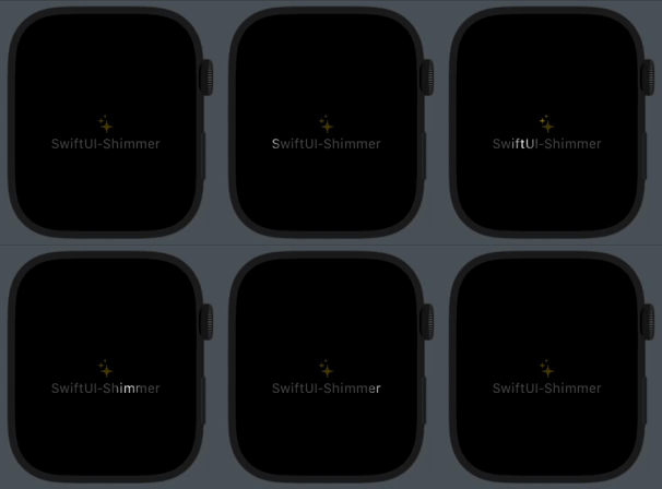
Shimmer is a super-light modifier that adds a shimmering effect to any SwiftUI View, for example, to show that an operation is in progress. It works well on light and dark modes, and across iOS, macOS, tvOS, watchOS and visionOS.
1,693
stars
23
commits
Swift
primary language
Aug 14, 2024
updated
README
SwiftUI-Shimmer ✨
Shimmer is a super-light modifier that adds a "shimmering" effect to any SwiftUI View, for example, to show that an operation is in progress. It works well on light and dark modes, left-to-right and right-to-left layout directions, and across all Apple platforms: iOS, macOS, tvOS, watchOS and even visionOS! 📱💻🖥️📺⌚️🥽✨

Usage
import SwiftUI
import Shimmer
⋮
⋮
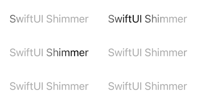
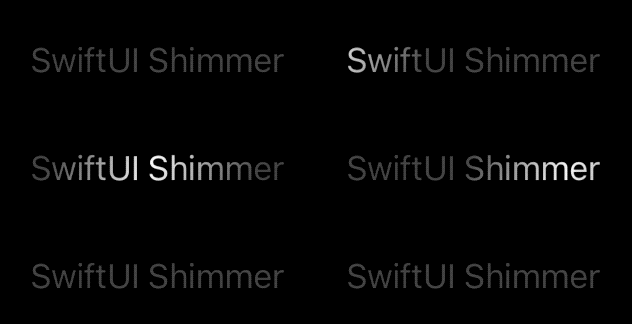
Text("SwiftUI Shimmer").modifier(Shimmer())
or more conveniently
Text("SwiftUI Shimmer").shimmering()
Optional Parameters ⚙️
active: Convenience parameter to conditionally enable the effect. Defaults totrue.animation: A custom animation. Defaults toShimmer.defaultAnimation.gradient: A custom gradient. Defaults toShimmer.defaultGradient.bandSize: The size of the animated mask's "band". Defaults to 0.2 unit points, which corresponds to 20% of the extent of the gradient.
Backward Compatible Parameters
active: Convenience parameter to conditionally enable the effect. Defaults totrue.duration: The duration of a shimmer cycle in seconds. Default:1.5.bounce: Whether to bounce (reverse) the animation back and forth. Defaults tofalse.delay: A delay in seconds. Defaults to0.
Custom Animations
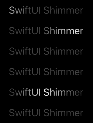
You can supply any custom animation:
Text("Loading...")
    .shimmering(
        active: isAnimating,
        animation: .easeInOut(duration: 2).repeatCount(5, autoreverses: false).delay(1)
    )
Gradient Mode
In addition to the original masking mode (which is still the default), Shimmer now supports additional modes to apply the gradient, including as a background or an overlay with a custom blend mode:

Text("Custom Gradient Mode").bold()
    .font(.largeTitle)
    .shimmering(
        gradient: Gradient(colors: [.clear, .orange, .white, .green, .clear]),
        bandSize: 0.5,
        mode: .overlay()
    )
Animated Skeletons ☠️
Of course, you can combine .shimmering(...) with the .redacted(...) modifier to create interesting animated skeleton views.
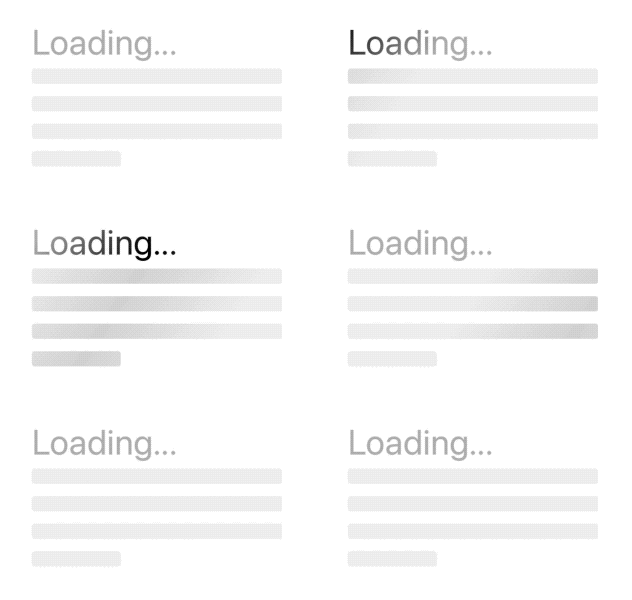
Text("Some text")
    .redacted(reason: .placeholder)
    .shimmering()
Right-To-Left (RTL) Support
The mask and animation now adjusts automatically to the environment's layoutDirection in order to better support
different languages and locales.
Installation
Swift Package Manager
Use the package URL or search for the SwiftUI-Shimmer package: https://github.com/markiv/SwiftUI-Shimmer.
For how-to integrate package dependencies refer to Adding Package Dependencies to Your App documentation.
Cocoapods
Add this to your Podfile:
pod 'SwiftUI-Shimmer', :git => 'https://github.com/markiv/SwiftUI-Shimmer.git'
What About UIKit?
For an older, UIKit-based shimmer effect, see UIView-Shimmer.


Similar repos


Languages
Swift
91.0%
Ruby
9.0%
Shimmer is a super-light modifier that adds a shimmering effect to any SwiftUI View, for example, to show that an operation is in progress. It works well on light and dark modes, and across iOS, macOS, tvOS, watchOS and visionOS.
1,693
stars
23
commits
Swift
primary language
Aug 14, 2024
updated
README
SwiftUI-Shimmer ✨
Shimmer is a super-light modifier that adds a "shimmering" effect to any SwiftUI View, for example, to show that an operation is in progress. It works well on light and dark modes, left-to-right and right-to-left layout directions, and across all Apple platforms: iOS, macOS, tvOS, watchOS and even visionOS! 📱💻🖥️📺⌚️🥽✨
Usage
import SwiftUI
import Shimmer
⋮
⋮
Text("SwiftUI Shimmer").modifier(Shimmer())
or more conveniently
Text("SwiftUI Shimmer").shimmering()
Optional Parameters ⚙️
active: Convenience parameter to conditionally enable the effect. Defaults totrue.animation: A custom animation. Defaults toShimmer.defaultAnimation.gradient: A custom gradient. Defaults toShimmer.defaultGradient.bandSize: The size of the animated mask's "band". Defaults to 0.2 unit points, which corresponds to 20% of the extent of the gradient.
Backward Compatible Parameters
active: Convenience parameter to conditionally enable the effect. Defaults totrue.duration: The duration of a shimmer cycle in seconds. Default:1.5.bounce: Whether to bounce (reverse) the animation back and forth. Defaults tofalse.delay: A delay in seconds. Defaults to0.
Custom Animations
You can supply any custom animation:
Text("Loading...")
    .shimmering(
        active: isAnimating,
        animation: .easeInOut(duration: 2).repeatCount(5, autoreverses: false).delay(1)
    )
Gradient Mode
In addition to the original masking mode (which is still the default), Shimmer now supports additional modes to apply the gradient, including as a background or an overlay with a custom blend mode:
Text("Custom Gradient Mode").bold()
    .font(.largeTitle)
    .shimmering(
        gradient: Gradient(colors: [.clear, .orange, .white, .green, .clear]),
        bandSize: 0.5,
        mode: .overlay()
    )
Animated Skeletons ☠️
Of course, you can combine .shimmering(...) with the .redacted(...) modifier to create interesting animated skeleton views.
Text("Some text")
    .redacted(reason: .placeholder)
    .shimmering()
Right-To-Left (RTL) Support
The mask and animation now adjusts automatically to the environment's layoutDirection in order to better support
different languages and locales.
Installation
Swift Package Manager
Use the package URL or search for the SwiftUI-Shimmer package: https://github.com/markiv/SwiftUI-Shimmer.
For how-to integrate package dependencies refer to Adding Package Dependencies to Your App documentation.
Cocoapods
Add this to your Podfile:
pod 'SwiftUI-Shimmer', :git => 'https://github.com/markiv/SwiftUI-Shimmer.git'
What About UIKit?
For an older, UIKit-based shimmer effect, see UIView-Shimmer.
Similar repos
Languages
Swift
91.0%
Ruby
9.0%