This project provides a modern, responsive interface for managing events and schedules with multiple viewing options.
See the codeA feature-rich calendar application built with Next.js, TypeScript, and Tailwind CSS. This project provides a modern, responsive interface for managing events and schedules with multiple viewing options.

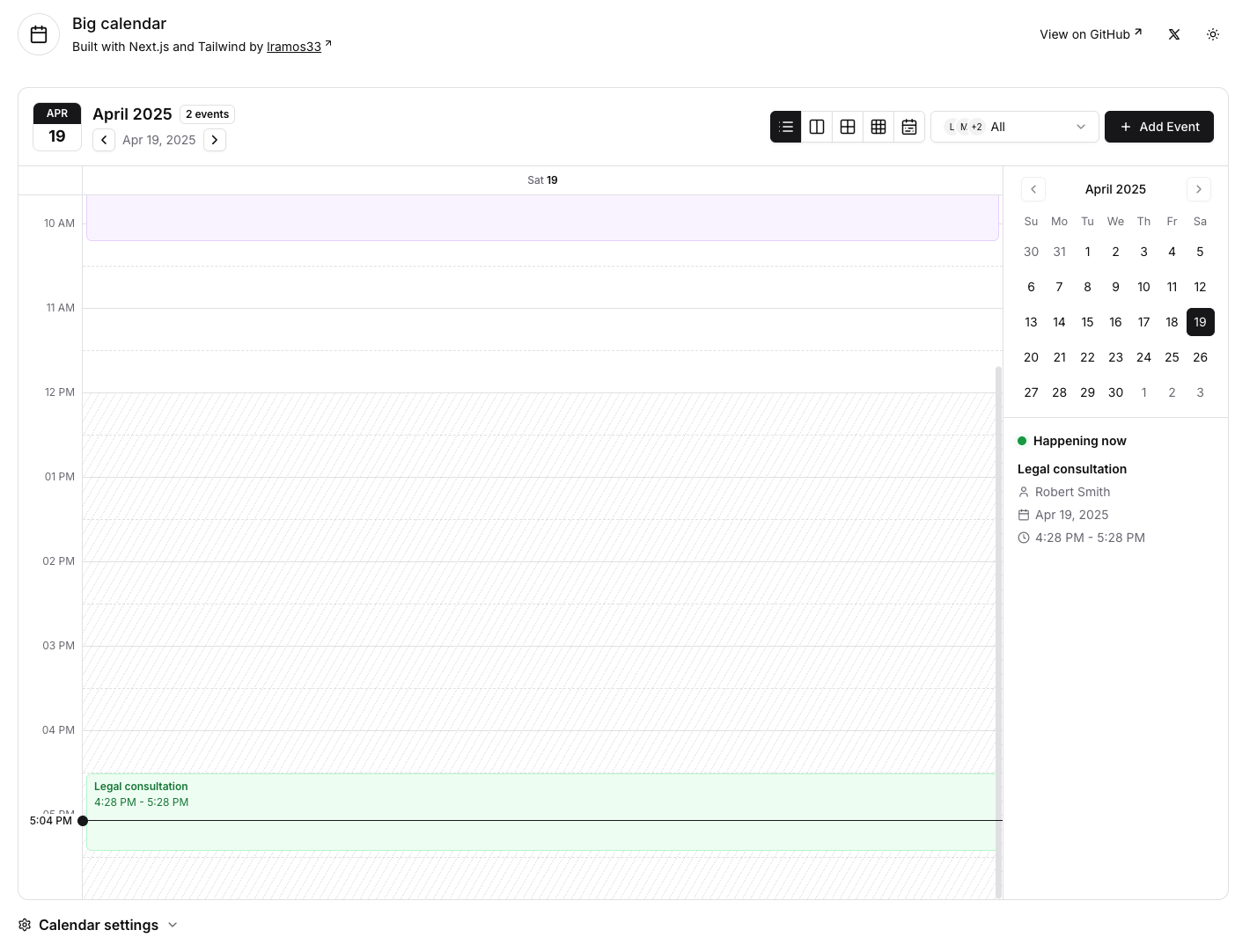
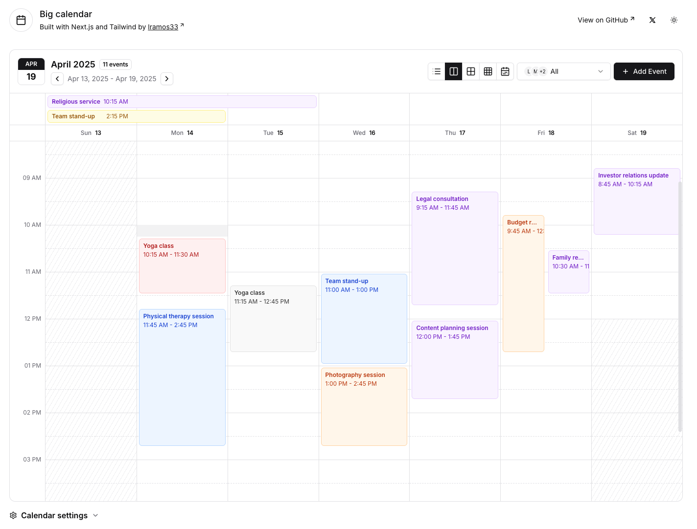
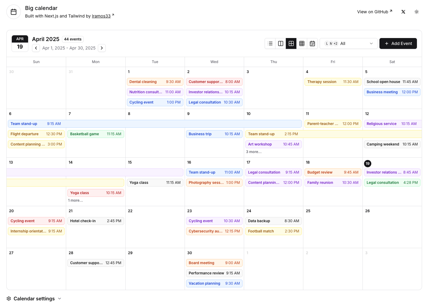
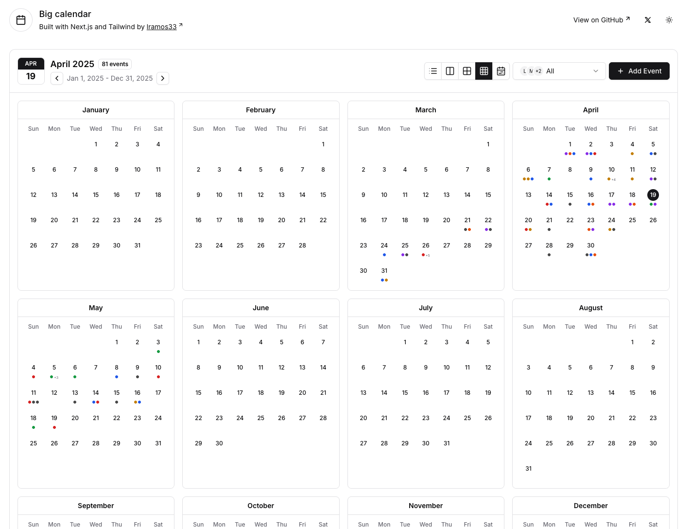
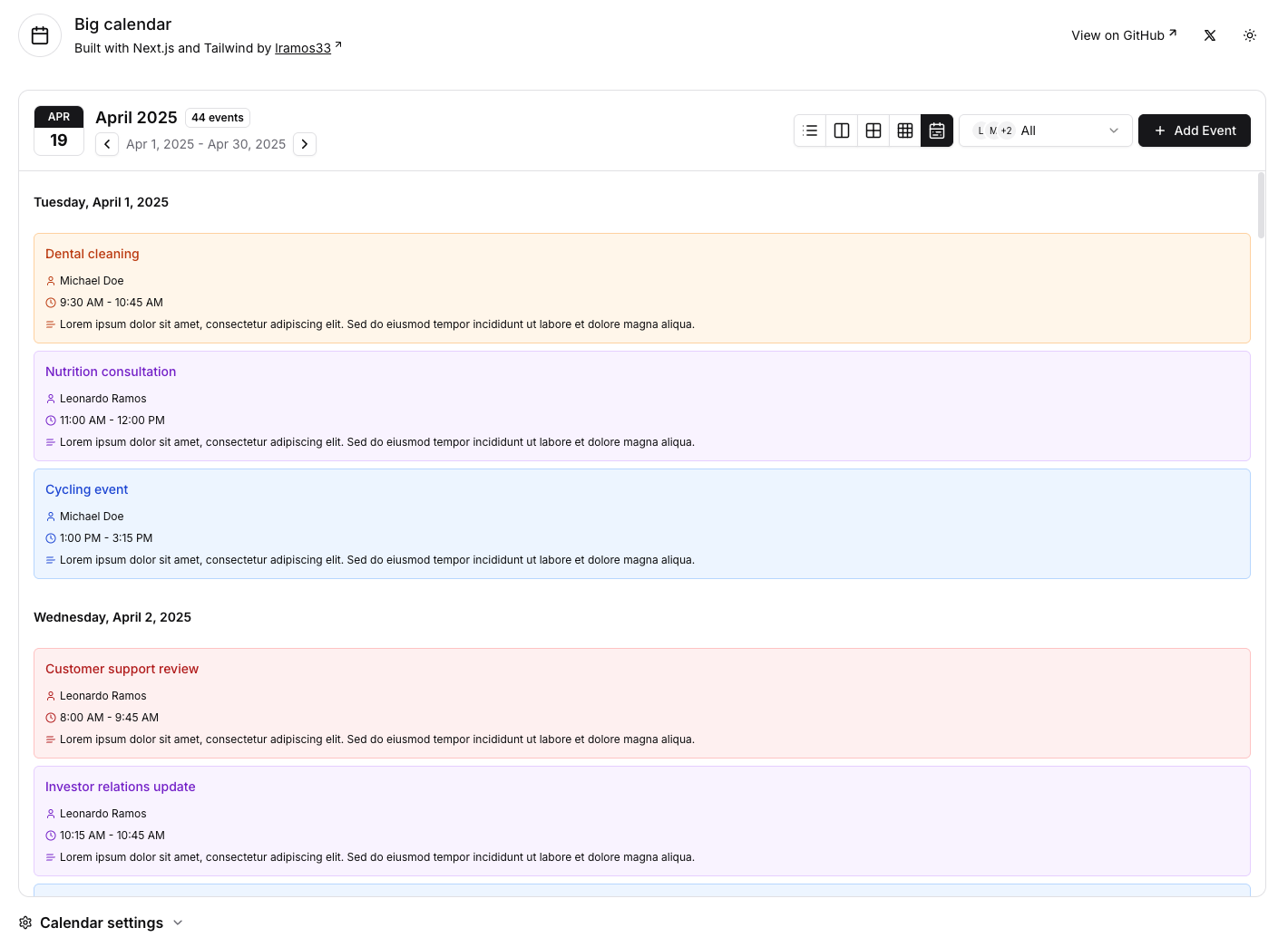
📅 Multiple calendar views:
🎨 Event customization:
🔄 Drag and Drop:
👥 User management:
⚡ Real-time features:
⏰ Time customization:
🎯 UI/UX features:
git clone https://github.com/lramos33/big-calendar.git
cd calendar-app
npm install
npm run dev
or
npm run turbo
http://localhost:3000 to view the application.The project structure is organized as follows:
src/
├── app/
├── calendar/                     # All files related to calendar are in this folder
│   ├── components/
│   │   ├── agenda-view/          # Agenda view components
│   │   ├── dialogs/              # Dialogs components
│   │   ├── dnd/                  # Drag and drop components
│   │   ├── header/               # Calendar header components
│   │   ├── month-view/           # Month view components
│   │   ├── week-and-day-view/    # Week and day view components
│   │   └── year-view/            # Year view components
│   ├── contexts/                 # Calendar context and state management
│   ├── helpers/                  # Utility functions
│   ├── interfaces/               # TypeScript interfaces
│   └── types/                    # TypeScript types
└── components/                   # Components not related to calendar eg: ui and layout components
src/calendar/         # Core calendar functionality
src/components/ui/    # UI components used by the calendar
src/hooks/            # Required hooks like use-disclosure
Set up the CalendarProvider
Wrap your application or page with the CalendarProvider:
import { CalendarProvider } from "@/calendar/contexts/calendar-context";

// Fetch your events and users data
const events = await getEvents();
const users = await getUsers();

export default function Layout({ children }) {
  return (
    <CalendarProvider users={users} events={events}>
      {children}
    </CalendarProvider>
  );
}
Add a CalendarView
Use the ClientContainer to render a specific view:
import { ClientContainer } from "@/calendar/components/client-container";

export default function CalendarPage() {
  return <ClientContainer view="month" />;
}
The calendar supports five different views, each can be used with the ClientContainer component:
// Day view
<ClientContainer view="day" />

// Week view
<ClientContainer view="week" />

// Month view
<ClientContainer view="month" />

// Year view
<ClientContainer view="year" />

// Agenda view
<ClientContainer view="agenda" />
Events Format
Events should follow this interface (you can modify it as you want, but the calendar will expect these fields):
interface IEvent {
  id: string;
  title: string;
  description: string;
  startDate: string; // ISO string
  endDate: string; // ISO string
  color: "blue" | "green" | "red" | "yellow" | "purple" | "orange";
  user: {
    id: string;
    name: string;
  };
}
Users format
Users should follow this interface (you can modify it as you want, but the calendar will expect these fields):
interface IUser {
  id: string;
  name: string;
  picturePath?: string; // Optional avatar image
}
Badge Variants
You can control the event display style with the ChangeBadgeVariantInput component:
import { ChangeBadgeVariantInput } from "@/calendar/components/change-badge-variant-input";

// Place this anywhere in your project tree inside the CalendarProvider
<ChangeBadgeVariantInput />;
Creating events
Implement your own event creation by modifying the onSubmit handler in the AddEventDialog component.
You can access and control the calendar state from any component using the useCalendar hook:
import { useCalendar } from "@/calendar/contexts/calendar-context";

function MyComponent() {
  const { selectedDate, setSelectedDate, selectedUserId, setSelectedUserId, events, users, badgeVariant, setBadgeVariant } = useCalendar();

  // Your component logic
}
// pages/calendar.tsx
import { CalendarProvider } from "@/calendar/contexts/calendar-context";
import { ClientContainer } from "@/calendar/components/client-container";
import { ChangeBadgeVariantInput } from "@/calendar/components/change-badge-variant-input";

export default function CalendarPage({ events, users }) {
  return (
    <CalendarProvider events={events} users={users}>
      <div className="mx-auto flex max-w-screen-2xl flex-col gap-4 p-4">
        <ClientContainer view="month" />
        <ChangeBadgeVariantInput />
      </div>
    </CalendarProvider>
  );
}
Contributions are welcome! Please feel free to submit a Pull Request.
Made by Leonardo Ramos 👋 Get in touch!
1,155 followers · starred Jul 2026
1,223 followers · starred Jun 2025
779 followers · starred Apr 2025
629 followers · starred Mar 2026
This project provides a modern, responsive interface for managing events and schedules with multiple viewing options.
See the codeA feature-rich calendar application built with Next.js, TypeScript, and Tailwind CSS. This project provides a modern, responsive interface for managing events and schedules with multiple viewing options.
📅 Multiple calendar views:
🎨 Event customization:
🔄 Drag and Drop:
👥 User management:
⚡ Real-time features:
⏰ Time customization:
🎯 UI/UX features:
git clone https://github.com/lramos33/big-calendar.git
cd calendar-app
npm install
npm run dev
or
npm run turbo
http://localhost:3000 to view the application.The project structure is organized as follows:
src/
├── app/
├── calendar/                     # All files related to calendar are in this folder
│   ├── components/
│   │   ├── agenda-view/          # Agenda view components
│   │   ├── dialogs/              # Dialogs components
│   │   ├── dnd/                  # Drag and drop components
│   │   ├── header/               # Calendar header components
│   │   ├── month-view/           # Month view components
│   │   ├── week-and-day-view/    # Week and day view components
│   │   └── year-view/            # Year view components
│   ├── contexts/                 # Calendar context and state management
│   ├── helpers/                  # Utility functions
│   ├── interfaces/               # TypeScript interfaces
│   └── types/                    # TypeScript types
└── components/                   # Components not related to calendar eg: ui and layout components
src/calendar/         # Core calendar functionality
src/components/ui/    # UI components used by the calendar
src/hooks/            # Required hooks like use-disclosure
Set up the CalendarProvider
Wrap your application or page with the CalendarProvider:
import { CalendarProvider } from "@/calendar/contexts/calendar-context";

// Fetch your events and users data
const events = await getEvents();
const users = await getUsers();

export default function Layout({ children }) {
  return (
    <CalendarProvider users={users} events={events}>
      {children}
    </CalendarProvider>
  );
}
Add a CalendarView
Use the ClientContainer to render a specific view:
import { ClientContainer } from "@/calendar/components/client-container";

export default function CalendarPage() {
  return <ClientContainer view="month" />;
}
The calendar supports five different views, each can be used with the ClientContainer component:
// Day view
<ClientContainer view="day" />

// Week view
<ClientContainer view="week" />

// Month view
<ClientContainer view="month" />

// Year view
<ClientContainer view="year" />

// Agenda view
<ClientContainer view="agenda" />
Events Format
Events should follow this interface (you can modify it as you want, but the calendar will expect these fields):
interface IEvent {
  id: string;
  title: string;
  description: string;
  startDate: string; // ISO string
  endDate: string; // ISO string
  color: "blue" | "green" | "red" | "yellow" | "purple" | "orange";
  user: {
    id: string;
    name: string;
  };
}
Users format
Users should follow this interface (you can modify it as you want, but the calendar will expect these fields):
interface IUser {
  id: string;
  name: string;
  picturePath?: string; // Optional avatar image
}
Badge Variants
You can control the event display style with the ChangeBadgeVariantInput component:
import { ChangeBadgeVariantInput } from "@/calendar/components/change-badge-variant-input";

// Place this anywhere in your project tree inside the CalendarProvider
<ChangeBadgeVariantInput />;
Creating events
Implement your own event creation by modifying the onSubmit handler in the AddEventDialog component.
You can access and control the calendar state from any component using the useCalendar hook:
import { useCalendar } from "@/calendar/contexts/calendar-context";

function MyComponent() {
  const { selectedDate, setSelectedDate, selectedUserId, setSelectedUserId, events, users, badgeVariant, setBadgeVariant } = useCalendar();

  // Your component logic
}
// pages/calendar.tsx
import { CalendarProvider } from "@/calendar/contexts/calendar-context";
import { ClientContainer } from "@/calendar/components/client-container";
import { ChangeBadgeVariantInput } from "@/calendar/components/change-badge-variant-input";

export default function CalendarPage({ events, users }) {
  return (
    <CalendarProvider events={events} users={users}>
      <div className="mx-auto flex max-w-screen-2xl flex-col gap-4 p-4">
        <ClientContainer view="month" />
        <ChangeBadgeVariantInput />
      </div>
    </CalendarProvider>
  );
}
Contributions are welcome! Please feel free to submit a Pull Request.
Made by Leonardo Ramos 👋 Get in touch!
1,155 followers · starred Jul 2026
1,223 followers · starred Jun 2025
779 followers · starred Apr 2025
629 followers · starred Mar 2026