FlexLayout adds a nice Swift interface to the highly optimized facebook/yoga flexbox implementation. Concise, intuitive & chainable syntax.
Swift
2,133
423 commits
updated Aug 30, 2026





FlexLayout adds a nice Swift interface to the highly optimized Yoga flexbox implementation. Concise, intuitive & chainable syntax.
Flexbox is an incredible improvement over UIStackView. It is simpler to use, much more versatile and amazingly performant.
Yoga is a multiplatform CSS Flexbox implementation (iOS/Android/...). Yoga is also the layout engine of React Native.
📌 FlexLayout is actively updated. So please come often to see latest changes. You can also Star it to be able to retrieve it easily later.
FlexLayout is a companion of PinLayout. They share a similar syntax and method names. PinLayout is a layout framework greatly inspired by CSS absolute positioning, it is particularly useful for greater fine control and animations. It gives you full control by layouting one view at a time (simple to code and debug).
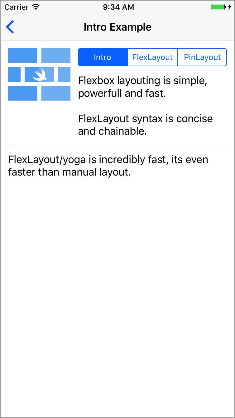
This example will layout multiples views using column and row flexbox containers.
Two steps to use a flexbox container:
layoutSubviews() (or willTransition(to: UITraitCollection, ...) and viewWillTransition(to: CGSize, ...)).
layout().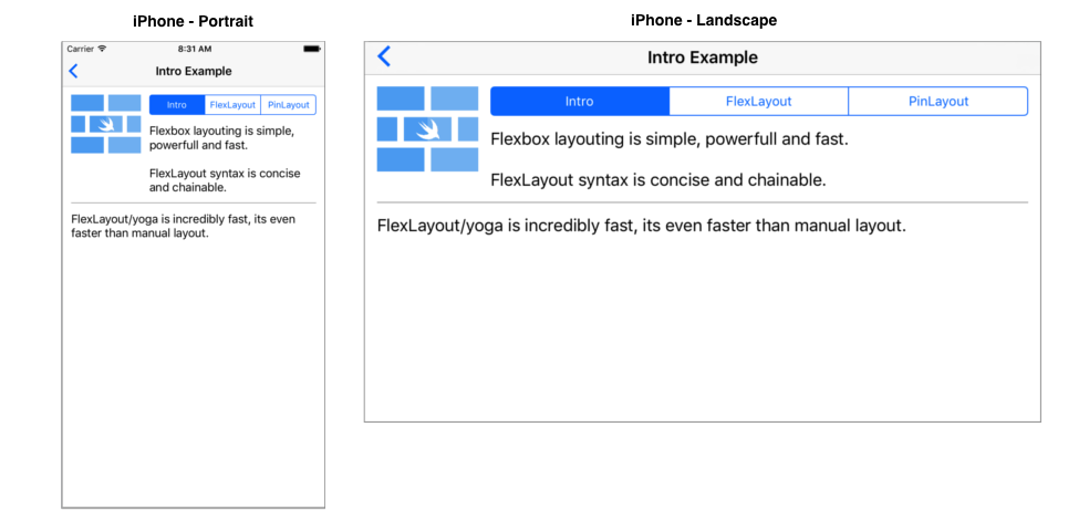
fileprivate let rootFlexContainer = UIView()

init() {
   super.init(frame: .zero)

   addSubview(rootFlexContainer)
   ...

   // Column container
   rootFlexContainer.flex.direction(.column).padding(12).define { (flex) in
        // Row container
        flex.addItem().direction(.row).define { (flex) in
            flex.addItem(imageView).width(100).aspectRatio(of: imageView)

            // Column container
            flex.addItem().direction(.column).paddingLeft(12).grow(1).define { (flex) in
                flex.addItem(segmentedControl).marginBottom(12).grow(1)
                flex.addItem(label)
            }
        }

        flex.addItem().height(1).marginTop(12).backgroundColor(.lightGray)
        flex.addItem(bottomLabel).marginTop(12)
    }
}

override func layoutSubviews() {
    super.layoutSubviews()

    // 1) Layout the flex container. This example use PinLayout for that purpose, but it could be done
    //    also by setting the rootFlexContainer's frame:
    //       rootFlexContainer.frame = CGRect(x: 0, y: 0,
    //                                        width: frame.width, height: rootFlexContainer.height)
    rootFlexContainer.pin.top().left().width(100%).marginTop(topLayoutGuide)

    // 2) Then let the flexbox container layout itself. Here the container's height will be adjusted automatically.
    rootFlexContainer.flex.layout(mode: .adjustHeight)
}
📌 This example is available in the Examples App. See complete source code
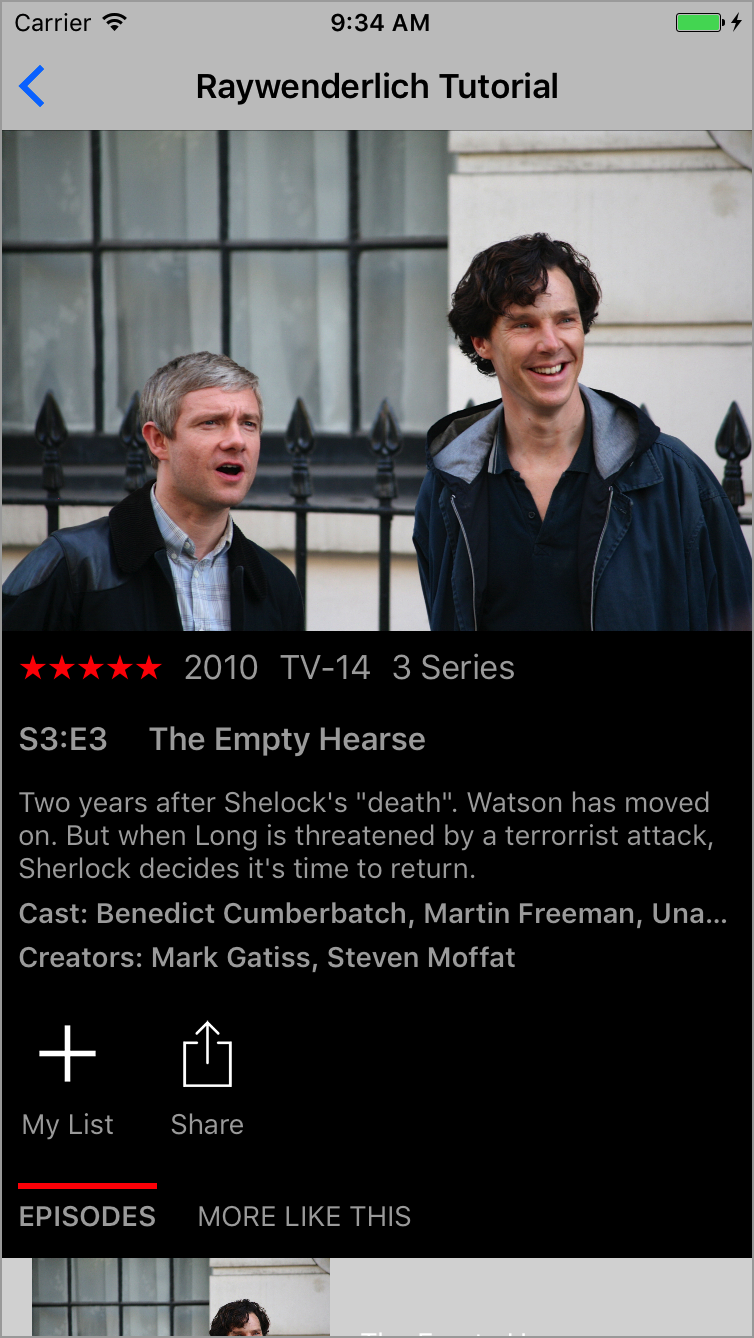
The example implements the Ray Wenderlich Yoga Tutorial screen using FlexLayout.
init() {
   ...

   rootFlexContainer.flex.define { (flex) in
        // Image
        flex.addItem(episodeImageView).grow(1).backgroundColor(.gray)

        // Summary row
        flex.addItem().direction(.row).padding(padding).define { (flex) in
            flex.addItem(summaryPopularityLabel).grow(1)

            flex.addItem().direction(.row).justifyContent(.spaceBetween).grow(2).define { (flex) in
                flex.addItem(yearLabel)
                flex.addItem(ratingLabel)
                flex.addItem(lengthLabel)
            }

            flex.addItem().width(100).height(1).grow(1)
        }

        // Title row
        flex.addItem().direction(.row).padding(padding).define { (flex) in
            flex.addItem(episodeIdLabel)
            flex.addItem(episodeTitleLabel).marginLeft(20)
        }

        // Description section
        flex.addItem().paddingHorizontal(paddingHorizontal).define { (flex) in
            flex.addItem(descriptionLabel)
            flex.addItem(castLabel)
            flex.addItem(creatorsLabel)
        }

        // Action row
        flex.addItem().direction(.row).padding(padding).define { (flex) in
            flex.addItem(addActionView)
            flex.addItem(shareActionView)
        }

        // Tabs row
        flex.addItem().direction(.row).padding(padding).define { (flex) in
            flex.addItem(episodesTabView)
            flex.addItem(moreTabView)
        }

        // Shows TableView
        flex.addItem(showsTableView).grow(1)
    }
}

override func layoutSubviews() {
    super.layoutSubviews()

    // 1) Layout the contentView & rootFlexContainer using PinLayout
    contentView.pin.top().bottom().left().right()
    rootFlexContainer.pin.top().left().right()

    // 2) Let the flexbox container layout itself and adjust the height
    rootFlexContainer.flex.layout(mode: .adjustHeight)

    // 3) Adjust the scrollview contentSize
    contentView.contentSize = rootFlexContainer.frame.size
}
📌 This example is available in the Examples App. See complete source code
NOTE: FlexLayout wraps facebook/yoga implementation and expose all its features. So note that on this documentation we will refer to FlexLayout, but this also applies to Yoga.
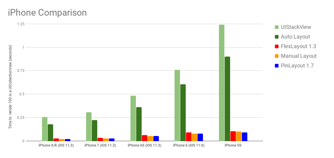
FlexLayout's performance has been measured using the Layout Framework Benchmark. FlexLayout and PinLayout has been added to this benchmark to compare their performance.
As you can see in the following chart, FlexLayout and PinLayout's performance are faster or equal to manual layouting. FlexLayout and PinLayout are between 8x and 12x faster than UIStackViews, and this for all types of iPhone (5S/6/6S/7/8/X)
See here more complete details, results and explanation of the benchmark.
In many CSS methods and properties name, the keyword flex was added to control name conflicts. FlexLayout removed this keyword for being more concise and removed this unecessary keyword:
| FlexLayout Name | CSS Name | React Native Name |
|---|---|---|
direction | flex-direction | flexDirection |
wrap | flex-wrap | flexWrap |
grow | flex-grow | flexGrow |
shrink | flex-shrink | flexShrink |
basis | flex-basis | flexBasis |
start | flex-start | flexStart |
end | flex-end | flexEnd |
FlexLayout default properties are sligthly different from CSS flexbox. This table resume these difference:
| Property | FlexLayout default value | CSS default value | React Native default value |
|---|---|---|---|
direction | column | row | column |
justifyContent | start | start | start |
alignItems | stretch | stretch | stretch |
alignSelf | auto | auto | auto |
alignContent | start | stretch | start |
grow | 0 | 0 | 0 |
shrink | 0 | 1 | 0 |
basis | 0 | auto | 0 |
wrap | noWrap | nowrap | noWrap |
FlexLayout additions:
NOTE: FlexLayout doesn't support the flexbox order property. The order is determined by the flex container's UIView.subviews array.
Flexbox is pretty easy and straightforward to use. The defining aspect of the flexbox is the ability to alter its items, width, height to best fill the available space on any display device. A flex container expands its items to fill the available free space or shrinks them to prevent overflow.
The flex layout is constituted of parent container referred as flex container and its immediate children which are called flex items. A flex item can also be a flex container, i.e. it is possible to add other flex items to it.
When working with StackViews you need to think in terms of two axes — the main axis and the cross axis. The main axis is defined by StackView's direction property, and the cross axis runs perpendicular to it.
| StackView direction | Axes |
|---|---|
| column (default) | 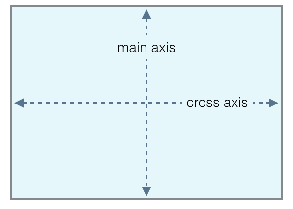 |
| row | 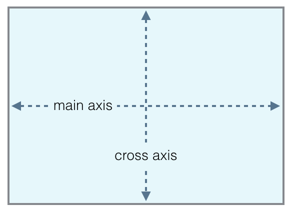 |
In the following sections we will see:
📌 This document is a guide that explains how to use FlexLayout. You can also checks the FlexLayout's API documentation.
flex containersMethod:
addItem(_: UIView) -> Flex view.flex.addItem(imageView).width(100).aspectRatio(1)
flex containersMethod:
addItem() -> FlexaddItem(: UIView) except that it also creates the flex item's UIView. Internally the method creates a UIView, adds it as a subview and enables flexbox. This is useful to add a flex item/container easily when you don't need to refer to it later. view.flex.addItem().direction(.row).padding(10)
flex containers(flex: Flex) -> VoidMethod:
define(_ closure: (_ flex: Flex) -> Void)flex. This parameter is in fact the view's flex interface. It can be used to adds other flex items and containers. view.flex.addItem().define { (flex) in
flex.addItem(imageView).grow(1)
flex.addItem().direction(.row).define { (flex) in
flex.addItem(titleLabel).grow(1)
flex.addItem(priceLabel)
}
}
The same results can also be obtained without using the define() method, but the result is not as elegant:
  let columnContainer = UIView()
  columnContainer.flex.addItem(imageView).grow(1)
  view.flex.addItem(columnContainer)

  let rowContainer = UIView()
  rowContainer.flex.direction(.row)
  rowContainer.flex.addItem(titleLabel).grow(1)
  rowContainer.flex.addItem(priceLabel)
  columnContainer.flex.addItem(rowContainer)
Advantages of using define():
define's closure, you can do whatever you want to fill the flexbox container. You can use for loops, iterate arrays of data, call functions, ...It is possible to access the flex items's UIView using flex.view. This is particularly useful when using flex.define() method.
This example creates a flexbox container and sets its alpha to 0.8.
    view.flex.direction(.row).padding(20).alignItems(.center).define { (flex) in
        flex.addItem().width(50).height(50).define { (flex) in
            flex.view?.alpha = 0.8
        }
    }
Another possible solution:
    view.flex.direction(.row).padding(20).alignItems(.center).define { (flex) in
        let container = UIView()
        container.alpha = 0.8

        flex.addItem(container).width(50).height(50)
    }
flex containersfitContainer / adjustWidth / adjustHeightfitContainerMethod:
layout(mode: LayoutMode = . fitContainer)
The method will layout the flex container's children.
Layout modes:
fitContainer: This is the default mode when no parameter is specified. Children are layouted inside the container's size (width and height).adjustHeight: In this mode, children are layouted using only the container's width. The container's height will be adjusted to fit the flexbox's childrenadjustWidth: In this mode, children are layouted using only the container's height. The container's width will be adjusted to fit the flexbox's children rootFlexContainer.flex.layout(mode: .adjustHeight)
This section describes all flex container's properties.
flex containerscolumn / columnReverse / row / rowReversecolumnflex-directionProperty:
direction: Direction?Method:
direction(_: Direction)
The direction property establishes the main-axis, thus defining the direction flex items are placed in the flex container.
The direction property specifies how flex items are laid out in the flex container, by setting the direction of the flex container’s main axis. They can be laid out in two main directions, like columns vertically or like rows horizontally.
Note that row and row-reverse are affected by the layout direction (see layoutDirection property) of the flex container. If its text direction is LTR (left to right), row represents the horizontal axis oriented from left to right, and row-reverse from right to left; if the direction is rtl, it's the opposite.
| Value | Result | Description |
|---|---|---|
| column (default) | 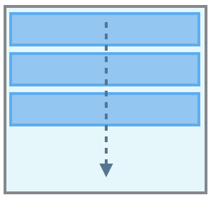 | Top to bottom |
| columnReverse | 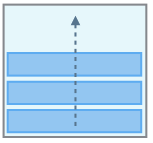 | Bottom to top |
| row | 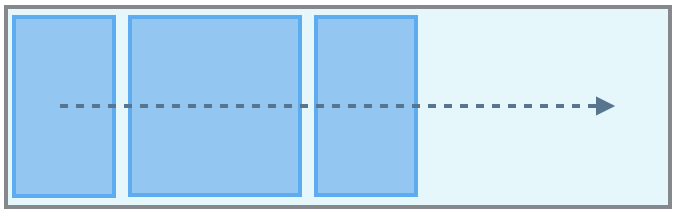 | Same as text direction |
| rowReverse | 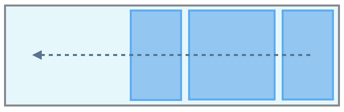 | opposite to text direction |
  view.flex.direction(.column)  // Not required, default value.
  view.flex.direction(.row)
This example center three buttons with a margin of 10 pixels between them.
Example source code
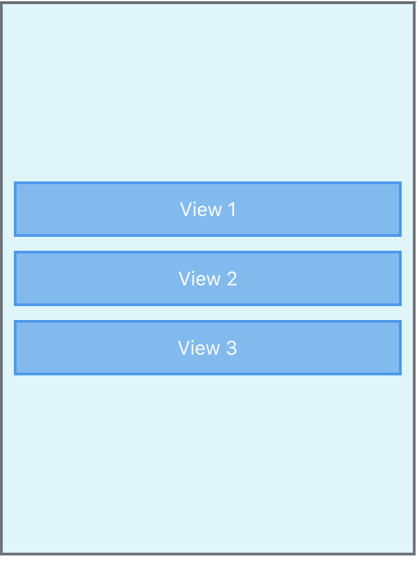
    rootFlexContainer.flex.justifyContent(.center).padding(10).define { (flex) in
        flex.addItem(button1)
        flex.addItem(button2).marginTop(10)
        flex.addItem(button3).marginTop(10)
    }
flex containersstart / end / center / spaceBetween / spaceAround / spaceEvenlystartjustify-contentMethod:
justifyContent(_: JustifyContent)justifyContent property defines the alignment along the main-axis of the current line of the flex container. It helps distribute extra free space leftover when either all the flex items on a line have reached their maximum size. For example, if children are flowing vertically, justifyContent controls how they align vertically.| direction(.column) | direction(.row) | ||
|---|---|---|---|
| start (default) | 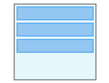 | 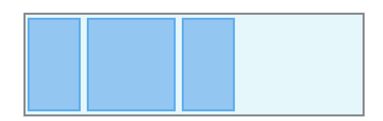 | Items are packed at the beginning of the main-axis. |
| end | 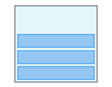 | 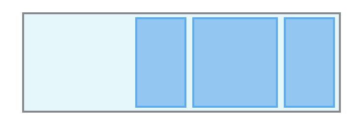 | Items are packed at the end of the main-axis. |
| center | 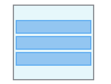 | 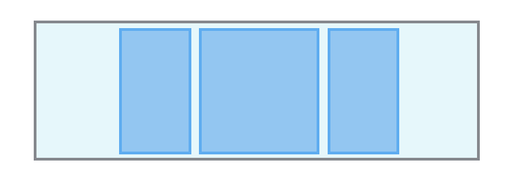 | items are centered along the main-axis. |
| spaceBetween | 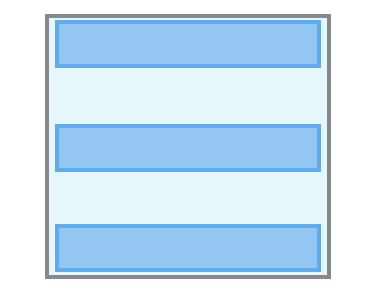 | 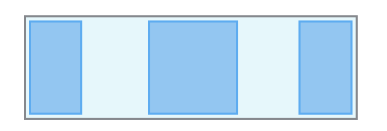 | Items are evenly distributed in the main-axis; first item is at the beginning, last item at the end. |
| spaceAround | 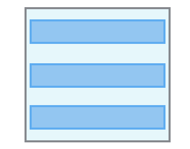 | 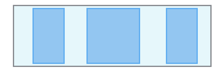 | Items are evenly distributed in the main-axis with equal space around them. |
| spaceEvenly | 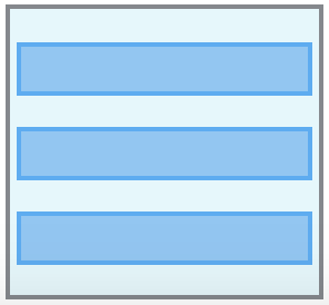 | 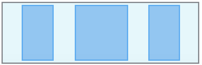 | Items are evenly distributed in the main-axis with equal space around them. |
  view.flex.justifyContent(.start)  // default value.
  view.flex.justifyContent(.center)
flex containersstretch / start / end / center / baselinestretchalign-itemsMethod:
alignItems(_: AlignItems)alignItems property defines how flex items are laid out along the cross axis on the current line. Similar to justifyContent but for the cross-axis (perpendicular to the main-axis). For example, if children are flowing vertically, alignItems controls how they align horizontally.| direction(.column) | direction(.row) | |
|---|---|---|
| stretch (default) | 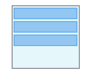 | 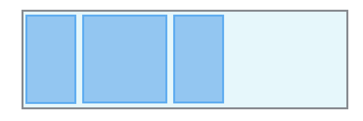 |
| start | 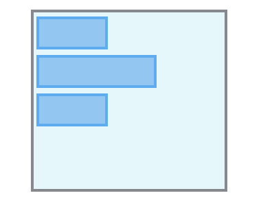 | 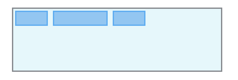 |
| end | 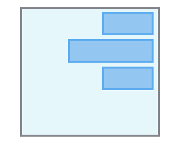 | 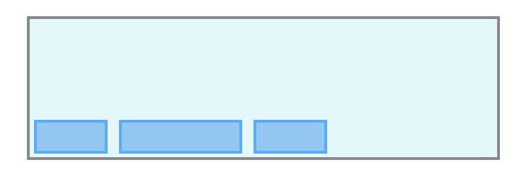 |
| center | 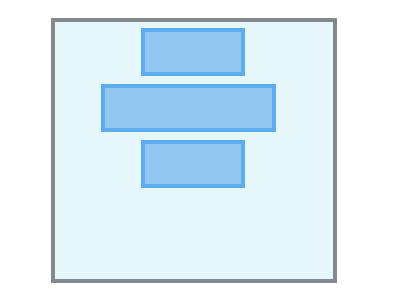 | 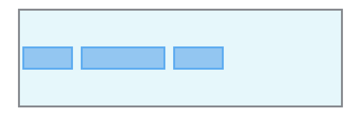 |
flex containersauto / stretch / start / end / center / baselineautoalign-selfMethod:
alignSelf(_: AlignSelf)alignSelf property controls how a child aligns in the cross direction, overriding the alignItems of the parent. For example, if children are flowing vertically, alignSelf will control how the flex item will align horizontally.The auto value means use the flex container alignItems property. See alignItems for documentation of the other values.
flex containersnoWrap / wrap / wrapReversenoWrapflex-wrapMethod:
wrap(_: Wrap)wrap property controls whether the flex container is single-lined or multi-lined, and the direction of the cross-axis, which determines the direction in which the new lines are stacked in.By default, the flex container fits all flex items into one line. Using this property we can change that. We can tell the container to lay out its items in single or multiple lines, and the direction the new lines are stacked in
Reminder: the cross axis is the axis perpendicular to the main axis. Its direction depends on the main axis direction.
| direction(.column) | direction(.row) | Description | |
|---|---|---|---|
| noWrap (default) | 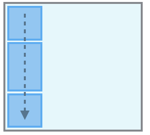 | 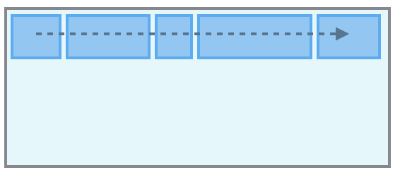 | Single-line which may cause the container to overflow. NEW: Flex items are displayed in one row and by default they are shrunk to fit the flex container’s width |
| wrap | 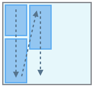 | 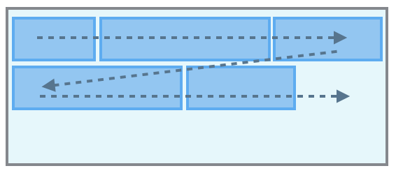 | Multi-lines, direction is defined by direction(). NEW: Flex items are displayed in multiple rows if needed from left-to-right and top-to-bottom |
| wrapReverse | 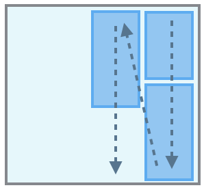 | 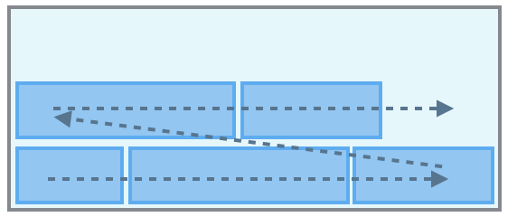 | Multi-lines, opposite to direction defined by direction(). NEW: Flex items are displayed in multiple rows if needed from left-to-right and bottom-to-top |
  view.flex.wrap(.nowrap)  // Not required, default value.
  view.flex.wrap(.wrap)
flex containersstart / end / center / stretch / spaceBetween / spaceAround / spaceEvenlystartalign-contentMethod:
alignContent(_: AlignContent)Note, alignContent has no effect when the flexbox has only a single line.
| direction(.column) | direction(.row) | |
|---|---|---|
| start (default) | 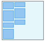 | 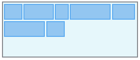 |
| end | 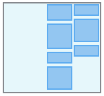 | 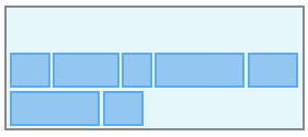 |
| center | 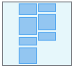 | 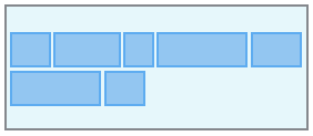 |
| stretch | 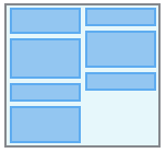 | 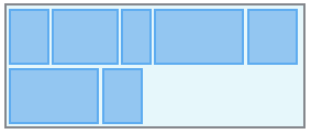 |
| spaceBetween | 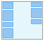 | 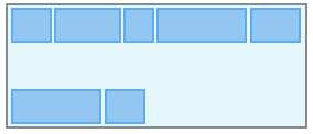 |
| spaceAround | 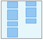 | 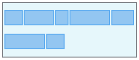 |
| spaceEvenly |
FlexLayout supports left-to-right (LTR) and right-to-left (RTL) languages.
Using start or end properties, you can position views without having to think about whether your item will show up on the left or the right side of the screen (depending on the person’s language
Method:
layoutDirection(_: LayoutDirection)
The layoutDirection property controls the flex container layout direction.
Values:
.inherit.ltr: Layout views from left to right. (Default).rtl: Layout views from right to left.This section describe all flex items's properties.
📌 Remembers that flex containers are also flex items, so all these properties also apply to containers.
flex itemsflex-growMethod:
grow(_: CGFloat)
The grow property defines the ability for a flex item to grow if necessary. It accepts a unitless value that serves as a proportion. It dictates what amount of the available space inside the flex container the item should take up.
A grow value of 0 (default value) keeps the view's size in the main-axis direction. If you want the view to use the available space set a grow value > 0.
For example, if all items have grow set to 1, every child will set to an equal size inside the container. If you were to give one of the children a value of 2, that child would take up twice as much space as the others.
flex itemsflex-shrinkMethod:
shrink(_: CGFloat)
It specifies the "flex shrink factor", which determines how much the flex item will shrink relative to the rest of the flex items in the flex container when there isn't enough space on the main-axis.
When omitted, it is set to 0 and the flex shrink factor is multiplied by the flex basis when distributing negative space.
A shrink value of 0 keeps the view's size in the main-axis direction. Note that this may cause the view to overflow its flex container.
Shrink is about proportions. If an item has a shrink of 3, and the rest have a shrink of 1, the item will shrink 3x as fast as the rest.
flex itemsflex-basisMethod:
basis(_ : CGFloat?)
This property takes the same values as the width and height properties, and specifies the initial size of the flex item, before free space is distributed according to the grow and shrink factors.
Specifying nil set the basis as auto, which means the length is equal to the length of the item. If the item has no length specified, the length will be according to its content
basis(_ : FPercent)
This property takes the same values as the width and height properties, and specifies the initial size of the flex item, before free space is distributed according to the grow and shrink factors.
flex containersgapMethod:
columnGap(_ value: CGFloat)
This property set distance between columns.
rowGap(_ value: CGFloat)
This property set distance between rows.
gap(_ value: CGFloat)
This property set distance between both of rows and columns.
flex itemsMethod:
isIncludedInLayout(_ value: Bool)FlexLayout automatically includes the UIView when:
UIView.flex property is accessedaddItem(:UIView) or addItem()flex itemsMethod:
display(_: Display)Set the item display or not, with none value, the item will be hidden and not included in the layout.
Values:
flex: Default value. The item is displayed normally and included in the layout.none: The item will be hidden and not included in the layout.contents: The node is removed from the layout flow, while its children are preserved and hoisted. This allows higher-level UI frameworks to compose wrapper components (e.g., to handle events) without influencing the layout of child nodes.flex itemsMethod:
boxSizing(_: BoxSizing)Set the box sizing mode for the item. This determines how the width and height of an element are calculated.
Values:
borderBox: Default value. With borderBox, the specified dimensions (width, height) include the content, padding, and border. This means the overall size of the element is as defined, with padding and border accounted for inside.contentBox: With contentBox, the specified dimensions refer only to the content area. Padding and borders are added outside these dimensions, potentially increasing the total size of the element.flex itemsMethod:
markDirty()
The framework is so highly optimized, that flex items are layouted only when a flex property is changed and when flex container size change. In the event that you want to force FlexLayout to do a layout of a flex item, you can mark it as dirty using markDirty().
Dirty flag propagates to the root of the flexbox tree ensuring that when any item is invalidated its whole subtree will be re-calculated.
In the case where a UILabel's text is updated, it is needed to mark the label as dirty and relayout the flex container.
    // 1) Update UILabel's text
    label.text = "I love FlexLayout"

    // 2) Mark the UILabel as dirty
    label.flex.markDirty()

    // 3) Then force a relayout of the flex container.
    rootFlexContainer.flex.layout()
    OR
    setNeedsLayout()
flex itemsMethod:
sizeThatFits()Get the size of view when layouted in a container with a width of 200 pixels.
let layoutSize = viewA.flex.sizeThatFits(size: CGSize(width: 200, height: CGFloat.greatestFiniteMagnitude))
flex itemsProperty:
intrinsicSizeflex itemsMethod:
position(_: Position)relative (default) The view is positioned using Insets properties (top, bottom, left, right, start, end) from its normal position within its flex container and will take up space within the flex container. This node will always form a containing block.absolute: The view is removed from the flex container's flow and is positioned using Insets properties (top, bottom, left, right, start, end). Insets will offset the node from its containing block.static: The view ignores insets and will not form a containing block. view.flex.position(.relative).top(10).left(10).size(50)
view.flex.position(.absolute).top(10).left(10).size(50)
A flex item with position set to .relative is positioned relative to its normal position within its flex container. Only one property can be applied in each direction, either vertical or horizontal. If both top and bottom properties are set, top takes precedence. If both left and right properties are set, left takes precedence.
A flex item with position set to .absolute is positioned absolutely with respect to its containing block. Using these properties you can control the size and position of an absolute item within its parent. Because absolutely positioned children don’t affect their sibling's layout. Absolute position can be used to create overlays and stack children in the Z axis.
This is done through the following methods:
Methods:
top(: CGFloat) / top(: FPercent):bottom(: CGFloat) / bottom(: FPercent):left(: CGFloat) / left(: FPercent):right(: CGFloat) / right(: FPercent):start(: CGFloat) / start(: FPercent):left() property and in RTL to right() property.end(: CGFloat) / end(: FPercent):right() property and in RTL to left() property.vertically(: CGFloat) / vertically(: FPercent):top().bottom().horizontally(: CGFloat) / horizontally(: FPercent):left().right().all(: CGFloat) / all(: FPercent):top().bottom().left().right(). view.flex.position(.relative).top(10).right(10).width(100).height(50)
view.flex.position(.absolute).top(10).right(10).width(100).height(50)
view.flex.position(.absolute).left(20%).right(20%)
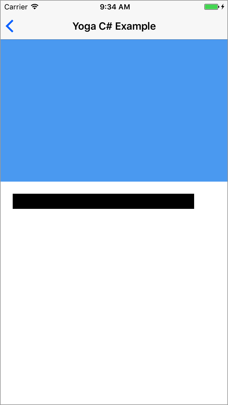
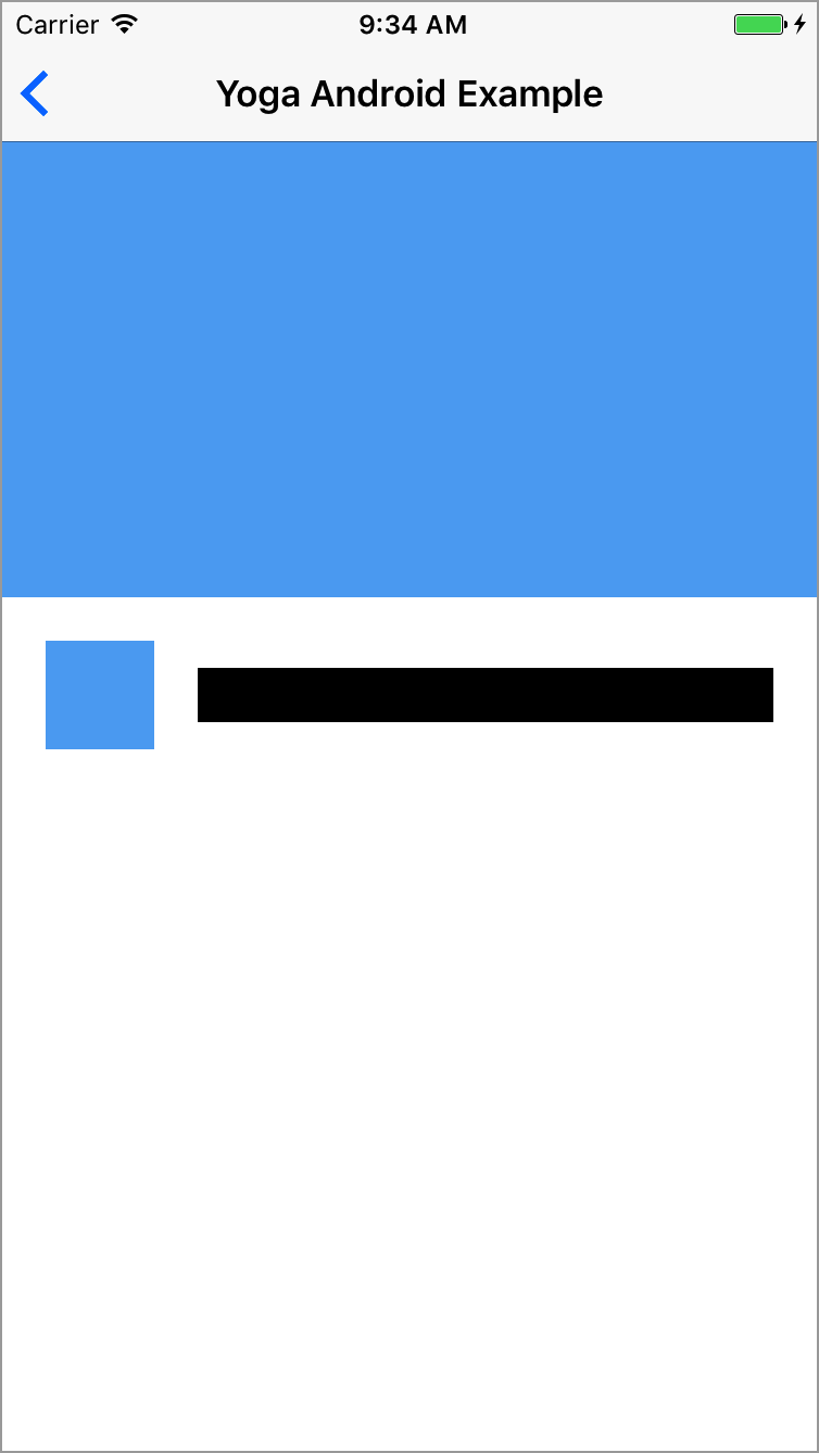
📌 See the "Yoga C" example in the Examples App. Source code
FlexLayout has methods to set the view’s height and width.
Methods:
width(_ width: CGFloat?)width(nil) to reset the property.width(_ percent: FPercent)width(nil) to reset the property.height(_ height: CGFloat?)height(nil) to reset the property.height(_ percent: FPercent)height(nil) to reset the property.size(_ size: CGSize?)size(nil) to reset the property.size(_ sideLength: CGFloat?)size(nil) to reset the property. view.flex.width(100)
view.flex.width(50%)
view.flex.height(200)
view.flex.size(250)
FlexLayout has methods to set the view’s minimum and maximum width, and minimum and maximum height.
Using minWidth, minHeight, maxWidth, and maxHeight gives you increased control over the final size of items in a layout. By mixing these properties with grow, shrink, and alignItems(.stretch), you are able to have items with dynamic size within a range which you control.
An example of when Max properties can be useful is if you are using alignItems(.stretch) but you know that your item won’t look good after it increases past a certain point. In this case, your item will stretch to the size of its parent or until it is as big as specified in the Max property.
Same goes for the Min properties when using shrink. For example, you may want children of a container to shrink to fit on one row, but if you specify a minimum width, they will break to the next line after a certain point (if you are using wrap(.wrap).
Another case where Min and Max dimension constraints are useful is when using aspectRatio.
Methods:
minWidth(_ width: CGFloat?)minWidth(nil) to reset the property.minWidth(_ percent: FPercent)minWidth(nil) to reset the property..maxWidth(_ width: CGFloat?)maxWidth(nil) to reset the property.maxWidth(_ percent: FPercent)maxWidth(nil) to reset the property.minHeight(_ height: CGFloat?)minHeight(nil) to reset the property.minHeight(_ percent: FPercent)minHeight(nil) to reset the property.maxHeight(_ height: CGFloat?)maxHeight(nil) to reset the property.maxHeight(_ percent: FPercent)maxHeight(nil) to reset the property. view.flex.maxWidth(200)
view.flex.maxWidth(50%)
view.flex.width(of: view1).maxWidth(250)
view.flex.maxHeight(100)
view.flex.height(of: view1).maxHeight(30%)
AspectRatio is a property introduced by Yoga that don't exist in CSS. AspectRatio solves the problem of knowing one dimension of an element and an aspect ratio, this is very common when it comes to images, videos, and other media types. AspectRatio accepts any floating point value > 0, the default is undefined.
grow.aspectRatio(nil) to reset the property. imageView.flex.aspectRatio(16/9)
By applying Margin to an item you specify the offset a certain edge of the item should have from it’s closest sibling or parent.
Methods:
marginTop(_ value: CGFloat), marginTop(_ percent: FPercent)marginLeft(_ value: CGFloat), marginLeft(_ percent: FPercent)marginBottom(_ value: CGFloat), marginBottom(_ percent: FPercent)marginRight(_ value: CGFloat), marginRight(_ percent: FPercent)marginStart(_ value: CGFloat), marginStart(_ percent: FPercent)marginEnd(_ value: CGFloat), marginEnd(_ percent: FPercent)marginHorizontal(_ value: CGFloat), marginHorizontal(_ percent: FPercent)marginVertical(_ value: CGFloat), marginVertical(_ percent: FPercent)margin(_ insets: UIEdgeInsets)
Set all margins using an UIEdgeInsets. This method is particularly useful to set all margins using iOS 11 UIView.safeAreaInsets.margin(_ insets: NSDirectionalEdgeInsets)
Set all margins using an NSDirectionalEdgeInsets. This method is useful to set all margins using iOS 11 UIView. directionalLayoutMargins when layouting a view supporting RTL/LTR languages.margin(_ value: CGFloat) margin(_ vertical: CGFloat, _ horizontal: CGFloat)margin(_ top: CGFloat, _ horizontal: CGFloat, _ bottom: CGFloat)margin(_ top: CGFloat, _ left: CGFloat, _ bottom: CGFloat, _ right: CGFloat) view.flex.margin(20)
view.flex.marginTop(20%).marginLeft(20%)
view.flex.marginHorizontal(20)
view.flex.margin(safeAreaInsets)
view.flex.margin(10, 12, 0, 12)
Padding specify the offset children should have from a certain edge on the container.
Methods:
paddingTop(_ value: CGFloat), paddingTop(_ percent: FPercent)paddingLeft(_ value: CGFloat), paddingLeft(_ percent: FPercent)paddingBottom(_ value: CGFloat), paddingBottom(_ percent: FPercent)paddingRight(_ value: CGFloat), paddingRight(_ percent: FPercent)paddingStart(_ value: CGFloat), paddingStart(_ percent: FPercent)paddingEnd(_ value: CGFloat), paddingEnd(_ percent: FPercent)paddingHorizontal(_ value: CGFloat), paddingHorizontal(_ percent: FPercent)paddingVertical(_ value: CGFloat), paddingVertical(_ percent: FPercent)padding(_ insets: UIEdgeInsets)
Set all paddings using an UIEdgeInsets. This method is particularly useful to set all paddings using iOS 11 UIView.safeAreaInsets.padding(_ insets: NSDirectionalEdgeInsets)UIView. directionalLayoutMargins when layouting a view supporting RTL/LTR languages.padding(_ value: CGFloat), padding(_ percent: FPercent)padding(_ vertical: CGFloat, _ horizontal: CGFloat), padding(_ vertical: FPercent, horizontal: FPercentpadding(_ top: CGFloat, _ horizontal: CGFloat, _ bottom: CGFloat), padding(_ top: FPercent, _ horizontal: FPercent, _ bottom: FPercent)padding(_ top: CGFloat, _ left: FPercent, _ bottom: FPercent, _ right: FPercent), padding(_ top: FPercent, _ left: FPercent, _ bottom: FPercent, _ right: FPercent) view.flex.padding(20)
view.flex.paddingTop(20%).paddingLeft(20%)
view.flex.paddingBottom(20)
view.flex.paddingHorizontal(20)
view.flex.padding(10, 12, 0, 12)
FlexLayout also adds methods to set common UIView properties.
Methods:
backgroundColor(_ color: UIColor)cornerRadius(_ value: CGFloat)border(_ width: CGFloat, _ color: UIColor) // Create a gray column container and add a black horizontal line separator
flex.addItem().backgroundColor(.gray).define { (flex) in
flex.addItem().height(1).backgroundColor(.black)
}
// Set rounded corner
flex.addItem().cornerRadius(12)
// Set border
flex.addItem().border(1, .black)
The complete FlexLayout API is available here.
The FlexLayout's Example App exposes some usage example of FlexLayout.
See the Example App section to get more information.
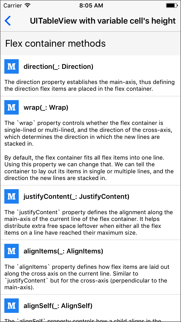
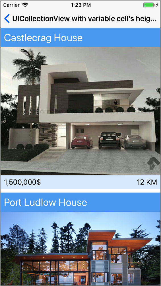
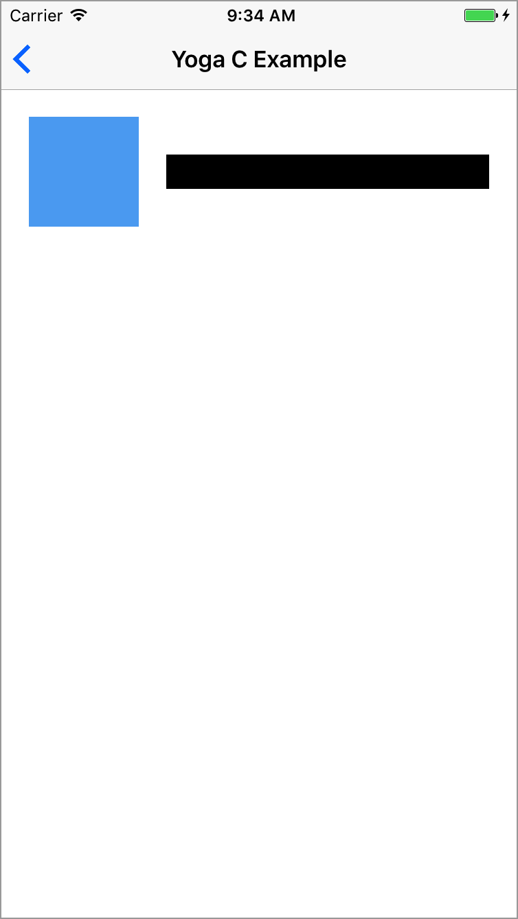
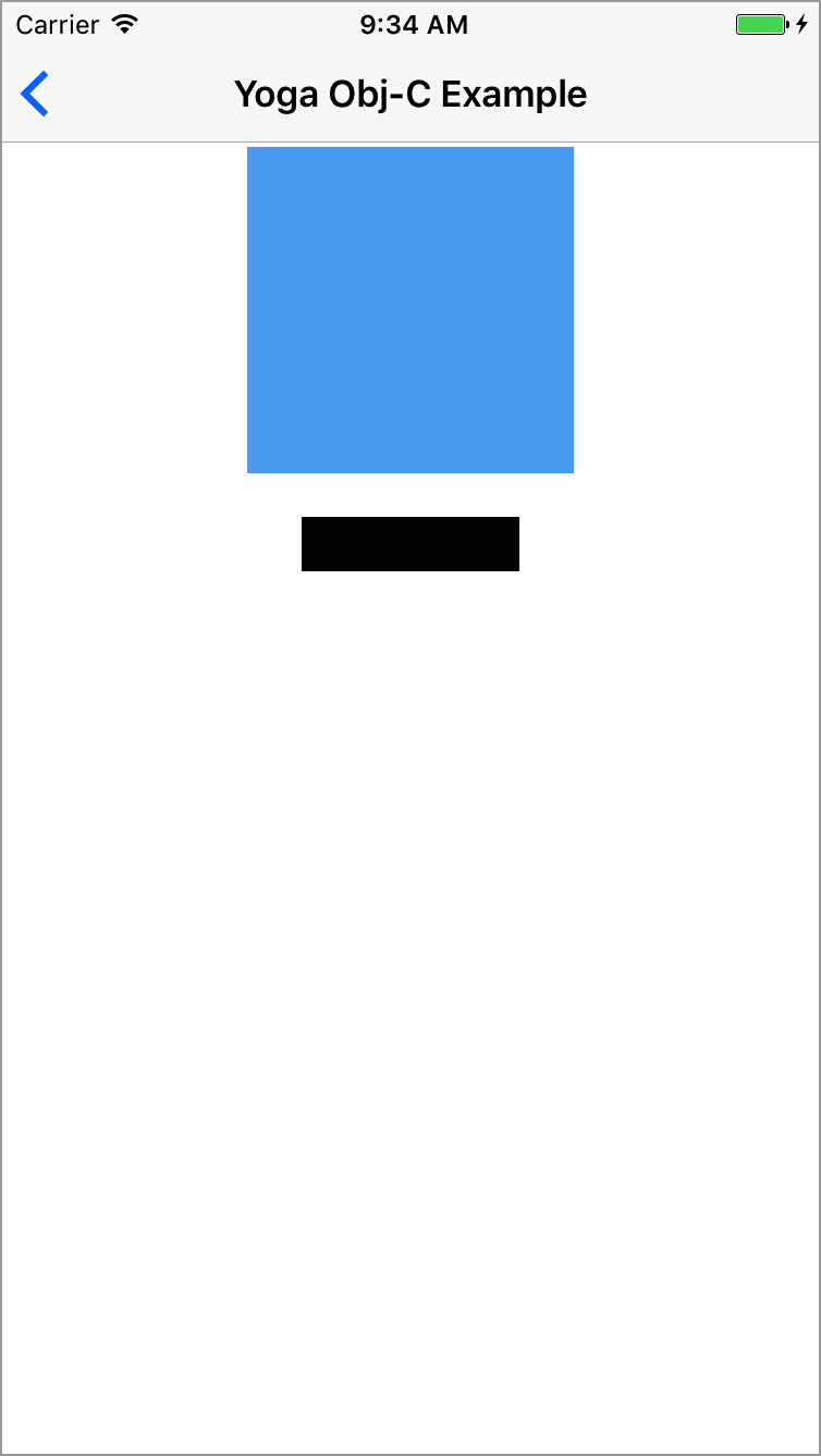
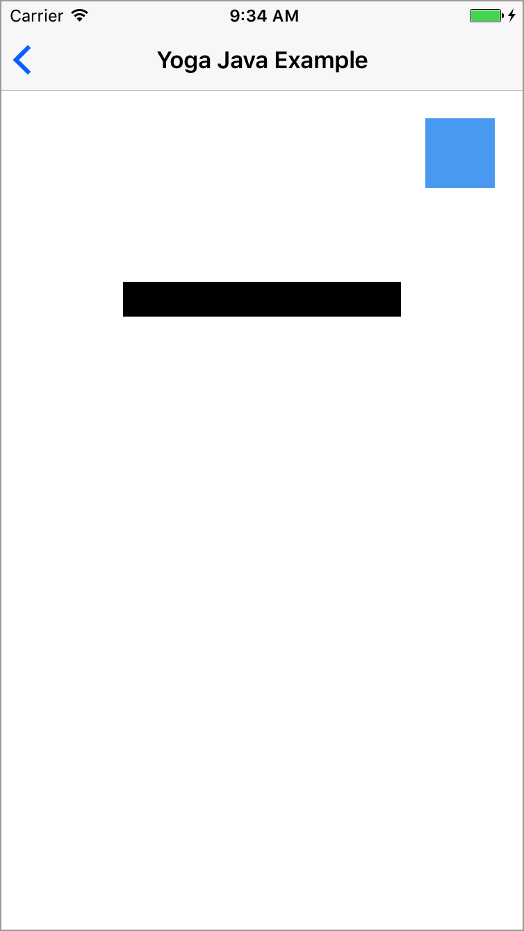
shrink value is 0, which keeps the item's current size in the main-axis direction. So that may cause the item to overflow its flex container. To fix that you just have to specify a shrink value bigger than 0: view.flex.shrink(1)
Q: How to keep the view size (width/height)?
A: By default view's flex shrink value is set to 1, which reduce the size of the view if the view is bigger than its flex container in the main-axis direction. If the direction is column, the height is adjusted, if the direction is row, the width is adjusted. Setting this value to 0 will keep the view size in the main-axis direction.
Q: How to apply percentage from a CGFloat, a Float or an Int value?
R: Few FlexLayout's method has a parameter of type FPercent. You can easily specify this type of parameter simply by adding the % operator to your value (eg: view.flex.width(25%). It is similar if you have a value of type CGFloat, Float or Int, simply adds the % operator:
let percentageValue: CGFloat = 50
view.flex.height(percentageValue%)
For any comments, ideas, suggestions, simply open an issue.
For issues, please have a look at Yoga's issues. Your issue may have been already reported. If not, it may be a FlexLayout issue. In this case open an issue and we'll let you know if the issue is related to Yoga's implementation.
If you find FlexLayout interesting, thanks to Star it. You'll be able to retrieve it easily later.
If you'd like to contribute, you're welcome!
To integrate FlexLayout into your Xcode project using CocoaPods, specify it in your Podfile:
pod 'FlexLayout'
Then, run pod install.
To integrate FlexLayout into your Xcode project using Carthage:
Cartfile:github "layoutBox/FlexLayout"
carthage update --no-build
(cd ./Carthage/Checkouts/FlexLayout && pod install)
carthage build --use-xcframeworks
FlexLayout.xcframework in your Xcode project in the Embedded Binaries section.To integrate FlexLayout into another Swift Package, add it as a dependency:
.package(url: "https://github.com/layoutBox/FlexLayout.git", from: "1.3.18")
To integrate FlexLayout into an Xcode target, use the File -> Swift Packages -> Add Package Dependency menu item.
FlexLayout recent history is available in the are documented in the CHANGELOG.
MIT License
425 followers · starred Jun 2023
322 followers · starred Aug 2018
1,590 followers · starred Dec 2020
111 followers · starred Sep 2017
FlexLayout adds a nice Swift interface to the highly optimized facebook/yoga flexbox implementation. Concise, intuitive & chainable syntax.
Swift
2,133
423 commits
updated Aug 30, 2026
FlexLayout adds a nice Swift interface to the highly optimized Yoga flexbox implementation. Concise, intuitive & chainable syntax.
Flexbox is an incredible improvement over UIStackView. It is simpler to use, much more versatile and amazingly performant.
Yoga is a multiplatform CSS Flexbox implementation (iOS/Android/...). Yoga is also the layout engine of React Native.
📌 FlexLayout is actively updated. So please come often to see latest changes. You can also Star it to be able to retrieve it easily later.
FlexLayout is a companion of PinLayout. They share a similar syntax and method names. PinLayout is a layout framework greatly inspired by CSS absolute positioning, it is particularly useful for greater fine control and animations. It gives you full control by layouting one view at a time (simple to code and debug).
This example will layout multiples views using column and row flexbox containers.
Two steps to use a flexbox container:
layoutSubviews() (or willTransition(to: UITraitCollection, ...) and viewWillTransition(to: CGSize, ...)).
layout().
fileprivate let rootFlexContainer = UIView()

init() {
   super.init(frame: .zero)

   addSubview(rootFlexContainer)
   ...

   // Column container
   rootFlexContainer.flex.direction(.column).padding(12).define { (flex) in
        // Row container
        flex.addItem().direction(.row).define { (flex) in
            flex.addItem(imageView).width(100).aspectRatio(of: imageView)

            // Column container
            flex.addItem().direction(.column).paddingLeft(12).grow(1).define { (flex) in
                flex.addItem(segmentedControl).marginBottom(12).grow(1)
                flex.addItem(label)
            }
        }

        flex.addItem().height(1).marginTop(12).backgroundColor(.lightGray)
        flex.addItem(bottomLabel).marginTop(12)
    }
}

override func layoutSubviews() {
    super.layoutSubviews()

    // 1) Layout the flex container. This example use PinLayout for that purpose, but it could be done
    //    also by setting the rootFlexContainer's frame:
    //       rootFlexContainer.frame = CGRect(x: 0, y: 0,
    //                                        width: frame.width, height: rootFlexContainer.height)
    rootFlexContainer.pin.top().left().width(100%).marginTop(topLayoutGuide)

    // 2) Then let the flexbox container layout itself. Here the container's height will be adjusted automatically.
    rootFlexContainer.flex.layout(mode: .adjustHeight)
}
📌 This example is available in the Examples App. See complete source code
The example implements the Ray Wenderlich Yoga Tutorial screen using FlexLayout.
init() {
   ...

   rootFlexContainer.flex.define { (flex) in
        // Image
        flex.addItem(episodeImageView).grow(1).backgroundColor(.gray)

        // Summary row
        flex.addItem().direction(.row).padding(padding).define { (flex) in
            flex.addItem(summaryPopularityLabel).grow(1)

            flex.addItem().direction(.row).justifyContent(.spaceBetween).grow(2).define { (flex) in
                flex.addItem(yearLabel)
                flex.addItem(ratingLabel)
                flex.addItem(lengthLabel)
            }

            flex.addItem().width(100).height(1).grow(1)
        }

        // Title row
        flex.addItem().direction(.row).padding(padding).define { (flex) in
            flex.addItem(episodeIdLabel)
            flex.addItem(episodeTitleLabel).marginLeft(20)
        }

        // Description section
        flex.addItem().paddingHorizontal(paddingHorizontal).define { (flex) in
            flex.addItem(descriptionLabel)
            flex.addItem(castLabel)
            flex.addItem(creatorsLabel)
        }

        // Action row
        flex.addItem().direction(.row).padding(padding).define { (flex) in
            flex.addItem(addActionView)
            flex.addItem(shareActionView)
        }

        // Tabs row
        flex.addItem().direction(.row).padding(padding).define { (flex) in
            flex.addItem(episodesTabView)
            flex.addItem(moreTabView)
        }

        // Shows TableView
        flex.addItem(showsTableView).grow(1)
    }
}

override func layoutSubviews() {
    super.layoutSubviews()

    // 1) Layout the contentView & rootFlexContainer using PinLayout
    contentView.pin.top().bottom().left().right()
    rootFlexContainer.pin.top().left().right()

    // 2) Let the flexbox container layout itself and adjust the height
    rootFlexContainer.flex.layout(mode: .adjustHeight)

    // 3) Adjust the scrollview contentSize
    contentView.contentSize = rootFlexContainer.frame.size
}
📌 This example is available in the Examples App. See complete source code
NOTE: FlexLayout wraps facebook/yoga implementation and expose all its features. So note that on this documentation we will refer to FlexLayout, but this also applies to Yoga.
FlexLayout's performance has been measured using the Layout Framework Benchmark. FlexLayout and PinLayout has been added to this benchmark to compare their performance.
As you can see in the following chart, FlexLayout and PinLayout's performance are faster or equal to manual layouting. FlexLayout and PinLayout are between 8x and 12x faster than UIStackViews, and this for all types of iPhone (5S/6/6S/7/8/X)
See here more complete details, results and explanation of the benchmark.
In many CSS methods and properties name, the keyword flex was added to control name conflicts. FlexLayout removed this keyword for being more concise and removed this unecessary keyword:
| FlexLayout Name | CSS Name | React Native Name |
|---|---|---|
direction | flex-direction | flexDirection |
wrap | flex-wrap | flexWrap |
grow | flex-grow | flexGrow |
shrink | flex-shrink | flexShrink |
basis | flex-basis | flexBasis |
start | flex-start | flexStart |
end | flex-end | flexEnd |
FlexLayout default properties are sligthly different from CSS flexbox. This table resume these difference:
| Property | FlexLayout default value | CSS default value | React Native default value |
|---|---|---|---|
direction | column | row | column |
justifyContent | start | start | start |
alignItems | stretch | stretch | stretch |
alignSelf | auto | auto | auto |
alignContent | start | stretch | start |
grow | 0 | 0 | 0 |
shrink | 0 | 1 | 0 |
basis | 0 | auto | 0 |
wrap | noWrap | nowrap | noWrap |
FlexLayout additions:
NOTE: FlexLayout doesn't support the flexbox order property. The order is determined by the flex container's UIView.subviews array.
Flexbox is pretty easy and straightforward to use. The defining aspect of the flexbox is the ability to alter its items, width, height to best fill the available space on any display device. A flex container expands its items to fill the available free space or shrinks them to prevent overflow.
The flex layout is constituted of parent container referred as flex container and its immediate children which are called flex items. A flex item can also be a flex container, i.e. it is possible to add other flex items to it.
When working with StackViews you need to think in terms of two axes — the main axis and the cross axis. The main axis is defined by StackView's direction property, and the cross axis runs perpendicular to it.
| StackView direction | Axes |
|---|---|
| column (default) | |
| row | |
In the following sections we will see:
📌 This document is a guide that explains how to use FlexLayout. You can also checks the FlexLayout's API documentation.
flex containersMethod:
addItem(_: UIView) -> Flex view.flex.addItem(imageView).width(100).aspectRatio(1)
flex containersMethod:
addItem() -> FlexaddItem(: UIView) except that it also creates the flex item's UIView. Internally the method creates a UIView, adds it as a subview and enables flexbox. This is useful to add a flex item/container easily when you don't need to refer to it later. view.flex.addItem().direction(.row).padding(10)
flex containers(flex: Flex) -> VoidMethod:
define(_ closure: (_ flex: Flex) -> Void)flex. This parameter is in fact the view's flex interface. It can be used to adds other flex items and containers. view.flex.addItem().define { (flex) in
flex.addItem(imageView).grow(1)
flex.addItem().direction(.row).define { (flex) in
flex.addItem(titleLabel).grow(1)
flex.addItem(priceLabel)
}
}
The same results can also be obtained without using the define() method, but the result is not as elegant:
  let columnContainer = UIView()
  columnContainer.flex.addItem(imageView).grow(1)
  view.flex.addItem(columnContainer)

  let rowContainer = UIView()
  rowContainer.flex.direction(.row)
  rowContainer.flex.addItem(titleLabel).grow(1)
  rowContainer.flex.addItem(priceLabel)
  columnContainer.flex.addItem(rowContainer)
Advantages of using define():
define's closure, you can do whatever you want to fill the flexbox container. You can use for loops, iterate arrays of data, call functions, ...It is possible to access the flex items's UIView using flex.view. This is particularly useful when using flex.define() method.
This example creates a flexbox container and sets its alpha to 0.8.
    view.flex.direction(.row).padding(20).alignItems(.center).define { (flex) in
        flex.addItem().width(50).height(50).define { (flex) in
            flex.view?.alpha = 0.8
        }
    }
Another possible solution:
    view.flex.direction(.row).padding(20).alignItems(.center).define { (flex) in
        let container = UIView()
        container.alpha = 0.8

        flex.addItem(container).width(50).height(50)
    }
flex containersfitContainer / adjustWidth / adjustHeightfitContainerMethod:
layout(mode: LayoutMode = . fitContainer)
The method will layout the flex container's children.
Layout modes:
fitContainer: This is the default mode when no parameter is specified. Children are layouted inside the container's size (width and height).adjustHeight: In this mode, children are layouted using only the container's width. The container's height will be adjusted to fit the flexbox's childrenadjustWidth: In this mode, children are layouted using only the container's height. The container's width will be adjusted to fit the flexbox's children rootFlexContainer.flex.layout(mode: .adjustHeight)
This section describes all flex container's properties.
flex containerscolumn / columnReverse / row / rowReversecolumnflex-directionProperty:
direction: Direction?Method:
direction(_: Direction)
The direction property establishes the main-axis, thus defining the direction flex items are placed in the flex container.
The direction property specifies how flex items are laid out in the flex container, by setting the direction of the flex container’s main axis. They can be laid out in two main directions, like columns vertically or like rows horizontally.
Note that row and row-reverse are affected by the layout direction (see layoutDirection property) of the flex container. If its text direction is LTR (left to right), row represents the horizontal axis oriented from left to right, and row-reverse from right to left; if the direction is rtl, it's the opposite.
| Value | Result | Description |
|---|---|---|
| column (default) | | Top to bottom |
| columnReverse | | Bottom to top |
| row | | Same as text direction |
| rowReverse | | opposite to text direction |
  view.flex.direction(.column)  // Not required, default value.
  view.flex.direction(.row)
This example center three buttons with a margin of 10 pixels between them.
Example source code
    rootFlexContainer.flex.justifyContent(.center).padding(10).define { (flex) in
        flex.addItem(button1)
        flex.addItem(button2).marginTop(10)
        flex.addItem(button3).marginTop(10)
    }
flex containersstart / end / center / spaceBetween / spaceAround / spaceEvenlystartjustify-contentMethod:
justifyContent(_: JustifyContent)justifyContent property defines the alignment along the main-axis of the current line of the flex container. It helps distribute extra free space leftover when either all the flex items on a line have reached their maximum size. For example, if children are flowing vertically, justifyContent controls how they align vertically.| direction(.column) | direction(.row) | ||
|---|---|---|---|
| start (default) | | | Items are packed at the beginning of the main-axis. |
| end | | | Items are packed at the end of the main-axis. |
| center | | | items are centered along the main-axis. |
| spaceBetween | | | Items are evenly distributed in the main-axis; first item is at the beginning, last item at the end. |
| spaceAround | | | Items are evenly distributed in the main-axis with equal space around them. |
| spaceEvenly | | | Items are evenly distributed in the main-axis with equal space around them. |
  view.flex.justifyContent(.start)  // default value.
  view.flex.justifyContent(.center)
flex containersstretch / start / end / center / baselinestretchalign-itemsMethod:
alignItems(_: AlignItems)alignItems property defines how flex items are laid out along the cross axis on the current line. Similar to justifyContent but for the cross-axis (perpendicular to the main-axis). For example, if children are flowing vertically, alignItems controls how they align horizontally.| direction(.column) | direction(.row) | |
|---|---|---|
| stretch (default) | | |
| start | | |
| end | | |
| center | | |
flex containersauto / stretch / start / end / center / baselineautoalign-selfMethod:
alignSelf(_: AlignSelf)alignSelf property controls how a child aligns in the cross direction, overriding the alignItems of the parent. For example, if children are flowing vertically, alignSelf will control how the flex item will align horizontally.The auto value means use the flex container alignItems property. See alignItems for documentation of the other values.
flex containersnoWrap / wrap / wrapReversenoWrapflex-wrapMethod:
wrap(_: Wrap)wrap property controls whether the flex container is single-lined or multi-lined, and the direction of the cross-axis, which determines the direction in which the new lines are stacked in.By default, the flex container fits all flex items into one line. Using this property we can change that. We can tell the container to lay out its items in single or multiple lines, and the direction the new lines are stacked in
Reminder: the cross axis is the axis perpendicular to the main axis. Its direction depends on the main axis direction.
| direction(.column) | direction(.row) | Description | |
|---|---|---|---|
| noWrap (default) | | | Single-line which may cause the container to overflow. NEW: Flex items are displayed in one row and by default they are shrunk to fit the flex container’s width |
| wrap | | | Multi-lines, direction is defined by direction(). NEW: Flex items are displayed in multiple rows if needed from left-to-right and top-to-bottom |
| wrapReverse | | | Multi-lines, opposite to direction defined by direction(). NEW: Flex items are displayed in multiple rows if needed from left-to-right and bottom-to-top |
  view.flex.wrap(.nowrap)  // Not required, default value.
  view.flex.wrap(.wrap)
flex containersstart / end / center / stretch / spaceBetween / spaceAround / spaceEvenlystartalign-contentMethod:
alignContent(_: AlignContent)Note, alignContent has no effect when the flexbox has only a single line.
| direction(.column) | direction(.row) | |
|---|---|---|
| start (default) | | |
| end | | |
| center | | |
| stretch | | |
| spaceBetween | | |
| spaceAround | | |
| spaceEvenly |
FlexLayout supports left-to-right (LTR) and right-to-left (RTL) languages.
Using start or end properties, you can position views without having to think about whether your item will show up on the left or the right side of the screen (depending on the person’s language
Method:
layoutDirection(_: LayoutDirection)
The layoutDirection property controls the flex container layout direction.
Values:
.inherit.ltr: Layout views from left to right. (Default).rtl: Layout views from right to left.This section describe all flex items's properties.
📌 Remembers that flex containers are also flex items, so all these properties also apply to containers.
flex itemsflex-growMethod:
grow(_: CGFloat)
The grow property defines the ability for a flex item to grow if necessary. It accepts a unitless value that serves as a proportion. It dictates what amount of the available space inside the flex container the item should take up.
A grow value of 0 (default value) keeps the view's size in the main-axis direction. If you want the view to use the available space set a grow value > 0.
For example, if all items have grow set to 1, every child will set to an equal size inside the container. If you were to give one of the children a value of 2, that child would take up twice as much space as the others.
flex itemsflex-shrinkMethod:
shrink(_: CGFloat)
It specifies the "flex shrink factor", which determines how much the flex item will shrink relative to the rest of the flex items in the flex container when there isn't enough space on the main-axis.
When omitted, it is set to 0 and the flex shrink factor is multiplied by the flex basis when distributing negative space.
A shrink value of 0 keeps the view's size in the main-axis direction. Note that this may cause the view to overflow its flex container.
Shrink is about proportions. If an item has a shrink of 3, and the rest have a shrink of 1, the item will shrink 3x as fast as the rest.
flex itemsflex-basisMethod:
basis(_ : CGFloat?)
This property takes the same values as the width and height properties, and specifies the initial size of the flex item, before free space is distributed according to the grow and shrink factors.
Specifying nil set the basis as auto, which means the length is equal to the length of the item. If the item has no length specified, the length will be according to its content
basis(_ : FPercent)
This property takes the same values as the width and height properties, and specifies the initial size of the flex item, before free space is distributed according to the grow and shrink factors.
flex containersgapMethod:
columnGap(_ value: CGFloat)
This property set distance between columns.
rowGap(_ value: CGFloat)
This property set distance between rows.
gap(_ value: CGFloat)
This property set distance between both of rows and columns.
flex itemsMethod:
isIncludedInLayout(_ value: Bool)FlexLayout automatically includes the UIView when:
UIView.flex property is accessedaddItem(:UIView) or addItem()flex itemsMethod:
display(_: Display)Set the item display or not, with none value, the item will be hidden and not included in the layout.
Values:
flex: Default value. The item is displayed normally and included in the layout.none: The item will be hidden and not included in the layout.contents: The node is removed from the layout flow, while its children are preserved and hoisted. This allows higher-level UI frameworks to compose wrapper components (e.g., to handle events) without influencing the layout of child nodes.flex itemsMethod:
boxSizing(_: BoxSizing)Set the box sizing mode for the item. This determines how the width and height of an element are calculated.
Values:
borderBox: Default value. With borderBox, the specified dimensions (width, height) include the content, padding, and border. This means the overall size of the element is as defined, with padding and border accounted for inside.contentBox: With contentBox, the specified dimensions refer only to the content area. Padding and borders are added outside these dimensions, potentially increasing the total size of the element.flex itemsMethod:
markDirty()
The framework is so highly optimized, that flex items are layouted only when a flex property is changed and when flex container size change. In the event that you want to force FlexLayout to do a layout of a flex item, you can mark it as dirty using markDirty().
Dirty flag propagates to the root of the flexbox tree ensuring that when any item is invalidated its whole subtree will be re-calculated.
In the case where a UILabel's text is updated, it is needed to mark the label as dirty and relayout the flex container.
    // 1) Update UILabel's text
    label.text = "I love FlexLayout"

    // 2) Mark the UILabel as dirty
    label.flex.markDirty()

    // 3) Then force a relayout of the flex container.
    rootFlexContainer.flex.layout()
    OR
    setNeedsLayout()
flex itemsMethod:
sizeThatFits()Get the size of view when layouted in a container with a width of 200 pixels.
let layoutSize = viewA.flex.sizeThatFits(size: CGSize(width: 200, height: CGFloat.greatestFiniteMagnitude))
flex itemsProperty:
intrinsicSizeflex itemsMethod:
position(_: Position)relative (default) The view is positioned using Insets properties (top, bottom, left, right, start, end) from its normal position within its flex container and will take up space within the flex container. This node will always form a containing block.absolute: The view is removed from the flex container's flow and is positioned using Insets properties (top, bottom, left, right, start, end). Insets will offset the node from its containing block.static: The view ignores insets and will not form a containing block. view.flex.position(.relative).top(10).left(10).size(50)
view.flex.position(.absolute).top(10).left(10).size(50)
A flex item with position set to .relative is positioned relative to its normal position within its flex container. Only one property can be applied in each direction, either vertical or horizontal. If both top and bottom properties are set, top takes precedence. If both left and right properties are set, left takes precedence.
A flex item with position set to .absolute is positioned absolutely with respect to its containing block. Using these properties you can control the size and position of an absolute item within its parent. Because absolutely positioned children don’t affect their sibling's layout. Absolute position can be used to create overlays and stack children in the Z axis.
This is done through the following methods:
Methods:
top(: CGFloat) / top(: FPercent):bottom(: CGFloat) / bottom(: FPercent):left(: CGFloat) / left(: FPercent):right(: CGFloat) / right(: FPercent):start(: CGFloat) / start(: FPercent):left() property and in RTL to right() property.end(: CGFloat) / end(: FPercent):right() property and in RTL to left() property.vertically(: CGFloat) / vertically(: FPercent):top().bottom().horizontally(: CGFloat) / horizontally(: FPercent):left().right().all(: CGFloat) / all(: FPercent):top().bottom().left().right(). view.flex.position(.relative).top(10).right(10).width(100).height(50)
view.flex.position(.absolute).top(10).right(10).width(100).height(50)
view.flex.position(.absolute).left(20%).right(20%)
📌 See the "Yoga C" example in the Examples App. Source code
FlexLayout has methods to set the view’s height and width.
Methods:
width(_ width: CGFloat?)width(nil) to reset the property.width(_ percent: FPercent)width(nil) to reset the property.height(_ height: CGFloat?)height(nil) to reset the property.height(_ percent: FPercent)height(nil) to reset the property.size(_ size: CGSize?)size(nil) to reset the property.size(_ sideLength: CGFloat?)size(nil) to reset the property. view.flex.width(100)
view.flex.width(50%)
view.flex.height(200)
view.flex.size(250)
FlexLayout has methods to set the view’s minimum and maximum width, and minimum and maximum height.
Using minWidth, minHeight, maxWidth, and maxHeight gives you increased control over the final size of items in a layout. By mixing these properties with grow, shrink, and alignItems(.stretch), you are able to have items with dynamic size within a range which you control.
An example of when Max properties can be useful is if you are using alignItems(.stretch) but you know that your item won’t look good after it increases past a certain point. In this case, your item will stretch to the size of its parent or until it is as big as specified in the Max property.
Same goes for the Min properties when using shrink. For example, you may want children of a container to shrink to fit on one row, but if you specify a minimum width, they will break to the next line after a certain point (if you are using wrap(.wrap).
Another case where Min and Max dimension constraints are useful is when using aspectRatio.
Methods:
minWidth(_ width: CGFloat?)minWidth(nil) to reset the property.minWidth(_ percent: FPercent)minWidth(nil) to reset the property..maxWidth(_ width: CGFloat?)maxWidth(nil) to reset the property.maxWidth(_ percent: FPercent)maxWidth(nil) to reset the property.minHeight(_ height: CGFloat?)minHeight(nil) to reset the property.minHeight(_ percent: FPercent)minHeight(nil) to reset the property.maxHeight(_ height: CGFloat?)maxHeight(nil) to reset the property.maxHeight(_ percent: FPercent)maxHeight(nil) to reset the property. view.flex.maxWidth(200)
view.flex.maxWidth(50%)
view.flex.width(of: view1).maxWidth(250)
view.flex.maxHeight(100)
view.flex.height(of: view1).maxHeight(30%)
AspectRatio is a property introduced by Yoga that don't exist in CSS. AspectRatio solves the problem of knowing one dimension of an element and an aspect ratio, this is very common when it comes to images, videos, and other media types. AspectRatio accepts any floating point value > 0, the default is undefined.
grow.aspectRatio(nil) to reset the property. imageView.flex.aspectRatio(16/9)
By applying Margin to an item you specify the offset a certain edge of the item should have from it’s closest sibling or parent.
Methods:
marginTop(_ value: CGFloat), marginTop(_ percent: FPercent)marginLeft(_ value: CGFloat), marginLeft(_ percent: FPercent)marginBottom(_ value: CGFloat), marginBottom(_ percent: FPercent)marginRight(_ value: CGFloat), marginRight(_ percent: FPercent)marginStart(_ value: CGFloat), marginStart(_ percent: FPercent)marginEnd(_ value: CGFloat), marginEnd(_ percent: FPercent)marginHorizontal(_ value: CGFloat), marginHorizontal(_ percent: FPercent)marginVertical(_ value: CGFloat), marginVertical(_ percent: FPercent)margin(_ insets: UIEdgeInsets)
Set all margins using an UIEdgeInsets. This method is particularly useful to set all margins using iOS 11 UIView.safeAreaInsets.margin(_ insets: NSDirectionalEdgeInsets)
Set all margins using an NSDirectionalEdgeInsets. This method is useful to set all margins using iOS 11 UIView. directionalLayoutMargins when layouting a view supporting RTL/LTR languages.margin(_ value: CGFloat) margin(_ vertical: CGFloat, _ horizontal: CGFloat)margin(_ top: CGFloat, _ horizontal: CGFloat, _ bottom: CGFloat)margin(_ top: CGFloat, _ left: CGFloat, _ bottom: CGFloat, _ right: CGFloat) view.flex.margin(20)
view.flex.marginTop(20%).marginLeft(20%)
view.flex.marginHorizontal(20)
view.flex.margin(safeAreaInsets)
view.flex.margin(10, 12, 0, 12)
Padding specify the offset children should have from a certain edge on the container.
Methods:
paddingTop(_ value: CGFloat), paddingTop(_ percent: FPercent)paddingLeft(_ value: CGFloat), paddingLeft(_ percent: FPercent)paddingBottom(_ value: CGFloat), paddingBottom(_ percent: FPercent)paddingRight(_ value: CGFloat), paddingRight(_ percent: FPercent)paddingStart(_ value: CGFloat), paddingStart(_ percent: FPercent)paddingEnd(_ value: CGFloat), paddingEnd(_ percent: FPercent)paddingHorizontal(_ value: CGFloat), paddingHorizontal(_ percent: FPercent)paddingVertical(_ value: CGFloat), paddingVertical(_ percent: FPercent)padding(_ insets: UIEdgeInsets)
Set all paddings using an UIEdgeInsets. This method is particularly useful to set all paddings using iOS 11 UIView.safeAreaInsets.padding(_ insets: NSDirectionalEdgeInsets)UIView. directionalLayoutMargins when layouting a view supporting RTL/LTR languages.padding(_ value: CGFloat), padding(_ percent: FPercent)padding(_ vertical: CGFloat, _ horizontal: CGFloat), padding(_ vertical: FPercent, horizontal: FPercentpadding(_ top: CGFloat, _ horizontal: CGFloat, _ bottom: CGFloat), padding(_ top: FPercent, _ horizontal: FPercent, _ bottom: FPercent)padding(_ top: CGFloat, _ left: FPercent, _ bottom: FPercent, _ right: FPercent), padding(_ top: FPercent, _ left: FPercent, _ bottom: FPercent, _ right: FPercent) view.flex.padding(20)
view.flex.paddingTop(20%).paddingLeft(20%)
view.flex.paddingBottom(20)
view.flex.paddingHorizontal(20)
view.flex.padding(10, 12, 0, 12)
FlexLayout also adds methods to set common UIView properties.
Methods:
backgroundColor(_ color: UIColor)cornerRadius(_ value: CGFloat)border(_ width: CGFloat, _ color: UIColor) // Create a gray column container and add a black horizontal line separator
flex.addItem().backgroundColor(.gray).define { (flex) in
flex.addItem().height(1).backgroundColor(.black)
}
// Set rounded corner
flex.addItem().cornerRadius(12)
// Set border
flex.addItem().border(1, .black)
The complete FlexLayout API is available here.
The FlexLayout's Example App exposes some usage example of FlexLayout.
See the Example App section to get more information.
shrink value is 0, which keeps the item's current size in the main-axis direction. So that may cause the item to overflow its flex container. To fix that you just have to specify a shrink value bigger than 0: view.flex.shrink(1)
Q: How to keep the view size (width/height)?
A: By default view's flex shrink value is set to 1, which reduce the size of the view if the view is bigger than its flex container in the main-axis direction. If the direction is column, the height is adjusted, if the direction is row, the width is adjusted. Setting this value to 0 will keep the view size in the main-axis direction.
Q: How to apply percentage from a CGFloat, a Float or an Int value?
R: Few FlexLayout's method has a parameter of type FPercent. You can easily specify this type of parameter simply by adding the % operator to your value (eg: view.flex.width(25%). It is similar if you have a value of type CGFloat, Float or Int, simply adds the % operator:
let percentageValue: CGFloat = 50
view.flex.height(percentageValue%)
For any comments, ideas, suggestions, simply open an issue.
For issues, please have a look at Yoga's issues. Your issue may have been already reported. If not, it may be a FlexLayout issue. In this case open an issue and we'll let you know if the issue is related to Yoga's implementation.
If you find FlexLayout interesting, thanks to Star it. You'll be able to retrieve it easily later.
If you'd like to contribute, you're welcome!
To integrate FlexLayout into your Xcode project using CocoaPods, specify it in your Podfile:
pod 'FlexLayout'
Then, run pod install.
To integrate FlexLayout into your Xcode project using Carthage:
Cartfile:github "layoutBox/FlexLayout"
carthage update --no-build
(cd ./Carthage/Checkouts/FlexLayout && pod install)
carthage build --use-xcframeworks
FlexLayout.xcframework in your Xcode project in the Embedded Binaries section.To integrate FlexLayout into another Swift Package, add it as a dependency:
.package(url: "https://github.com/layoutBox/FlexLayout.git", from: "1.3.18")
To integrate FlexLayout into an Xcode target, use the File -> Swift Packages -> Add Package Dependency menu item.
FlexLayout recent history is available in the are documented in the CHANGELOG.
MIT License
425 followers · starred Jun 2023
322 followers · starred Aug 2018
1,590 followers · starred Dec 2020
111 followers · starred Sep 2017