
Markdown rendering on React Native
See the codeREADME






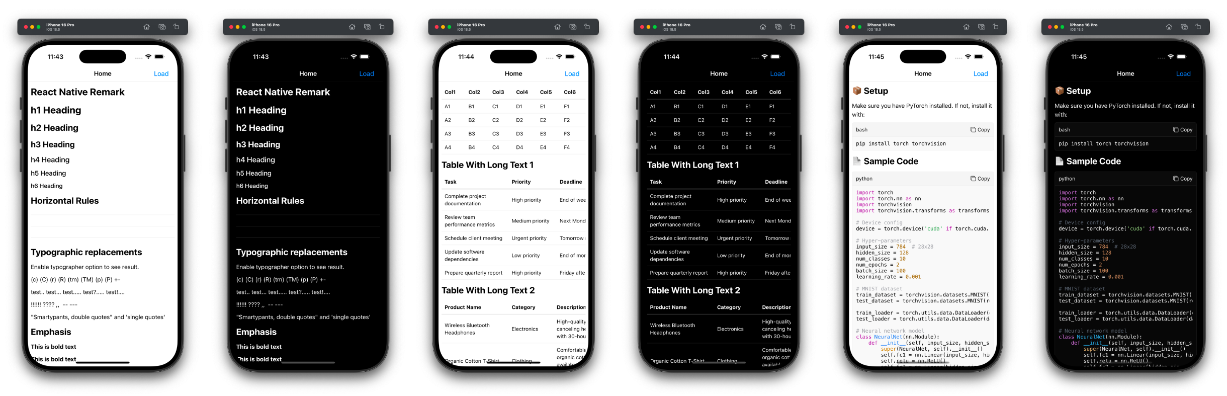
react-native-remark provides elegant and powerful Markdown rendering capabilities for React Native applications.
Features
- 📱 Render Markdown in React Native applications
- 🎯 Supports GitHub Flavored Markdown (GFM)
- 🌈 Syntax highlighting for code blocks
- 📊 Table rendering with horizontal scroll view
- 🖼️ Inline and block image rendering
- 🌙 Dark Mode support
- ⚙️ Custom renderers and styles for flexible UI customization
- 🧩 Supports Remark plugins to enhance capabilities
Installation
npm install react-native-remark
Usage
import { Markdown } from "react-native-remark";

const markdown = `
# Hello World! 👋

This is a **Markdown** example with [a link](https://reactnative.dev).

- List item 1
- List item 2
`;

export default function App() {
  return (
    <Markdown
      markdown={markdown}
      customRenderers={{
        // Override default renderers for mdast nodes.
        // Checkout https://github.com/imwithye/react-native-remark/blob/main/src/renderers/index.tsx
        // for the default renderers.
        InlineCodeRenderer: ({ node }) => (
          <Text style={{ color: "blue" }}>{node.value}</Text>
        ),
        ThematicBreakRenderer: () => (
          <View style={{ height: 5, backgroundColor: "red" }} />
        ),
      }}
      customStyles={{
        // Override default styles
        // Checkout https://github.com/imwithye/react-native-remark/blob/main/src/themes/default.tsx
        // for the default styles.
        inlineCode: {
          color: "red",
        },
        text: {
          color: "red",
        },
      }}
      onCodeCopy={(code) => Clipboard.setStringAsync(code)}
      onLinkPress={(url) => Linking.openURL(url)}
    />
  );
}
Supported Custom Renderers
All mdast node types have corresponding renderers, and each renderer can be fully customized. A renderer receives the following props:
// The current mdast node
node: any;

// The parent node, if it exists
parent?: Node;

// The index of this node within the parent's children
index?: number;
Checkout renderers for the default implementations. To ensure type safety when creating custom renderers, you can use the RendererArgs<MdastType> props interface.
Note that the library ships with renderers for the remark-gfm plugin since we think it is often used. You don't need to pass custom renderers (though you can!) for this plugin.
Supported Themes
Themes are pre-defined style collections that provide consistent visual styling for markdown content. Currently, we support two built-in themes:
- default
- serif
- github
To use a theme, you can follow this pattern:
import { themes } from "react-native-remark"
const { serifTheme } = themes;

// Then you can use it with
<Markdown theme={serifTheme} ... />
Custom styles will override the selected theme's default styles.
Supported Custom Styles
Checkout default.tsx for default styles.
| Style Key | Description | Example Markdown Element |
|---|---|---|
blockquote | Styles for blockquotes | > This is a blockquote |
borderColor | Default border color used globally | Borders, thematic breaks |
break | Line break styling (empty by default) | Line breaks |
codeBlock | Styles for code blocks | code blocks |
container | Container layout spacing | Root container layout |
delete | Deleted text style | |
emphasis | Italic text style | italic or italic |
footnoteReference | Style for footnote references | Footnote markers |
heading | Heading styles (h1, h2, h3...) | # Heading |
image | Image styling | Inline or block images |
inlineCode | Inline code styling | inline code |
link | Link styling | link |
linkReference | Reference-style links | [reference][id] |
list | List container styling | Lists (- item or 1. item) |
listItem | List item styling | Each list item |
paragraph | Paragraph text styling | Normal paragraphs |
strong | Bold text style | bold |
tableCell | Table cell text styling | Table cell contents |
text | General text style | Plain text |
thematicBreak | Horizontal rule styling | --- |
Remark plugins usage
You can inject Remark plugins via the remarkPlugins prop. For example, you can use remark-cjk-friendly to add support for bold (**) with Chinese, Japanese and Korean alphabets by doing the following:
import remarkCjkFriendly from "remark-cjk-friendly";
import remarkGfm from "remark-gfm";

<Markdown remarkPlugins={[remarkGfm, remarkCjkFriendly]} /* ... */ />;
Note that:
- though
remark-gfmis supported out of the box, you'll need to add the plugin manually when injecting other Remark plugins - when using plugins that add support for additional nodes, you'll need to inject the required renderers using the
customRenderersprop - ⚠️ asynchronous plugins aren't supported yet; passing any asynchronous plugin will result in a crash ⚠️
Quick Look
Contribute
See CONTRIBUTING.md for ways to get started.
This project has a CODE OF CONDUCT. By interacting with this repository, organization, or community you agree to abide by its terms.
Star History


Similar repos


Languages
TypeScript
97.4%
JavaScript
2.6%
Markdown rendering on React Native
See the codeREADME
react-native-remark provides elegant and powerful Markdown rendering capabilities for React Native applications.
Features
- 📱 Render Markdown in React Native applications
- 🎯 Supports GitHub Flavored Markdown (GFM)
- 🌈 Syntax highlighting for code blocks
- 📊 Table rendering with horizontal scroll view
- 🖼️ Inline and block image rendering
- 🌙 Dark Mode support
- ⚙️ Custom renderers and styles for flexible UI customization
- 🧩 Supports Remark plugins to enhance capabilities
Installation
npm install react-native-remark
Usage
import { Markdown } from "react-native-remark";

const markdown = `
# Hello World! 👋

This is a **Markdown** example with [a link](https://reactnative.dev).

- List item 1
- List item 2
`;

export default function App() {
  return (
    <Markdown
      markdown={markdown}
      customRenderers={{
        // Override default renderers for mdast nodes.
        // Checkout https://github.com/imwithye/react-native-remark/blob/main/src/renderers/index.tsx
        // for the default renderers.
        InlineCodeRenderer: ({ node }) => (
          <Text style={{ color: "blue" }}>{node.value}</Text>
        ),
        ThematicBreakRenderer: () => (
          <View style={{ height: 5, backgroundColor: "red" }} />
        ),
      }}
      customStyles={{
        // Override default styles
        // Checkout https://github.com/imwithye/react-native-remark/blob/main/src/themes/default.tsx
        // for the default styles.
        inlineCode: {
          color: "red",
        },
        text: {
          color: "red",
        },
      }}
      onCodeCopy={(code) => Clipboard.setStringAsync(code)}
      onLinkPress={(url) => Linking.openURL(url)}
    />
  );
}
Supported Custom Renderers
All mdast node types have corresponding renderers, and each renderer can be fully customized. A renderer receives the following props:
// The current mdast node
node: any;

// The parent node, if it exists
parent?: Node;

// The index of this node within the parent's children
index?: number;
Checkout renderers for the default implementations. To ensure type safety when creating custom renderers, you can use the RendererArgs<MdastType> props interface.
Note that the library ships with renderers for the remark-gfm plugin since we think it is often used. You don't need to pass custom renderers (though you can!) for this plugin.
Supported Themes
Themes are pre-defined style collections that provide consistent visual styling for markdown content. Currently, we support two built-in themes:
- default
- serif
- github
To use a theme, you can follow this pattern:
import { themes } from "react-native-remark"
const { serifTheme } = themes;

// Then you can use it with
<Markdown theme={serifTheme} ... />
Custom styles will override the selected theme's default styles.
Supported Custom Styles
Checkout default.tsx for default styles.
| Style Key | Description | Example Markdown Element |
|---|---|---|
blockquote | Styles for blockquotes | > This is a blockquote |
borderColor | Default border color used globally | Borders, thematic breaks |
break | Line break styling (empty by default) | Line breaks |
codeBlock | Styles for code blocks | code blocks |
container | Container layout spacing | Root container layout |
delete | Deleted text style | |
emphasis | Italic text style | italic or italic |
footnoteReference | Style for footnote references | Footnote markers |
heading | Heading styles (h1, h2, h3...) | # Heading |
image | Image styling | Inline or block images |
inlineCode | Inline code styling | inline code |
link | Link styling | link |
linkReference | Reference-style links | [reference][id] |
list | List container styling | Lists (- item or 1. item) |
listItem | List item styling | Each list item |
paragraph | Paragraph text styling | Normal paragraphs |
strong | Bold text style | bold |
tableCell | Table cell text styling | Table cell contents |
text | General text style | Plain text |
thematicBreak | Horizontal rule styling | --- |
Remark plugins usage
You can inject Remark plugins via the remarkPlugins prop. For example, you can use remark-cjk-friendly to add support for bold (**) with Chinese, Japanese and Korean alphabets by doing the following:
import remarkCjkFriendly from "remark-cjk-friendly";
import remarkGfm from "remark-gfm";

<Markdown remarkPlugins={[remarkGfm, remarkCjkFriendly]} /* ... */ />;
Note that:
- though
remark-gfmis supported out of the box, you'll need to add the plugin manually when injecting other Remark plugins - when using plugins that add support for additional nodes, you'll need to inject the required renderers using the
customRenderersprop - ⚠️ asynchronous plugins aren't supported yet; passing any asynchronous plugin will result in a crash ⚠️
Quick Look
Contribute
See CONTRIBUTING.md for ways to get started.
This project has a CODE OF CONDUCT. By interacting with this repository, organization, or community you agree to abide by its terms.
Star History
Similar repos
Languages
TypeScript
97.4%
JavaScript
2.6%