A lightweight Android material bottom navigation bar library
Kotlin
2,065
141 commits
updated Aug 19, 2026
A lightweight Android material bottom navigation bar library, available as a classic View and as a fully native Jetpack Compose composable.



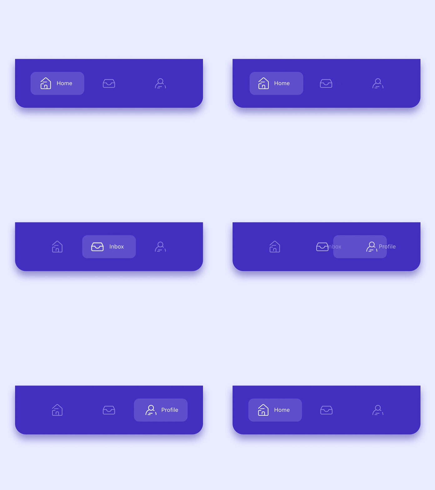
All design and inspiration credits belong to Alejandro Ausejo.
A fully Compose-native SmoothBottomBar composable, functionally equivalent to the View version below. It's a controlled component — the caller owns selectedIndex and reacts to onItemSelected/onItemReselected.
val items = listOf(
    SmoothBarItem(icon = painterResource(R.drawable.ic_dashboard_white_24dp), label = "Dashboard"),
    SmoothBarItem(icon = painterResource(R.drawable.ic_multiline_chart_white_24dp), label = "Leaderboard"),
    SmoothBarItem(icon = painterResource(R.drawable.ic_store_white_24dp), label = "Store", hasBadge = true),
    SmoothBarItem(icon = painterResource(R.drawable.ic_person_outline_white_24dp), label = "Profile"),
)

var selectedIndex by remember { mutableStateOf(0) }

SmoothBottomBar(
    items = items,
    selectedIndex = selectedIndex,
    onItemSelected = { selectedIndex = it },
    modifier = Modifier.fillMaxWidth().height(76.dp),
    backgroundColor = Color(0xFF432FBF),
)
See app/src/main/java/me/ibrahimsn/app/ComposeMainActivity.kt for a full example wired up to navigation-compose.
| Parameter | Default | Description |
|---|---|---|
items | — | List<SmoothBarItem> (icon, label, contentDescription, hasBadge) |
selectedIndex | — | Index of the currently active item |
onItemSelected | — | Called when a different item is tapped |
modifier | Modifier | Standard Compose modifier |
onItemReselected | {} | Called when the already-selected item is tapped again |
backgroundColor | Color.White | Bar background color |
shape | RectangleShape | Bar background shape |
indicatorColor | Color(0x2DFFFFFF) | Active-item pill color |
indicatorRadius | 12.dp | Active-item pill corner radius |
sideMargins | 10.dp | Left/right margin before the first/last item |
itemPadding | 10.dp | Padding inside each item |
itemSpacing | 8.dp | Minimum spacing between items |
itemTextColor | Color.White | Label text color |
itemTextSize | 11.sp | Label text size |
itemFontFamily | null | Label font family |
itemBadgeColor | Color.Red | Badge dot color |
itemBadgeRadius | 4.dp | Badge dot radius |
itemIconSize | 18.dp | Icon size |
itemIconMargin | 4.dp | Space between icon and label when active |
itemIconTint | Color(0xC8FFFFFF) | Icon tint when inactive |
itemIconTintActive | Color.White | Icon tint when active |
itemAnimDurationMillis | 200 | Selection transition duration |
iconBackgroundColor | Color.Transparent | Icon background circle color, inactive items only |
iconBackgroundPadding | 6.dp | Icon background circle padding |
<?xml version="1.0" encoding="utf-8"?>
<menu xmlns:android="http://schemas.android.com/apk/res/android">

    <item
        android:id="@+id/item0"
        android:title="@string/menu_dashboard"
        android:icon="@drawable/ic_dashboard_white_24dp"/>

    <item
        android:id="@+id/item1"
        android:title="@string/menu_leaderboard"
        android:icon="@drawable/ic_multiline_chart_white_24dp"/>

    <item
        android:id="@+id/item2"
        android:title="@string/menu_store"
        android:icon="@drawable/ic_store_white_24dp"/>

    <item
        android:id="@+id/item3"
        android:title="@string/menu_profile"
        android:icon="@drawable/ic_person_outline_white_24dp"/>

</menu>
<me.ibrahimsn.smoothbottombar.SmoothBottomBar
    android:id="@+id/bottomBar"
    android:layout_width="match_parent"
    android:layout_height="70dp"
    app:backgroundColor="@color/colorPrimary"
    app:badgeColor="@color/colorBadge"
    app:menu="@menu/menu_bottom"/>
bottomBar.onItemSelected = {
    status.text = "Item $it selected"
}

bottomBar.onItemReselected = {
    status.text = "Item $it re-selected"
}
OR
bottomBar.setOnItemSelectedListener(object: OnItemSelectedListener {
    override fun onItemSelect(pos: Int): Boolean {
        status.text = "Item $pos selected"
        return true
    }
})

bottomBar.setOnItemReselectedListener(object: OnItemReselectedListener {
    override fun onItemReselect(pos: Int) {
        status.text = "Item $pos re-selected"
    }
})
Note: For projects without kotlin, you may need to add
org.jetbrains.kotlin:kotlin-stdlib:$kotlinVersionto your dependencies since this is a Kotlin library.
Coupled with the Navigation Component from the Android Jetpack, SmoothBottomBar offers easier navigation within your application by designating navigation to the Navigation Component. This works best when using fragments, as the Navigation component helps to handle your fragment transactions.
id is the same as the MenuItems in your Menu i.e res/menu/ folder<?xml version="1.0" encoding="utf-8"?>
<menu xmlns:android="http://schemas.android.com/apk/res/android">
<item
android:id="@+id/first_fragment"
android:title="@string/menu_dashboard"
android:icon="@drawable/ic_dashboard_white_24dp"/>
<item
android:id="@+id/second_fragment"
android:title="@string/menu_leaderboard"
android:icon="@drawable/ic_multiline_chart_white_24dp"/>
<item
android:id="@+id/third_fragment"
android:title="@string/menu_store"
android:icon="@drawable/ic_store_white_24dp"/>
<item
android:id="@+id/fourth_fragment"
android:title="@string/menu_profile"
android:icon="@drawable/ic_person_outline_white_24dp"/>
</menu>
Navigation Graph i.e res/navigation/ folder
<?xml version="1.0" encoding="utf-8"?>
<navigation xmlns:android="http://schemas.android.com/apk/res/android"
    xmlns:app="http://schemas.android.com/apk/res-auto"
    xmlns:tools="http://schemas.android.com/tools"
    android:id="@+id/nav_graph"
    app:startDestination="@id/first_fragment">

    <fragment
        android:id="@+id/first_fragment"
        android:name="me.ibrahimsn.app.FirstFragment"
        android:label="Dashboard"
        tools:layout="@layout/fragment_first" >
        <action
            android:id="@+id/action_firstFragment_to_secondFragment"
            app:destination="@id/second_fragment" />
    </fragment>
    <fragment
        android:id="@+id/second_fragment"
        android:name="me.ibrahimsn.app.SecondFragment"
        android:label="Leaderboard"
        tools:layout="@layout/fragment_second" >
        <action
            android:id="@+id/action_secondFragment_to_thirdFragment"
            app:destination="@id/third_fragment" />
    </fragment>
    <fragment
        android:id="@+id/third_fragment"
        android:name="me.ibrahimsn.app.ThirdFragment"
        android:label="Store"
        tools:layout="@layout/fragment_third" >
        <action
            android:id="@+id/action_thirdFragment_to_fourthFragment"
            app:destination="@id/fourth_fragment" />
    </fragment>
    <fragment
        android:id="@+id/fourth_fragment"
        android:name="me.ibrahimsn.app.FourthFragment"
        android:label="Profile"
        tools:layout="@layout/fragment_fourth" />
</navigation>
MainActivity, create an instance of PopupMenu which takes a context and an anchor(pass in null) and then inflate this PopupMenu with the layout menu for the SmoothBottomBar.SmoothBottomBar and call setupWithNavController() which takes in a Menu and NavController, pass in the menu of the previously instantiated PopupMenu i.e.(popUpMenu.menu) and your NavController.setupSmoothBottomMenu()) in the onCreate method of your activity.N.B: Sample app makes use of ViewBinding to get reference to views in the layout.
   private fun setupSmoothBottomMenu() {
        binding.bottomBar.setupWithNavController(navController)
   }
You can also setup your ActionBar with the Navigation Component by calling setupActionBarWithNavController and pass in your NavController.
N.B: Your app needs to have a Toolbar for setupActionBarWithNavController to work. If your app theme doesn't have a Toolbar i.e. (Theme.AppCompat.Light.NoActionBar) you would need to:
 <com.google.android.material.appbar.AppBarLayout
        android:id="@+id/app_bar_layout"
        android:layout_width="match_parent"
        android:layout_height="wrap_content"
        app:layout_constraintEnd_toEndOf="parent"
        app:layout_constraintStart_toStartOf="parent"
        app:layout_constraintTop_toTopOf="parent">
        <androidx.appcompat.widget.Toolbar
            android:id="@+id/toolBar"
            android:layout_width="match_parent"
            android:layout_height="wrap_content" />
    </com.google.android.material.appbar.AppBarLayout>
Toolbar using setSupportActionBar(your_toolbar_id) in this case setSupportActionBar(binding.toolBar)We now have something like this:
 private lateinit var navController: NavController
 private lateinit var binding: ActivityMainBinding

    override fun onCreate(savedInstanceState: Bundle?) {
        super.onCreate(savedInstanceState)
        binding = ActivityMainBinding.inflate(layoutInflater)
        setContentView(binding.root)
        navController = findNavController(R.id.main_fragment)
        setupActionBarWithNavController(navController)
        setupSmoothBottomMenu()
    }

    private fun setupSmoothBottomMenu() {
        binding.bottomBar.setupWithNavController(navController)
    }

    //set an active fragment programmatically
    fun setSelectedItem(pos:Int){
        binding.bottomBar.setSelectedItem(pos)
    }
    //set badge indicator
    fun setBadge(pos:Int){
        binding.bottomBar.setBadge(pos)
    }
    //remove badge indicator
    fun removeBadge(pos:Int){
        binding.bottomBar.removeBadge(pos)
    }

    override fun onSupportNavigateUp(): Boolean {
        return navController.navigateUp() || super.onSupportNavigateUp()
    }
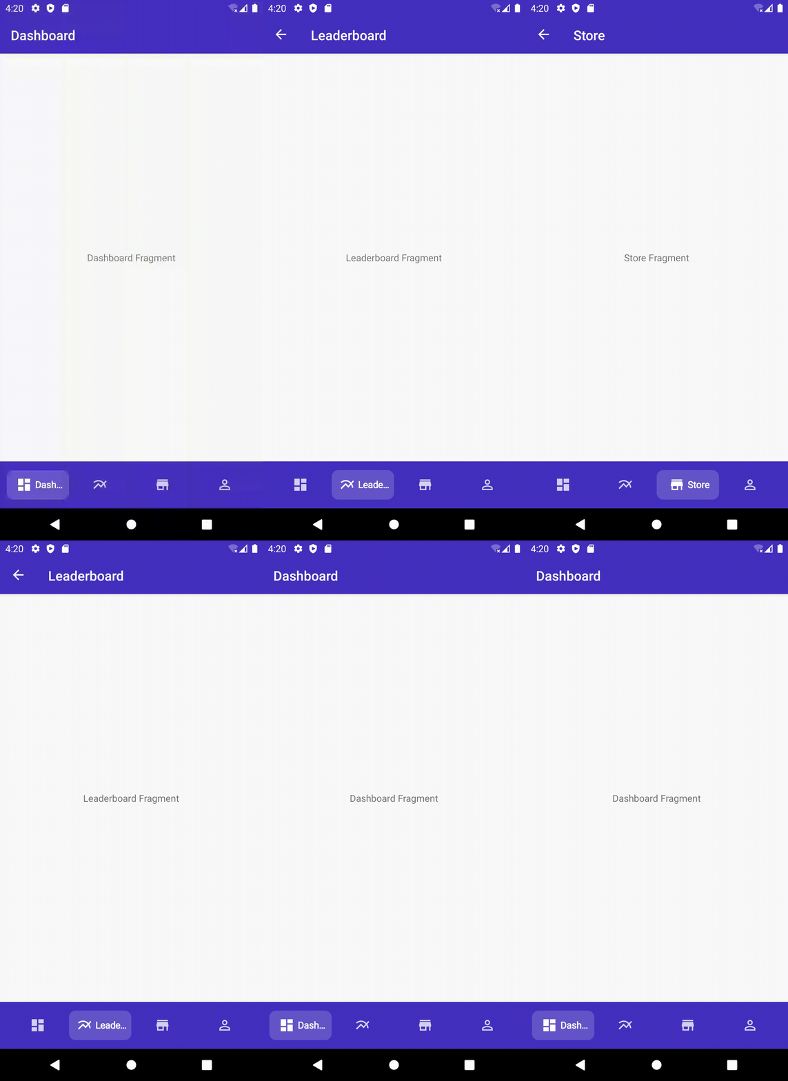
Prior to the initial addition of this feature, you can now inflate separate menu items for the SmoothBottomBar and your Toolbar.
Toolbar i.e.<?xml version="1.0" encoding="utf-8"?>
<menu xmlns:android="http://schemas.android.com/apk/res/android">
<item
android:id="@+id/another_item_1"
android:title="Another Item 1" />
<item
android:id="@+id/another_item_2"
android:title="Another Item 2" />
<item
android:id="@+id/another_item_3"
android:title="Another Item 3" />
</menu>
OnCreateOptionsMenu and onOptionsItemSelected (ensure it returns super.onOptionsItemSelected(item)). Now we have: class MainActivity : AppCompatActivity() {
private lateinit var navController: NavController
private lateinit var binding: ActivityMainBinding
override fun onCreate(savedInstanceState: Bundle?) {
super.onCreate(savedInstanceState)
binding = ActivityMainBinding.inflate(layoutInflater)
setContentView(binding.root)
navController = findNavController(R.id.main_fragment)
setupActionBarWithNavController(navController)
setupSmoothBottomMenu()
}
override fun onCreateOptionsMenu(menu: Menu?): Boolean {
menuInflater.inflate(R.menu.another_menu, menu)
return true
}
override fun onOptionsItemSelected(item: MenuItem): Boolean {
when (item.itemId) {
R.id.another_item_1 -> {
showToast("Another Menu Item 1 Selected")
}
R.id.another_item_2 -> {
showToast("Another Menu Item 2 Selected")
}
R.id.another_item_3 -> {
showToast("Another Menu Item 3 Selected")
}
}
return super.onOptionsItemSelected(item)
}
private fun showToast(msg: String) {
Toast.makeText(this, msg, Toast.LENGTH_SHORT).show()
}
private fun setupSmoothBottomMenu() {
binding.bottomBar.setupWithNavController(navController)
}
//set an active fragment programmatically
fun setSelectedItem(pos:Int){
binding.bottomBar.setSelectedItem(pos)
}
//set badge indicator
fun setBadge(pos:Int){
binding.bottomBar.setBadge(pos)
}
//remove badge indicator
fun removeBadge(pos:Int){
binding.bottomBar.removeBadge(pos)
}
override fun onSupportNavigateUp(): Boolean {
return navController.navigateUp() || super.onSupportNavigateUp()
}
}
    buttonId.setOnClickListener {
        (requireActivity() as MainActivity).setSelectedItem(2)
    }

<me.ibrahimsn.smoothbottombar.SmoothBottomBar
        android:id="@+id/bottomBar"
        android:layout_width="match_parent"
        android:layout_height="70dp"
        app:menu=""
        app:backgroundColor=""
        app:indicatorColor=""
        app:indicatorRadius=""
        app:cornerRadius=""
        app:corners=""
        app:sideMargins=""
        app:itemPadding=""
        app:itemSpacing=""
        app:textColor=""
        app:badgeColor=""
        app:badgeRadius=""
        app:iconBackgroundColor=""
        app:iconBackgroundPadding=""
        app:itemFontFamily=""
        app:textSize=""
        app:iconSize=""
        app:iconMargin=""
        app:iconTint=""
        app:iconTintActive=""
        app:activeItem=""
        app:duration="" />
Follow me on Twitter @ibrahimsn98
Requires minSdk 32, compileSdk 37, Kotlin 2.2+, Java 21.
//project label build.gradle
buildscript {
    repositories {
         ....
        maven { url 'https://jitpack.io' }
    }
}

allprojects {
    repositories {
     .......
        maven { url 'https://www.jitpack.io' }
    }
}
//app label build.gradle
dependencies {
        implementation 'com.github.ibrahimsn98:SmoothBottomBar:<version — see JitPack badge above>'
}
Note: The latest tagged release predates the
me.ibrahimsn.smoothbottombarpackage rename and the Compose module — a new tag needs to be cut before those changes are available via JitPack. Until then, build from source (git clone+include ':lib'/include ':compose') to use the code documented on this page.
The sample app module has two entry points: ComposeMainActivity (the Jetpack Compose demo above) is the default launcher activity; the classic View-based MainActivity is reachable from its overflow menu.
MIT License

Copyright (c) 2019 İbrahim Süren

Permission is hereby granted, free of charge, to any person obtaining a copy
of this software and associated documentation files (the "Software"), to deal
in the Software without restriction, including without limitation the rights
to use, copy, modify, merge, publish, distribute, sublicense, and/or sell
copies of the Software, and to permit persons to whom the Software is
furnished to do so, subject to the following conditions:

The above copyright notice and this permission notice shall be included in all
copies or substantial portions of the Software.

THE SOFTWARE IS PROVIDED "AS IS", WITHOUT WARRANTY OF ANY KIND, EXPRESS OR
IMPLIED, INCLUDING BUT NOT LIMITED TO THE WARRANTIES OF MERCHANTABILITY,
FITNESS FOR A PARTICULAR PURPOSE AND NONINFRINGEMENT. IN NO EVENT SHALL THE
AUTHORS OR COPYRIGHT HOLDERS BE LIABLE FOR ANY CLAIM, DAMAGES OR OTHER
LIABILITY, WHETHER IN AN ACTION OF CONTRACT, TORT OR OTHERWISE, ARISING FROM,
OUT OF OR IN CONNECTION WITH THE SOFTWARE OR THE USE OR OTHER DEALINGS IN THE
SOFTWARE.
342 followers · starred Jul 2020
12 followers · starred Oct 2019
43 followers · starred Nov 2019
21 followers · starred Mar 2021
A lightweight Android material bottom navigation bar library
Kotlin
2,065
141 commits
updated Aug 19, 2026
A lightweight Android material bottom navigation bar library, available as a classic View and as a fully native Jetpack Compose composable.
All design and inspiration credits belong to Alejandro Ausejo.
A fully Compose-native SmoothBottomBar composable, functionally equivalent to the View version below. It's a controlled component — the caller owns selectedIndex and reacts to onItemSelected/onItemReselected.
val items = listOf(
    SmoothBarItem(icon = painterResource(R.drawable.ic_dashboard_white_24dp), label = "Dashboard"),
    SmoothBarItem(icon = painterResource(R.drawable.ic_multiline_chart_white_24dp), label = "Leaderboard"),
    SmoothBarItem(icon = painterResource(R.drawable.ic_store_white_24dp), label = "Store", hasBadge = true),
    SmoothBarItem(icon = painterResource(R.drawable.ic_person_outline_white_24dp), label = "Profile"),
)

var selectedIndex by remember { mutableStateOf(0) }

SmoothBottomBar(
    items = items,
    selectedIndex = selectedIndex,
    onItemSelected = { selectedIndex = it },
    modifier = Modifier.fillMaxWidth().height(76.dp),
    backgroundColor = Color(0xFF432FBF),
)
See app/src/main/java/me/ibrahimsn/app/ComposeMainActivity.kt for a full example wired up to navigation-compose.
| Parameter | Default | Description |
|---|---|---|
items | — | List<SmoothBarItem> (icon, label, contentDescription, hasBadge) |
selectedIndex | — | Index of the currently active item |
onItemSelected | — | Called when a different item is tapped |
modifier | Modifier | Standard Compose modifier |
onItemReselected | {} | Called when the already-selected item is tapped again |
backgroundColor | Color.White | Bar background color |
shape | RectangleShape | Bar background shape |
indicatorColor | Color(0x2DFFFFFF) | Active-item pill color |
indicatorRadius | 12.dp | Active-item pill corner radius |
sideMargins | 10.dp | Left/right margin before the first/last item |
itemPadding | 10.dp | Padding inside each item |
itemSpacing | 8.dp | Minimum spacing between items |
itemTextColor | Color.White | Label text color |
itemTextSize | 11.sp | Label text size |
itemFontFamily | null | Label font family |
itemBadgeColor | Color.Red | Badge dot color |
itemBadgeRadius | 4.dp | Badge dot radius |
itemIconSize | 18.dp | Icon size |
itemIconMargin | 4.dp | Space between icon and label when active |
itemIconTint | Color(0xC8FFFFFF) | Icon tint when inactive |
itemIconTintActive | Color.White | Icon tint when active |
itemAnimDurationMillis | 200 | Selection transition duration |
iconBackgroundColor | Color.Transparent | Icon background circle color, inactive items only |
iconBackgroundPadding | 6.dp | Icon background circle padding |
<?xml version="1.0" encoding="utf-8"?>
<menu xmlns:android="http://schemas.android.com/apk/res/android">

    <item
        android:id="@+id/item0"
        android:title="@string/menu_dashboard"
        android:icon="@drawable/ic_dashboard_white_24dp"/>

    <item
        android:id="@+id/item1"
        android:title="@string/menu_leaderboard"
        android:icon="@drawable/ic_multiline_chart_white_24dp"/>

    <item
        android:id="@+id/item2"
        android:title="@string/menu_store"
        android:icon="@drawable/ic_store_white_24dp"/>

    <item
        android:id="@+id/item3"
        android:title="@string/menu_profile"
        android:icon="@drawable/ic_person_outline_white_24dp"/>

</menu>
<me.ibrahimsn.smoothbottombar.SmoothBottomBar
    android:id="@+id/bottomBar"
    android:layout_width="match_parent"
    android:layout_height="70dp"
    app:backgroundColor="@color/colorPrimary"
    app:badgeColor="@color/colorBadge"
    app:menu="@menu/menu_bottom"/>
bottomBar.onItemSelected = {
    status.text = "Item $it selected"
}

bottomBar.onItemReselected = {
    status.text = "Item $it re-selected"
}
OR
bottomBar.setOnItemSelectedListener(object: OnItemSelectedListener {
    override fun onItemSelect(pos: Int): Boolean {
        status.text = "Item $pos selected"
        return true
    }
})

bottomBar.setOnItemReselectedListener(object: OnItemReselectedListener {
    override fun onItemReselect(pos: Int) {
        status.text = "Item $pos re-selected"
    }
})
Note: For projects without kotlin, you may need to add
org.jetbrains.kotlin:kotlin-stdlib:$kotlinVersionto your dependencies since this is a Kotlin library.
Coupled with the Navigation Component from the Android Jetpack, SmoothBottomBar offers easier navigation within your application by designating navigation to the Navigation Component. This works best when using fragments, as the Navigation component helps to handle your fragment transactions.
id is the same as the MenuItems in your Menu i.e res/menu/ folder<?xml version="1.0" encoding="utf-8"?>
<menu xmlns:android="http://schemas.android.com/apk/res/android">
<item
android:id="@+id/first_fragment"
android:title="@string/menu_dashboard"
android:icon="@drawable/ic_dashboard_white_24dp"/>
<item
android:id="@+id/second_fragment"
android:title="@string/menu_leaderboard"
android:icon="@drawable/ic_multiline_chart_white_24dp"/>
<item
android:id="@+id/third_fragment"
android:title="@string/menu_store"
android:icon="@drawable/ic_store_white_24dp"/>
<item
android:id="@+id/fourth_fragment"
android:title="@string/menu_profile"
android:icon="@drawable/ic_person_outline_white_24dp"/>
</menu>
Navigation Graph i.e res/navigation/ folder
<?xml version="1.0" encoding="utf-8"?>
<navigation xmlns:android="http://schemas.android.com/apk/res/android"
    xmlns:app="http://schemas.android.com/apk/res-auto"
    xmlns:tools="http://schemas.android.com/tools"
    android:id="@+id/nav_graph"
    app:startDestination="@id/first_fragment">

    <fragment
        android:id="@+id/first_fragment"
        android:name="me.ibrahimsn.app.FirstFragment"
        android:label="Dashboard"
        tools:layout="@layout/fragment_first" >
        <action
            android:id="@+id/action_firstFragment_to_secondFragment"
            app:destination="@id/second_fragment" />
    </fragment>
    <fragment
        android:id="@+id/second_fragment"
        android:name="me.ibrahimsn.app.SecondFragment"
        android:label="Leaderboard"
        tools:layout="@layout/fragment_second" >
        <action
            android:id="@+id/action_secondFragment_to_thirdFragment"
            app:destination="@id/third_fragment" />
    </fragment>
    <fragment
        android:id="@+id/third_fragment"
        android:name="me.ibrahimsn.app.ThirdFragment"
        android:label="Store"
        tools:layout="@layout/fragment_third" >
        <action
            android:id="@+id/action_thirdFragment_to_fourthFragment"
            app:destination="@id/fourth_fragment" />
    </fragment>
    <fragment
        android:id="@+id/fourth_fragment"
        android:name="me.ibrahimsn.app.FourthFragment"
        android:label="Profile"
        tools:layout="@layout/fragment_fourth" />
</navigation>
MainActivity, create an instance of PopupMenu which takes a context and an anchor(pass in null) and then inflate this PopupMenu with the layout menu for the SmoothBottomBar.SmoothBottomBar and call setupWithNavController() which takes in a Menu and NavController, pass in the menu of the previously instantiated PopupMenu i.e.(popUpMenu.menu) and your NavController.setupSmoothBottomMenu()) in the onCreate method of your activity.N.B: Sample app makes use of ViewBinding to get reference to views in the layout.
   private fun setupSmoothBottomMenu() {
        binding.bottomBar.setupWithNavController(navController)
   }
You can also setup your ActionBar with the Navigation Component by calling setupActionBarWithNavController and pass in your NavController.
N.B: Your app needs to have a Toolbar for setupActionBarWithNavController to work. If your app theme doesn't have a Toolbar i.e. (Theme.AppCompat.Light.NoActionBar) you would need to:
 <com.google.android.material.appbar.AppBarLayout
        android:id="@+id/app_bar_layout"
        android:layout_width="match_parent"
        android:layout_height="wrap_content"
        app:layout_constraintEnd_toEndOf="parent"
        app:layout_constraintStart_toStartOf="parent"
        app:layout_constraintTop_toTopOf="parent">
        <androidx.appcompat.widget.Toolbar
            android:id="@+id/toolBar"
            android:layout_width="match_parent"
            android:layout_height="wrap_content" />
    </com.google.android.material.appbar.AppBarLayout>
Toolbar using setSupportActionBar(your_toolbar_id) in this case setSupportActionBar(binding.toolBar)We now have something like this:
 private lateinit var navController: NavController
 private lateinit var binding: ActivityMainBinding

    override fun onCreate(savedInstanceState: Bundle?) {
        super.onCreate(savedInstanceState)
        binding = ActivityMainBinding.inflate(layoutInflater)
        setContentView(binding.root)
        navController = findNavController(R.id.main_fragment)
        setupActionBarWithNavController(navController)
        setupSmoothBottomMenu()
    }

    private fun setupSmoothBottomMenu() {
        binding.bottomBar.setupWithNavController(navController)
    }

    //set an active fragment programmatically
    fun setSelectedItem(pos:Int){
        binding.bottomBar.setSelectedItem(pos)
    }
    //set badge indicator
    fun setBadge(pos:Int){
        binding.bottomBar.setBadge(pos)
    }
    //remove badge indicator
    fun removeBadge(pos:Int){
        binding.bottomBar.removeBadge(pos)
    }

    override fun onSupportNavigateUp(): Boolean {
        return navController.navigateUp() || super.onSupportNavigateUp()
    }
Prior to the initial addition of this feature, you can now inflate separate menu items for the SmoothBottomBar and your Toolbar.
Toolbar i.e.<?xml version="1.0" encoding="utf-8"?>
<menu xmlns:android="http://schemas.android.com/apk/res/android">
<item
android:id="@+id/another_item_1"
android:title="Another Item 1" />
<item
android:id="@+id/another_item_2"
android:title="Another Item 2" />
<item
android:id="@+id/another_item_3"
android:title="Another Item 3" />
</menu>
OnCreateOptionsMenu and onOptionsItemSelected (ensure it returns super.onOptionsItemSelected(item)). Now we have: class MainActivity : AppCompatActivity() {
private lateinit var navController: NavController
private lateinit var binding: ActivityMainBinding
override fun onCreate(savedInstanceState: Bundle?) {
super.onCreate(savedInstanceState)
binding = ActivityMainBinding.inflate(layoutInflater)
setContentView(binding.root)
navController = findNavController(R.id.main_fragment)
setupActionBarWithNavController(navController)
setupSmoothBottomMenu()
}
override fun onCreateOptionsMenu(menu: Menu?): Boolean {
menuInflater.inflate(R.menu.another_menu, menu)
return true
}
override fun onOptionsItemSelected(item: MenuItem): Boolean {
when (item.itemId) {
R.id.another_item_1 -> {
showToast("Another Menu Item 1 Selected")
}
R.id.another_item_2 -> {
showToast("Another Menu Item 2 Selected")
}
R.id.another_item_3 -> {
showToast("Another Menu Item 3 Selected")
}
}
return super.onOptionsItemSelected(item)
}
private fun showToast(msg: String) {
Toast.makeText(this, msg, Toast.LENGTH_SHORT).show()
}
private fun setupSmoothBottomMenu() {
binding.bottomBar.setupWithNavController(navController)
}
//set an active fragment programmatically
fun setSelectedItem(pos:Int){
binding.bottomBar.setSelectedItem(pos)
}
//set badge indicator
fun setBadge(pos:Int){
binding.bottomBar.setBadge(pos)
}
//remove badge indicator
fun removeBadge(pos:Int){
binding.bottomBar.removeBadge(pos)
}
override fun onSupportNavigateUp(): Boolean {
return navController.navigateUp() || super.onSupportNavigateUp()
}
}
    buttonId.setOnClickListener {
        (requireActivity() as MainActivity).setSelectedItem(2)
    }
<me.ibrahimsn.smoothbottombar.SmoothBottomBar
        android:id="@+id/bottomBar"
        android:layout_width="match_parent"
        android:layout_height="70dp"
        app:menu=""
        app:backgroundColor=""
        app:indicatorColor=""
        app:indicatorRadius=""
        app:cornerRadius=""
        app:corners=""
        app:sideMargins=""
        app:itemPadding=""
        app:itemSpacing=""
        app:textColor=""
        app:badgeColor=""
        app:badgeRadius=""
        app:iconBackgroundColor=""
        app:iconBackgroundPadding=""
        app:itemFontFamily=""
        app:textSize=""
        app:iconSize=""
        app:iconMargin=""
        app:iconTint=""
        app:iconTintActive=""
        app:activeItem=""
        app:duration="" />
Follow me on Twitter @ibrahimsn98
Requires minSdk 32, compileSdk 37, Kotlin 2.2+, Java 21.
//project label build.gradle
buildscript {
    repositories {
         ....
        maven { url 'https://jitpack.io' }
    }
}

allprojects {
    repositories {
     .......
        maven { url 'https://www.jitpack.io' }
    }
}
//app label build.gradle
dependencies {
        implementation 'com.github.ibrahimsn98:SmoothBottomBar:<version — see JitPack badge above>'
}
Note: The latest tagged release predates the
me.ibrahimsn.smoothbottombarpackage rename and the Compose module — a new tag needs to be cut before those changes are available via JitPack. Until then, build from source (git clone+include ':lib'/include ':compose') to use the code documented on this page.
The sample app module has two entry points: ComposeMainActivity (the Jetpack Compose demo above) is the default launcher activity; the classic View-based MainActivity is reachable from its overflow menu.
MIT License

Copyright (c) 2019 İbrahim Süren

Permission is hereby granted, free of charge, to any person obtaining a copy
of this software and associated documentation files (the "Software"), to deal
in the Software without restriction, including without limitation the rights
to use, copy, modify, merge, publish, distribute, sublicense, and/or sell
copies of the Software, and to permit persons to whom the Software is
furnished to do so, subject to the following conditions:

The above copyright notice and this permission notice shall be included in all
copies or substantial portions of the Software.

THE SOFTWARE IS PROVIDED "AS IS", WITHOUT WARRANTY OF ANY KIND, EXPRESS OR
IMPLIED, INCLUDING BUT NOT LIMITED TO THE WARRANTIES OF MERCHANTABILITY,
FITNESS FOR A PARTICULAR PURPOSE AND NONINFRINGEMENT. IN NO EVENT SHALL THE
AUTHORS OR COPYRIGHT HOLDERS BE LIABLE FOR ANY CLAIM, DAMAGES OR OTHER
LIABILITY, WHETHER IN AN ACTION OF CONTRACT, TORT OR OTHERWISE, ARISING FROM,
OUT OF OR IN CONNECTION WITH THE SOFTWARE OR THE USE OR OTHER DEALINGS IN THE
SOFTWARE.
342 followers · starred Jul 2020
12 followers · starred Oct 2019
43 followers · starred Nov 2019
21 followers · starred Mar 2021



