Go package to make lightweight ASCII line graph ╭┈╯ in command line apps with no other dependencies.
See the code



Go package to make lightweight ASCII line graphs ╭┈╯.
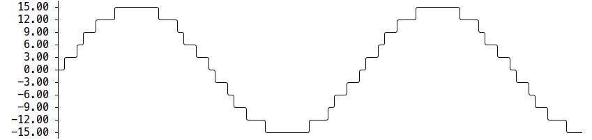
go get -u github.com/guptarohit/asciigraph@latest
package main

import (
    "fmt"
    "github.com/guptarohit/asciigraph"
)

func main() {
    data := []float64{3, 4, 9, 6, 2, 4, 5, 8, 5, 10, 2, 7, 2, 5, 6}
    graph := asciigraph.Plot(data)

    fmt.Println(graph)
}
Running this example would render the following graph:
  10.00 ┤        ╭╮
   9.00 ┤ ╭╮     ││
   8.00 ┤ ││   ╭╮││
   7.00 ┤ ││   ││││╭╮
   6.00 ┤ │╰╮  ││││││ ╭
   5.00 ┤ │ │ ╭╯╰╯│││╭╯
   4.00 ┤╭╯ │╭╯   ││││
   3.00 ┼╯  ││    ││││
   2.00 ┤   ╰╯    ╰╯╰╯
package main

import (
    "fmt"
    "github.com/guptarohit/asciigraph"
)

func main() {
	data := [][]float64{{0, 1, 2, 3, 3, 3, 2, 0}, {5, 4, 2, 1, 4, 6, 6}}
	graph := asciigraph.PlotMany(data)

	fmt.Println(graph)
}
Running this example would render the following graph:
 6.00 ┤    ╭─
 5.00 ┼╮   │
 4.00 ┤╰╮ ╭╯
 3.00 ┤ │╭│─╮
 2.00 ┤ ╰╮│ ╰╮
 1.00 ┤╭╯╰╯  │
 0.00 ┼╯     ╰
Use YAxisValueFormatter(...) to control how values printed on the Y-axis are rendered.
This is useful for human-readable units like bytes, durations, or domain-specific labels.
package main

import (
	"fmt"

	"github.com/guptarohit/asciigraph"
)

func main() {
	data := []float64{
		30 * 1024 * 1024 * 1024,
		70 * 1024 * 1024 * 1024,
		2 * 1024 * 1024 * 1024,
	}

	graph := asciigraph.Plot(data,
		asciigraph.Height(5),
		asciigraph.Width(45),
		asciigraph.YAxisValueFormatter(func(v float64) string {
			return fmt.Sprintf("%.2f GiB", v/1024/1024/1024)
		}),
	)

	fmt.Println(graph)
}
Running this example would render the following graph:
 70.00 GiB ┤                 ╭──────╮
 56.40 GiB ┤         ╭───────╯      ╰────╮
 42.80 GiB ┤  ╭──────╯                   ╰───╮
 29.20 GiB ┼──╯                              ╰────╮
 15.60 GiB ┤                                      ╰───╮
  2.00 GiB ┤                                          ╰─
Use XAxisRange(min, max) to add a labeled X-axis below the graph.
XAxisTickCount(n) controls how many tick marks appear (default 5, minimum 2).
package main

import (
	"fmt"
	"github.com/guptarohit/asciigraph"
)

func main() {
	data := []float64{3, 4, 9, 6, 2, 4, 5, 8, 5, 10, 2, 7, 2, 5, 6}
	graph := asciigraph.Plot(data,
		asciigraph.XAxisRange(0, 14),
		asciigraph.XAxisTickCount(3),
	)

	fmt.Println(graph)
}
Running this example would render the following graph:
 10.00 ┤        ╭╮
  9.00 ┤ ╭╮     ││
  8.00 ┤ ││   ╭╮││
  7.00 ┤ ││   ││││╭╮
  6.00 ┤ │╰╮  ││││││ ╭
  5.00 ┤ │ │ ╭╯╰╯│││╭╯
  4.00 ┤╭╯ │╭╯   ││││
  3.00 ┼╯  ││    ││││
  2.00 ┤   ╰╯    ╰╯╰╯
       └┬──────┬──────┬
        0      7     14
package main

import (
    "fmt"
    "github.com/guptarohit/asciigraph"
)

func main() {
	data := make([][]float64, 4)

	for i := 0; i < 4; i++ {
		for x := -20; x <= 20; x++ {
			v := math.NaN()
			if r := 20 - i; x >= -r && x <= r {
				v = math.Sqrt(math.Pow(float64(r), 2)-math.Pow(float64(x), 2)) / 2
			}
			data[i] = append(data[i], v)
		}
	}
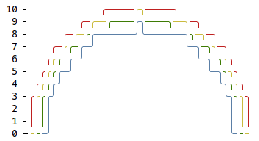
	graph := asciigraph.PlotMany(data, asciigraph.Precision(0), asciigraph.SeriesColors(
		asciigraph.Red,
		asciigraph.Yellow,
		asciigraph.Green,
		asciigraph.Blue,
	))

	fmt.Println(graph)
}
Running this example would render the following graph:
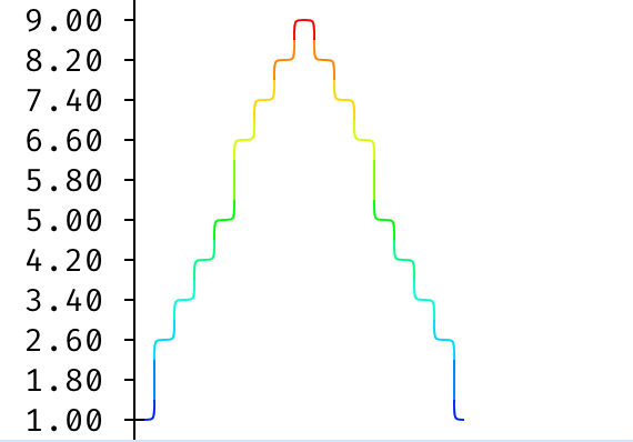
Instead of a solid color per series, SeriesColorGradient colors each point by
its value along a palette — warm tones for high values, cool tones for low ones.
The built-in HeatmapSpectrum provides a ready-made cool-to-warm palette, or you
can pass your own color stops (lowest value first).
package main

import (
	"fmt"
	"github.com/guptarohit/asciigraph"
)

func main() {
	data := []float64{1, 2, 3, 4, 5, 6, 7, 8, 9, 8, 7, 6, 5, 4, 3, 2, 1}
	graph := asciigraph.Plot(data,
		asciigraph.Height(10),
		asciigraph.SeriesColorGradient(asciigraph.HeatmapSpectrum...),
	)
	fmt.Println(graph)
}
Running this example would render the following graph:
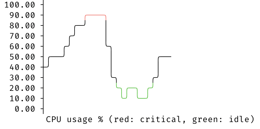
ColorAbove and ColorBelow highlight points that breach a threshold —
useful for flagging alerts, like a CPU usage spike or a disk space warning —
without recoloring the whole series. ColorAbove colors points strictly above
its threshold (value > threshold) and ColorBelow strictly below (value <
threshold). Points in between keep their normal color — the series color, or
the gradient color when SeriesColorGradient is set. These take precedence over
SeriesColorGradient and SeriesColors; when both thresholds match the same
point, ColorAbove wins.
package main

import (
	"fmt"
	"github.com/guptarohit/asciigraph"
)

func main() {
	data := []float64{42, 48, 55, 81, 85, 91, 87, 34, 12, 17, 10, 18, 55, 50}
	graph := asciigraph.Plot(data,
		asciigraph.Height(10),
		asciigraph.Width(25),
		asciigraph.LowerBound(0),
		asciigraph.UpperBound(100),
		asciigraph.Caption("CPU usage % (red: critical, green: idle)"),
		asciigraph.ColorAbove(asciigraph.Red, 80),
		asciigraph.ColorBelow(asciigraph.Green, 25),
	)
	fmt.Println(graph)
}
Running this example would render the following graph — the spike above 80% in red and the dip below 25% in green:
On the CLI, the same thresholds are available via the -ca and -cb flags,
each taking a color,value pair:
seq 1 100 | asciigraph -h 10 -ca red,80 -cb green,25
The graph can include legends for each series, making it easier to interpret.
package main

import (
	"fmt"
	"github.com/guptarohit/asciigraph"
	"math"
)

func main() {
	data := make([][]float64, 3)
	for i := 0; i < 3; i++ {
		for x := -12; x <= 12; x++ {
			v := math.NaN()
			if r := 12 - i; x >= -r && x <= r {
				v = math.Sqrt(math.Pow(float64(r), 2)-math.Pow(float64(x), 2)) / 2
			}
			data[i] = append(data[i], v)
		}
	}
	graph := asciigraph.PlotMany(data,
		asciigraph.Precision(0),
		asciigraph.SeriesColors(asciigraph.Red, asciigraph.Green, asciigraph.Blue),
		asciigraph.SeriesLegends("Red", "Green", "Blue"),
		asciigraph.Caption("Series with legends"))
	fmt.Println(graph)
}
Running this example would render the following graph:
This package also brings a small utility for command line usage.
Assuming $GOPATH/bin is in your $PATH, install CLI with following command:
go install github.com/guptarohit/asciigraph/cmd/asciigraph@latest
or pull Docker image:
docker pull ghcr.io/guptarohit/asciigraph:latest
or download binaries from the releases page.
> asciigraph --help
Usage of asciigraph:
  asciigraph [options]
Options:
  -ac axis color
    	y-axis color of the plot
  -b buffer
    	data points buffer when realtime graph enabled, default equal to `width`
  -c caption
    	caption for the graph
  -ca above
    	color points above a threshold: "color,value" (e.g. "red,4")
  -cb below
    	color points below a threshold: "color,value" (e.g. "green,2")
  -cc caption color
    	caption color of the plot
  -d delimiter
    	data delimiter for splitting data points in the input stream (default ",")
  -f fps
    	set fps to control how frequently graph to be rendered when realtime graph enabled (default 24)
  -g gradient
    	gradient palette coloring points by value: "spectrum" for the built-in heatmap, or comma-separated color stops low to high (e.g. "blue,cyan,green")
  -h height
    	height in text rows, 0 for auto-scaling
  -lb lower bound
    	lower bound set the minimum value for the vertical axis (ignored if series contains lower values) (default +Inf)
  -lc label color
    	y-axis label color of the plot
  -o offset
    	offset in columns, for the label (default 3)
  -p precision
    	precision of data point labels along the y-axis (default 2)
  -r realtime
    	enables realtime graph for data stream
  -sc series colors
    	comma-separated series colors corresponding to each series
  -sl series legends
    	comma-separated series legends corresponding to each series
  -sn number of series
    	number of series (columns) in the input data (default 1)
  -ub upper bound
    	upper bound set the maximum value for the vertical axis (ignored if series contains larger values) (default -Inf)
  -w width
    	width in columns, 0 for auto-scaling
  -xmax value
    	x-axis maximum value (default NaN)
  -xmin value
    	x-axis minimum value (default NaN)
  -xt tick count
    	x-axis tick count (default 5, minimum 2)
asciigraph expects data points from stdin. Invalid values are logged to stderr.
Feed it data points via stdin:
seq 1 72 | asciigraph -h 10 -c "plot data from stdin" -xmin 0 -xmax 40 -xt 5
or use Docker image:
seq 1 72 | docker run -i --rm ghcr.io/guptarohit/asciigraph -h 10 -c "plot data from stdin" -xmin 0 -xmax 40 -xt 5
Output:
 72.00 ┤                                                                  ╭────
 64.90 ┤                                                           ╭──────╯
 57.80 ┤                                                    ╭──────╯
 50.70 ┤                                             ╭──────╯
 43.60 ┤                                      ╭──────╯
 36.50 ┤                              ╭───────╯
 29.40 ┤                       ╭──────╯
 22.30 ┤                ╭──────╯
 15.20 ┤         ╭──────╯
  8.10 ┤  ╭──────╯
  1.00 ┼──╯
       └┬─────────────────┬─────────────────┬────────────────┬─────────────────┬
        0                10                20               30                40
                                  plot data from stdin
Example of real-time graph for data points stream via stdin:

ping -i.2 google.com | grep -oP '(?<=time=).*(?=ms)' --line-buffered | asciigraph -r -h 10 -w 40 -c "realtime plot data (google ping in ms) from stdin"
Example of multi-series real-time graph for data points stream via stdin:

{unbuffer paste -d, <(ping -i 0.4 google.com | sed -u -n -E 's/.*time=(.*)ms.*/\1/p') <(ping -i 0.4 duckduckgo.com | sed -u -n -E 's/.*time=(.*)ms.*/\1/p') } | asciigraph -r -h 15 -w 60 -sn 2 -sc "blue,red" -c "Ping Latency Comparison" -sl "Google, DuckDuckGo"
This package started as golang port of asciichart.
Feel free to make a pull request! :octocat:
Overall
Maintained
Code review
Go module
Latest release
Releases this year
(top 24 of 53)
54,603 followers · starred Jul 2018
329 followers · starred Sep 2019
8,726 followers · starred May 2024
720 followers · starred Jan 2019
Go package to make lightweight ASCII line graph ╭┈╯ in command line apps with no other dependencies.
See the code
Go package to make lightweight ASCII line graphs ╭┈╯.
go get -u github.com/guptarohit/asciigraph@latest
package main

import (
    "fmt"
    "github.com/guptarohit/asciigraph"
)

func main() {
    data := []float64{3, 4, 9, 6, 2, 4, 5, 8, 5, 10, 2, 7, 2, 5, 6}
    graph := asciigraph.Plot(data)

    fmt.Println(graph)
}
Running this example would render the following graph:
  10.00 ┤        ╭╮
   9.00 ┤ ╭╮     ││
   8.00 ┤ ││   ╭╮││
   7.00 ┤ ││   ││││╭╮
   6.00 ┤ │╰╮  ││││││ ╭
   5.00 ┤ │ │ ╭╯╰╯│││╭╯
   4.00 ┤╭╯ │╭╯   ││││
   3.00 ┼╯  ││    ││││
   2.00 ┤   ╰╯    ╰╯╰╯
package main

import (
    "fmt"
    "github.com/guptarohit/asciigraph"
)

func main() {
	data := [][]float64{{0, 1, 2, 3, 3, 3, 2, 0}, {5, 4, 2, 1, 4, 6, 6}}
	graph := asciigraph.PlotMany(data)

	fmt.Println(graph)
}
Running this example would render the following graph:
 6.00 ┤    ╭─
 5.00 ┼╮   │
 4.00 ┤╰╮ ╭╯
 3.00 ┤ │╭│─╮
 2.00 ┤ ╰╮│ ╰╮
 1.00 ┤╭╯╰╯  │
 0.00 ┼╯     ╰
Use YAxisValueFormatter(...) to control how values printed on the Y-axis are rendered.
This is useful for human-readable units like bytes, durations, or domain-specific labels.
package main

import (
	"fmt"

	"github.com/guptarohit/asciigraph"
)

func main() {
	data := []float64{
		30 * 1024 * 1024 * 1024,
		70 * 1024 * 1024 * 1024,
		2 * 1024 * 1024 * 1024,
	}

	graph := asciigraph.Plot(data,
		asciigraph.Height(5),
		asciigraph.Width(45),
		asciigraph.YAxisValueFormatter(func(v float64) string {
			return fmt.Sprintf("%.2f GiB", v/1024/1024/1024)
		}),
	)

	fmt.Println(graph)
}
Running this example would render the following graph:
 70.00 GiB ┤                 ╭──────╮
 56.40 GiB ┤         ╭───────╯      ╰────╮
 42.80 GiB ┤  ╭──────╯                   ╰───╮
 29.20 GiB ┼──╯                              ╰────╮
 15.60 GiB ┤                                      ╰───╮
  2.00 GiB ┤                                          ╰─
Use XAxisRange(min, max) to add a labeled X-axis below the graph.
XAxisTickCount(n) controls how many tick marks appear (default 5, minimum 2).
package main

import (
	"fmt"
	"github.com/guptarohit/asciigraph"
)

func main() {
	data := []float64{3, 4, 9, 6, 2, 4, 5, 8, 5, 10, 2, 7, 2, 5, 6}
	graph := asciigraph.Plot(data,
		asciigraph.XAxisRange(0, 14),
		asciigraph.XAxisTickCount(3),
	)

	fmt.Println(graph)
}
Running this example would render the following graph:
 10.00 ┤        ╭╮
  9.00 ┤ ╭╮     ││
  8.00 ┤ ││   ╭╮││
  7.00 ┤ ││   ││││╭╮
  6.00 ┤ │╰╮  ││││││ ╭
  5.00 ┤ │ │ ╭╯╰╯│││╭╯
  4.00 ┤╭╯ │╭╯   ││││
  3.00 ┼╯  ││    ││││
  2.00 ┤   ╰╯    ╰╯╰╯
       └┬──────┬──────┬
        0      7     14
package main

import (
    "fmt"
    "github.com/guptarohit/asciigraph"
)

func main() {
	data := make([][]float64, 4)

	for i := 0; i < 4; i++ {
		for x := -20; x <= 20; x++ {
			v := math.NaN()
			if r := 20 - i; x >= -r && x <= r {
				v = math.Sqrt(math.Pow(float64(r), 2)-math.Pow(float64(x), 2)) / 2
			}
			data[i] = append(data[i], v)
		}
	}
	graph := asciigraph.PlotMany(data, asciigraph.Precision(0), asciigraph.SeriesColors(
		asciigraph.Red,
		asciigraph.Yellow,
		asciigraph.Green,
		asciigraph.Blue,
	))

	fmt.Println(graph)
}
Running this example would render the following graph:
Instead of a solid color per series, SeriesColorGradient colors each point by
its value along a palette — warm tones for high values, cool tones for low ones.
The built-in HeatmapSpectrum provides a ready-made cool-to-warm palette, or you
can pass your own color stops (lowest value first).
package main

import (
	"fmt"
	"github.com/guptarohit/asciigraph"
)

func main() {
	data := []float64{1, 2, 3, 4, 5, 6, 7, 8, 9, 8, 7, 6, 5, 4, 3, 2, 1}
	graph := asciigraph.Plot(data,
		asciigraph.Height(10),
		asciigraph.SeriesColorGradient(asciigraph.HeatmapSpectrum...),
	)
	fmt.Println(graph)
}
Running this example would render the following graph:
ColorAbove and ColorBelow highlight points that breach a threshold —
useful for flagging alerts, like a CPU usage spike or a disk space warning —
without recoloring the whole series. ColorAbove colors points strictly above
its threshold (value > threshold) and ColorBelow strictly below (value <
threshold). Points in between keep their normal color — the series color, or
the gradient color when SeriesColorGradient is set. These take precedence over
SeriesColorGradient and SeriesColors; when both thresholds match the same
point, ColorAbove wins.
package main

import (
	"fmt"
	"github.com/guptarohit/asciigraph"
)

func main() {
	data := []float64{42, 48, 55, 81, 85, 91, 87, 34, 12, 17, 10, 18, 55, 50}
	graph := asciigraph.Plot(data,
		asciigraph.Height(10),
		asciigraph.Width(25),
		asciigraph.LowerBound(0),
		asciigraph.UpperBound(100),
		asciigraph.Caption("CPU usage % (red: critical, green: idle)"),
		asciigraph.ColorAbove(asciigraph.Red, 80),
		asciigraph.ColorBelow(asciigraph.Green, 25),
	)
	fmt.Println(graph)
}
Running this example would render the following graph — the spike above 80% in red and the dip below 25% in green:
On the CLI, the same thresholds are available via the -ca and -cb flags,
each taking a color,value pair:
seq 1 100 | asciigraph -h 10 -ca red,80 -cb green,25
The graph can include legends for each series, making it easier to interpret.
package main

import (
	"fmt"
	"github.com/guptarohit/asciigraph"
	"math"
)

func main() {
	data := make([][]float64, 3)
	for i := 0; i < 3; i++ {
		for x := -12; x <= 12; x++ {
			v := math.NaN()
			if r := 12 - i; x >= -r && x <= r {
				v = math.Sqrt(math.Pow(float64(r), 2)-math.Pow(float64(x), 2)) / 2
			}
			data[i] = append(data[i], v)
		}
	}
	graph := asciigraph.PlotMany(data,
		asciigraph.Precision(0),
		asciigraph.SeriesColors(asciigraph.Red, asciigraph.Green, asciigraph.Blue),
		asciigraph.SeriesLegends("Red", "Green", "Blue"),
		asciigraph.Caption("Series with legends"))
	fmt.Println(graph)
}
Running this example would render the following graph:
This package also brings a small utility for command line usage.
Assuming $GOPATH/bin is in your $PATH, install CLI with following command:
go install github.com/guptarohit/asciigraph/cmd/asciigraph@latest
or pull Docker image:
docker pull ghcr.io/guptarohit/asciigraph:latest
or download binaries from the releases page.
> asciigraph --help
Usage of asciigraph:
  asciigraph [options]
Options:
  -ac axis color
    	y-axis color of the plot
  -b buffer
    	data points buffer when realtime graph enabled, default equal to `width`
  -c caption
    	caption for the graph
  -ca above
    	color points above a threshold: "color,value" (e.g. "red,4")
  -cb below
    	color points below a threshold: "color,value" (e.g. "green,2")
  -cc caption color
    	caption color of the plot
  -d delimiter
    	data delimiter for splitting data points in the input stream (default ",")
  -f fps
    	set fps to control how frequently graph to be rendered when realtime graph enabled (default 24)
  -g gradient
    	gradient palette coloring points by value: "spectrum" for the built-in heatmap, or comma-separated color stops low to high (e.g. "blue,cyan,green")
  -h height
    	height in text rows, 0 for auto-scaling
  -lb lower bound
    	lower bound set the minimum value for the vertical axis (ignored if series contains lower values) (default +Inf)
  -lc label color
    	y-axis label color of the plot
  -o offset
    	offset in columns, for the label (default 3)
  -p precision
    	precision of data point labels along the y-axis (default 2)
  -r realtime
    	enables realtime graph for data stream
  -sc series colors
    	comma-separated series colors corresponding to each series
  -sl series legends
    	comma-separated series legends corresponding to each series
  -sn number of series
    	number of series (columns) in the input data (default 1)
  -ub upper bound
    	upper bound set the maximum value for the vertical axis (ignored if series contains larger values) (default -Inf)
  -w width
    	width in columns, 0 for auto-scaling
  -xmax value
    	x-axis maximum value (default NaN)
  -xmin value
    	x-axis minimum value (default NaN)
  -xt tick count
    	x-axis tick count (default 5, minimum 2)
asciigraph expects data points from stdin. Invalid values are logged to stderr.
Feed it data points via stdin:
seq 1 72 | asciigraph -h 10 -c "plot data from stdin" -xmin 0 -xmax 40 -xt 5
or use Docker image:
seq 1 72 | docker run -i --rm ghcr.io/guptarohit/asciigraph -h 10 -c "plot data from stdin" -xmin 0 -xmax 40 -xt 5
Output:
 72.00 ┤                                                                  ╭────
 64.90 ┤                                                           ╭──────╯
 57.80 ┤                                                    ╭──────╯
 50.70 ┤                                             ╭──────╯
 43.60 ┤                                      ╭──────╯
 36.50 ┤                              ╭───────╯
 29.40 ┤                       ╭──────╯
 22.30 ┤                ╭──────╯
 15.20 ┤         ╭──────╯
  8.10 ┤  ╭──────╯
  1.00 ┼──╯
       └┬─────────────────┬─────────────────┬────────────────┬─────────────────┬
        0                10                20               30                40
                                  plot data from stdin
Example of real-time graph for data points stream via stdin:
ping -i.2 google.com | grep -oP '(?<=time=).*(?=ms)' --line-buffered | asciigraph -r -h 10 -w 40 -c "realtime plot data (google ping in ms) from stdin"
Example of multi-series real-time graph for data points stream via stdin:
{unbuffer paste -d, <(ping -i 0.4 google.com | sed -u -n -E 's/.*time=(.*)ms.*/\1/p') <(ping -i 0.4 duckduckgo.com | sed -u -n -E 's/.*time=(.*)ms.*/\1/p') } | asciigraph -r -h 15 -w 60 -sn 2 -sc "blue,red" -c "Ping Latency Comparison" -sl "Google, DuckDuckGo"
This package started as golang port of asciichart.
Feel free to make a pull request! :octocat:
Overall
Maintained
Code review
Go module
Latest release
Releases this year
(top 24 of 53)
54,603 followers · starred Jul 2018
329 followers · starred Sep 2019
8,726 followers · starred May 2024
720 followers · starred Jan 2019