
Interaction-driven React UI components that visibly age and develop digital patina through real use — clicks, drags, typing and scrolling leave material wear. Built with Next.js, React, Tailwind CSS and Radix UI.
See the codeSee what people are saying
README
Fadeworn UI
Fadeworn UI is an interaction-driven digital patina experiment for React. Unlike static vintage or distressed UI styles, components begin clean and develop visible wear through actual user interaction over time. Clicks, drags, selections, typing, and scrolling change each control through material-specific wear rather than randomly applied distress.
The interface remembers how it was used, until there is nothing left to remember.
Live demo: fang520huang-lgtm.github.io/Fadeworn-UI
Read What is digital patina in UI? for the concept, the difference from a static vintage style, and examples of usage-based interface aging.
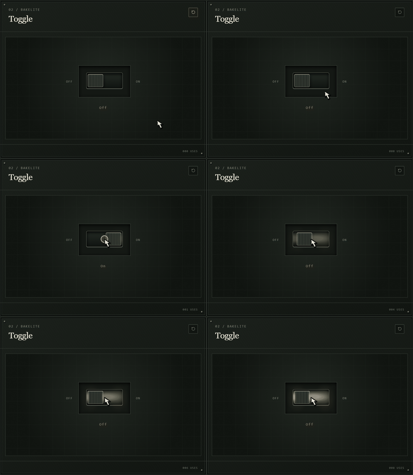
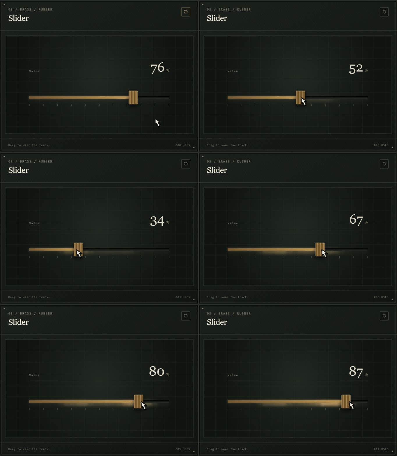
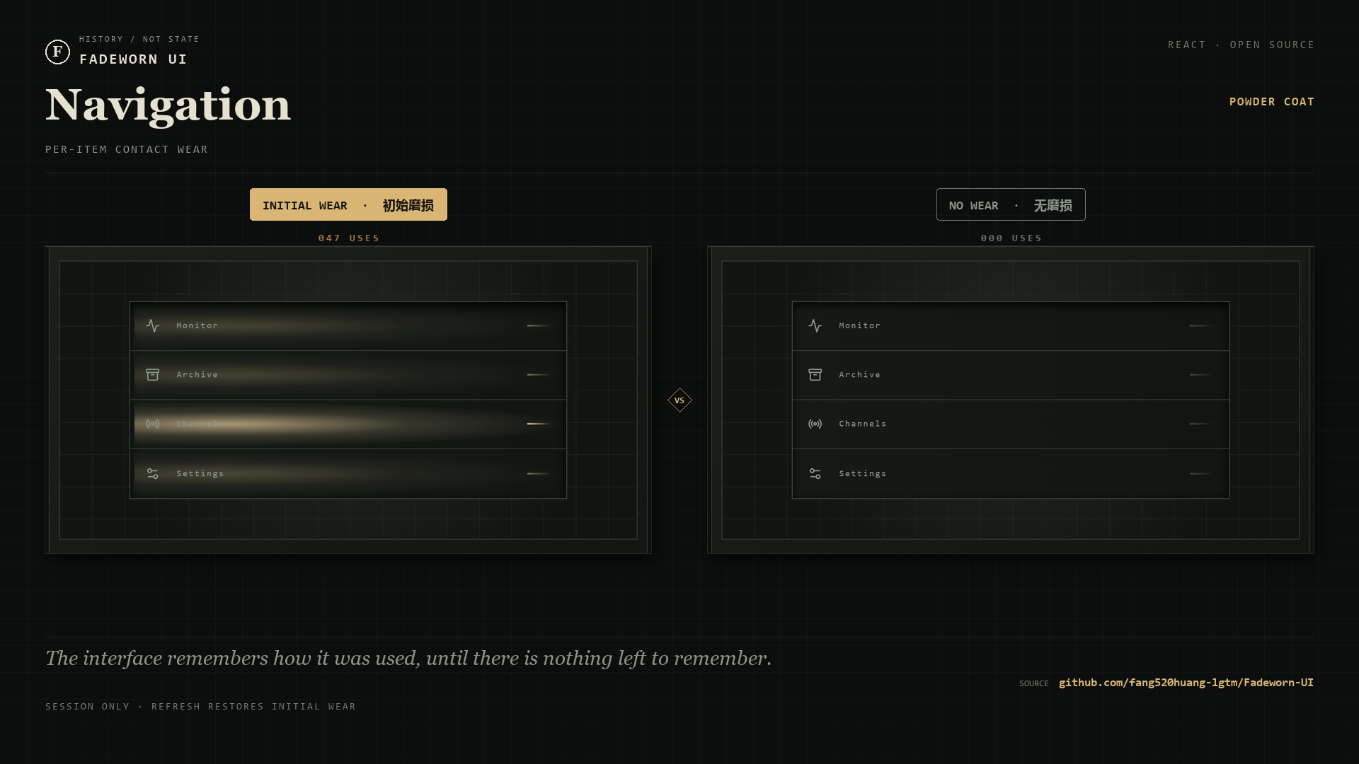
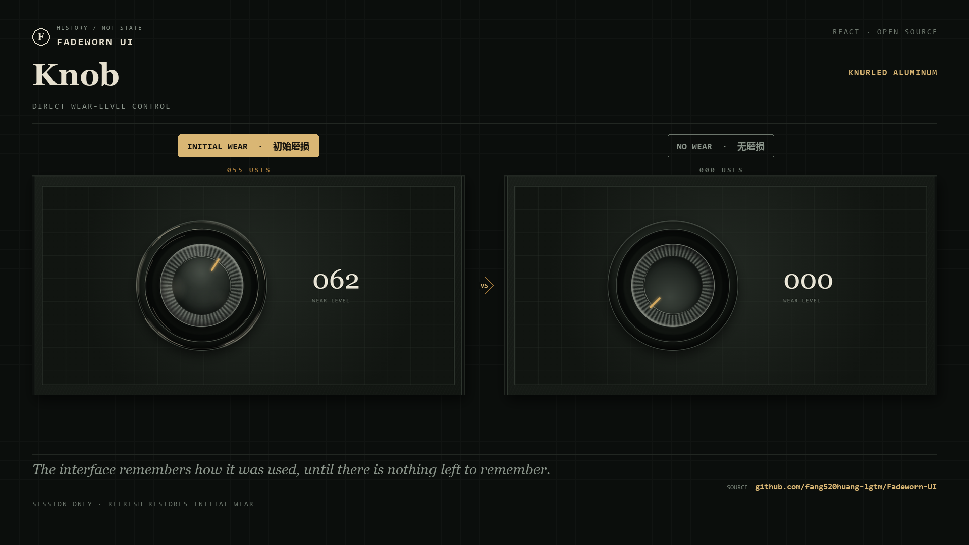
The showcase starts with a curated wear preset. Wear is stored only for the current browser session: refreshing restores the preset, while No Wear clears every surface for comparison.
What this repository provides
- Ten working, accessible examples of wear-aware controls.
- A React hook that records usage, positional traces, and glyph-level wear.
- CSS treatments for painted steel, brass, rubber, paper, enamel, and machined surfaces.
- A complete Next.js showcase and a static export workflow for GitHub Pages.
This repository is a reference implementation, not a published npm package. You do not need to clone it merely to view the project; use the live demo for that. Clone or fork it when you want to study the implementation, adapt the wear system, or build on the showcase.
Use it in your project
The code currently targets Next.js 16, React 19, TypeScript, Tailwind CSS 4, and Radix UI. Because the specimens share a state model and a visual system, they are provided as source rather than as isolated drop-in components.
For the quickest integration:
- Copy
hooks/use-wear-system.tsinto your project. - Copy the specimen you want from
components/wear/, together withspecimen-frame.tsx. - Copy the UI primitives imported by that specimen from
components/ui/, pluslib/utils.ts. - Copy the corresponding material and component styles from
app/globals.css. - Call
useWearSystem()in a client component and pass the relevant record and mutation functions to the specimen.
For example, the button specimen is connected like this:
"use client";

import { WearButtonSpecimen } from "@/components/wear/action-specimens";
import { useWearSystem } from "@/hooks/use-wear-system";

export function WearButtonExample() {
  const { wearState, markUse, resetOne } = useWearSystem();

  return (
    <WearButtonSpecimen
      record={wearState.button}
      markUse={markUse}
      onReset={() => resetOne("button")}
    />
  );
}
See Using Fadeworn UI in another project for dependencies, file-by-file guidance, and instructions for creating a custom wear-aware control.
Run the showcase locally
Node.js 22.13 or newer is required.
git clone https://github.com/fang520huang-lgtm/Fadeworn-UI.git
cd Fadeworn-UI
npm install
npm run dev
Open http://localhost:5173. On Windows, Open Fadeworn UI.html opens the same address after the development server is running.
Component reference
| # | Component | Material | Recorded interaction |
|---|---|---|---|
| 01 | Button | Painted steel | Press count and uniform surface fade |
| 02 | Toggle | Bakelite | Resting-side friction |
| 03 | Slider | Brass / rubber | Travel-path friction |
| 04 | Input | Anodized alloy | Glyph-position abrasion |
| 05 | Tabs | Printed ABS | Per-tab selection frequency |
| 06 | Navigation | Powder coat | Per-item contact wear |
| 07 | Card | Archival paper | Fiber wear and oxidation |
| 08 | Checkbox / Radio | Enameled metal | Selection activity |
| 09 | Scrollbar | Machined rail | Scroll-path memory |
| 10 | Knob | Knurled aluminum | Direct wear-level control |
docs/COMPONENTS.md lists each component's source file, props, interaction model, and initial preset.
How the wear system works
Each specimen owns a WearRecord containing a usage count, an overall wear level, a last-used timestamp, and interaction-specific traces. The system exposes three main write paths:
markUserecords uniform wear.markTracerecords wear at a normalized position.markInputGlyphrecords text wear across measured glyph ranges.
getWearLevelForDisplay normalizes the different histories for the inspector without changing how the controls render. Wear never represents a disabled, error, or loading state, and it never reduces usability.
Read docs/WEAR-SYSTEM.md for the data model, presets, rendering properties, and extension points.
Project structure
app/
  page.tsx                  Showcase composition and page content
  what-is-digital-patina/   Concept page about usage-based interface aging
  globals.css               Layout, materials, and wear rendering
components/
  wear/                     Wear-aware specimen implementations
  ui/                       Shared shadcn/ui and Radix UI primitives
hooks/
  use-wear-system.ts        Wear state, interaction mapping, and presets
lib/
  utils.ts                  Shared class-name helper
docs/
  COMPONENTS.md             Component reference
  WEAR-SYSTEM.md            State and rendering model
  USING-IN-YOUR-PROJECT.md  Source-integration guide
  DEPLOYMENT.md             Static deployment guide
Development
Run both checks before submitting a change:
npm run lint
npm run build
To verify the same static output used by GitHub Pages:
npm run build:static
npx serve out
Deployment
The included GitHub Actions workflow publishes the static export to GitHub Pages whenever master or main is updated. For another static host, use npm run build:static as the build command and out as the output directory.
See docs/DEPLOYMENT.md for GitHub Pages, Cloudflare Pages, and custom-domain guidance.
Contributing
Contributions are welcome. Read CONTRIBUTING.md before opening a pull request.
License
Contributors

93 commits
Similar repos


Languages
TypeScript
61.1%
CSS
35.4%
JavaScript
2.8%
Interaction-driven React UI components that visibly age and develop digital patina through real use — clicks, drags, typing and scrolling leave material wear. Built with Next.js, React, Tailwind CSS and Radix UI.
See the codeSee what people are saying
README
Fadeworn UI
Fadeworn UI is an interaction-driven digital patina experiment for React. Unlike static vintage or distressed UI styles, components begin clean and develop visible wear through actual user interaction over time. Clicks, drags, selections, typing, and scrolling change each control through material-specific wear rather than randomly applied distress.
The interface remembers how it was used, until there is nothing left to remember.
Live demo: fang520huang-lgtm.github.io/Fadeworn-UI
Read What is digital patina in UI? for the concept, the difference from a static vintage style, and examples of usage-based interface aging.
The showcase starts with a curated wear preset. Wear is stored only for the current browser session: refreshing restores the preset, while No Wear clears every surface for comparison.
What this repository provides
- Ten working, accessible examples of wear-aware controls.
- A React hook that records usage, positional traces, and glyph-level wear.
- CSS treatments for painted steel, brass, rubber, paper, enamel, and machined surfaces.
- A complete Next.js showcase and a static export workflow for GitHub Pages.
This repository is a reference implementation, not a published npm package. You do not need to clone it merely to view the project; use the live demo for that. Clone or fork it when you want to study the implementation, adapt the wear system, or build on the showcase.
Use it in your project
The code currently targets Next.js 16, React 19, TypeScript, Tailwind CSS 4, and Radix UI. Because the specimens share a state model and a visual system, they are provided as source rather than as isolated drop-in components.
For the quickest integration:
- Copy
hooks/use-wear-system.tsinto your project. - Copy the specimen you want from
components/wear/, together withspecimen-frame.tsx. - Copy the UI primitives imported by that specimen from
components/ui/, pluslib/utils.ts. - Copy the corresponding material and component styles from
app/globals.css. - Call
useWearSystem()in a client component and pass the relevant record and mutation functions to the specimen.
For example, the button specimen is connected like this:
"use client";

import { WearButtonSpecimen } from "@/components/wear/action-specimens";
import { useWearSystem } from "@/hooks/use-wear-system";

export function WearButtonExample() {
  const { wearState, markUse, resetOne } = useWearSystem();

  return (
    <WearButtonSpecimen
      record={wearState.button}
      markUse={markUse}
      onReset={() => resetOne("button")}
    />
  );
}
See Using Fadeworn UI in another project for dependencies, file-by-file guidance, and instructions for creating a custom wear-aware control.
Run the showcase locally
Node.js 22.13 or newer is required.
git clone https://github.com/fang520huang-lgtm/Fadeworn-UI.git
cd Fadeworn-UI
npm install
npm run dev
Open http://localhost:5173. On Windows, Open Fadeworn UI.html opens the same address after the development server is running.
Component reference
| # | Component | Material | Recorded interaction |
|---|---|---|---|
| 01 | Button | Painted steel | Press count and uniform surface fade |
| 02 | Toggle | Bakelite | Resting-side friction |
| 03 | Slider | Brass / rubber | Travel-path friction |
| 04 | Input | Anodized alloy | Glyph-position abrasion |
| 05 | Tabs | Printed ABS | Per-tab selection frequency |
| 06 | Navigation | Powder coat | Per-item contact wear |
| 07 | Card | Archival paper | Fiber wear and oxidation |
| 08 | Checkbox / Radio | Enameled metal | Selection activity |
| 09 | Scrollbar | Machined rail | Scroll-path memory |
| 10 | Knob | Knurled aluminum | Direct wear-level control |
docs/COMPONENTS.md lists each component's source file, props, interaction model, and initial preset.
How the wear system works
Each specimen owns a WearRecord containing a usage count, an overall wear level, a last-used timestamp, and interaction-specific traces. The system exposes three main write paths:
markUserecords uniform wear.markTracerecords wear at a normalized position.markInputGlyphrecords text wear across measured glyph ranges.
getWearLevelForDisplay normalizes the different histories for the inspector without changing how the controls render. Wear never represents a disabled, error, or loading state, and it never reduces usability.
Read docs/WEAR-SYSTEM.md for the data model, presets, rendering properties, and extension points.
Project structure
app/
  page.tsx                  Showcase composition and page content
  what-is-digital-patina/   Concept page about usage-based interface aging
  globals.css               Layout, materials, and wear rendering
components/
  wear/                     Wear-aware specimen implementations
  ui/                       Shared shadcn/ui and Radix UI primitives
hooks/
  use-wear-system.ts        Wear state, interaction mapping, and presets
lib/
  utils.ts                  Shared class-name helper
docs/
  COMPONENTS.md             Component reference
  WEAR-SYSTEM.md            State and rendering model
  USING-IN-YOUR-PROJECT.md  Source-integration guide
  DEPLOYMENT.md             Static deployment guide
Development
Run both checks before submitting a change:
npm run lint
npm run build
To verify the same static output used by GitHub Pages:
npm run build:static
npx serve out
Deployment
The included GitHub Actions workflow publishes the static export to GitHub Pages whenever master or main is updated. For another static host, use npm run build:static as the build command and out as the output directory.
See docs/DEPLOYMENT.md for GitHub Pages, Cloudflare Pages, and custom-domain guidance.
Contributing
Contributions are welcome. Read CONTRIBUTING.md before opening a pull request.
License
Similar repos
Contributors
93 commits
Languages
TypeScript
61.1%
CSS
35.4%
JavaScript
2.8%