
Exo Dash — A free, modern React and Tailwind CSS admin dashboard template. Clean, responsive, and ready for your next SaaS project.
See the codeSee what people are saying (1)
README
Exo UI - React Dashboard Template
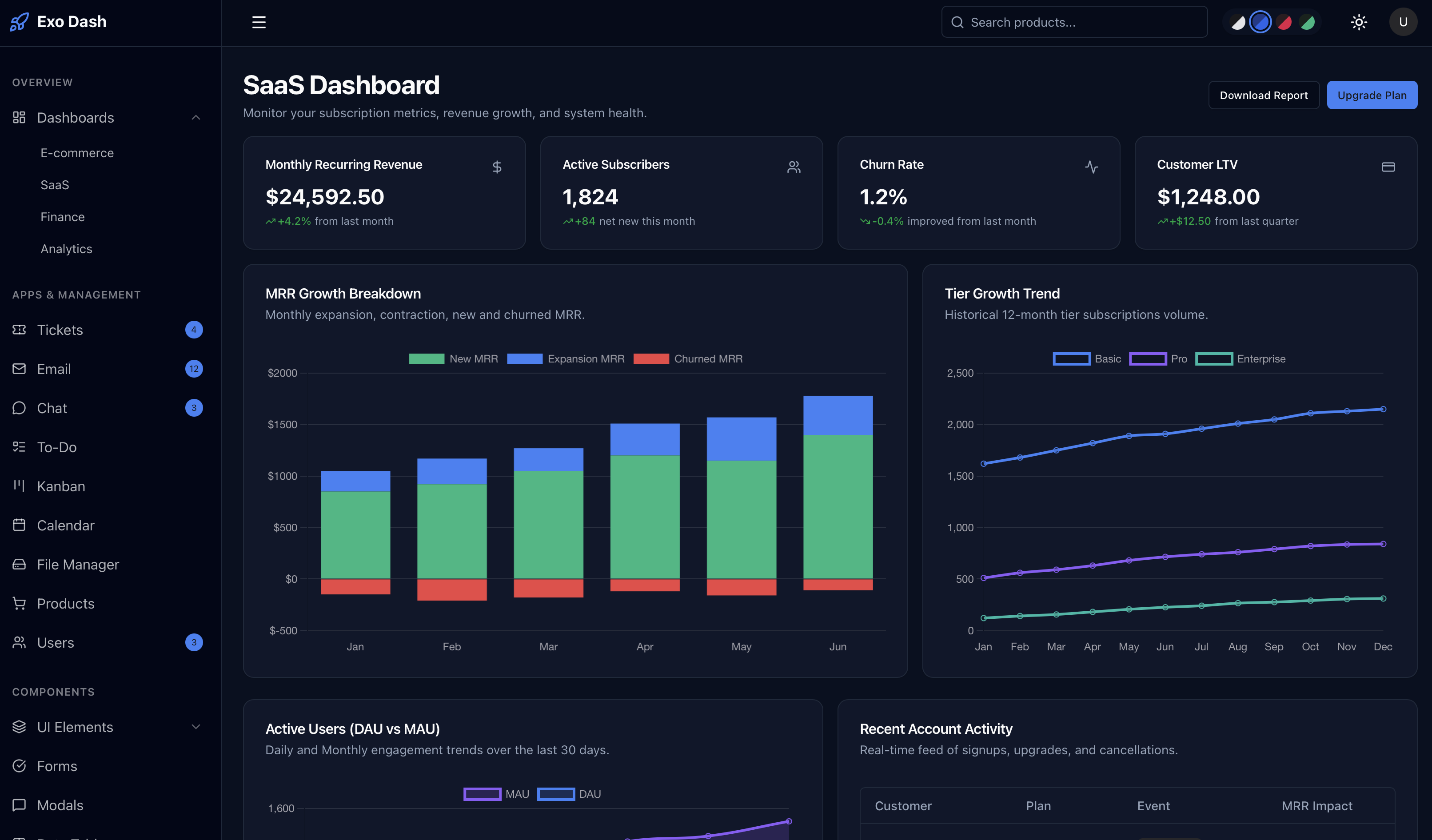
Welcome to Exo UI, a premium, beautifully crafted React dashboard template designed with developer experience in mind. It leverages the latest React 19 features alongside Tailwind CSS v4 for ultimate customizability.
🅰️ Looking for the Angular version? We also maintain a purely Angular version of this dashboard built with Standalone Components, Signals, and Functional Routing. Check out Exo UI Angular here.
📚 View the Official Documentation
🚀 Setup Guide (React)
1. Prerequisites
Before you begin, ensure you have the following installed on your local machine:
- Node.js:
v18.13.0or higher (we recommend using the latest LTS version). - npm or yarn package manager.
2. Installation
To get started with the Exo UI template, navigate to your project folder and install the dependencies:
# Navigate to the project root
cd react-tailwind-dashboard-template

# Install NPM dependencies
npm install
3. Running the Development Server
Exo UI comes pre-configured with a highly optimized Vite-based development server. To start local development:
npm run dev
Once the server has spun up, open your browser and navigate to:
http://localhost:5173/
The application features hot-module replacement (HMR), so it will automatically update in the browser whenever you modify source files.
4. Building for Production
When you're ready to deploy your application to a live server, run the production build command:
npm run build
This compiles the project ahead-of-time (AOT) and stores the minified, highly optimized build artifacts in the dist/ directory.
5. Running Tests
Exo UI is configured to use Vitest for incredibly fast component and unit testing out of the box.
npm run test
📂 Directory Architecture Breakdown
Here is a breakdown of the project layout, defining where pages, components, and application state live:
src/pages/(Pages): This is where all the main application pages (e.g., dashboard, analytics, settings) reside.src/components/ui/(Components): Reusable and presentational UI components (buttons, cards, tables, modals, etc.) shared across various feature modules.src/components/layout/: Contains the broad structural wrappers for the application, such asapp-shell(the primary dashboard wrapper containing the sidebar and header) andsidebar.src/hooks/(State): Houses application-wide generic React hooks. This is where central layout context and state management live (use-sidebar.tsx,use-theme.tsx).
🎨 Advanced Theming & Customization
Exo UI features a robust styling engine powered by Tailwind CSS v4 and native CSS variables. This creates a flexible system where updating a few core variables instantly trickles down to hundreds of UI components seamlessly.
1. The Design Token Architecture
In src/styles.css, you will find @layer base defining standard CSS variables under the :root selector. These variables map directly to dynamic Tailwind utility classes.
- For example,
--primary: #18181b;enables you to use classes likebg-primary,text-primary, orborder-primaryinside your components. - By tweaking these tokens, you can rapidly adapt the Exo UI template to perfectly match your unique brand identity.
2. Managing Dark Mode
Exo UI handles dark mode inverse color styling locally under the .dark class block inside src/styles.css.
When the HTML dark class is appended to the global document root, the variables automatically swap seamlessly:
/* Typical Light Mode Setup */
:root {
  --background: #ffffff;
  --primary: #18181b;
}

/* Matching Dark Mode Setup */
.dark {
  --background: #09090b;
  --primary: #fafafa;
}
3. Creating Custom Theme Variants
Exo UI ships with four color variants out of the box (zinc default, blue, rose, green).
Creating a new architectural theme is incredibly straightforward. Simply declare a brand new class globally in your stylesheet overriding the core UI tokens you wish to adjust.
/* Custom Purple Theme */
.theme-purple {
  --primary: #9333ea;
  --ring: #9333ea;
}
.theme-purple.dark {
  --primary: #c084fc;
  --ring: #c084fc;
}
4. Interfacing with ThemeService
Central state management of the UI theme lives in src/hooks/use-theme.tsx. It strictly leverages modern React Context Providers to maintain absolute reactive sync with the browser's actual DOM and memory localStorage.
import { useTheme } from '../hooks/use-theme';

export function SettingsComponent() {
  const { theme, setTheme, colorScheme, setColorScheme } = useTheme();

  const swapTheme = () => {
    // Toggles Light/Dark Mode
    setTheme(theme === 'dark' ? 'light' : 'dark');

    // Switch to a completely different color scheme palette
    setColorScheme('rose');
  }

  return <button onClick={swapTheme}>Change Theme</button>;
}
🏗️ Core Application Guidelines
To ensure your dashboard stays performant and maintainable during large-scale production extensions, we recommend adhering to Exo UI's leading architectural principles below.
UI Component Sandbox
- All generic presentational frontend components sit inside
src/components/ui/. - Components (such as
<Card>or<Button>) rely natively on standard React functional property mappings via interfaces. - Always pass variant styles directly to components via the
variantparameters hooking intoclass-variance-authorityconstraints rather than hard-coding business logic into shared elements.
React Hook Forms API
Exo UI leverages the bleeding-edge react-hook-form API alongside @hookform/resolvers and Zod validation mechanisms for all user input pipelines natively.
- Forms are strongly typed, fully reactive, and incredibly lightweight avoiding redundant renders.
- See
src/pages/components/forms.tsxfor live configuration and setup examples of structured profile schemas.
App Routing Ecosystem
Exo UI relies entirely on modern react-router-dom leveraging <BrowserRouter> mechanics without heavy routing metadata payloads.
- Open
src/App.tsxto view and modify the primary routing tree structure. - Application
<Layout />structures are segregated securely at the router root viaOutlet: the authentication layout wrapper (AuthLayout) operates completely isolated from the standard administrative (AppShell) dashboard environment.
Contributors

6 commits
Similar repos


Languages
TypeScript
96.1%
CSS
3.7%
Exo Dash — A free, modern React and Tailwind CSS admin dashboard template. Clean, responsive, and ready for your next SaaS project.
See the codeSee what people are saying (1)
README
Exo UI - React Dashboard Template
Welcome to Exo UI, a premium, beautifully crafted React dashboard template designed with developer experience in mind. It leverages the latest React 19 features alongside Tailwind CSS v4 for ultimate customizability.
🅰️ Looking for the Angular version? We also maintain a purely Angular version of this dashboard built with Standalone Components, Signals, and Functional Routing. Check out Exo UI Angular here.
📚 View the Official Documentation
🚀 Setup Guide (React)
1. Prerequisites
Before you begin, ensure you have the following installed on your local machine:
- Node.js:
v18.13.0or higher (we recommend using the latest LTS version). - npm or yarn package manager.
2. Installation
To get started with the Exo UI template, navigate to your project folder and install the dependencies:
# Navigate to the project root
cd react-tailwind-dashboard-template

# Install NPM dependencies
npm install
3. Running the Development Server
Exo UI comes pre-configured with a highly optimized Vite-based development server. To start local development:
npm run dev
Once the server has spun up, open your browser and navigate to:
http://localhost:5173/
The application features hot-module replacement (HMR), so it will automatically update in the browser whenever you modify source files.
4. Building for Production
When you're ready to deploy your application to a live server, run the production build command:
npm run build
This compiles the project ahead-of-time (AOT) and stores the minified, highly optimized build artifacts in the dist/ directory.
5. Running Tests
Exo UI is configured to use Vitest for incredibly fast component and unit testing out of the box.
npm run test
📂 Directory Architecture Breakdown
Here is a breakdown of the project layout, defining where pages, components, and application state live:
src/pages/(Pages): This is where all the main application pages (e.g., dashboard, analytics, settings) reside.src/components/ui/(Components): Reusable and presentational UI components (buttons, cards, tables, modals, etc.) shared across various feature modules.src/components/layout/: Contains the broad structural wrappers for the application, such asapp-shell(the primary dashboard wrapper containing the sidebar and header) andsidebar.src/hooks/(State): Houses application-wide generic React hooks. This is where central layout context and state management live (use-sidebar.tsx,use-theme.tsx).
🎨 Advanced Theming & Customization
Exo UI features a robust styling engine powered by Tailwind CSS v4 and native CSS variables. This creates a flexible system where updating a few core variables instantly trickles down to hundreds of UI components seamlessly.
1. The Design Token Architecture
In src/styles.css, you will find @layer base defining standard CSS variables under the :root selector. These variables map directly to dynamic Tailwind utility classes.
- For example,
--primary: #18181b;enables you to use classes likebg-primary,text-primary, orborder-primaryinside your components. - By tweaking these tokens, you can rapidly adapt the Exo UI template to perfectly match your unique brand identity.
2. Managing Dark Mode
Exo UI handles dark mode inverse color styling locally under the .dark class block inside src/styles.css.
When the HTML dark class is appended to the global document root, the variables automatically swap seamlessly:
/* Typical Light Mode Setup */
:root {
  --background: #ffffff;
  --primary: #18181b;
}

/* Matching Dark Mode Setup */
.dark {
  --background: #09090b;
  --primary: #fafafa;
}
3. Creating Custom Theme Variants
Exo UI ships with four color variants out of the box (zinc default, blue, rose, green).
Creating a new architectural theme is incredibly straightforward. Simply declare a brand new class globally in your stylesheet overriding the core UI tokens you wish to adjust.
/* Custom Purple Theme */
.theme-purple {
  --primary: #9333ea;
  --ring: #9333ea;
}
.theme-purple.dark {
  --primary: #c084fc;
  --ring: #c084fc;
}
4. Interfacing with ThemeService
Central state management of the UI theme lives in src/hooks/use-theme.tsx. It strictly leverages modern React Context Providers to maintain absolute reactive sync with the browser's actual DOM and memory localStorage.
import { useTheme } from '../hooks/use-theme';

export function SettingsComponent() {
  const { theme, setTheme, colorScheme, setColorScheme } = useTheme();

  const swapTheme = () => {
    // Toggles Light/Dark Mode
    setTheme(theme === 'dark' ? 'light' : 'dark');

    // Switch to a completely different color scheme palette
    setColorScheme('rose');
  }

  return <button onClick={swapTheme}>Change Theme</button>;
}
🏗️ Core Application Guidelines
To ensure your dashboard stays performant and maintainable during large-scale production extensions, we recommend adhering to Exo UI's leading architectural principles below.
UI Component Sandbox
- All generic presentational frontend components sit inside
src/components/ui/. - Components (such as
<Card>or<Button>) rely natively on standard React functional property mappings via interfaces. - Always pass variant styles directly to components via the
variantparameters hooking intoclass-variance-authorityconstraints rather than hard-coding business logic into shared elements.
React Hook Forms API
Exo UI leverages the bleeding-edge react-hook-form API alongside @hookform/resolvers and Zod validation mechanisms for all user input pipelines natively.
- Forms are strongly typed, fully reactive, and incredibly lightweight avoiding redundant renders.
- See
src/pages/components/forms.tsxfor live configuration and setup examples of structured profile schemas.
App Routing Ecosystem
Exo UI relies entirely on modern react-router-dom leveraging <BrowserRouter> mechanics without heavy routing metadata payloads.
- Open
src/App.tsxto view and modify the primary routing tree structure. - Application
<Layout />structures are segregated securely at the router root viaOutlet: the authentication layout wrapper (AuthLayout) operates completely isolated from the standard administrative (AppShell) dashboard environment.
Similar repos
Contributors
6 commits
Languages
TypeScript
96.1%
CSS
3.7%