
See what people are saying
README
RevaCSS
Start with HTML. Set your defaults once.
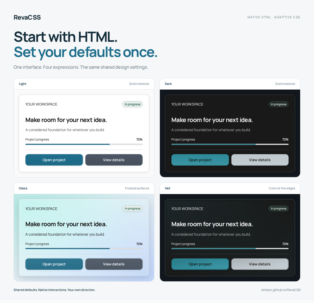
Build consistent interfaces from native HTML. Choose your theme, palette, shape, and spacing on a parent; components inherit the design, and local settings handle the exceptions.
Documentation · Live demos · Get started · API reference
Version 1.0.0 · Erisian · Download the release · MIT
Why RevaCSS
- A shared design, with fewer repeated decisions. Set page or section defaults with inherited
data-*attributes. Override individual settings where you need them. - Native elements and interactions. Buttons, forms, details, radio choices, and popovers keep their browser behavior. The framework requires no JavaScript runtime.
- Room for your own design. Tokens, CSS custom properties, low-specificity selectors, and cascade layers make ordinary CSS overrides practical.
- Appearance that adapts. Light, dark, and system themes; eight coordinated palettes; optional Glass and Veil materials; support for user preferences.
- A compact foundation. The complete minified core has an enforced 15 KiB gzip budget. Fonts, icons, and optional extensions are separate assets.
Use RevaCSS with static pages, server-rendered templates, or a framework that renders HTML. Your application owns its data, routing, and business actions.
See it in action
Explore complete layouts, change their appearance, and download the starting HTML.
| Demo | Explore |
|---|---|
| Forma · Marketing website | Responsive navigation, features, pricing, FAQ, and a contact form. |
| Workspace · Dashboard | An application shell, metric cards, SVG charts, and activity history. |
| Fieldnotes · Journal | Articles, archives, category pages, and author profiles. |
| Still · Shop | A catalogue, product pages, native radio galleries, and a sample bag. |
The demos use sample content. Commerce, form processing, and live application data come from your backend.
Start with HTML
Download reva.min.css, place it beside your HTML, and link it in the page:
<!doctype html>
<html lang="en" data-theme="auto" data-palette="ocean" data-shape="rounded">
  <head>
    <meta charset="utf-8">
    <meta name="viewport" content="width=device-width, initial-scale=1">
    <title>My first RevaCSS page</title>
    <link rel="stylesheet" href="reva.min.css">
  </head>
  <body>
    <main class="container">
      <article class="card">
        <h1>Your next idea starts here.</h1>
        <p>Native HTML. A shared design. Your own direction.</p>
        <button type="button">Get started</button>
      </article>
    </main>
  </body>
</html>
Native elements receive useful defaults. A structural class, such as .card or .container, identifies a pattern where one is needed. See the getting-started guide for installation and stylesheet choices.
Install the npm package with npm install revacss@1.0.0, then import revacss in your application's CSS-capable bundler. See the npm guide for scoped styles, fonts, icons, and CDN installation.
Configure once, refine locally
Appearance settings work independently. A local value changes that setting while the rest of the design continues to inherit.
<section data-theme="dark" data-palette="violet" data-size="large">
  <button type="button">Save changes</button>
  <button type="button" class="secondary" data-size="small">Back</button>
</section>
Choose shared attributes and defaults, learn inheritance and overrides, or browse the component contracts.
Make it yours
| Choice | What it adds |
|---|---|
| Palettes | Eight coordinated color families across light, dark, and system themes. |
| Glass | Frosted surfaces, backdrop blur, and shared appearance settings. |
| Veil | Diffused perimeter color and inset contours without backdrop blur. |
| Motion | Optional native-popover entrances that follow the shared motion setting. |
| Native selects | An optional enhancement for single-select pickers in supporting browsers. |
| Icons | An outline SVG set that inherits the surrounding text color. |
Load an optional extension after the core, then configure it through the same parent settings:
<link rel="stylesheet" href="reva.min.css">
<link rel="stylesheet" href="reva.glass.css">

<article class="card" data-material="glass">
  <h2>A different atmosphere.</h2>
  <p>The same markup and shared design settings.</p>
</article>
Complete, scoped, and modular builds are available in dist/. Fonts load separately through reva-fonts.css; copy dist/fonts/ alongside it. The stylesheet reference explains dependencies and extension choices.
Project status
RevaCSS 1.0.0 — Erisian is the first public GitHub release. Download the compiled CSS, optional extensions, icons, font, and starter HTML from the release page. Archives include licenses; a separate SHA-256 checksum file verifies the downloads.
Automated validation and known limits are recorded in the release notes and validation record. Six manual checks remain open. The maintainer has authorized the first npm release with these limitations disclosed; this does not certify completion of manual acceptance.
The current implementation targets modern browsers. Native popover patterns require browser support; individual enhancements document their fallbacks. Accessibility also depends on your markup and application behavior. See the behavior and accessibility guide.
Specification · Implementation record · Component quality standard
Develop and validate
Clone the repository for development; the release archives contain compiled assets. Use Node 22.12 or newer; Node 24 is recommended. Python 3 is required for the browser-test server.
npm ci
npm run dev
Build and run the automated checks
npm run clean
npm run build
npm test
npx playwright install --with-deps chromium firefox webkit
npm run test:browser
npm run test:package
npm run test:package:browser
npm run check:release-quality
Unit checks cover tokens, contrast pairs, output budgets, documentation, and runtime boundaries. Browser tests run against the built documentation in Chromium, Firefox, and WebKit. The release-quality command reports remaining blockers separately; automated checks do not replace manual accessibility and real-device review.
After building, run npm run release:package to reproduce the GitHub downloads in artifacts/, including the starter page, licenses, and SHA-256 checksum file.
The npm package workflow validates a clean tarball installation and retains a candidate archive for review. npm pack --pack-destination artifacts creates the same kind of local candidate; the existing quality gate still applies to publication.
GitHub Pages builds and deploys documentation from main. The three-engine validation workflow is run manually. REVA_SITE and REVA_BASE configure the documentation origin and path.
Astro builds the documentation. An optional documentation settings helper remembers appearance choices and prepares demo downloads; the RevaCSS framework itself has no JavaScript runtime.
License
RevaCSS is MIT licensed. The bundled Manrope font retains its SIL Open Font License.
Similar repos


Languages
HTML
61.6%
JavaScript
24.1%
CSS
13.8%
See what people are saying
README
RevaCSS
Start with HTML. Set your defaults once.
Build consistent interfaces from native HTML. Choose your theme, palette, shape, and spacing on a parent; components inherit the design, and local settings handle the exceptions.
Documentation · Live demos · Get started · API reference
Version 1.0.0 · Erisian · Download the release · MIT
Why RevaCSS
- A shared design, with fewer repeated decisions. Set page or section defaults with inherited
data-*attributes. Override individual settings where you need them. - Native elements and interactions. Buttons, forms, details, radio choices, and popovers keep their browser behavior. The framework requires no JavaScript runtime.
- Room for your own design. Tokens, CSS custom properties, low-specificity selectors, and cascade layers make ordinary CSS overrides practical.
- Appearance that adapts. Light, dark, and system themes; eight coordinated palettes; optional Glass and Veil materials; support for user preferences.
- A compact foundation. The complete minified core has an enforced 15 KiB gzip budget. Fonts, icons, and optional extensions are separate assets.
Use RevaCSS with static pages, server-rendered templates, or a framework that renders HTML. Your application owns its data, routing, and business actions.
See it in action
Explore complete layouts, change their appearance, and download the starting HTML.
| Demo | Explore |
|---|---|
| Forma · Marketing website | Responsive navigation, features, pricing, FAQ, and a contact form. |
| Workspace · Dashboard | An application shell, metric cards, SVG charts, and activity history. |
| Fieldnotes · Journal | Articles, archives, category pages, and author profiles. |
| Still · Shop | A catalogue, product pages, native radio galleries, and a sample bag. |
The demos use sample content. Commerce, form processing, and live application data come from your backend.
Start with HTML
Download reva.min.css, place it beside your HTML, and link it in the page:
<!doctype html>
<html lang="en" data-theme="auto" data-palette="ocean" data-shape="rounded">
  <head>
    <meta charset="utf-8">
    <meta name="viewport" content="width=device-width, initial-scale=1">
    <title>My first RevaCSS page</title>
    <link rel="stylesheet" href="reva.min.css">
  </head>
  <body>
    <main class="container">
      <article class="card">
        <h1>Your next idea starts here.</h1>
        <p>Native HTML. A shared design. Your own direction.</p>
        <button type="button">Get started</button>
      </article>
    </main>
  </body>
</html>
Native elements receive useful defaults. A structural class, such as .card or .container, identifies a pattern where one is needed. See the getting-started guide for installation and stylesheet choices.
Install the npm package with npm install revacss@1.0.0, then import revacss in your application's CSS-capable bundler. See the npm guide for scoped styles, fonts, icons, and CDN installation.
Configure once, refine locally
Appearance settings work independently. A local value changes that setting while the rest of the design continues to inherit.
<section data-theme="dark" data-palette="violet" data-size="large">
  <button type="button">Save changes</button>
  <button type="button" class="secondary" data-size="small">Back</button>
</section>
Choose shared attributes and defaults, learn inheritance and overrides, or browse the component contracts.
Make it yours
| Choice | What it adds |
|---|---|
| Palettes | Eight coordinated color families across light, dark, and system themes. |
| Glass | Frosted surfaces, backdrop blur, and shared appearance settings. |
| Veil | Diffused perimeter color and inset contours without backdrop blur. |
| Motion | Optional native-popover entrances that follow the shared motion setting. |
| Native selects | An optional enhancement for single-select pickers in supporting browsers. |
| Icons | An outline SVG set that inherits the surrounding text color. |
Load an optional extension after the core, then configure it through the same parent settings:
<link rel="stylesheet" href="reva.min.css">
<link rel="stylesheet" href="reva.glass.css">

<article class="card" data-material="glass">
  <h2>A different atmosphere.</h2>
  <p>The same markup and shared design settings.</p>
</article>
Complete, scoped, and modular builds are available in dist/. Fonts load separately through reva-fonts.css; copy dist/fonts/ alongside it. The stylesheet reference explains dependencies and extension choices.
Project status
RevaCSS 1.0.0 — Erisian is the first public GitHub release. Download the compiled CSS, optional extensions, icons, font, and starter HTML from the release page. Archives include licenses; a separate SHA-256 checksum file verifies the downloads.
Automated validation and known limits are recorded in the release notes and validation record. Six manual checks remain open. The maintainer has authorized the first npm release with these limitations disclosed; this does not certify completion of manual acceptance.
The current implementation targets modern browsers. Native popover patterns require browser support; individual enhancements document their fallbacks. Accessibility also depends on your markup and application behavior. See the behavior and accessibility guide.
Specification · Implementation record · Component quality standard
Develop and validate
Clone the repository for development; the release archives contain compiled assets. Use Node 22.12 or newer; Node 24 is recommended. Python 3 is required for the browser-test server.
npm ci
npm run dev
Build and run the automated checks
npm run clean
npm run build
npm test
npx playwright install --with-deps chromium firefox webkit
npm run test:browser
npm run test:package
npm run test:package:browser
npm run check:release-quality
Unit checks cover tokens, contrast pairs, output budgets, documentation, and runtime boundaries. Browser tests run against the built documentation in Chromium, Firefox, and WebKit. The release-quality command reports remaining blockers separately; automated checks do not replace manual accessibility and real-device review.
After building, run npm run release:package to reproduce the GitHub downloads in artifacts/, including the starter page, licenses, and SHA-256 checksum file.
The npm package workflow validates a clean tarball installation and retains a candidate archive for review. npm pack --pack-destination artifacts creates the same kind of local candidate; the existing quality gate still applies to publication.
GitHub Pages builds and deploys documentation from main. The three-engine validation workflow is run manually. REVA_SITE and REVA_BASE configure the documentation origin and path.
Astro builds the documentation. An optional documentation settings helper remembers appearance choices and prepares demo downloads; the RevaCSS framework itself has no JavaScript runtime.
License
RevaCSS is MIT licensed. The bundled Manrope font retains its SIL Open Font License.
Similar repos
Languages
HTML
61.6%
JavaScript
24.1%
CSS
13.8%