
A proportional programming font that has a 1/3 of space before uppercase letters
Befunge
9
56 commits
updated Sep 5, 2026
See what people are saying (1)
README
Camelana (2026 Version)
Camelana is a proportional coding font.
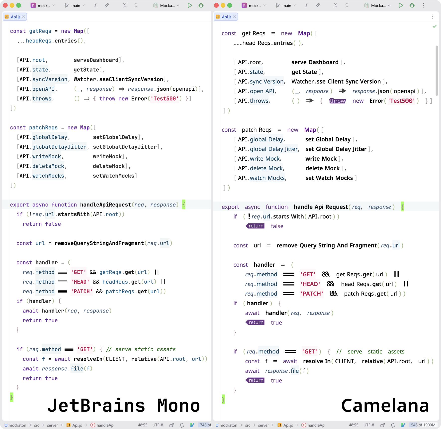
Here‘s a side-by-side with one of the most legible monospace typeface. The IDE on the picture uses Tabular Eye, which renders code in columns without adding whitespace.
Features
Besides common coding ligatures, this font has a little bit of left padding on uppercase letters when they are part of a CamelCase identifier. So to avoid confusion, the normal space glyph is much wider. It takes about 10 minutes to get used to that extra padding.
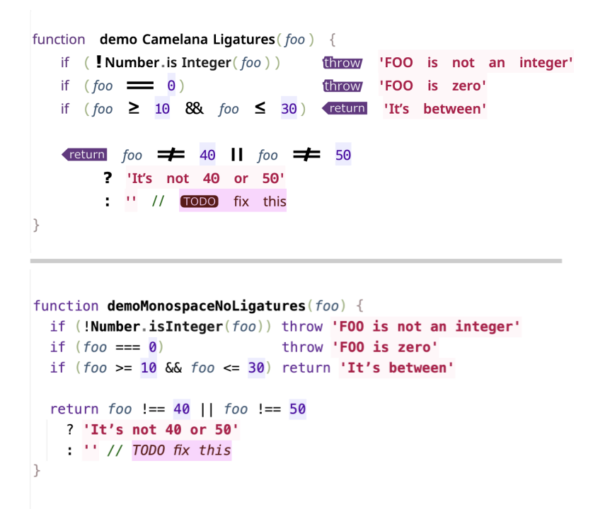
Also, !, ?, and : are oversized so it's easier to spot them.
By the same token, return, throw, and TODO have a solid background.
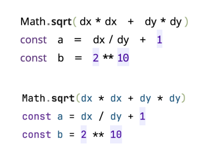
Also, there are ligatures for *, /, and ** when surrounded by spaces,
so math operators resemble their precedence.
Weights
- Regular (currently, this is the only weight with ligatures)
- Italic
- SemiBold
- SemiBoldItalic
Release notes
- This new version is based on Noto Sans, which is nearly identical to Verdana.
- The
returnand the newthrowligatures are now context aware, so words such asreturneddon't get the replacement. - The left padding on uppercase letters is now context aware, e.g., SCREAMING_CASE identifiers don't get the replacement.
Docs
The docs/ folder explains how it was done.
VerdanaCamel (2016 Version)
Motivation
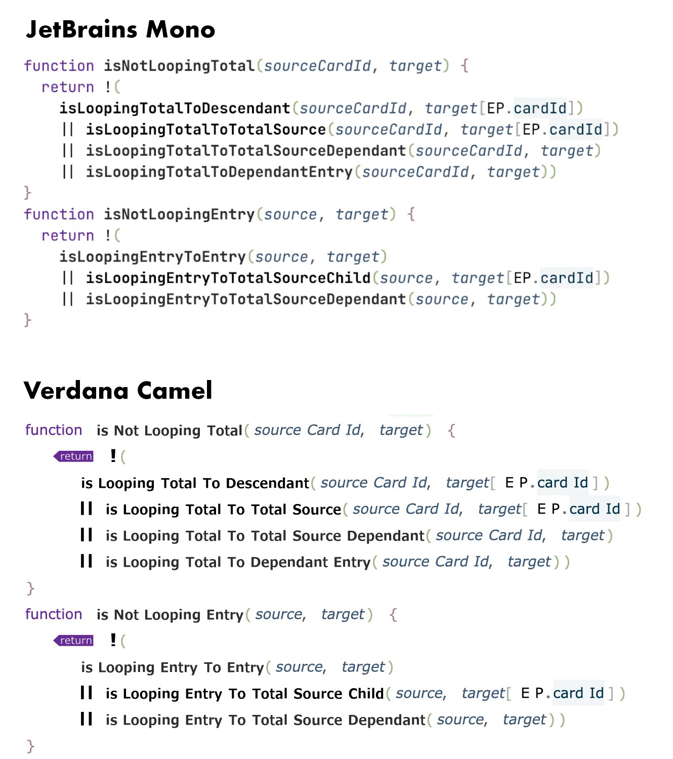
The code snippet above was the motivation behind the camelization kerning. The day I wrote that code I was tired enough to notice that I had to make an extra effort to read those camelCase names. So I tried all the fonts I had installed and Verdana stood out. Then, I tweaked the kerning until it was suitable for coding. The first version had very little left padding on uppercase letters because I thought it would be confusing. But after a few minutes of using it I noticed I could increase it even more, provided the normal space glyph was wide enough.
Contributors

56 commits
Similar repos





Languages
Befunge
99.8%
A proportional programming font that has a 1/3 of space before uppercase letters
Befunge
9
56 commits
updated Sep 5, 2026
See what people are saying (1)
README
Camelana (2026 Version)
Camelana is a proportional coding font.
Here‘s a side-by-side with one of the most legible monospace typeface. The IDE on the picture uses Tabular Eye, which renders code in columns without adding whitespace.
Features
Besides common coding ligatures, this font has a little bit of left padding on uppercase letters when they are part of a CamelCase identifier. So to avoid confusion, the normal space glyph is much wider. It takes about 10 minutes to get used to that extra padding.
Also, !, ?, and : are oversized so it's easier to spot them.
By the same token, return, throw, and TODO have a solid background.
Also, there are ligatures for *, /, and ** when surrounded by spaces,
so math operators resemble their precedence.
Weights
- Regular (currently, this is the only weight with ligatures)
- Italic
- SemiBold
- SemiBoldItalic
Release notes
- This new version is based on Noto Sans, which is nearly identical to Verdana.
- The
returnand the newthrowligatures are now context aware, so words such asreturneddon't get the replacement. - The left padding on uppercase letters is now context aware, e.g., SCREAMING_CASE identifiers don't get the replacement.
Docs
The docs/ folder explains how it was done.
VerdanaCamel (2016 Version)
Motivation
The code snippet above was the motivation behind the camelization kerning. The day I wrote that code I was tired enough to notice that I had to make an extra effort to read those camelCase names. So I tried all the fonts I had installed and Verdana stood out. Then, I tweaked the kerning until it was suitable for coding. The first version had very little left padding on uppercase letters because I thought it would be confusing. But after a few minutes of using it I noticed I could increase it even more, provided the normal space glyph was wide enough.
Similar repos
Contributors
56 commits
Languages
Befunge
99.8%