
Liquid Glass UI - Apple-Inspired Glass Effects Library
JavaScript
1,198
1 commits
updated Jun 12, 2025
See what people are saying
README
🍎 Liquid Glass JS
Apple Liquid Glass-inspired glass effects for the web
A WebGL-powered library bringing sophisticated glass JS components with real-time refraction, blur, and masking
🌐 Live Demo | 📚 Documentation | 🚀 Quick Start
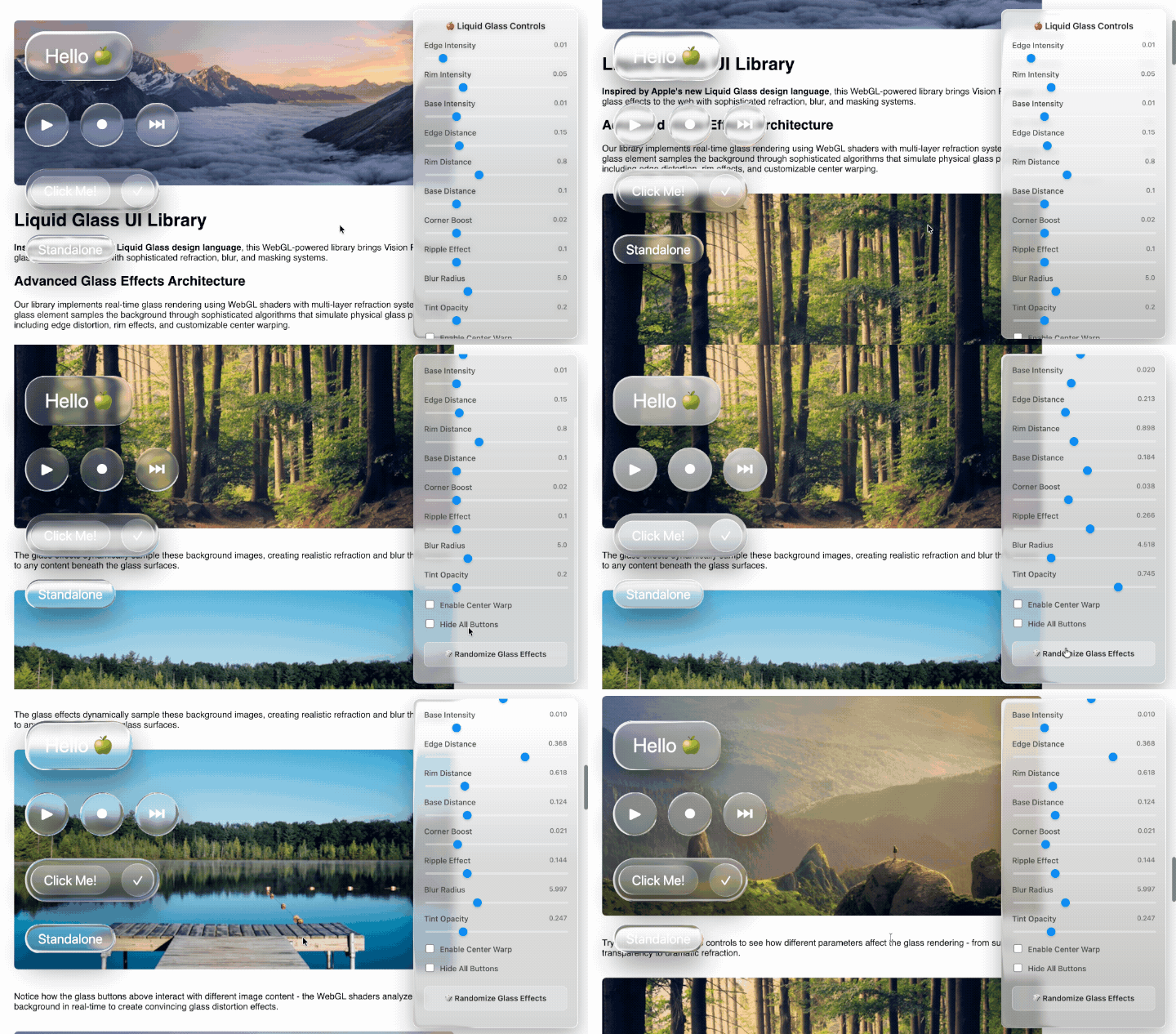



✨ Features
- 🎯 Three Shape Types: Rounded rectangles, perfect circles, and pill/capsule shapes
- 🔍 Real-time Refraction: Advanced WebGL shaders with multi-layer glass effects
- 🌊 Nested Glass System: Child elements sample parent container outputs
- ⚡ Live Parameter Control: Real-time adjustment of all glass properties
- 📱 Responsive Design: Automatic sizing and viewport adaptation
- 🎨 Customizable Tinting: Per-instance opacity and gradient control
- 🌐 Cross-browser: Modern browser support with WebGL
- 📦 Zero Dependencies: Pure JavaScript (except html2canvas for page sampling)
🚀 Quick Start
Basic Usage
<!DOCTYPE html>
<html>
  <head>
    <link rel="stylesheet" href="styles.css" />
    <link rel="stylesheet" href="glass.css" />
  </head>
  <body>
    <script src="https://cdn.jsdelivr.net/npm/html2canvas@1.4.1/dist/html2canvas.min.js"></script>
    <script src="container.js"></script>
    <script src="button.js"></script>

    <script>
      // Create a glass button
      const button = new Button({
        text: 'Click Me!',
        size: 32,
        type: 'rounded',
        onClick: () => alert('Hello Glass!')
      })

      document.body.appendChild(button.element)
    </script>
  </body>
</html>
Container with Nested Glass
// Create a glass container
const container = new Container({
  borderRadius: 24,
  type: 'pill',
  tintOpacity: 0.3
})

// Add glass buttons to container
const button1 = new Button({
  text: 'Action',
  size: 24,
  type: 'pill'
})

const button2 = new Button({
  text: '✓',
  size: 24,
  type: 'circle'
})

container.addChild(button1)
container.addChild(button2)
document.body.appendChild(container.element)
📚 API Reference
Container Class
Constructor Options
| Option | Type | Default | Description |
|---|---|---|---|
borderRadius | number | 48 | Corner radius in pixels |
type | string | 'rounded' | Shape type: 'rounded', 'circle', or 'pill' |
tintOpacity | number | 0.2 | Tint overlay opacity (0-1) |
Methods
// Add child element (enables nested glass)
container.addChild(childElement)

// Remove child element
container.removeChild(childElement)

// Force size update from DOM
container.updateSizeFromDOM()
Button Class
Extends Container with button-specific functionality.
Constructor Options
| Option | Type | Default | Description |
|---|---|---|---|
text | string | 'Button' | Button text content |
size | number | 48 | Font size in pixels |
type | string | 'rounded' | Shape type: 'rounded', 'circle', or 'pill' |
onClick | function | null | Click event handler |
warp | boolean | false | Enable center distortion effect |
tintOpacity | number | 0.2 | Tint overlay opacity (0-1) |
Example
const button = new Button({
  text: 'Save Changes',
  size: 28,
  type: 'pill',
  tintOpacity: 0.4,
  warp: true,
  onClick: text => {
    console.log(`${text} was clicked!`)
  }
})
🎛️ Glass Effect Parameters
The library provides fine-grained control over glass rendering:
| Parameter | Range | Description |
|---|---|---|
| Edge Intensity | 0-0.1 | Refraction strength at shape edges |
| Rim Intensity | 0-0.2 | Intensity of rim lighting effects |
| Base Intensity | 0-0.05 | Center distortion strength |
| Edge Distance | 0.05-0.5 | Falloff curve for edge effects |
| Rim Distance | 0.1-2.0 | Falloff curve for rim effects |
| Base Distance | 0.05-0.3 | Falloff curve for base effects |
| Corner Boost | 0-0.1 | Additional corner enhancement |
| Ripple Effect | 0-0.5 | Surface texture simulation |
| Blur Radius | 1-15 | Background blur amount |
| Tint Opacity | 0-1.0 | Gradient overlay strength |
🔧 Advanced Usage
Custom Glass Controls
// Global glass parameters
window.glassControls = {
  edgeIntensity: 0.02,
  rimIntensity: 0.08,
  blurRadius: 7.0,
  tintOpacity: 0.3
}

// Update all instances
function updateAllGlassInstances() {
  Container.instances.forEach(instance => {
    if (instance.gl_refs && instance.gl_refs.gl) {
      const gl = instance.gl_refs.gl
      gl.uniform1f(instance.gl_refs.edgeIntensityLoc, window.glassControls.edgeIntensity)
      // ... update other uniforms
      if (instance.render) instance.render()
    }
  })
}
Shape Types
Rounded Rectangle
const rounded = new Button({
  type: 'rounded',
  borderRadius: 16 // Custom radius
})
Perfect Circle
const circle = new Button({
  type: 'circle',
  size: 32 // Determines circle diameter
})
Pill/Capsule
const pill = new Button({
  type: 'pill',
  text: 'Elongated Button' // Auto-sizing
})
🎨 Styling
CSS Classes
The library provides semantic CSS classes:
/* Glass containers */
.glass-container {
  /* Base container styles */
}
.glass-container-circle {
  /* Circle-specific styles */
}
.glass-container-pill {
  /* Pill-specific styles */
}

/* Glass buttons */
.glass-button {
  /* Base button styles */
}
.glass-button-circle {
  /* Circle button styles */
}
.glass-button-text {
  /* Button text overlay */
}
Custom Themes
/* Dark theme example */
.glass-button {
  box-shadow: 0 25px 50px rgba(0, 0, 0, 0.4);
}

.glass-button-text {
  color: #ffffff;
  text-shadow: 0 1px 2px rgba(0, 0, 0, 0.3);
}
🏗️ Architecture
WebGL Implementation
- Multi-layer refraction: Separate edge, rim, and base calculations
- Shape-aware normals: Different algorithms per shape type
- Gaussian blur sampling: 13×13 adaptive kernel
- Real-time page capture: html2canvas integration
- Dynamic uniforms: Live parameter updates
File Structure
liquid-glass-js/
├── container.js      # Core Container class
├── button.js         # Button class (extends Container)
├── demo.js          # Demo setup and controls
├── styles.css       # Base styling
├── glass.css        # Glass component styles
├── demo.css         # Demo layout styles
├── controls.css     # Control panel styles
└── index.html       # Demo page
🌐 Browser Support
| Browser | Version | Status |
|---|---|---|
| Chrome | 80+ | ✅ Full support |
| Firefox | 75+ | ✅ Full support |
| Safari | 14+ | ✅ Full support |
| Edge | 80+ | ✅ Full support |
Requirements:
- WebGL 2.0 support
- ES6+ JavaScript features
- HTML5 Canvas API
🛠️ Development
Local Development
# Clone the repository
git clone https://github.com/your-username/liquid-glass-js.git
cd liquid-glass-js

# Open in browser (requires local server for WebGL)
# For example, using serve
npx serve .
Building
No build step required! The library uses vanilla JavaScript and can be used directly.
🤝 Contributing
- Fork the repository
- Create a feature branch:
git checkout -b feature/amazing-feature - Commit changes:
git commit -m 'Add amazing feature' - Push to branch:
git push origin feature/amazing-feature - Open a Pull Request
Development Guidelines
- Follow existing code style
- Add comments for complex WebGL operations
- Test across different browsers
- Update documentation for new features
📖 Examples
Navigation Bar
const navContainer = new Container({
  type: 'rounded',
  borderRadius: 20,
  tintOpacity: 0.1
})

;['Home', 'About', 'Contact'].forEach(text => {
  const navButton = new Button({
    text: text,
    size: 16,
    type: 'pill',
    onClick: text => navigate(text)
  })
  navContainer.addChild(navButton)
})
Control Panel
const controlPanel = new Container({
  type: 'rounded',
  borderRadius: 12,
  tintOpacity: 0.6
})

const playButton = new Button({
  text: '▶',
  size: 24,
  type: 'circle',
  onClick: () => player.play()
})

controlPanel.addChild(playButton)
🔮 Roadmap
- Bundle for NPM
- TypeScript rewrite
- React/Vue component wrappers
- Animation system
- Accessibility improvements
- Performance optimizations
- Mobile touch optimizations
📄 License
This project is licensed under the MIT License - see the LICENSE file for details.
🙏 Acknowledgments
- Inspired by Apple's Liquid Glass design language
- WebGL techniques from various computer graphics resources
- html2canvas library for page capture functionality
Built with ❤️ for the future of web interfaces
Demo • Issues • Discussions
Significant stargazers

19 followers · starred Sep 2025
Similar repos


Languages
JavaScript
72.5%
HTML
19.1%
CSS
8.4%
Liquid Glass UI - Apple-Inspired Glass Effects Library
JavaScript
1,198
1 commits
updated Jun 12, 2025
See what people are saying
README
🍎 Liquid Glass JS
Apple Liquid Glass-inspired glass effects for the web
A WebGL-powered library bringing sophisticated glass JS components with real-time refraction, blur, and masking
🌐 Live Demo | 📚 Documentation | 🚀 Quick Start
✨ Features
- 🎯 Three Shape Types: Rounded rectangles, perfect circles, and pill/capsule shapes
- 🔍 Real-time Refraction: Advanced WebGL shaders with multi-layer glass effects
- 🌊 Nested Glass System: Child elements sample parent container outputs
- ⚡ Live Parameter Control: Real-time adjustment of all glass properties
- 📱 Responsive Design: Automatic sizing and viewport adaptation
- 🎨 Customizable Tinting: Per-instance opacity and gradient control
- 🌐 Cross-browser: Modern browser support with WebGL
- 📦 Zero Dependencies: Pure JavaScript (except html2canvas for page sampling)
🚀 Quick Start
Basic Usage
<!DOCTYPE html>
<html>
  <head>
    <link rel="stylesheet" href="styles.css" />
    <link rel="stylesheet" href="glass.css" />
  </head>
  <body>
    <script src="https://cdn.jsdelivr.net/npm/html2canvas@1.4.1/dist/html2canvas.min.js"></script>
    <script src="container.js"></script>
    <script src="button.js"></script>

    <script>
      // Create a glass button
      const button = new Button({
        text: 'Click Me!',
        size: 32,
        type: 'rounded',
        onClick: () => alert('Hello Glass!')
      })

      document.body.appendChild(button.element)
    </script>
  </body>
</html>
Container with Nested Glass
// Create a glass container
const container = new Container({
  borderRadius: 24,
  type: 'pill',
  tintOpacity: 0.3
})

// Add glass buttons to container
const button1 = new Button({
  text: 'Action',
  size: 24,
  type: 'pill'
})

const button2 = new Button({
  text: '✓',
  size: 24,
  type: 'circle'
})

container.addChild(button1)
container.addChild(button2)
document.body.appendChild(container.element)
📚 API Reference
Container Class
Constructor Options
| Option | Type | Default | Description |
|---|---|---|---|
borderRadius | number | 48 | Corner radius in pixels |
type | string | 'rounded' | Shape type: 'rounded', 'circle', or 'pill' |
tintOpacity | number | 0.2 | Tint overlay opacity (0-1) |
Methods
// Add child element (enables nested glass)
container.addChild(childElement)

// Remove child element
container.removeChild(childElement)

// Force size update from DOM
container.updateSizeFromDOM()
Button Class
Extends Container with button-specific functionality.
Constructor Options
| Option | Type | Default | Description |
|---|---|---|---|
text | string | 'Button' | Button text content |
size | number | 48 | Font size in pixels |
type | string | 'rounded' | Shape type: 'rounded', 'circle', or 'pill' |
onClick | function | null | Click event handler |
warp | boolean | false | Enable center distortion effect |
tintOpacity | number | 0.2 | Tint overlay opacity (0-1) |
Example
const button = new Button({
  text: 'Save Changes',
  size: 28,
  type: 'pill',
  tintOpacity: 0.4,
  warp: true,
  onClick: text => {
    console.log(`${text} was clicked!`)
  }
})
🎛️ Glass Effect Parameters
The library provides fine-grained control over glass rendering:
| Parameter | Range | Description |
|---|---|---|
| Edge Intensity | 0-0.1 | Refraction strength at shape edges |
| Rim Intensity | 0-0.2 | Intensity of rim lighting effects |
| Base Intensity | 0-0.05 | Center distortion strength |
| Edge Distance | 0.05-0.5 | Falloff curve for edge effects |
| Rim Distance | 0.1-2.0 | Falloff curve for rim effects |
| Base Distance | 0.05-0.3 | Falloff curve for base effects |
| Corner Boost | 0-0.1 | Additional corner enhancement |
| Ripple Effect | 0-0.5 | Surface texture simulation |
| Blur Radius | 1-15 | Background blur amount |
| Tint Opacity | 0-1.0 | Gradient overlay strength |
🔧 Advanced Usage
Custom Glass Controls
// Global glass parameters
window.glassControls = {
  edgeIntensity: 0.02,
  rimIntensity: 0.08,
  blurRadius: 7.0,
  tintOpacity: 0.3
}

// Update all instances
function updateAllGlassInstances() {
  Container.instances.forEach(instance => {
    if (instance.gl_refs && instance.gl_refs.gl) {
      const gl = instance.gl_refs.gl
      gl.uniform1f(instance.gl_refs.edgeIntensityLoc, window.glassControls.edgeIntensity)
      // ... update other uniforms
      if (instance.render) instance.render()
    }
  })
}
Shape Types
Rounded Rectangle
const rounded = new Button({
  type: 'rounded',
  borderRadius: 16 // Custom radius
})
Perfect Circle
const circle = new Button({
  type: 'circle',
  size: 32 // Determines circle diameter
})
Pill/Capsule
const pill = new Button({
  type: 'pill',
  text: 'Elongated Button' // Auto-sizing
})
🎨 Styling
CSS Classes
The library provides semantic CSS classes:
/* Glass containers */
.glass-container {
  /* Base container styles */
}
.glass-container-circle {
  /* Circle-specific styles */
}
.glass-container-pill {
  /* Pill-specific styles */
}

/* Glass buttons */
.glass-button {
  /* Base button styles */
}
.glass-button-circle {
  /* Circle button styles */
}
.glass-button-text {
  /* Button text overlay */
}
Custom Themes
/* Dark theme example */
.glass-button {
  box-shadow: 0 25px 50px rgba(0, 0, 0, 0.4);
}

.glass-button-text {
  color: #ffffff;
  text-shadow: 0 1px 2px rgba(0, 0, 0, 0.3);
}
🏗️ Architecture
WebGL Implementation
- Multi-layer refraction: Separate edge, rim, and base calculations
- Shape-aware normals: Different algorithms per shape type
- Gaussian blur sampling: 13×13 adaptive kernel
- Real-time page capture: html2canvas integration
- Dynamic uniforms: Live parameter updates
File Structure
liquid-glass-js/
├── container.js      # Core Container class
├── button.js         # Button class (extends Container)
├── demo.js          # Demo setup and controls
├── styles.css       # Base styling
├── glass.css        # Glass component styles
├── demo.css         # Demo layout styles
├── controls.css     # Control panel styles
└── index.html       # Demo page
🌐 Browser Support
| Browser | Version | Status |
|---|---|---|
| Chrome | 80+ | ✅ Full support |
| Firefox | 75+ | ✅ Full support |
| Safari | 14+ | ✅ Full support |
| Edge | 80+ | ✅ Full support |
Requirements:
- WebGL 2.0 support
- ES6+ JavaScript features
- HTML5 Canvas API
🛠️ Development
Local Development
# Clone the repository
git clone https://github.com/your-username/liquid-glass-js.git
cd liquid-glass-js

# Open in browser (requires local server for WebGL)
# For example, using serve
npx serve .
Building
No build step required! The library uses vanilla JavaScript and can be used directly.
🤝 Contributing
- Fork the repository
- Create a feature branch:
git checkout -b feature/amazing-feature - Commit changes:
git commit -m 'Add amazing feature' - Push to branch:
git push origin feature/amazing-feature - Open a Pull Request
Development Guidelines
- Follow existing code style
- Add comments for complex WebGL operations
- Test across different browsers
- Update documentation for new features
📖 Examples
Navigation Bar
const navContainer = new Container({
  type: 'rounded',
  borderRadius: 20,
  tintOpacity: 0.1
})

;['Home', 'About', 'Contact'].forEach(text => {
  const navButton = new Button({
    text: text,
    size: 16,
    type: 'pill',
    onClick: text => navigate(text)
  })
  navContainer.addChild(navButton)
})
Control Panel
const controlPanel = new Container({
  type: 'rounded',
  borderRadius: 12,
  tintOpacity: 0.6
})

const playButton = new Button({
  text: '▶',
  size: 24,
  type: 'circle',
  onClick: () => player.play()
})

controlPanel.addChild(playButton)
🔮 Roadmap
- Bundle for NPM
- TypeScript rewrite
- React/Vue component wrappers
- Animation system
- Accessibility improvements
- Performance optimizations
- Mobile touch optimizations
📄 License
This project is licensed under the MIT License - see the LICENSE file for details.
🙏 Acknowledgments
- Inspired by Apple's Liquid Glass design language
- WebGL techniques from various computer graphics resources
- html2canvas library for page capture functionality
Built with ❤️ for the future of web interfaces
Demo • Issues • Discussions
Similar repos
Significant stargazers
19 followers · starred Sep 2025
Languages
JavaScript
72.5%
HTML
19.1%
CSS
8.4%