Tools for developing, documenting, and testing React component libraries
See the code
Tools for developing, documenting, and testing React component libraries
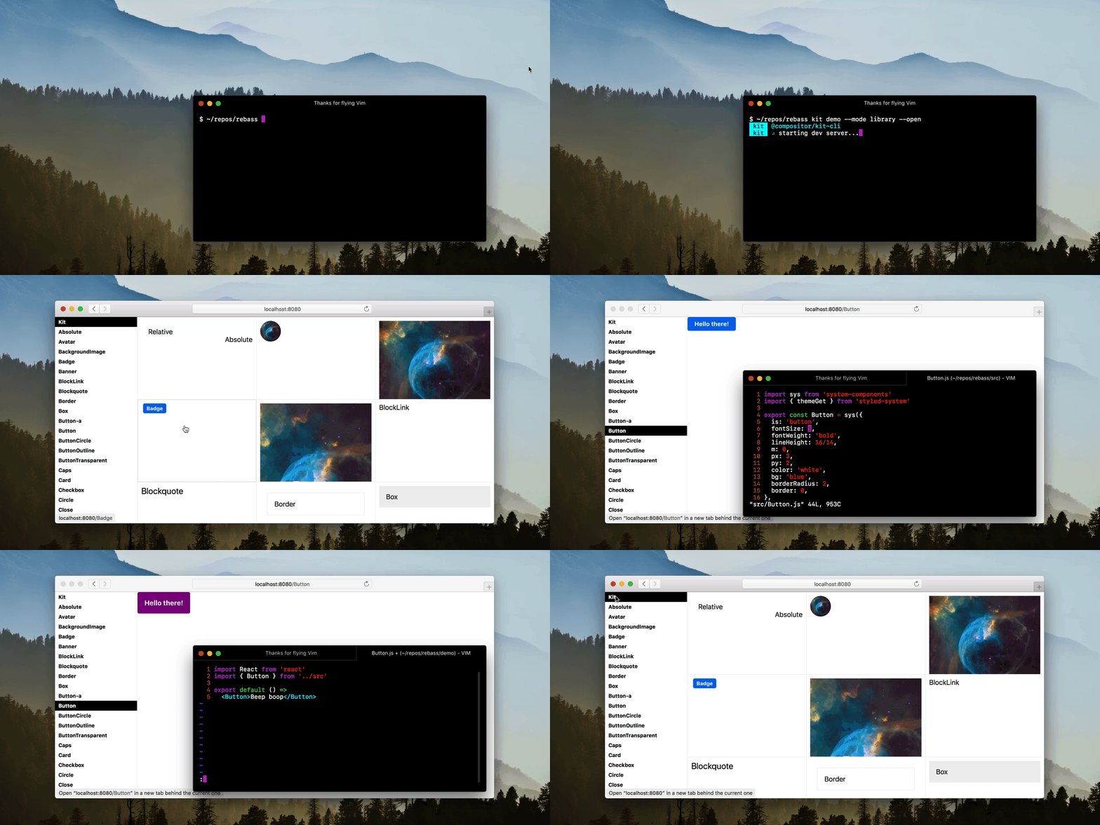
Install the Kit CLI to get started with isolated component development.
npm i -g @compositor/kit-cli
Create an examples folder for your components.
This folder can be used for development, documentation, and testing purposes.
An example file should export a single default component for rendering.
// Button.js example
import React from 'react'
import { Button } from '../src'

export default props =>
  <Button>Button</Button>
Be sure to install any local dependencies, including react,
and start the development server.
kit examples
The index will show a list of links to each example. Each example will have its own route where it can be viewed in isolation.
To view all examples in library mode with persistent navigation, use the --mode flag.
kit examples --mode library
If you already have an existing development setup, or want to enhance your examples, use the Kit components directly in any React setup.
npm i @compositor/kit
Use the Library, Example, and Detail components to create a custom component library view.
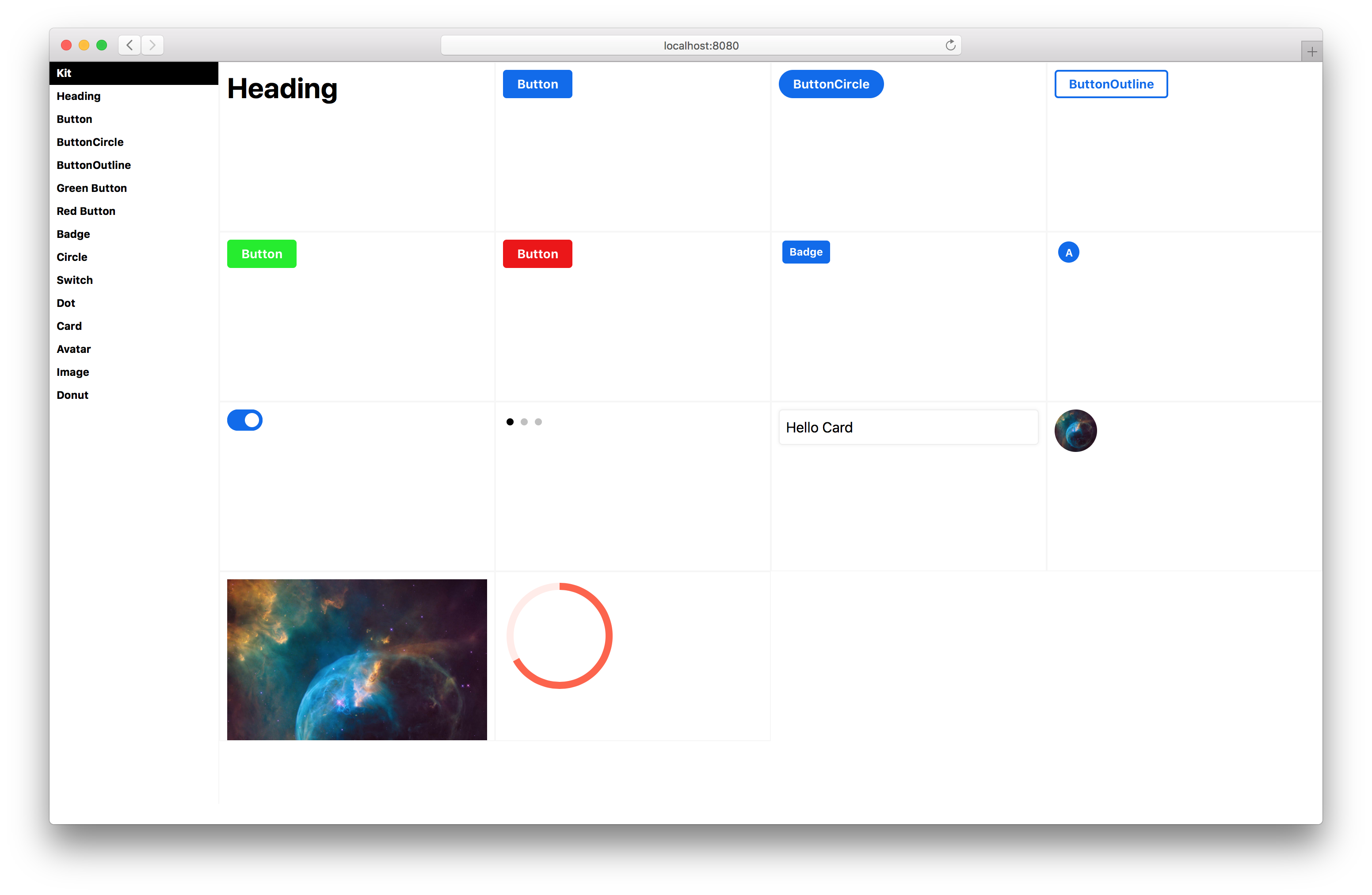
import React from 'react'
import { Library, Example } from '@compositor/kit'
import { Button } from '../src'

export default props =>
  <Library>
    <Example name='Button'>
      <Button>Button</Button>
    </Example>
  </Library>
Use the XRay component to outline HTML elements and display a grid to help ensure your UI is visually aligned.

import React from 'react'
import { XRay } from '@compositor/kit'
import { Button } from '../src'

export default props =>
  <XRay>
    <Button>Button</Button>
  </XRay>
Use the Cartesian component to render the cartesian product of props.
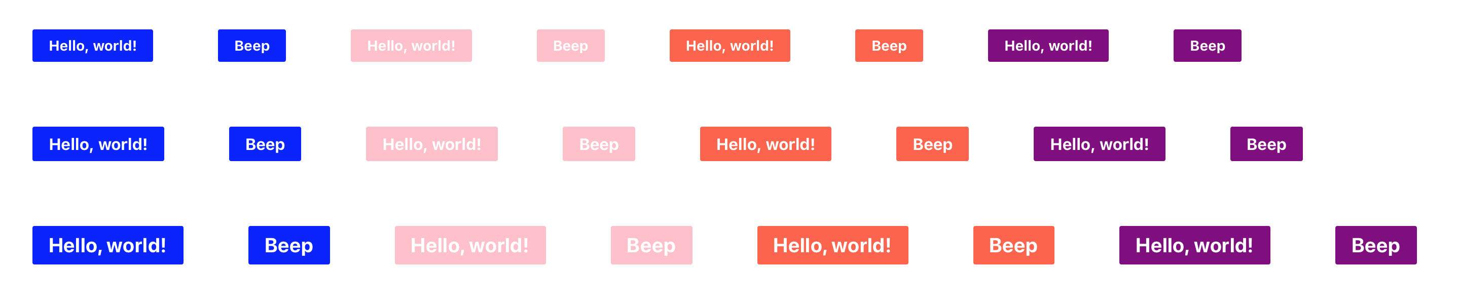
import React from 'react'
import { Cartesian } from '@compositor/kit'
import Button from '../src/Button'

export default props => (
  <Cartesian
    component={Button}
    m={4}
    fontSize={[1, 2, 3]}
    bg={['blue', 'pink', 'tomato', 'purple']}
    children={['Hello, world!', 'Beep']}
  />
)
Use the Responsive component to render components in multiple iframes at different viewport sizes.
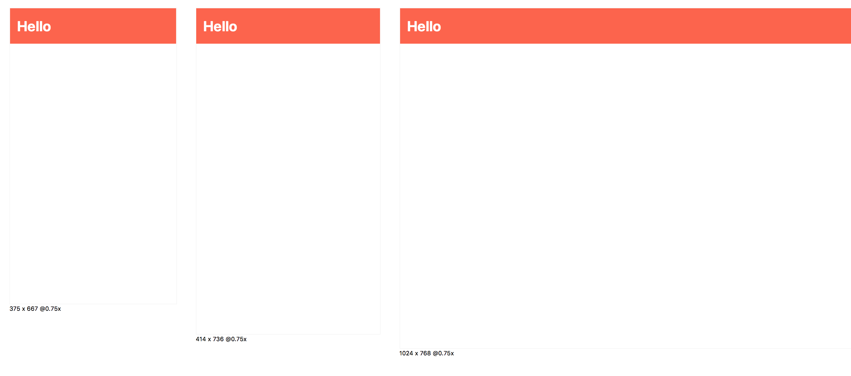
import React from 'react'
import { Responsive } from '@compositor/kit'
import PageHeader from '../src/PageHeader'

const example = (
  <Responsive>
    <PageHeader />
  </Responsive>
)
See the Kit components package for more components.
Use the kit init command to create a new project based on a growing set of templates.
git checkout -b my-new-feature)git commit -am 'Add some feature')git push origin my-new-feature)93,942 followers · starred May 2018
1,838 followers · starred Jun 2018
1,089 followers · starred Jan 2021
605 followers · starred Aug 2018
Tools for developing, documenting, and testing React component libraries
See the code
Tools for developing, documenting, and testing React component libraries
Install the Kit CLI to get started with isolated component development.
npm i -g @compositor/kit-cli
Create an examples folder for your components.
This folder can be used for development, documentation, and testing purposes.
An example file should export a single default component for rendering.
// Button.js example
import React from 'react'
import { Button } from '../src'

export default props =>
  <Button>Button</Button>
Be sure to install any local dependencies, including react,
and start the development server.
kit examples
The index will show a list of links to each example. Each example will have its own route where it can be viewed in isolation.
To view all examples in library mode with persistent navigation, use the --mode flag.
kit examples --mode library
If you already have an existing development setup, or want to enhance your examples, use the Kit components directly in any React setup.
npm i @compositor/kit
Use the Library, Example, and Detail components to create a custom component library view.
import React from 'react'
import { Library, Example } from '@compositor/kit'
import { Button } from '../src'

export default props =>
  <Library>
    <Example name='Button'>
      <Button>Button</Button>
    </Example>
  </Library>
Use the XRay component to outline HTML elements and display a grid to help ensure your UI is visually aligned.
import React from 'react'
import { XRay } from '@compositor/kit'
import { Button } from '../src'

export default props =>
  <XRay>
    <Button>Button</Button>
  </XRay>
Use the Cartesian component to render the cartesian product of props.
import React from 'react'
import { Cartesian } from '@compositor/kit'
import Button from '../src/Button'

export default props => (
  <Cartesian
    component={Button}
    m={4}
    fontSize={[1, 2, 3]}
    bg={['blue', 'pink', 'tomato', 'purple']}
    children={['Hello, world!', 'Beep']}
  />
)
Use the Responsive component to render components in multiple iframes at different viewport sizes.
import React from 'react'
import { Responsive } from '@compositor/kit'
import PageHeader from '../src/PageHeader'

const example = (
  <Responsive>
    <PageHeader />
  </Responsive>
)
See the Kit components package for more components.
Use the kit init command to create a new project based on a growing set of templates.
git checkout -b my-new-feature)git commit -am 'Add some feature')git push origin my-new-feature)93,942 followers · starred May 2018
1,838 followers · starred Jun 2018
1,089 followers · starred Jan 2021
605 followers · starred Aug 2018