
GPU-Rendered UI library built from scratch in Rust [WIP]
See the codeSee what people are saying
README
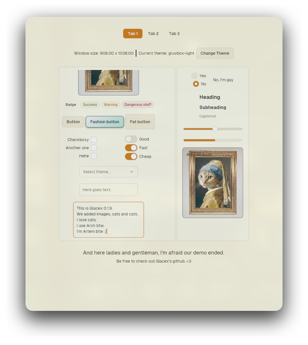
glacex


GPU-accelerated, immediate-mode UI library built from scratch in Rust on top of wgpu, winit, and taffy.
Built by Artem Tsitronov and Soumalya Das.
Status: early and actively changing. Expect breaking API changes between 0.x releases.
Table of Contents
- What is glacex?
- Features
- Requirements
- Installation
- Quick Start
- Core Concepts
- Widgets
- Styling & Theming
- Accessibility
- How Rendering Works
- Examples
- Project Layout
- Known Limitations
- Documentation
- Contributing
- License
If you'd like an experimental version of glacex, try visiting programmersd21 fork: https://github.com/programmersd21/glacex [DISCLAIMER]: Artem Tsitronov is not responsible for programmersd21 fork. That includes drastic changes, redesigns, and AI-generated content
What is glacex?
glacex is an immediate-mode UI library for Rust that draws its own pixels instead of wrapping a native toolkit or a browser engine:
winitowns the window and the cross-platform event loop.wgpurenders every shape as an instanced signed-distance-field (SDF) quad on the GPU.glyphonshapes and rasterizes text into glyph atlases with per-widget clipping.taffydoes the flexbox math forrow!/column!layouts.imagedecodes the images.kurbois responsible for paths.
There's no retained widget tree and no markup — you describe the UI in plain Rust every frame, and glacex measures, lays out, hit-tests, animates, and renders it.
Features
- Custom renderer: instanced shapes (anti-aliased SDF), borders, and soft drop shadows, batched into one draw call per shared clip rect.
- Arbitrary Bezier paths (
MeasurablePath::Free) via a second tessellated-mesh pipeline, for shapes beyond rect/ellipse — see Custom Shapes / Paths. - Text rendering via
glyphonwith independent clip bounds per widget. - Fills: solid colors, gradients (linear, radial, conic), and images, cached into a GPU atlas.
Coloris#[repr(C)]+Pod/Zeroable, so it maps straight onto GPU vertex buffers. Hex, RGB, HSV, alpha blending,lerp, lighten/darken.- Cursor changes (pointer, text, resize, default) driven by hover state.
- A floating tooltip layer that clamps to the viewport.
- Widgets:
Button,Checkbox,RadioButton,Switch,Slider,ProgressBar,TextInput,TextArea,ScrollView,Card,Container,Badge,Divider,Label,SelectBox,Tabs. row![]/column![]macros backed bytaffy, with alignment and spacing.- Interaction: hover/press/click, secondary/middle mouse buttons, Tab/Shift+Tab focus order, double/triple-click word/line selection, clipboard via
arboard, blinking cursor. - Widget state persists across frames keyed by a stable string id, even though the widget itself is rebuilt every frame. Every stateful widget exposes this via
.state(ui)/.take_state(ui)/.put_state(ui, state)(from theStatefulWidgettrait), plus small typed accessors for the common case (checkbox.is_checked(ui),slider.value(ui), etc.) — see Widgets.Ui::widget_state/take_widget_state/put_widget_stateare the lower-level primitives underneath, for state that isn't tied to a single widget's id. - Animation via exponential decay (
animate_towards) plus a small set of easing curves and spring presets, unified under named half-life constants (Motion::INSTANT/SNAPPY/FLUID/GENTLE) so transitions feel consistent across widgets. - Draggable auto-hiding scrollbars shared by
ScrollViewandTextArea. - Optional accessibility tree (AT-SPI on Linux via
accesskit) — see Accessibility.
Requirements
- Rust 1.85+ (2024 edition).
- A GPU/driver backend
wgpusupports (Vulkan, Metal, DirectX 12, or OpenGL ES). - On Linux: a running Wayland or X11 session. Headless environments need a virtual display (e.g.
xvfb) to create a window surface.
Installation
From crates.io
cargo add glacex
or in Cargo.toml:
[dependencies]
glacex = "0.1.95"
From GitHub (main branch)
[dependencies]
glacex = { git = "https://github.com/artemtsitronov/glacex.git", branch = "main" }
Linux build dependencies
# Debian / Ubuntu
sudo apt install libx11-dev libxcursor-dev libxrandr-dev libxi-dev libxkbcommon-dev libwayland-dev

# Fedora
sudo dnf install libX11-devel libXcursor-devel libXrandr-devel libXi-devel libxkbcommon-devel wayland-devel

# Arch Linux
sudo pacman -S libx11 libxcursor libxrandr libxi libxkbcommon wayland
Quick Start
A minimal counter:
use glacex::{App, Button, Color, Label, Ui, Widget, column};

struct Counter {
    count: u32,
}

impl Widget for Counter {
    type Output = ();

    fn ui(&mut self, ui: &mut Ui) {
        ui.set_bgcolor(Color::rgb(18, 18, 22));

        let mut label = Label::new(format!("Count: {}", self.count));
        let mut button = Button::new("Increment").id("increment-button");

        column![&mut label, &mut button]
            .spacing(12.0)
            .arrange_at([40.0, 40.0], ui);

        if button.clicked() {
            self.count += 1;
        }
    }
}

fn main() {
    App::new(Counter { count: 0 }).run();
}
App::new(root).run() opens a window, sets up the GPU pipelines, and runs the event loop.
Core Concepts
App
App<W: Widget> owns the winit window and event loop:
App::new(root_widget)
    .update(|root| {
        // Runs once per frame before rendering. Good place for
        // app-level state changes based on the previous frame's input.
    })
    .run();
Widget and Measurable
Every UI element implements Widget:
pub trait Widget {
    type Output;
    fn ui(&mut self, ui: &mut Ui) -> Self::Output;
}
Widgets that can be placed inside row!/column! also implement Measurable:
pub trait Measurable: Widget {
    fn measure(&mut self, ui: &mut Ui) -> [f32; 2];
    fn arrange(&mut self, position: [f32; 2], size: [f32; 2], ui: &mut Ui) -> Self::Output;
}
measurereturns the widget's natural size.arrangedoes hit-testing, input handling, and issues draw calls at the resolved rect.
Ui
Ui is the per-frame context passed into every widget:
- Input:
mouse_position(),mouse_pressed(),mouse_right_pressed(),click_count(),key_pressed(),ctrl_held(),shift_held(). - Cursor:
set_cursor_icon(CursorIcon). - Tooltips:
show_tooltip(text),show_tooltip_at(text, pos). - State:
widget_state::<T>(id),take_widget_state::<T>(id),put_widget_state(id, state)— the primitives behind every widget's.state(ui)/.take_state(ui)/.put_state(ui, state). - Focus:
request_focus(id),is_focused(id),advance_focus(backward). - Clipping:
push_clip(rect),pop_clip(),push_input_block(rect). - Drawing:
draw_shape(...),draw_text(...),measure_text(...),line_height(). - Window:
set_title(&str),set_bgcolor(Color).
Layout
For layout please see docs/layout.md.
Controls
Button
let mut btn = Button::new("Deploy")
    .id("button")
    .tooltip("Triggers a deployment event")
    .primary();

if btn.clicked() {
    println!("clicked");
}
Variants: .primary(), .outline(), .ghost(), .danger().
Checkbox
let mut check = Checkbox::new().id("checkbox").default_checked(true);
let is_checked = check.is_checked(ui);
RadioButton
row![
    &mut RadioButton::new("theme_group").id("dark"),
    &mut Label::new("Dark Theme"),
];

let selected = ui.selected_option("theme_group").unwrap_or("dark");
Switch
let mut sw = Switch::new().id("switch").default_enabled(true);
let enabled = sw.enabled(ui);
Slider
let mut slider = Slider::new(0.0, 100.0).id("slider").width(240.0).default_value(50.0);
let val = slider.value(ui);
TextInput
let mut input = TextInput::new().id("username-input").width(260.0).placeholder("Enter a username");
let text = input.text(ui);
TextArea
let mut notes = TextArea::new().id("notes").size([300.0, 120.0]);
SelectBox
use glacex::{SelectBox, SelectOption};

let options = vec![
    SelectOption::new("light", "Light"),
    SelectOption::new("dark", "Dark"),
    SelectOption::new("mocha", "Catppuccin Mocha"),
    SelectOption::new("tokyo", "Tokyo Night"),
];

let mut sel = SelectBox::new(options)
    .id("select-box")
    .placeholder("Choose a theme…")
    .width(220.0)
    .tooltip("Switch the active colour theme");

sel.arrange_at([40.0, 40.0], ui);

let selected = sel.selected(ui);
Enable live filtering with .searchable():
let mut sel = SelectBox::new(countries)
    .id("searchable")
    .placeholder("Select a country…")
    .width(260.0)
    .searchable();
The dropdown opens with a spring animation, closes on Escape or outside-click, supports ↑/↓ keyboard navigation and Enter to confirm.
Tabs
use glacex::{Tabs, TabItem};

let mut tabs = Tabs::new(
    vec![
        TabItem::new("General").id("tab1"),
        TabItem::new("Account").id("tab2"),
        TabItem::new("Billing").id("tab3"),
    ],
).id("tabs");

let selected = tabs.selected(ui);
The active pill slides and resizes to the selected tab with a spring animation; clicking a tab updates the selection immediately. Selection is stored the same way as RadioButton groups, so ui.selected_option("settings_tabs") also works.
Containers
Card
let mut content = Label::new("Inside Card");
let mut card = Card::new(&mut content).padding([16.0, 16.0]);
ScrollView
ScrollView::new(&mut child_column)
    .id("scroll-view")
    .size([300.0, 150.0])
    .arrange_at([20.0, 20.0], ui);
Container & Divider
Container::new(&mut child).size([w, h])— fixed-size wrapper.Divider::horizontal(width)/Divider::vertical(height)— separator rule,.faint()for a subtler hairline.
Displays
Label::new(text)— text, with.secondary(),.muted(),.accent(), size presets (.caption(),.heading(),.metric(), ...), and.mono().Badge::new(text)— status pill,.secondary()/.outline()/.success()/.warning()/.error().ProgressBar::new(ratio)— completion bar
Styling
Style Structs
use glacex::{Button, ButtonStyle, Color, Fill, ShadowStyle};

let save_btn = Button::new("Save").id("btn").style(ButtonStyle {
    fill: Fill::Solid(Color::hex_str("#4f46e5")),
    hover_fill: Fill::Solid(Color::hex_str("#6366f1")),
    pressed_fill: Fill::Solid(Color::hex_str("#4338ca")),
    border_width: 1.0,
    border_color: Color::WHITE.with_alpha(0.2),
    corner_radius: 8.0,
    shadow: Some(ShadowStyle {
        color: Color::hex_str("#4f46e5").with_alpha(0.4),
        blur_radius: 12.0,
        offset: [0.0, 3.0],
    }),
    sharp: false,
});
| Style Struct | Target Widget | Key Fields |
|---|---|---|
ButtonStyle | Button | fill, hover_fill, pressed_fill, border_width, border_color, corner_radius, shadow, sharp |
CheckboxStyle | Checkbox | fill, hover_fill, checked_fill, border_width, border_color, corner_radius, shadow |
TextInputStyle | TextInput | fill, border_width, border_color, focus_border_color, corner_radius, selection_color, cursor_color, shadow |
TextAreaStyle | TextArea | fill, border_color, focus_border_color, thumb_fill, thumb_dragging_fill |
ScrollViewStyle | ScrollView | thumb_fill, thumb_dragging_fill, thumb_corner_radius |
CardStyle | Card | fill, border_width, border_color, corner_radius, padding, shadow |
SelectBoxStyle | SelectBox | fill, hover_fill, focus_fill, border_color, focus_border_color, corner_radius, height, dropdown_fill, dropdown_shadow, item_height, item_hover_fill, item_active_fill, searchable |
TabsStyle | Tabs | height, tab_padding_x, gap, text_color, hover_text_color, active_fill, pill_corner_radius, pill_inset_y |
ShadowStyle
pub struct ShadowStyle {
    pub color: Color,
    pub blur_radius: f32,
    pub offset: [f32; 2],
}
Color
Color is #[repr(C)] and derives bytemuck::Pod/Zeroable so it can go straight into a GPU vertex buffer:
Color::rgb(255, 128, 0);
Color::rgba(255, 128, 0, 0.5);
Color::hex_str("#4f46e5");
Color::hex(0x4f46e5);
Color::hsv(240.0, 0.8, 0.9);

let tinted = Color::WHITE.with_alpha(0.3);
let blended = Color::RED.lerp(Color::BLUE, 0.5);
let dark = Color::RED.darken(0.2);
let light = Color::RED.lighten(0.2);
Fills, Gradients & Images
use glacex::{Color, Fill, Gradient, GradientKind, GradientStop};

let sunset = Fill::Gradient(Gradient {
    kind: GradientKind::Linear { angle: 90.0 },
    stops: vec![
        GradientStop { position: 0.0, color: Color::hex_str("#ff7e5f") },
        GradientStop { position: 1.0, color: Color::hex_str("#feb47b") },
    ],
});
Supported kinds: GradientKind::Linear { angle }, Radial { center, radius }, Conic { center }. Gradients are cached in a GPU ramp atlas by content hash, so reusing the same definition across frames is free.
Images work the same way as a solid color or gradient — load once, then use anywhere a Fill is expected:
let logo = ui.load_image("assets/logo.png"); // PNG/JPEG/WebP via the `image` crate
let fill = Fill::Image(logo);
ImageHandle::width() / height() / size() return the image's natural pixel dimensions, handy for sizing a widget to match it.
Custom Shapes / Paths
Every built-in widget draws a rounded rect or an ellipse (MeasurablePath::Rect / Ellipse), but the renderer also supports arbitrary shapes via MeasurablePath::Free(BezPath), using kurbo's BezPath for the outline:
use glacex::{Color, Fill, MeasurablePath};
use kurbo::BezPath;

let mut star = BezPath::new();
star.move_to((160.0, 90.0));
star.line_to((188.0, 152.0));
// ...remaining points...
star.close_path();

ui.draw_shape(
    MeasurablePath::free(star),
    Fill::Solid(Color::hex_str("#f59e0b")),
    4.0,                          // border_width
    Color::hex_str("#1e293b"),    // border_color
    0.0,                          // blur_radius — not supported for Free paths, ignored
    false,                        // sharp
    0.0,                          // rotation, radians
);
Free paths are tessellated on the CPU (flatten + ear-clip) into a triangle mesh and rendered through a second, non-instanced pipeline, separate from the SDF pipeline that draws every rect/ellipse. Solid and gradient fills are supported (gradient color is evaluated per vertex, so it's exact for Linear and a close approximation for Radial/Conic — finer curves tessellate into more vertices and sharpen it further); Fill::Image isn't supported on a Free path yet and renders transparent, same as GradientKind::Mesh. Borders are drawn as a separately tessellated stroke outline (via kurbo::stroke), so they read as a classic SVG-style outline around the shape rather than the inset border used by rect/ellipse widgets. Free-path shapes are batched and clipped the same way as everything else, but currently always draw after all rect/ellipse shapes within the same frame — paint-order interleaving with them isn't implemented yet. Only the outer contour of a self-intersecting or multi-hole path is filled correctly; simple (non-self-intersecting) contours are the supported case.
Theme
9 built-in palettes, switchable at runtime with ui.set_theme(...).
ui.set_theme(Theme::LIGHT);
ui.set_theme(Theme::DARK);
ui.set_theme(Theme::CATPPUCCIN_MOCHA);
ui.set_theme(Theme::CATPPUCCIN_LATTE);
ui.set_theme(Theme::TOKYO_NIGHT);
ui.set_theme(Theme::GRUVBOX_DARK);
ui.set_theme(Theme::GRUVBOX_LIGHT);
ui.set_theme(Theme::NORD);
ui.set_theme(Theme::ROSE_PINE);
Design tokens
| Token | Default (LIGHT) | Used for |
|---|---|---|
bg_canvas | #ffffff | Window background |
surface | #ffffff | Cards, panels |
surface_subtle | #f4f4f5 | Inset panels, control tracks |
surface_elevated | #ffffff | Modals, tooltips, dropdowns |
idle | #f4f4f5 | Resting button/control fill |
hovered | #e4e4e7 | Hover state |
pressed | #d4d4d8 | Pressed state |
active | #18181b | Primary action |
border_faint | rgba(0,0,0,0.04) | Hairline dividers |
border | rgba(0,0,0,0.08) | Standard borders |
border_strong | rgba(0,0,0,0.16) | Focused/emphasized borders |
text_primary | #09090b | Body text |
text_secondary | #71717a | Captions |
text_muted | #a1a1aa | Placeholders, metadata |
success | #16a34a | Success state |
warning | #d97706 | Warning state |
error | #e11d48 | Error state |
Window Title and Background
ui.set_title("My App");
ui.set_theme(Theme::LIGHT); // also updates the window background color
Accessibility
glacex can expose its widget tree to assistive technology through accesskit — AT-SPI on Linux, UIA on Windows, NSAccessibility on macOS. It's disabled by default; turn it on when building the app:
App::new(root_widget)
    .accessibility_enabled(true)
    .run();
Widgets pick up a role and label automatically where it makes sense (Button, Checkbox, TextInput, ...). It's been checked against Orca and Accerciser on Arch Linux.
Examples
# Dashboard-style demo (buttons, inputs, switches, sliders, logs)
cargo run --example demo

# Color/theme preview
cargo run --example example1

# Style playground
cargo run --example example2

# Simple demo application
cargo run --example reminder

# Demonstation of free shapes
cargo run --example free_shape

# Theming demonstration
cargo run --example themes
Known Limitations
GradientKind::Meshis reserved but not implemented yet — it currently falls back to transparent. Use Linear, Radial, or Conic.Fill::Imageshares one atlas slot with no packing/eviction yet, so only one image is supported at a time. A real atlas packer is planned for 0.2.0.MeasurablePath::Free(see Custom Shapes / Paths) doesn't supportFill::Image, blur/shadow, or holes/self-intersection, and doesn't interleave paint order with rect/ellipse shapes sharing the same clip rect — it always draws after them.- Pre-1.0, so the API still moves around between releases.
Documentation
- Architecture & Rendering —
wgpu, SDF shaders, the frame lifecycle. - Widget Reference — every widget, its constructor, and its builder methods.
- Layout Guide — flexbox mechanics with
taffy.
Contributing
Bug reports and PRs are welcome — see CONTRIBUTING.md for coding standards and the PR checklist.
License
MIT. See LICENSE.
Copyright (c) 2026 Artem Tsitronov and Glacex contibutors.
If you scrolled far enough to see this
Thank you! Please, star this project, or download it in cargo. This is still in a development stage, and it takes up a lot of time to develop! If you plan on helping, testing, or just have questions, contact me on artemtsitronov@gmail.com
Any support is appreciated :)
Similar repos


Languages
Rust
97.3%
WGSL
2.3%
GPU-Rendered UI library built from scratch in Rust [WIP]
See the codeSee what people are saying
README
glacex
GPU-accelerated, immediate-mode UI library built from scratch in Rust on top of wgpu, winit, and taffy.
Built by Artem Tsitronov and Soumalya Das.
Status: early and actively changing. Expect breaking API changes between 0.x releases.
Table of Contents
- What is glacex?
- Features
- Requirements
- Installation
- Quick Start
- Core Concepts
- Widgets
- Styling & Theming
- Accessibility
- How Rendering Works
- Examples
- Project Layout
- Known Limitations
- Documentation
- Contributing
- License
If you'd like an experimental version of glacex, try visiting programmersd21 fork: https://github.com/programmersd21/glacex [DISCLAIMER]: Artem Tsitronov is not responsible for programmersd21 fork. That includes drastic changes, redesigns, and AI-generated content
What is glacex?
glacex is an immediate-mode UI library for Rust that draws its own pixels instead of wrapping a native toolkit or a browser engine:
winitowns the window and the cross-platform event loop.wgpurenders every shape as an instanced signed-distance-field (SDF) quad on the GPU.glyphonshapes and rasterizes text into glyph atlases with per-widget clipping.taffydoes the flexbox math forrow!/column!layouts.imagedecodes the images.kurbois responsible for paths.
There's no retained widget tree and no markup — you describe the UI in plain Rust every frame, and glacex measures, lays out, hit-tests, animates, and renders it.
Features
- Custom renderer: instanced shapes (anti-aliased SDF), borders, and soft drop shadows, batched into one draw call per shared clip rect.
- Arbitrary Bezier paths (
MeasurablePath::Free) via a second tessellated-mesh pipeline, for shapes beyond rect/ellipse — see Custom Shapes / Paths. - Text rendering via
glyphonwith independent clip bounds per widget. - Fills: solid colors, gradients (linear, radial, conic), and images, cached into a GPU atlas.
Coloris#[repr(C)]+Pod/Zeroable, so it maps straight onto GPU vertex buffers. Hex, RGB, HSV, alpha blending,lerp, lighten/darken.- Cursor changes (pointer, text, resize, default) driven by hover state.
- A floating tooltip layer that clamps to the viewport.
- Widgets:
Button,Checkbox,RadioButton,Switch,Slider,ProgressBar,TextInput,TextArea,ScrollView,Card,Container,Badge,Divider,Label,SelectBox,Tabs. row![]/column![]macros backed bytaffy, with alignment and spacing.- Interaction: hover/press/click, secondary/middle mouse buttons, Tab/Shift+Tab focus order, double/triple-click word/line selection, clipboard via
arboard, blinking cursor. - Widget state persists across frames keyed by a stable string id, even though the widget itself is rebuilt every frame. Every stateful widget exposes this via
.state(ui)/.take_state(ui)/.put_state(ui, state)(from theStatefulWidgettrait), plus small typed accessors for the common case (checkbox.is_checked(ui),slider.value(ui), etc.) — see Widgets.Ui::widget_state/take_widget_state/put_widget_stateare the lower-level primitives underneath, for state that isn't tied to a single widget's id. - Animation via exponential decay (
animate_towards) plus a small set of easing curves and spring presets, unified under named half-life constants (Motion::INSTANT/SNAPPY/FLUID/GENTLE) so transitions feel consistent across widgets. - Draggable auto-hiding scrollbars shared by
ScrollViewandTextArea. - Optional accessibility tree (AT-SPI on Linux via
accesskit) — see Accessibility.
Requirements
- Rust 1.85+ (2024 edition).
- A GPU/driver backend
wgpusupports (Vulkan, Metal, DirectX 12, or OpenGL ES). - On Linux: a running Wayland or X11 session. Headless environments need a virtual display (e.g.
xvfb) to create a window surface.
Installation
From crates.io
cargo add glacex
or in Cargo.toml:
[dependencies]
glacex = "0.1.95"
From GitHub (main branch)
[dependencies]
glacex = { git = "https://github.com/artemtsitronov/glacex.git", branch = "main" }
Linux build dependencies
# Debian / Ubuntu
sudo apt install libx11-dev libxcursor-dev libxrandr-dev libxi-dev libxkbcommon-dev libwayland-dev

# Fedora
sudo dnf install libX11-devel libXcursor-devel libXrandr-devel libXi-devel libxkbcommon-devel wayland-devel

# Arch Linux
sudo pacman -S libx11 libxcursor libxrandr libxi libxkbcommon wayland
Quick Start
A minimal counter:
use glacex::{App, Button, Color, Label, Ui, Widget, column};

struct Counter {
    count: u32,
}

impl Widget for Counter {
    type Output = ();

    fn ui(&mut self, ui: &mut Ui) {
        ui.set_bgcolor(Color::rgb(18, 18, 22));

        let mut label = Label::new(format!("Count: {}", self.count));
        let mut button = Button::new("Increment").id("increment-button");

        column![&mut label, &mut button]
            .spacing(12.0)
            .arrange_at([40.0, 40.0], ui);

        if button.clicked() {
            self.count += 1;
        }
    }
}

fn main() {
    App::new(Counter { count: 0 }).run();
}
App::new(root).run() opens a window, sets up the GPU pipelines, and runs the event loop.
Core Concepts
App
App<W: Widget> owns the winit window and event loop:
App::new(root_widget)
    .update(|root| {
        // Runs once per frame before rendering. Good place for
        // app-level state changes based on the previous frame's input.
    })
    .run();
Widget and Measurable
Every UI element implements Widget:
pub trait Widget {
    type Output;
    fn ui(&mut self, ui: &mut Ui) -> Self::Output;
}
Widgets that can be placed inside row!/column! also implement Measurable:
pub trait Measurable: Widget {
    fn measure(&mut self, ui: &mut Ui) -> [f32; 2];
    fn arrange(&mut self, position: [f32; 2], size: [f32; 2], ui: &mut Ui) -> Self::Output;
}
measurereturns the widget's natural size.arrangedoes hit-testing, input handling, and issues draw calls at the resolved rect.
Ui
Ui is the per-frame context passed into every widget:
- Input:
mouse_position(),mouse_pressed(),mouse_right_pressed(),click_count(),key_pressed(),ctrl_held(),shift_held(). - Cursor:
set_cursor_icon(CursorIcon). - Tooltips:
show_tooltip(text),show_tooltip_at(text, pos). - State:
widget_state::<T>(id),take_widget_state::<T>(id),put_widget_state(id, state)— the primitives behind every widget's.state(ui)/.take_state(ui)/.put_state(ui, state). - Focus:
request_focus(id),is_focused(id),advance_focus(backward). - Clipping:
push_clip(rect),pop_clip(),push_input_block(rect). - Drawing:
draw_shape(...),draw_text(...),measure_text(...),line_height(). - Window:
set_title(&str),set_bgcolor(Color).
Layout
For layout please see docs/layout.md.
Controls
Button
let mut btn = Button::new("Deploy")
    .id("button")
    .tooltip("Triggers a deployment event")
    .primary();

if btn.clicked() {
    println!("clicked");
}
Variants: .primary(), .outline(), .ghost(), .danger().
Checkbox
let mut check = Checkbox::new().id("checkbox").default_checked(true);
let is_checked = check.is_checked(ui);
RadioButton
row![
    &mut RadioButton::new("theme_group").id("dark"),
    &mut Label::new("Dark Theme"),
];

let selected = ui.selected_option("theme_group").unwrap_or("dark");
Switch
let mut sw = Switch::new().id("switch").default_enabled(true);
let enabled = sw.enabled(ui);
Slider
let mut slider = Slider::new(0.0, 100.0).id("slider").width(240.0).default_value(50.0);
let val = slider.value(ui);
TextInput
let mut input = TextInput::new().id("username-input").width(260.0).placeholder("Enter a username");
let text = input.text(ui);
TextArea
let mut notes = TextArea::new().id("notes").size([300.0, 120.0]);
SelectBox
use glacex::{SelectBox, SelectOption};

let options = vec![
    SelectOption::new("light", "Light"),
    SelectOption::new("dark", "Dark"),
    SelectOption::new("mocha", "Catppuccin Mocha"),
    SelectOption::new("tokyo", "Tokyo Night"),
];

let mut sel = SelectBox::new(options)
    .id("select-box")
    .placeholder("Choose a theme…")
    .width(220.0)
    .tooltip("Switch the active colour theme");

sel.arrange_at([40.0, 40.0], ui);

let selected = sel.selected(ui);
Enable live filtering with .searchable():
let mut sel = SelectBox::new(countries)
    .id("searchable")
    .placeholder("Select a country…")
    .width(260.0)
    .searchable();
The dropdown opens with a spring animation, closes on Escape or outside-click, supports ↑/↓ keyboard navigation and Enter to confirm.
Tabs
use glacex::{Tabs, TabItem};

let mut tabs = Tabs::new(
    vec![
        TabItem::new("General").id("tab1"),
        TabItem::new("Account").id("tab2"),
        TabItem::new("Billing").id("tab3"),
    ],
).id("tabs");

let selected = tabs.selected(ui);
The active pill slides and resizes to the selected tab with a spring animation; clicking a tab updates the selection immediately. Selection is stored the same way as RadioButton groups, so ui.selected_option("settings_tabs") also works.
Containers
Card
let mut content = Label::new("Inside Card");
let mut card = Card::new(&mut content).padding([16.0, 16.0]);
ScrollView
ScrollView::new(&mut child_column)
    .id("scroll-view")
    .size([300.0, 150.0])
    .arrange_at([20.0, 20.0], ui);
Container & Divider
Container::new(&mut child).size([w, h])— fixed-size wrapper.Divider::horizontal(width)/Divider::vertical(height)— separator rule,.faint()for a subtler hairline.
Displays
Label::new(text)— text, with.secondary(),.muted(),.accent(), size presets (.caption(),.heading(),.metric(), ...), and.mono().Badge::new(text)— status pill,.secondary()/.outline()/.success()/.warning()/.error().ProgressBar::new(ratio)— completion bar
Styling
Style Structs
use glacex::{Button, ButtonStyle, Color, Fill, ShadowStyle};

let save_btn = Button::new("Save").id("btn").style(ButtonStyle {
    fill: Fill::Solid(Color::hex_str("#4f46e5")),
    hover_fill: Fill::Solid(Color::hex_str("#6366f1")),
    pressed_fill: Fill::Solid(Color::hex_str("#4338ca")),
    border_width: 1.0,
    border_color: Color::WHITE.with_alpha(0.2),
    corner_radius: 8.0,
    shadow: Some(ShadowStyle {
        color: Color::hex_str("#4f46e5").with_alpha(0.4),
        blur_radius: 12.0,
        offset: [0.0, 3.0],
    }),
    sharp: false,
});
| Style Struct | Target Widget | Key Fields |
|---|---|---|
ButtonStyle | Button | fill, hover_fill, pressed_fill, border_width, border_color, corner_radius, shadow, sharp |
CheckboxStyle | Checkbox | fill, hover_fill, checked_fill, border_width, border_color, corner_radius, shadow |
TextInputStyle | TextInput | fill, border_width, border_color, focus_border_color, corner_radius, selection_color, cursor_color, shadow |
TextAreaStyle | TextArea | fill, border_color, focus_border_color, thumb_fill, thumb_dragging_fill |
ScrollViewStyle | ScrollView | thumb_fill, thumb_dragging_fill, thumb_corner_radius |
CardStyle | Card | fill, border_width, border_color, corner_radius, padding, shadow |
SelectBoxStyle | SelectBox | fill, hover_fill, focus_fill, border_color, focus_border_color, corner_radius, height, dropdown_fill, dropdown_shadow, item_height, item_hover_fill, item_active_fill, searchable |
TabsStyle | Tabs | height, tab_padding_x, gap, text_color, hover_text_color, active_fill, pill_corner_radius, pill_inset_y |
ShadowStyle
pub struct ShadowStyle {
    pub color: Color,
    pub blur_radius: f32,
    pub offset: [f32; 2],
}
Color
Color is #[repr(C)] and derives bytemuck::Pod/Zeroable so it can go straight into a GPU vertex buffer:
Color::rgb(255, 128, 0);
Color::rgba(255, 128, 0, 0.5);
Color::hex_str("#4f46e5");
Color::hex(0x4f46e5);
Color::hsv(240.0, 0.8, 0.9);

let tinted = Color::WHITE.with_alpha(0.3);
let blended = Color::RED.lerp(Color::BLUE, 0.5);
let dark = Color::RED.darken(0.2);
let light = Color::RED.lighten(0.2);
Fills, Gradients & Images
use glacex::{Color, Fill, Gradient, GradientKind, GradientStop};

let sunset = Fill::Gradient(Gradient {
    kind: GradientKind::Linear { angle: 90.0 },
    stops: vec![
        GradientStop { position: 0.0, color: Color::hex_str("#ff7e5f") },
        GradientStop { position: 1.0, color: Color::hex_str("#feb47b") },
    ],
});
Supported kinds: GradientKind::Linear { angle }, Radial { center, radius }, Conic { center }. Gradients are cached in a GPU ramp atlas by content hash, so reusing the same definition across frames is free.
Images work the same way as a solid color or gradient — load once, then use anywhere a Fill is expected:
let logo = ui.load_image("assets/logo.png"); // PNG/JPEG/WebP via the `image` crate
let fill = Fill::Image(logo);
ImageHandle::width() / height() / size() return the image's natural pixel dimensions, handy for sizing a widget to match it.
Custom Shapes / Paths
Every built-in widget draws a rounded rect or an ellipse (MeasurablePath::Rect / Ellipse), but the renderer also supports arbitrary shapes via MeasurablePath::Free(BezPath), using kurbo's BezPath for the outline:
use glacex::{Color, Fill, MeasurablePath};
use kurbo::BezPath;

let mut star = BezPath::new();
star.move_to((160.0, 90.0));
star.line_to((188.0, 152.0));
// ...remaining points...
star.close_path();

ui.draw_shape(
    MeasurablePath::free(star),
    Fill::Solid(Color::hex_str("#f59e0b")),
    4.0,                          // border_width
    Color::hex_str("#1e293b"),    // border_color
    0.0,                          // blur_radius — not supported for Free paths, ignored
    false,                        // sharp
    0.0,                          // rotation, radians
);
Free paths are tessellated on the CPU (flatten + ear-clip) into a triangle mesh and rendered through a second, non-instanced pipeline, separate from the SDF pipeline that draws every rect/ellipse. Solid and gradient fills are supported (gradient color is evaluated per vertex, so it's exact for Linear and a close approximation for Radial/Conic — finer curves tessellate into more vertices and sharpen it further); Fill::Image isn't supported on a Free path yet and renders transparent, same as GradientKind::Mesh. Borders are drawn as a separately tessellated stroke outline (via kurbo::stroke), so they read as a classic SVG-style outline around the shape rather than the inset border used by rect/ellipse widgets. Free-path shapes are batched and clipped the same way as everything else, but currently always draw after all rect/ellipse shapes within the same frame — paint-order interleaving with them isn't implemented yet. Only the outer contour of a self-intersecting or multi-hole path is filled correctly; simple (non-self-intersecting) contours are the supported case.
Theme
9 built-in palettes, switchable at runtime with ui.set_theme(...).
ui.set_theme(Theme::LIGHT);
ui.set_theme(Theme::DARK);
ui.set_theme(Theme::CATPPUCCIN_MOCHA);
ui.set_theme(Theme::CATPPUCCIN_LATTE);
ui.set_theme(Theme::TOKYO_NIGHT);
ui.set_theme(Theme::GRUVBOX_DARK);
ui.set_theme(Theme::GRUVBOX_LIGHT);
ui.set_theme(Theme::NORD);
ui.set_theme(Theme::ROSE_PINE);
Design tokens
| Token | Default (LIGHT) | Used for |
|---|---|---|
bg_canvas | #ffffff | Window background |
surface | #ffffff | Cards, panels |
surface_subtle | #f4f4f5 | Inset panels, control tracks |
surface_elevated | #ffffff | Modals, tooltips, dropdowns |
idle | #f4f4f5 | Resting button/control fill |
hovered | #e4e4e7 | Hover state |
pressed | #d4d4d8 | Pressed state |
active | #18181b | Primary action |
border_faint | rgba(0,0,0,0.04) | Hairline dividers |
border | rgba(0,0,0,0.08) | Standard borders |
border_strong | rgba(0,0,0,0.16) | Focused/emphasized borders |
text_primary | #09090b | Body text |
text_secondary | #71717a | Captions |
text_muted | #a1a1aa | Placeholders, metadata |
success | #16a34a | Success state |
warning | #d97706 | Warning state |
error | #e11d48 | Error state |
Window Title and Background
ui.set_title("My App");
ui.set_theme(Theme::LIGHT); // also updates the window background color
Accessibility
glacex can expose its widget tree to assistive technology through accesskit — AT-SPI on Linux, UIA on Windows, NSAccessibility on macOS. It's disabled by default; turn it on when building the app:
App::new(root_widget)
    .accessibility_enabled(true)
    .run();
Widgets pick up a role and label automatically where it makes sense (Button, Checkbox, TextInput, ...). It's been checked against Orca and Accerciser on Arch Linux.
Examples
# Dashboard-style demo (buttons, inputs, switches, sliders, logs)
cargo run --example demo

# Color/theme preview
cargo run --example example1

# Style playground
cargo run --example example2

# Simple demo application
cargo run --example reminder

# Demonstation of free shapes
cargo run --example free_shape

# Theming demonstration
cargo run --example themes
Known Limitations
GradientKind::Meshis reserved but not implemented yet — it currently falls back to transparent. Use Linear, Radial, or Conic.Fill::Imageshares one atlas slot with no packing/eviction yet, so only one image is supported at a time. A real atlas packer is planned for 0.2.0.MeasurablePath::Free(see Custom Shapes / Paths) doesn't supportFill::Image, blur/shadow, or holes/self-intersection, and doesn't interleave paint order with rect/ellipse shapes sharing the same clip rect — it always draws after them.- Pre-1.0, so the API still moves around between releases.
Documentation
- Architecture & Rendering —
wgpu, SDF shaders, the frame lifecycle. - Widget Reference — every widget, its constructor, and its builder methods.
- Layout Guide — flexbox mechanics with
taffy.
Contributing
Bug reports and PRs are welcome — see CONTRIBUTING.md for coding standards and the PR checklist.
License
MIT. See LICENSE.
Copyright (c) 2026 Artem Tsitronov and Glacex contibutors.
If you scrolled far enough to see this
Thank you! Please, star this project, or download it in cargo. This is still in a development stage, and it takes up a lot of time to develop! If you plan on helping, testing, or just have questions, contact me on artemtsitronov@gmail.com
Any support is appreciated :)
Similar repos
Languages
Rust
97.3%
WGSL
2.3%