🏆 Use Ant Design like a Pro!
See the code
Designed for Enterprise-Level Application, Use Ant Design like a Pro!












English · 简体中文 · Report Bug · Request Feature

To install @ant-design/pro-components, run the following command:
$ pnpm install @ant-design/pro-components
Pro Series components are meticulously engineered to bolster the robust architecture of enterprise-grade applications.
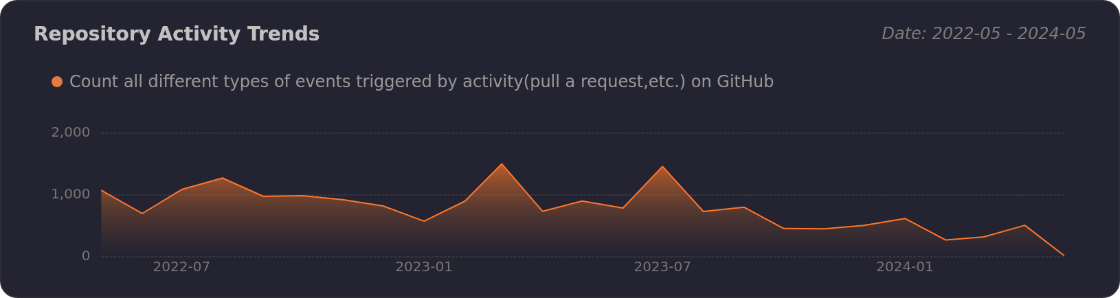
[!NOTE]
ProComponents stands as a beacon for React-based enterprise application development. Here’s what makes it exceptional:
In essence, ProComponents is a robust, user-friendly, and versatile UI component library, architected to empower applications across various scales and domains.
[!WARNING]
While ProComponents offers a wealth of benefits, it’s important to weigh certain considerations:
[!TIP]
To summarize, ProComponents is a formidable contender in the realm of enterprise application UI libraries, yet it comes with its own set of trade-offs, including customization constraints, a considerable learning curve, browser compatibility considerations, and a sizable codebase. Developers are advised to thoroughly assess their project needs and limitations prior to integrating ProComponents into their workflow.
 Edge |  Firefox |  Chrome |  Safari |  Opera |  Electron |
|---|---|---|---|---|---|
| last 2 versions | last 2 versions | last 2 versions | last 2 versions | last 2 versions | last 2 versions |
Dropped support of IE after
ProComponents 3.0.
You can use Github Codespaces for online development:

Or clone it for local development:
$ git clone https://github.com/ant-design/pro-components.git
$ cd pro-components
$ pnpm install
$ pnpm dev
Common scripts:
$ pnpm build           # library build (father)
$ pnpm test            # vitest (see also pnpm test:coverage)
$ pnpm start           # same as pnpm dev — Rspress doc dev server
$ pnpm docs build      # static doc site build (Rspress)
More detail: CONTRIBUTING.md.
[!IMPORTANT]
Join our collaborative ecosystem. Your contributions are the heartbeat of our project. Here's how you can be an integral part of our vibrant community:
Every contribution, big or small, is celebrated. Join us in our mission to refine and elevate the world of open-source enterprise UI components. 😃
|
| |
|---|---|
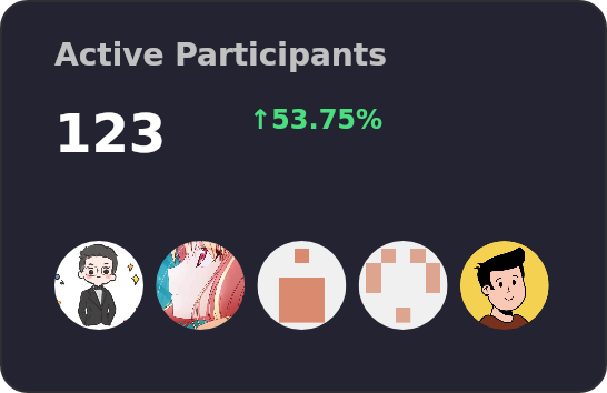
|
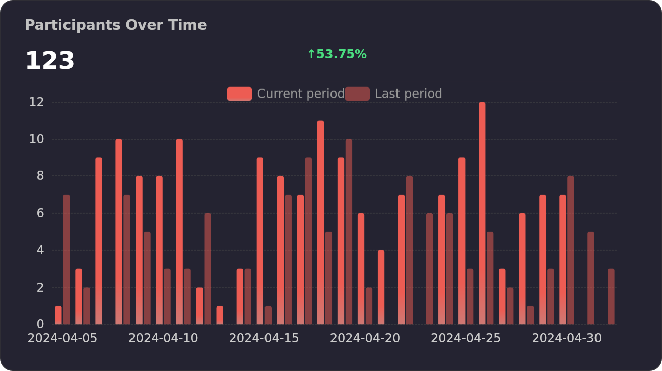
|
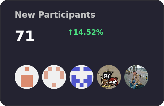
| |
Copyright © 2023 - present AFX & Ant Digital.
This project is MIT licensed.
Overall
Maintained
Code review
Latest release
Releases this year
382 followers · starred Feb 2022
421 followers · starred Jul 2026
823 followers · starred Jan 2024
80 followers · starred Nov 2024
🏆 Use Ant Design like a Pro!
See the code
Designed for Enterprise-Level Application, Use Ant Design like a Pro!
English · 简体中文 · Report Bug · Request Feature
To install @ant-design/pro-components, run the following command:
$ pnpm install @ant-design/pro-components
Pro Series components are meticulously engineered to bolster the robust architecture of enterprise-grade applications.
[!NOTE]
ProComponents stands as a beacon for React-based enterprise application development. Here’s what makes it exceptional:
In essence, ProComponents is a robust, user-friendly, and versatile UI component library, architected to empower applications across various scales and domains.
[!WARNING]
While ProComponents offers a wealth of benefits, it’s important to weigh certain considerations:
[!TIP]
To summarize, ProComponents is a formidable contender in the realm of enterprise application UI libraries, yet it comes with its own set of trade-offs, including customization constraints, a considerable learning curve, browser compatibility considerations, and a sizable codebase. Developers are advised to thoroughly assess their project needs and limitations prior to integrating ProComponents into their workflow.
Edge | Firefox | Chrome | Safari | Opera | Electron |
|---|---|---|---|---|---|
| last 2 versions | last 2 versions | last 2 versions | last 2 versions | last 2 versions | last 2 versions |
Dropped support of IE after
ProComponents 3.0.
You can use Github Codespaces for online development:
Or clone it for local development:
$ git clone https://github.com/ant-design/pro-components.git
$ cd pro-components
$ pnpm install
$ pnpm dev
Common scripts:
$ pnpm build           # library build (father)
$ pnpm test            # vitest (see also pnpm test:coverage)
$ pnpm start           # same as pnpm dev — Rspress doc dev server
$ pnpm docs build      # static doc site build (Rspress)
More detail: CONTRIBUTING.md.
[!IMPORTANT]
Join our collaborative ecosystem. Your contributions are the heartbeat of our project. Here's how you can be an integral part of our vibrant community:
Every contribution, big or small, is celebrated. Join us in our mission to refine and elevate the world of open-source enterprise UI components. 😃
|
| |
|---|---|
|
|
|
|
| |
Copyright © 2023 - present AFX & Ant Digital.
This project is MIT licensed.
Overall
Maintained
Code review
Latest release
Releases this year
382 followers · starred Feb 2022
421 followers · starred Jul 2026
823 followers · starred Jan 2024
80 followers · starred Nov 2024





