Web Components Framework - Web组件框架
See the codeEnglish | 简体中文

import { render, signal, tag, Component, h } from 'omi'

const count = signal(0)

function add() {
  count.value++
}

function sub() {
  count.value--
}

@tag('counter-demo')
export class CounterDemo extends Component {
  static css = 'span { color: red; }'

  render() {
    return (
      <>
        <button onClick={sub}>-</button>
        <span>{count.value}</span>
        <button onClick={add}>+</button>
      </>
    )
  }
}
Use this component:
import { h } from 'omi'
import './counter-demo'

render(<counter-demo />, document.body)

// or
import { CounterDemo, Other } from './counter-demo'
// Prevent tree Shaking when importing other things
render(<CounterDemo />, document.body)

// or
document.body.appendChild(document.createElement('counter-demo'))
npm i omi
To quickly create an Omi + Vite + TS/JS project:
$ npx omi-cli init my-app    # or create js project by: npx omi-cli init-js my-app
$ cd my-app
$ npm start           # develop
$ npm run build       # release
To quickly create an Omi + Router + Signal + Suspense + Tailwindcss + Vite + TS project:
$ npx omi-cli init-spa my-app
$ cd my-app
$ npm start           # develop
$ npm run build       # release
omi - Implementation of omi framework.omi-form - Powerful, simple and cross frameworks form solution.lucide-omi - Lucide icon collection for omi.omiu - Hope to create the best web components. For example, the powerful vchart and vtableomi-router - Create SPA of omi framework.omi-cli - To quickly create an Omi + Vite + TS/JS project.omi-elements - Tailwind Element Omi UI KIT.omi-starter-spa - A starter repo for building single page app using Omi + OmiRouter + Tailwindcss + TypeScript + Vite + Prettier.omi-starter-ts - A starter repo for building web app or reusable components using Omi in TypeScript base on Vite.omi-starter-tailwind - A starter repo for building web app or reusable components using Omi + Tailwindcss + TypeScript + Vite.omi-starter-js - A starter repo for building web app or reusable components using Omi in JavaScript base on Vite.omi-vue - Vue SFC + Vite + OMI + OMI-WeUI.omi-weui - WeUI Components of omi.omi-auto-animate - Omi version of @formkit/auto-animate.omi-suspense - Handling asynchronous dependencies.omi-transition - Applying animations when an component is entering and leaving the DOM.omi-ripple - A lightweight component for adding ripple effects to user interface elements.snake-game-2tier - SNake Game with Signal classsnake-game-3tier - SNake Game with reactivity functionsomi-tutorial - Source code of omi tutorial.If you want to help the project grow, start by simply sharing it with your peers!
Thank you!
Data oriented programming
In data-oriented programming, the focus is on the data itself and the operations on the data, rather than the objects or data structures that hold the data. This programming paradigm emphasizes the change and flow of data, and how to respond to these changes. The TodoApp with reactivity functions is a good example of this, using the concepts of reactive programming, where the UI automatically updates to reflect changes in the data (i.e., the to-do list).
import { render, signal, computed, tag, Component, h } from 'omi'

const todos = signal([
  { text: 'Learn OMI', completed: true },
  { text: 'Learn Web Components', completed: false },
  { text: 'Learn JSX', completed: false },
  { text: 'Learn Signal', completed: false }
])

const completedCount = computed(() => {
  return todos.value.filter(todo => todo.completed).length
})

const newItem = signal('')

function addTodo() {
  // api a
  todos.value.push({ text: newItem.value, completed: false })
  todos.update() // Trigger UI auto update

  // api b, same as api a
  // todos.value = [...todos.value, { text: newItem.value, completed: false }]

  newItem.value = '' // Changing the value type can automatically update the UI
}

function removeTodo(index: number) {
  todos.value.splice(index, 1)
  todos.update() // Trigger UI auto update
}

@tag('todo-list')
class TodoList extends Component {
  onInput = (event: Event) => {
    const target = event.target as HTMLInputElement
    newItem.value = target.value
  }

  render() {
    return (
      <>
        <input type="text" value={newItem.value} onInput={this.onInput} />
        <button onClick={addTodo}>Add</button>
        <ul>
          {todos.value.map((todo, index) => {
            return (
              <li>
                <label>
                  <input
                    type="checkbox"
                    checked={todo.completed}
                    onInput={() => {
                      todo.completed = !todo.completed
                      todos.update() // Trigger UI auto update
                    }}
                  />
                  {todo.completed ? <s>{todo.text}</s> : todo.text}
                </label>
                {' '}
                <button onClick={() => removeTodo(index)}>❌</button>
              </li>
            )
          })}
        </ul>
        <p>Completed count: {completedCount.value}</p>
      </>
    )
  }
}

render(<todo-list />, document.body)
vite.config.js:
import { defineConfig } from 'vite'

export default defineConfig({
  esbuild: {
    jsxInject: "import { h } from 'omi'",
    jsxFactory: "h",
    jsxFragment: "h.f"
  }
})
You can inject code during construction, so you don't have to manually export h.
The case of using Omi component in Vue is as follows:
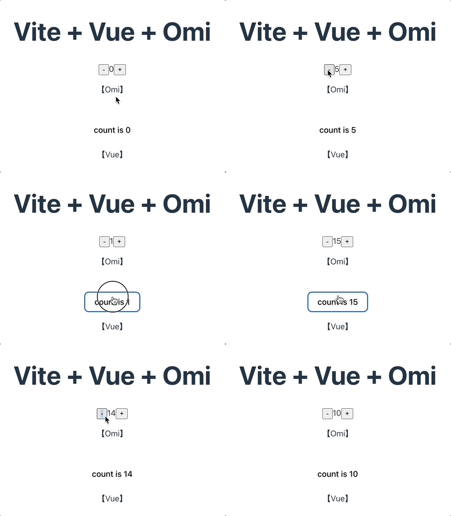
my-counter.tsx:
import { tag, Component, h, bind } from 'omi'

@tag('my-counter')
class MyCounter extends Component {
  static props = {
    count: {
      type: Number,
      default: 0,
      changed(newValue, oldValue) {
        this.state.count = newValue
        this.update()
      }
    }
  }

  state = {
    count: null
  }

  install() {
    this.state.count = this.props.count
  }

  @bind
  sub() {
    this.state.count--
    this.update()
    this.fire('change', this.state.count)
  }

  @bind
  add() {
    this.state.count++
    this.update()
    this.fire('change', this.state.count)
  }

  render() {
    return (
      <>
        <button onClick={this.sub}>-</button>
        <span>{this.state.count}</span>
        <button onClick={this.add}>+</button>
      </>
    )
  }
}
<script setup>
import { ref } from 'vue'
// import omi component
import './my-counter'

defineProps({
  msg: String,
})

const count = ref(0)

const change = (e) => {
  count.value = e.detail
}

</script>

<template>
  <h1>{{ msg }}</h1>

  <my-counter @change="change" :count="count" />
  <p>
    【Omi】
  </p>

  <div class="card">
    <button type="button" @click="count++">count is {{ count }}</button>
    <p>
     【Vue】
    </p>
  </div>

</template>
If you fire the count-change in an Omi component:
this.fire('count-change', this.state.count)
To use the component and listen for events in Vue:
<my-counter @count-change="change" :count="count" />
import { useState, useRef, useEffect } from 'react'
import useEventListener from '@use-it/event-listener'
import './my-counter'

function App() {
  const [count, setCount] = useState(100)
  const myCounterRef = useRef(null)

  useEffect(() => {
    const counter = myCounterRef.current
    if (counter) {
      const handleChange = (evt) => {
        setCount(evt.detail)
      }
      counter.addEventListener('change', handleChange)
      return () => {
        counter.removeEventListener('change', handleChange)
      }
    }
  }, [])

  return (
    <>
      <h1>Omi + React</h1>
      <my-counter count={count} ref={myCounterRef}></my-counter>
      <div className="card">
        <button onClick={() => setCount((count) => count + 1)}>
          count is {count}
        </button>
      </div>
    </>
  )
}

export default App
MIT © Tencent
Overall
Maintained
Code review
npm
Latest release
Releases this year
822 followers · starred Oct 2018
533 followers · starred Oct 2018
144 followers · starred Oct 2018
314 followers · starred Mar 2020
Web Components Framework - Web组件框架
See the codeEnglish | 简体中文
import { render, signal, tag, Component, h } from 'omi'

const count = signal(0)

function add() {
  count.value++
}

function sub() {
  count.value--
}

@tag('counter-demo')
export class CounterDemo extends Component {
  static css = 'span { color: red; }'

  render() {
    return (
      <>
        <button onClick={sub}>-</button>
        <span>{count.value}</span>
        <button onClick={add}>+</button>
      </>
    )
  }
}
Use this component:
import { h } from 'omi'
import './counter-demo'

render(<counter-demo />, document.body)

// or
import { CounterDemo, Other } from './counter-demo'
// Prevent tree Shaking when importing other things
render(<CounterDemo />, document.body)

// or
document.body.appendChild(document.createElement('counter-demo'))
npm i omi
To quickly create an Omi + Vite + TS/JS project:
$ npx omi-cli init my-app    # or create js project by: npx omi-cli init-js my-app
$ cd my-app
$ npm start           # develop
$ npm run build       # release
To quickly create an Omi + Router + Signal + Suspense + Tailwindcss + Vite + TS project:
$ npx omi-cli init-spa my-app
$ cd my-app
$ npm start           # develop
$ npm run build       # release
omi - Implementation of omi framework.omi-form - Powerful, simple and cross frameworks form solution.lucide-omi - Lucide icon collection for omi.omiu - Hope to create the best web components. For example, the powerful vchart and vtableomi-router - Create SPA of omi framework.omi-cli - To quickly create an Omi + Vite + TS/JS project.omi-elements - Tailwind Element Omi UI KIT.omi-starter-spa - A starter repo for building single page app using Omi + OmiRouter + Tailwindcss + TypeScript + Vite + Prettier.omi-starter-ts - A starter repo for building web app or reusable components using Omi in TypeScript base on Vite.omi-starter-tailwind - A starter repo for building web app or reusable components using Omi + Tailwindcss + TypeScript + Vite.omi-starter-js - A starter repo for building web app or reusable components using Omi in JavaScript base on Vite.omi-vue - Vue SFC + Vite + OMI + OMI-WeUI.omi-weui - WeUI Components of omi.omi-auto-animate - Omi version of @formkit/auto-animate.omi-suspense - Handling asynchronous dependencies.omi-transition - Applying animations when an component is entering and leaving the DOM.omi-ripple - A lightweight component for adding ripple effects to user interface elements.snake-game-2tier - SNake Game with Signal classsnake-game-3tier - SNake Game with reactivity functionsomi-tutorial - Source code of omi tutorial.If you want to help the project grow, start by simply sharing it with your peers!
Thank you!
Data oriented programming
In data-oriented programming, the focus is on the data itself and the operations on the data, rather than the objects or data structures that hold the data. This programming paradigm emphasizes the change and flow of data, and how to respond to these changes. The TodoApp with reactivity functions is a good example of this, using the concepts of reactive programming, where the UI automatically updates to reflect changes in the data (i.e., the to-do list).
import { render, signal, computed, tag, Component, h } from 'omi'

const todos = signal([
  { text: 'Learn OMI', completed: true },
  { text: 'Learn Web Components', completed: false },
  { text: 'Learn JSX', completed: false },
  { text: 'Learn Signal', completed: false }
])

const completedCount = computed(() => {
  return todos.value.filter(todo => todo.completed).length
})

const newItem = signal('')

function addTodo() {
  // api a
  todos.value.push({ text: newItem.value, completed: false })
  todos.update() // Trigger UI auto update

  // api b, same as api a
  // todos.value = [...todos.value, { text: newItem.value, completed: false }]

  newItem.value = '' // Changing the value type can automatically update the UI
}

function removeTodo(index: number) {
  todos.value.splice(index, 1)
  todos.update() // Trigger UI auto update
}

@tag('todo-list')
class TodoList extends Component {
  onInput = (event: Event) => {
    const target = event.target as HTMLInputElement
    newItem.value = target.value
  }

  render() {
    return (
      <>
        <input type="text" value={newItem.value} onInput={this.onInput} />
        <button onClick={addTodo}>Add</button>
        <ul>
          {todos.value.map((todo, index) => {
            return (
              <li>
                <label>
                  <input
                    type="checkbox"
                    checked={todo.completed}
                    onInput={() => {
                      todo.completed = !todo.completed
                      todos.update() // Trigger UI auto update
                    }}
                  />
                  {todo.completed ? <s>{todo.text}</s> : todo.text}
                </label>
                {' '}
                <button onClick={() => removeTodo(index)}>❌</button>
              </li>
            )
          })}
        </ul>
        <p>Completed count: {completedCount.value}</p>
      </>
    )
  }
}

render(<todo-list />, document.body)
vite.config.js:
import { defineConfig } from 'vite'

export default defineConfig({
  esbuild: {
    jsxInject: "import { h } from 'omi'",
    jsxFactory: "h",
    jsxFragment: "h.f"
  }
})
You can inject code during construction, so you don't have to manually export h.
The case of using Omi component in Vue is as follows:
my-counter.tsx:
import { tag, Component, h, bind } from 'omi'

@tag('my-counter')
class MyCounter extends Component {
  static props = {
    count: {
      type: Number,
      default: 0,
      changed(newValue, oldValue) {
        this.state.count = newValue
        this.update()
      }
    }
  }

  state = {
    count: null
  }

  install() {
    this.state.count = this.props.count
  }

  @bind
  sub() {
    this.state.count--
    this.update()
    this.fire('change', this.state.count)
  }

  @bind
  add() {
    this.state.count++
    this.update()
    this.fire('change', this.state.count)
  }

  render() {
    return (
      <>
        <button onClick={this.sub}>-</button>
        <span>{this.state.count}</span>
        <button onClick={this.add}>+</button>
      </>
    )
  }
}
<script setup>
import { ref } from 'vue'
// import omi component
import './my-counter'

defineProps({
  msg: String,
})

const count = ref(0)

const change = (e) => {
  count.value = e.detail
}

</script>

<template>
  <h1>{{ msg }}</h1>

  <my-counter @change="change" :count="count" />
  <p>
    【Omi】
  </p>

  <div class="card">
    <button type="button" @click="count++">count is {{ count }}</button>
    <p>
     【Vue】
    </p>
  </div>

</template>
If you fire the count-change in an Omi component:
this.fire('count-change', this.state.count)
To use the component and listen for events in Vue:
<my-counter @count-change="change" :count="count" />
import { useState, useRef, useEffect } from 'react'
import useEventListener from '@use-it/event-listener'
import './my-counter'

function App() {
  const [count, setCount] = useState(100)
  const myCounterRef = useRef(null)

  useEffect(() => {
    const counter = myCounterRef.current
    if (counter) {
      const handleChange = (evt) => {
        setCount(evt.detail)
      }
      counter.addEventListener('change', handleChange)
      return () => {
        counter.removeEventListener('change', handleChange)
      }
    }
  }, [])

  return (
    <>
      <h1>Omi + React</h1>
      <my-counter count={count} ref={myCounterRef}></my-counter>
      <div className="card">
        <button onClick={() => setCount((count) => count + 1)}>
          count is {count}
        </button>
      </div>
    </>
  )
}

export default App
MIT © Tencent
Overall
Maintained
Code review
npm
Latest release
Releases this year
822 followers · starred Oct 2018
533 followers · starred Oct 2018
144 followers · starred Oct 2018
314 followers · starred Mar 2020