
A native-feeling SF Symbols picker for iOS, iPadOS, macOS and visionOS, designed to integrate seamlessly into your app.
Swift
52
109 commits
updated Mar 30, 2026
README
SymbolPicker



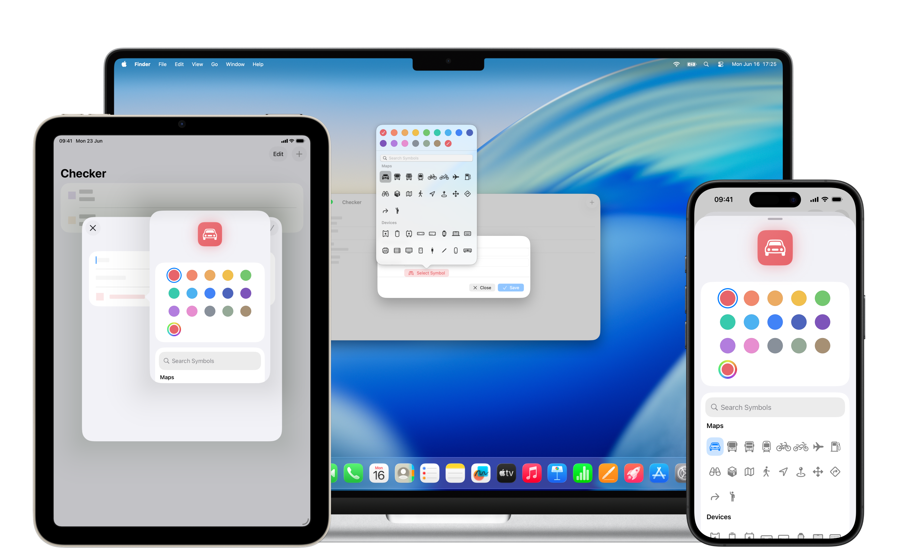
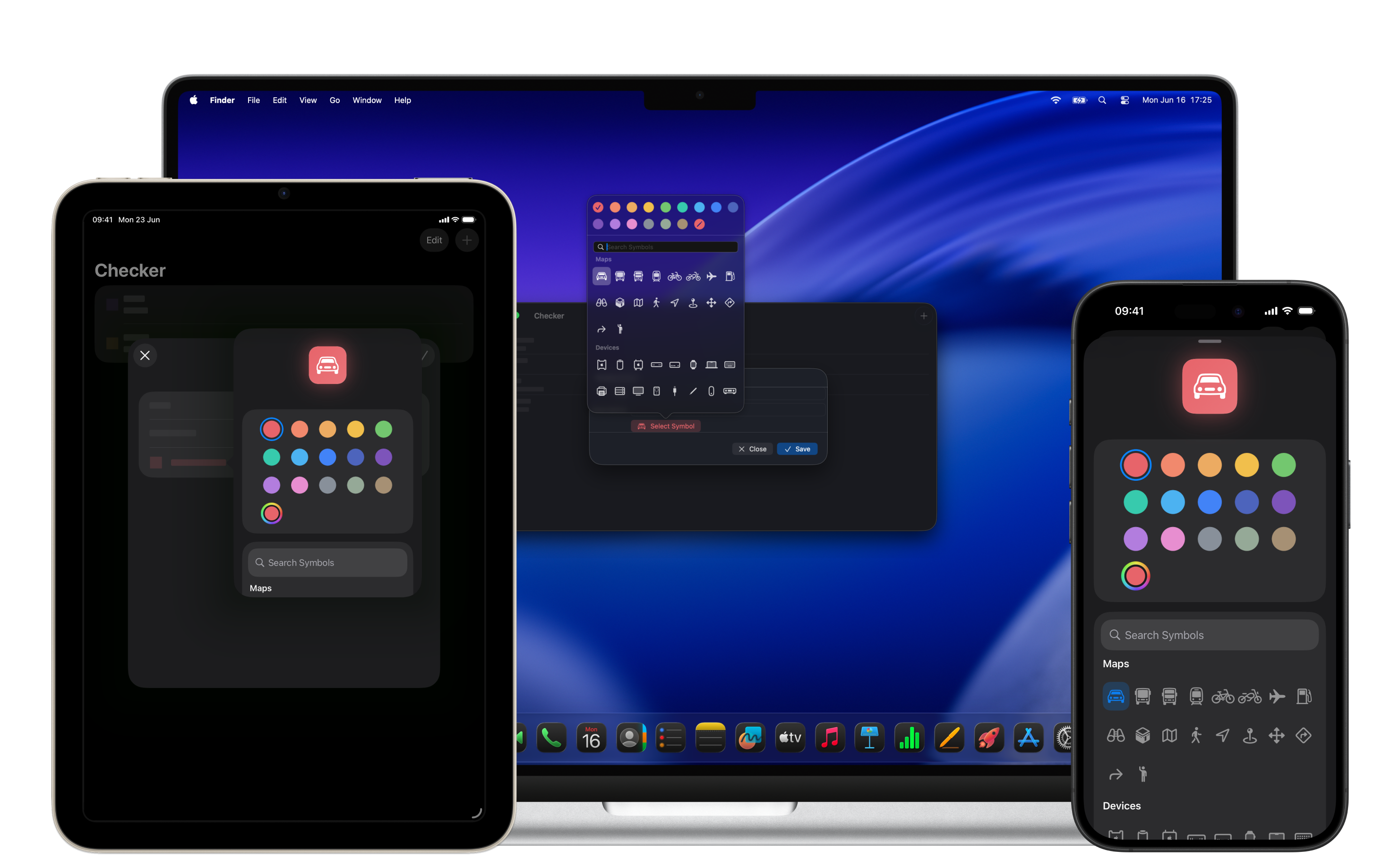
SymbolPicker is a SwiftUI package that provides a native, highly customizable symbol picker component for iOS, iPadOS, macOS, and visionOS. Built to integrate seamlessly with SwiftUI, it leverages Apple’s SF Symbols and offers a familiar interface for browsing and selecting symbols with flexible styling and color options. With support for dynamic type, accessibility, and platform-adaptive presentations, SymbolPicker is ideal for creating intuitive symbol selection experiences.
For detailed documentation, visit the SymbolPicker Documentation.
Table of Contents
Features
- Native Integration: Delivers a platform-authentic symbol picker experience, mirroring Apple’s SF Symbols interface.
- Extensive Customization: Modify symbol rendering styles, colors (RGB
[Double], SwiftUIColor, or predefinedSymbolColor), and filled/outline variants via SwiftUI modifiers. - Dynamic Search: Real-time symbol filtering with a built-in search bar for quick navigation.
- Symbol Categorization: Organizes symbols to match Apple’s official SF Symbols categories.
- Color Flexibility: Supports
[Double]for RGBA, SwiftUIColor, orSymbolColorwith precise styling viacustomColor(red:green:blue:alpha:). - Accessibility: Full support for VoiceOver, Dynamic Type, and adaptive layouts for inclusive experiences.
- Platform Consistency: Unified SwiftUI API with adaptive presentations (sheets on iPhone, popovers on iPad/visionOS, windows on macOS).
- Built-in Unit Tests: Includes comprehensive unit and UI tests to ensure reliability across all supported platforms.
Resources
Explore additional SymbolPicker resources to deepen your understanding:
- Documentation: Dive into detailed SymbolPicker documentation.
Usage
The SymbolPicker component is a SwiftUI View that adapts to each platform, offering a simple yet powerful API for integration and customization.
Basic Usage
A minimal setup for a functional symbol picker across platforms:
import SwiftUI
import SymbolPicker

struct ContentView: View {
    @State private var isPresented = false
    @State private var symbolName = "star.fill"

    var body: some View {
        Button(action: { isPresented = true }) {
            Image(systemName: symbolName)
                .resizable()
                .scaledToFit()
                .frame(width: 50, height: 50)
        }
        .symbolPicker(isPresented: $isPresented, symbolName: $symbolName)
        .symbolPickerSymbolsStyle(.filled)
        .symbolPickerDismiss(type: .onSymbolSelect)
    }
}
Advanced Customization
Enhance the symbol picker with color selection using [Double], SymbolColor, or SwiftUI Color, along with custom styles and platform-specific behaviors:
import SwiftUI
import SymbolPicker

struct ContentView: View {
    @State private var isPresented = false
    @State private var symbolName = "car.fill"
    @State private var colorValues: [Double] = [0.906, 0.392, 0.416, 1.0]

    var body: some View {
        VStack {
            Image(systemName: symbolName)
                .foregroundStyle(Color(
                    red: colorValues[0],
                    green: colorValues[1],
                    blue: colorValues[2],
                    opacity: colorValues[3]
                ))
                .font(.system(size: 64))
            Button("Select Symbol") { isPresented.toggle() }
            Text("Symbol: \(symbolName)")
        }
        .padding()
        .symbolPicker(
            isPresented: $isPresented,
            symbolName: $symbolName,
            color: $colorValues
        )
        .symbolPickerSymbolsStyle(.filled)
        .symbolPickerDismiss(type: .onSymbolSelect)
    }
}
Modifiers
The SymbolPicker package offers modifiers to customize its appearance, behavior, and interaction. Below are key examples from each category. For a complete list, refer to the SymbolPicker Documentation.
Symbol Picker Modifiers
symbolPicker(isPresented:symbolName:): Presents the picker without color selection, ideal for simple symbol selection.
Available on iOS (14.0+), iPadOS (14.0+), macOS (11.0+), visionOS (1.0+).symbolPicker(isPresented:symbolName:color:): Configures the picker with color binding supporting[Double]for RGBA, SwiftUIColor, orSymbolColor.
Available on iOS (14.0+), iPadOS (14.0+), macOS (11.0+), visionOS (1.0+).
Configuration Modifiers
symbolPickerSymbolsStyle(_:): Toggles between.filled(e.g.,star.fill) and.outline(e.g.,star) symbol variants.
Available on iOS (14.0+), iPadOS (14.0+), macOS (11.0+), visionOS (1.0+).symbolPickerDismiss(type:): Configures dismissal behavior, with.onSymbolSelectto close the picker upon symbol selection.
Available on iOS (14.0+), iPadOS (14.0+), macOS (11.0+), visionOS (1.0+).
Color Options
- Supports predefined
SymbolColorvalues (e.g.,.red,.blue,.customColor(red:green:blue:alpha:)) for consistent styling. - Allows
[Double]for RGBA values, SwiftUIColor, orSymbolColor.customColor(red:green:blue:alpha:)for precise color customization.
Installation
Swift Package Manager
Add SymbolPicker to your project via Swift Package Manager. The minimum version required is 1.0.0.
In Package.swift:
dependencies: [
    .package(url: "https://github.com/SzpakKamil/SymbolPicker.git", from: "1.0.0")
]
In Xcode:
- Go to File > Swift Packages > Add Package Dependency.
- Enter the URL:
https://github.com/SzpakKamil/SymbolPicker.git. - Select version 1.0.0 or later.
Agent Skill
You can install the SymbolPicker skill for your CLI agent to get expert guidance on SymbolPicker directly in your terminal.
Using skills.sh:
npx skills add https://github.com/SzpakKamil/AgentSkills --skill SymbolPicker
Using ClawdHub:
npx dlx clawdhub@latest install symbolpicker
Requirements
- iOS: 14.0+
- iPadOS: 14.0+
- macOS: 11.0+
- visionOS: 1.0+
- Swift: 5.9+
- Xcode: 15.0+
License
SymbolPicker is released under the MIT license.
Contributors

108 commits

1 commits
Similar repos


Languages
Swift
100.0%
A native-feeling SF Symbols picker for iOS, iPadOS, macOS and visionOS, designed to integrate seamlessly into your app.
Swift
52
109 commits
updated Mar 30, 2026
README
SymbolPicker
SymbolPicker is a SwiftUI package that provides a native, highly customizable symbol picker component for iOS, iPadOS, macOS, and visionOS. Built to integrate seamlessly with SwiftUI, it leverages Apple’s SF Symbols and offers a familiar interface for browsing and selecting symbols with flexible styling and color options. With support for dynamic type, accessibility, and platform-adaptive presentations, SymbolPicker is ideal for creating intuitive symbol selection experiences.
For detailed documentation, visit the SymbolPicker Documentation.
Table of Contents
Features
- Native Integration: Delivers a platform-authentic symbol picker experience, mirroring Apple’s SF Symbols interface.
- Extensive Customization: Modify symbol rendering styles, colors (RGB
[Double], SwiftUIColor, or predefinedSymbolColor), and filled/outline variants via SwiftUI modifiers. - Dynamic Search: Real-time symbol filtering with a built-in search bar for quick navigation.
- Symbol Categorization: Organizes symbols to match Apple’s official SF Symbols categories.
- Color Flexibility: Supports
[Double]for RGBA, SwiftUIColor, orSymbolColorwith precise styling viacustomColor(red:green:blue:alpha:). - Accessibility: Full support for VoiceOver, Dynamic Type, and adaptive layouts for inclusive experiences.
- Platform Consistency: Unified SwiftUI API with adaptive presentations (sheets on iPhone, popovers on iPad/visionOS, windows on macOS).
- Built-in Unit Tests: Includes comprehensive unit and UI tests to ensure reliability across all supported platforms.
Resources
Explore additional SymbolPicker resources to deepen your understanding:
- Documentation: Dive into detailed SymbolPicker documentation.
Usage
The SymbolPicker component is a SwiftUI View that adapts to each platform, offering a simple yet powerful API for integration and customization.
Basic Usage
A minimal setup for a functional symbol picker across platforms:
import SwiftUI
import SymbolPicker

struct ContentView: View {
    @State private var isPresented = false
    @State private var symbolName = "star.fill"

    var body: some View {
        Button(action: { isPresented = true }) {
            Image(systemName: symbolName)
                .resizable()
                .scaledToFit()
                .frame(width: 50, height: 50)
        }
        .symbolPicker(isPresented: $isPresented, symbolName: $symbolName)
        .symbolPickerSymbolsStyle(.filled)
        .symbolPickerDismiss(type: .onSymbolSelect)
    }
}
Advanced Customization
Enhance the symbol picker with color selection using [Double], SymbolColor, or SwiftUI Color, along with custom styles and platform-specific behaviors:
import SwiftUI
import SymbolPicker

struct ContentView: View {
    @State private var isPresented = false
    @State private var symbolName = "car.fill"
    @State private var colorValues: [Double] = [0.906, 0.392, 0.416, 1.0]

    var body: some View {
        VStack {
            Image(systemName: symbolName)
                .foregroundStyle(Color(
                    red: colorValues[0],
                    green: colorValues[1],
                    blue: colorValues[2],
                    opacity: colorValues[3]
                ))
                .font(.system(size: 64))
            Button("Select Symbol") { isPresented.toggle() }
            Text("Symbol: \(symbolName)")
        }
        .padding()
        .symbolPicker(
            isPresented: $isPresented,
            symbolName: $symbolName,
            color: $colorValues
        )
        .symbolPickerSymbolsStyle(.filled)
        .symbolPickerDismiss(type: .onSymbolSelect)
    }
}
Modifiers
The SymbolPicker package offers modifiers to customize its appearance, behavior, and interaction. Below are key examples from each category. For a complete list, refer to the SymbolPicker Documentation.
Symbol Picker Modifiers
symbolPicker(isPresented:symbolName:): Presents the picker without color selection, ideal for simple symbol selection.
Available on iOS (14.0+), iPadOS (14.0+), macOS (11.0+), visionOS (1.0+).symbolPicker(isPresented:symbolName:color:): Configures the picker with color binding supporting[Double]for RGBA, SwiftUIColor, orSymbolColor.
Available on iOS (14.0+), iPadOS (14.0+), macOS (11.0+), visionOS (1.0+).
Configuration Modifiers
symbolPickerSymbolsStyle(_:): Toggles between.filled(e.g.,star.fill) and.outline(e.g.,star) symbol variants.
Available on iOS (14.0+), iPadOS (14.0+), macOS (11.0+), visionOS (1.0+).symbolPickerDismiss(type:): Configures dismissal behavior, with.onSymbolSelectto close the picker upon symbol selection.
Available on iOS (14.0+), iPadOS (14.0+), macOS (11.0+), visionOS (1.0+).
Color Options
- Supports predefined
SymbolColorvalues (e.g.,.red,.blue,.customColor(red:green:blue:alpha:)) for consistent styling. - Allows
[Double]for RGBA values, SwiftUIColor, orSymbolColor.customColor(red:green:blue:alpha:)for precise color customization.
Installation
Swift Package Manager
Add SymbolPicker to your project via Swift Package Manager. The minimum version required is 1.0.0.
In Package.swift:
dependencies: [
    .package(url: "https://github.com/SzpakKamil/SymbolPicker.git", from: "1.0.0")
]
In Xcode:
- Go to File > Swift Packages > Add Package Dependency.
- Enter the URL:
https://github.com/SzpakKamil/SymbolPicker.git. - Select version 1.0.0 or later.
Agent Skill
You can install the SymbolPicker skill for your CLI agent to get expert guidance on SymbolPicker directly in your terminal.
Using skills.sh:
npx skills add https://github.com/SzpakKamil/AgentSkills --skill SymbolPicker
Using ClawdHub:
npx dlx clawdhub@latest install symbolpicker
Requirements
- iOS: 14.0+
- iPadOS: 14.0+
- macOS: 11.0+
- visionOS: 1.0+
- Swift: 5.9+
- Xcode: 15.0+
License
SymbolPicker is released under the MIT license.
Similar repos
Contributors
108 commits
1 commits
Languages
Swift
100.0%