
A Typst package for creating colorful and customizable boxes
Typst
149
132 commits
updated Jul 28, 2025
README
Showybox (v2.0.4)
Showybox is a Typst package for creating colorful and customizable boxes.
Please note that this repository contains the latest (development) version of this package and may not yet be published at Typst's official package repository. If you want to use this package, see https://github.com/typst/packages/tree/main/packages/preview for the latest stable version
Usage
To use this library through the Typst package manager (for Typst 0.6.0 or greater), write #import "@preview/showybox:2.0.4": showybox at the beginning of your Typst file.
Once imported, you can create an empty showybox by using the function showybox() and giving a default body content inside the parenthesis or outside them using squared brackets [].
By default a showybox with these properties will be created:
- No title
- No shadow
- Not breakable
- Black borders
- White background
5ptof border radius1ptof border thickness
#import "@preview/showybox:2.0.4": showybox

#showybox(
  [Hello world!]
)

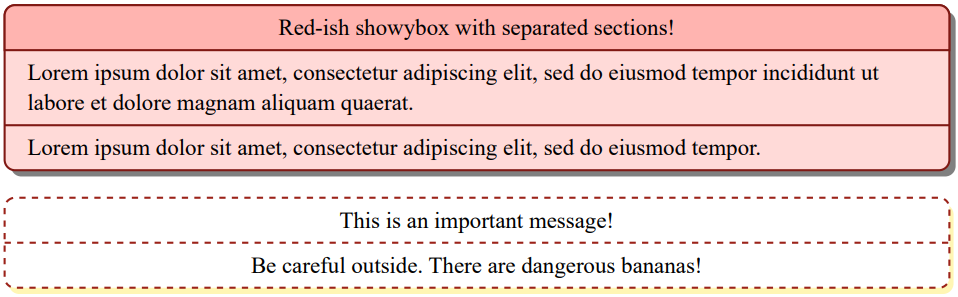
Looks quite simple, but the "magic" starts when adding a title, color and shadows. The following code creates two "unique" boxes with defined colors and custom borders:
// First showybox
#showybox(
  frame: (
    border-color: red.darken(50%),
    title-color: red.lighten(60%),
    body-color: red.lighten(80%)
  ),
  title-style: (
    color: black,
    weight: "regular",
    align: center
  ),
  shadow: (
    offset: 3pt,
  ),
  title: "Red-ish showybox with separated sections!",
  lorem(20),
  lorem(12)
)

// Second showybox
#showybox(
  frame: (
    dash: "dashed",
    border-color: red.darken(40%)
  ),
  body-style: (
    align: center
  ),
  sep: (
    dash: "dashed"
  ),
  shadow: (
	  offset: (x: 2pt, y: 3pt),
    color: yellow.lighten(70%)
  ),
  [This is an important message!],
  [Be careful outside. There are dangerous bananas!]
)
Reference
The showybox() function can receive the following parameters:
title: A string used as the title of the showyboxfooter: A string used as the footer of the showyboxframe: A dictionary containing the frame's propertiestitle-style: A dictionary containing the title's stylesbody-style: A dictionary containing the body's stylesfooter-style: A dictionary containing the footer's stylessep: A dictionary containing the separator's propertiesshadow: A dictionary containing the shadow's propertieswidth: A relative length indicating the showybox's widthalign: An unidimensional alignment for the showybox in the pagebreakable: A boolean indicating whether a showybox can break if it reached an end of pagespacing: Space above and below the showyboxabove: Space above the showyboxbelow: Space below the showyboxbody: The content of the showybox
Frame properties
title-color: Color used as background color where the title goes (default isblack)body-color: Color used as background color where the body goes (default iswhite)footer-color: Color used as background color where the footer goes (default isluma(85))border-color: Color used for the showybox's border (default isblack)inset: Inset used for title, body and footer elements (default is(x: 1em, y: 0.65em)) if none of the followings are given:title-inset: Inset used for the titlebody-inset: Inset used for the bodyfooter-inset: Inset used for the body
radius: Showybox's radius (default is5pt)thickness: Border thickness of the showybox (default is1pt)dash: Showybox's border style (default issolid)
Title styles
color: Text color (default iswhite)weight: Text weight (default isbold)align: Text align (default isstart)sep-thickness: Thickness of the separator between title and body (default is1pt)boxed-style: If it's a dictionary of properties, indicates that the title must appear like a "floating box" above the showybox. If it'snone, the title appears normally (default isnone)
Boxed styles
anchor: Anchor of the boxed titley: Vertical anchor (top,horizonorbottom-- default ishorizon)x: Horizontal anchor (left,start,center,right,end-- default isstart)
offset: How much to offset the boxed title in x and y direction as a dictionary with keysxandy(default is0pt)radius: Boxed title radius as a dictionary or relative length (default is5pt)
Body styles
color: Text color (default isblack)align: Text align (default isstart)
Footer styles
color: Text color (default isluma(85))weight: Text weight (default isregular)align: Text align (default isstart)sep-thickness: Thickness of the separator between body and footer (default is1pt)
Separator properties
thickness: Separator's thickness (default is1pt)dash: Separator's style (as alinedash style, default is"solid")gutter: Separator's space above and below (default is0.65em)
Shadow properties
color: Shadow color (default isblack)offset: How much to offset the shadow in x and y direction either as a length or a dictionary with keysxandy(default is4pt)
Gallery
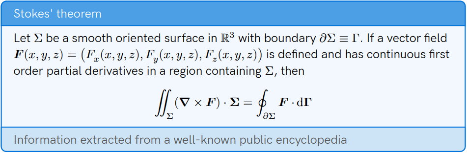
Colors for title, body and footer example (Stokes' theorem)
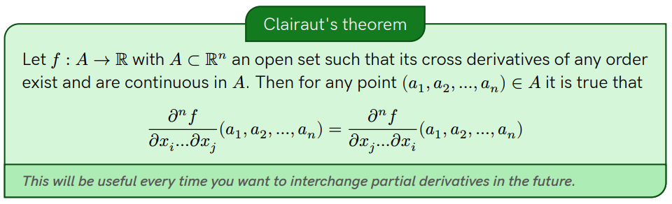
Boxed-title example (Clairaut's theorem)
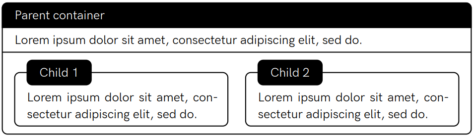
Encapsulation example
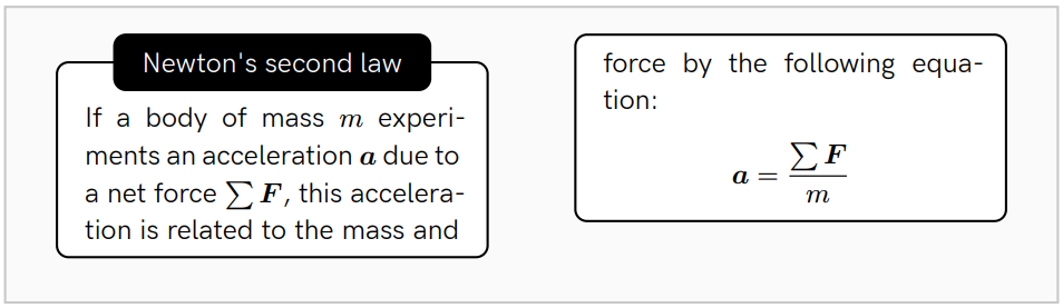
Breakable showybox example (Newton's second law)
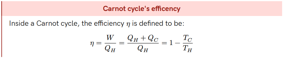
Custom radius and title's separator thickness example (Carnot's cycle efficency)
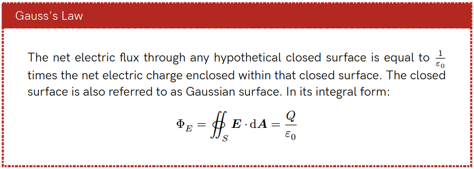
Custom border dash and inset example (Gauss's law)
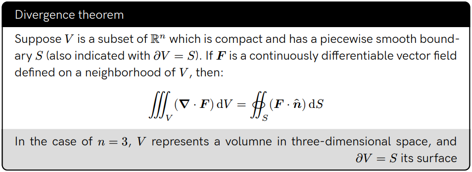
Custom footer's separator thickness example (Divergence's theorem)
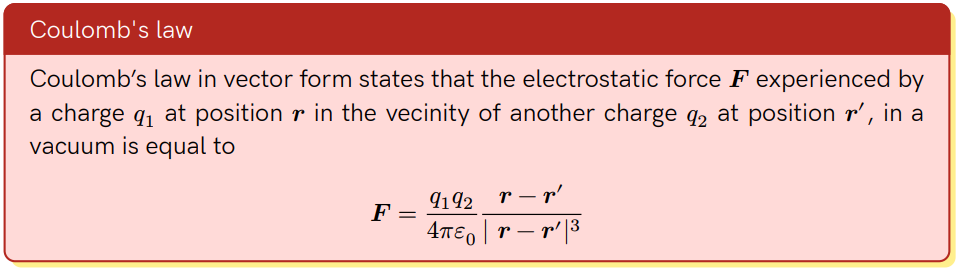
Colorful shadow example (Coulomb's law)
Changelog
Version 2.0.4
Special thanks to enklht (https://github.com/enklht) and PgBiel (https://github.com/PgBiel) for their collaboration with this version's changes
- Change default alignments to
start, instead ofleft - Fix pre-rendering logic while creating boxed-titles
- This fixes a reported bug occurring while creating a
counterinside a showybox declaration
- This fixes a reported bug occurring while creating a
Version 2.0.3
- Revert fix breakable box empty before new page. Layout didn't converge
Version 2.0.2
- Remove deprecated functions in Typst 0.12.0
- Fix breakable box empty before new page
Version 2.0.1
- Fix bad behaviours of boxed-titles
anchorinside afigure - Fix wrong
breakablebehaviour of showyboxes inside afigure - Fix Manual and README's Stokes theorem example
Version 2.0.0
Special thanks to Andrew Voynov (https://github.com/Andrew15-5) for the feedback while creating the new behaviours for boxed-titles
- Update
type()conditionals to Typst 0.8.0 standards - Add
boxed-styleproperty, withanchor,offsetandradiusproperties. - Refactor
showy-inset()for being general-purpose. Now it's calledshowy-value-in-direction()and has a default value for handling properties defaults - Now sharp corners can be set by giving a dictionary to frame
radius(e.g.radius: (top: 5pt, bottom: 0pt)). Before this only was possible for untitled showyboxes. - Refactor shadow functions to be in a separated file.
- Fix bug of bad behaviour while writing too long titles.
- Fix bug while rendering separators with custom thickness. Now the thickness is gotten properly.
- Fix bad shadow drawing in showyboxes with a boxed-title that has a "extreme"
offsetvalue. - Fix bad sizing while creating showyboxes with a
widthof less than100%, and a shadow.
Version 1.1.0
- Added
boxedoption in title styles - Added
boxed-alignin title styles - Added
sep-thicknessfor title and footer - Refactored repository's files layout
Version 1.0.0
- Fixed shadow displacement
- Details: Instead of displacing the showybox's body from the shadow, now the shadow is displaced from the body.
Changes below were performed by Jonas Neugebauer (https://github.com/jneug)
- Added
title-inset,body-inset,footer-insetandinsetoptions- Details:
title-inset,body-insetandfooter-insetwill set the inset of the title, body and footer area respectively.insetis a fallback for those areas.
- Details:
- Added a
sep.gutteroption to set the spacing around separator lines - Added option
widthto set the width of a showybox - Added option
alignto move a showybox withwidth< 100% along the x-axis- Details: A showybox is now wrapped in another block to allow alignment. This also makes it possible to pass the spacing options
spacing,aboveandbelowto#showybox().
- Details: A showybox is now wrapped in another block to allow alignment. This also makes it possible to pass the spacing options
- Added
footerandfooter-styleoptions- Details: The optional footer is added at the bottom of the box.
Version 0.2.1
All changes listed here were performed by Jonas Neugebauer (https://github.com/jneug)
- Added the
shadowoption - Enabled auto-break (
breakable) functionality for titled showyboxes - Removed a thin line that appears in showyboxes with no borders or dashed borders
Version 0.2.0
- Improved code documentation
- Enabled an auto-break functionality for non-titled showyboxes
- Created a separator functionality to separate content inside a showybox with a horizontal line
Version 0.1.1
- Changed package name from colorbox to showybox
- Fixed a spacing bug in encapsulated showyboxes
- Details: When a showybox was encapsulated inside another, the spacing after that showybox was
0pt, probably due to some "fixes" improved to manage default spacing betweenrectelements. The issue was solved by avoiding#setstatements and adding a#v(-1.1em)to correct extra spacing between the titlerectand the bodyrect.
- Details: When a showybox was encapsulated inside another, the spacing after that showybox was
Version 0.1.0
- Initial release
Contributors


Similar repos


Languages
Typst
100.0%
A Typst package for creating colorful and customizable boxes
Typst
149
132 commits
updated Jul 28, 2025
README
Showybox (v2.0.4)
Showybox is a Typst package for creating colorful and customizable boxes.
Please note that this repository contains the latest (development) version of this package and may not yet be published at Typst's official package repository. If you want to use this package, see https://github.com/typst/packages/tree/main/packages/preview for the latest stable version
Usage
To use this library through the Typst package manager (for Typst 0.6.0 or greater), write #import "@preview/showybox:2.0.4": showybox at the beginning of your Typst file.
Once imported, you can create an empty showybox by using the function showybox() and giving a default body content inside the parenthesis or outside them using squared brackets [].
By default a showybox with these properties will be created:
- No title
- No shadow
- Not breakable
- Black borders
- White background
5ptof border radius1ptof border thickness
#import "@preview/showybox:2.0.4": showybox

#showybox(
  [Hello world!]
)
Looks quite simple, but the "magic" starts when adding a title, color and shadows. The following code creates two "unique" boxes with defined colors and custom borders:
// First showybox
#showybox(
  frame: (
    border-color: red.darken(50%),
    title-color: red.lighten(60%),
    body-color: red.lighten(80%)
  ),
  title-style: (
    color: black,
    weight: "regular",
    align: center
  ),
  shadow: (
    offset: 3pt,
  ),
  title: "Red-ish showybox with separated sections!",
  lorem(20),
  lorem(12)
)

// Second showybox
#showybox(
  frame: (
    dash: "dashed",
    border-color: red.darken(40%)
  ),
  body-style: (
    align: center
  ),
  sep: (
    dash: "dashed"
  ),
  shadow: (
	  offset: (x: 2pt, y: 3pt),
    color: yellow.lighten(70%)
  ),
  [This is an important message!],
  [Be careful outside. There are dangerous bananas!]
)
Reference
The showybox() function can receive the following parameters:
title: A string used as the title of the showyboxfooter: A string used as the footer of the showyboxframe: A dictionary containing the frame's propertiestitle-style: A dictionary containing the title's stylesbody-style: A dictionary containing the body's stylesfooter-style: A dictionary containing the footer's stylessep: A dictionary containing the separator's propertiesshadow: A dictionary containing the shadow's propertieswidth: A relative length indicating the showybox's widthalign: An unidimensional alignment for the showybox in the pagebreakable: A boolean indicating whether a showybox can break if it reached an end of pagespacing: Space above and below the showyboxabove: Space above the showyboxbelow: Space below the showyboxbody: The content of the showybox
Frame properties
title-color: Color used as background color where the title goes (default isblack)body-color: Color used as background color where the body goes (default iswhite)footer-color: Color used as background color where the footer goes (default isluma(85))border-color: Color used for the showybox's border (default isblack)inset: Inset used for title, body and footer elements (default is(x: 1em, y: 0.65em)) if none of the followings are given:title-inset: Inset used for the titlebody-inset: Inset used for the bodyfooter-inset: Inset used for the body
radius: Showybox's radius (default is5pt)thickness: Border thickness of the showybox (default is1pt)dash: Showybox's border style (default issolid)
Title styles
color: Text color (default iswhite)weight: Text weight (default isbold)align: Text align (default isstart)sep-thickness: Thickness of the separator between title and body (default is1pt)boxed-style: If it's a dictionary of properties, indicates that the title must appear like a "floating box" above the showybox. If it'snone, the title appears normally (default isnone)
Boxed styles
anchor: Anchor of the boxed titley: Vertical anchor (top,horizonorbottom-- default ishorizon)x: Horizontal anchor (left,start,center,right,end-- default isstart)
offset: How much to offset the boxed title in x and y direction as a dictionary with keysxandy(default is0pt)radius: Boxed title radius as a dictionary or relative length (default is5pt)
Body styles
color: Text color (default isblack)align: Text align (default isstart)
Footer styles
color: Text color (default isluma(85))weight: Text weight (default isregular)align: Text align (default isstart)sep-thickness: Thickness of the separator between body and footer (default is1pt)
Separator properties
thickness: Separator's thickness (default is1pt)dash: Separator's style (as alinedash style, default is"solid")gutter: Separator's space above and below (default is0.65em)
Shadow properties
color: Shadow color (default isblack)offset: How much to offset the shadow in x and y direction either as a length or a dictionary with keysxandy(default is4pt)
Gallery
Colors for title, body and footer example (Stokes' theorem)
Boxed-title example (Clairaut's theorem)
Encapsulation example
Breakable showybox example (Newton's second law)
Custom radius and title's separator thickness example (Carnot's cycle efficency)
Custom border dash and inset example (Gauss's law)
Custom footer's separator thickness example (Divergence's theorem)
Colorful shadow example (Coulomb's law)
Changelog
Version 2.0.4
Special thanks to enklht (https://github.com/enklht) and PgBiel (https://github.com/PgBiel) for their collaboration with this version's changes
- Change default alignments to
start, instead ofleft - Fix pre-rendering logic while creating boxed-titles
- This fixes a reported bug occurring while creating a
counterinside a showybox declaration
- This fixes a reported bug occurring while creating a
Version 2.0.3
- Revert fix breakable box empty before new page. Layout didn't converge
Version 2.0.2
- Remove deprecated functions in Typst 0.12.0
- Fix breakable box empty before new page
Version 2.0.1
- Fix bad behaviours of boxed-titles
anchorinside afigure - Fix wrong
breakablebehaviour of showyboxes inside afigure - Fix Manual and README's Stokes theorem example
Version 2.0.0
Special thanks to Andrew Voynov (https://github.com/Andrew15-5) for the feedback while creating the new behaviours for boxed-titles
- Update
type()conditionals to Typst 0.8.0 standards - Add
boxed-styleproperty, withanchor,offsetandradiusproperties. - Refactor
showy-inset()for being general-purpose. Now it's calledshowy-value-in-direction()and has a default value for handling properties defaults - Now sharp corners can be set by giving a dictionary to frame
radius(e.g.radius: (top: 5pt, bottom: 0pt)). Before this only was possible for untitled showyboxes. - Refactor shadow functions to be in a separated file.
- Fix bug of bad behaviour while writing too long titles.
- Fix bug while rendering separators with custom thickness. Now the thickness is gotten properly.
- Fix bad shadow drawing in showyboxes with a boxed-title that has a "extreme"
offsetvalue. - Fix bad sizing while creating showyboxes with a
widthof less than100%, and a shadow.
Version 1.1.0
- Added
boxedoption in title styles - Added
boxed-alignin title styles - Added
sep-thicknessfor title and footer - Refactored repository's files layout
Version 1.0.0
- Fixed shadow displacement
- Details: Instead of displacing the showybox's body from the shadow, now the shadow is displaced from the body.
Changes below were performed by Jonas Neugebauer (https://github.com/jneug)
- Added
title-inset,body-inset,footer-insetandinsetoptions- Details:
title-inset,body-insetandfooter-insetwill set the inset of the title, body and footer area respectively.insetis a fallback for those areas.
- Details:
- Added a
sep.gutteroption to set the spacing around separator lines - Added option
widthto set the width of a showybox - Added option
alignto move a showybox withwidth< 100% along the x-axis- Details: A showybox is now wrapped in another block to allow alignment. This also makes it possible to pass the spacing options
spacing,aboveandbelowto#showybox().
- Details: A showybox is now wrapped in another block to allow alignment. This also makes it possible to pass the spacing options
- Added
footerandfooter-styleoptions- Details: The optional footer is added at the bottom of the box.
Version 0.2.1
All changes listed here were performed by Jonas Neugebauer (https://github.com/jneug)
- Added the
shadowoption - Enabled auto-break (
breakable) functionality for titled showyboxes - Removed a thin line that appears in showyboxes with no borders or dashed borders
Version 0.2.0
- Improved code documentation
- Enabled an auto-break functionality for non-titled showyboxes
- Created a separator functionality to separate content inside a showybox with a horizontal line
Version 0.1.1
- Changed package name from colorbox to showybox
- Fixed a spacing bug in encapsulated showyboxes
- Details: When a showybox was encapsulated inside another, the spacing after that showybox was
0pt, probably due to some "fixes" improved to manage default spacing betweenrectelements. The issue was solved by avoiding#setstatements and adding a#v(-1.1em)to correct extra spacing between the titlerectand the bodyrect.
- Details: When a showybox was encapsulated inside another, the spacing after that showybox was
Version 0.1.0
- Initial release
Similar repos
Contributors
Languages
Typst
100.0%