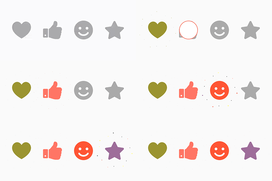
This is a UI lib for Android. Effects like shining.
Kotlin
4,194
148 commits
updated Jul 30, 2026





A lightweight, customizable Android UI library that adds a "shining" effect to buttons, similar to Twitter's heart animation.
build.gradle file:allprojects {
repositories {
...
maven { url 'https://jitpack.io' }
}
}
app/build.gradle file:dependencies {
implementation 'com.github.ChadCSong:ShineButton:v2.0.0'
}
Add the dependency to your app/build.gradle file:
dependencies {
    implementation 'com.sackcentury:shinebutton:2.0.0'
}
<dependency>
  <groupId>com.sackcentury</groupId>
  <artifactId>shinebutton</artifactId>
  <version>2.0.0</version>
  <type>aar</type>
</dependency>
The simplest way to use ShineButton is in your XML layout:
<com.sackcentury.shinebuttonlib.ShineButton
    android:id="@+id/shine_button"
    android:layout_width="50dp"
    android:layout_height="50dp"
    android:layout_centerInParent="true"
    android:src="@android:color/darker_gray"
    app:btn_color="@android:color/darker_gray"
    app:btn_fill_color="#FF6666"
    app:allow_random_color="false"
    app:siShape="@raw/like" />
ShineButton shineButton = (ShineButton) findViewById(R.id.shine_button);
shineButton.init(activity);
ShineButton now supports Jetpack Compose natively!
var isChecked by remember { mutableStateOf(false) }

ShineButtonCompose(
    isChecked = isChecked,
    onCheckedChange = { isChecked = it },
    shape = Icons.Default.Favorite, // Use any ImageVector
    btnColor = Color.LightGray,
    btnFillColor = Color.Red,
    shineColor = Color.Red,
    shineSize = 50.dp,
    allowRandomColor = true
)
Or create it dynamically:
ShineButton shineButtonJava = new ShineButton(this);
shineButtonJava.setBtnColor(Color.GRAY);
shineButtonJava.setBtnFillColor(Color.RED);
shineButtonJava.setShapeResource(R.raw.heart);
shineButtonJava.setAllowRandomColor(true);

LinearLayout.LayoutParams layoutParams = new LinearLayout.LayoutParams(100, 100);
shineButtonJava.setLayoutParams(layoutParams);
linearLayout.addView(shineButtonJava);
If you are using ShineButton inside a Dialog, call setFixDialog(dialog) to ensure it renders correctly:
shineButton.setFixDialog(dialog);
| Attribute | Java Method | Description | Default |
|---|---|---|---|
app:siShape | setShapeResource(int) | Raw resource (PNG mask) for the shape | - |
app:btn_color | setBtnColor(int) | Initial color of the button | Color.GRAY |
app:btn_fill_color | setBtnFillColor(int) | Color of the button after being checked | Color.BLACK |
app:allow_random_color | setAllowRandomColor(boolean) | Whether the shine effects use random colors | false |
app:shine_count | setShineCount(int) | Number of shine particles | 8 |
app:shine_size | setShineSize(int) | Size of the shine particles in pixels | - |
app:big_shine_color | setBigShineColor(int) | Color of the primary shine particles | - |
app:small_shine_color | setSmallShineColor(int) | Color of the secondary shine particles | - |
app:shine_animation_duration | setAnimDuration(int) | Duration of the shine animation (ms) | 1500 |
app:click_animation_duration | setClickAnimDuration(int) | Duration of the click animation (ms) | 200 |
app:enable_flashing | enableFlashing(boolean) | Enable a flashing effect | false |
app:shine_distance_multiple | setShineDistanceMultiple(float) | Multiple of distance from button center | 1.5f |
app:shine_turn_angle | setShineTurnAngle(float) | Angle offset for shine particles | 20 |
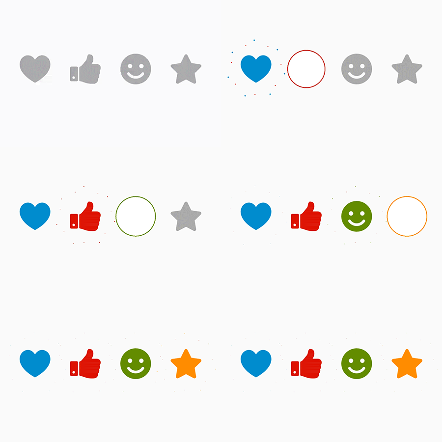
| Small Shine | More Shine | Others |
|---|---|---|
 |  | |
We are continuously working to improve ShineButton. Here is what we have planned:
VectorDrawable as shape masks.You may now use this library with React Native via the module here
You may also use this library with NativeScript via the plugin here
MIT License. See LICENSE for details.
Overall
Maintained
Code review
Latest release
Releases this year
1,162 followers · starred Aug 2018
68 followers · starred Aug 2017
43 followers · starred Jul 2016
This is a UI lib for Android. Effects like shining.
Kotlin
4,194
148 commits
updated Jul 30, 2026
A lightweight, customizable Android UI library that adds a "shining" effect to buttons, similar to Twitter's heart animation.
build.gradle file:allprojects {
repositories {
...
maven { url 'https://jitpack.io' }
}
}
app/build.gradle file:dependencies {
implementation 'com.github.ChadCSong:ShineButton:v2.0.0'
}
Add the dependency to your app/build.gradle file:
dependencies {
    implementation 'com.sackcentury:shinebutton:2.0.0'
}
<dependency>
  <groupId>com.sackcentury</groupId>
  <artifactId>shinebutton</artifactId>
  <version>2.0.0</version>
  <type>aar</type>
</dependency>
The simplest way to use ShineButton is in your XML layout:
<com.sackcentury.shinebuttonlib.ShineButton
    android:id="@+id/shine_button"
    android:layout_width="50dp"
    android:layout_height="50dp"
    android:layout_centerInParent="true"
    android:src="@android:color/darker_gray"
    app:btn_color="@android:color/darker_gray"
    app:btn_fill_color="#FF6666"
    app:allow_random_color="false"
    app:siShape="@raw/like" />
ShineButton shineButton = (ShineButton) findViewById(R.id.shine_button);
shineButton.init(activity);
ShineButton now supports Jetpack Compose natively!
var isChecked by remember { mutableStateOf(false) }

ShineButtonCompose(
    isChecked = isChecked,
    onCheckedChange = { isChecked = it },
    shape = Icons.Default.Favorite, // Use any ImageVector
    btnColor = Color.LightGray,
    btnFillColor = Color.Red,
    shineColor = Color.Red,
    shineSize = 50.dp,
    allowRandomColor = true
)
Or create it dynamically:
ShineButton shineButtonJava = new ShineButton(this);
shineButtonJava.setBtnColor(Color.GRAY);
shineButtonJava.setBtnFillColor(Color.RED);
shineButtonJava.setShapeResource(R.raw.heart);
shineButtonJava.setAllowRandomColor(true);

LinearLayout.LayoutParams layoutParams = new LinearLayout.LayoutParams(100, 100);
shineButtonJava.setLayoutParams(layoutParams);
linearLayout.addView(shineButtonJava);
If you are using ShineButton inside a Dialog, call setFixDialog(dialog) to ensure it renders correctly:
shineButton.setFixDialog(dialog);
| Attribute | Java Method | Description | Default |
|---|---|---|---|
app:siShape | setShapeResource(int) | Raw resource (PNG mask) for the shape | - |
app:btn_color | setBtnColor(int) | Initial color of the button | Color.GRAY |
app:btn_fill_color | setBtnFillColor(int) | Color of the button after being checked | Color.BLACK |
app:allow_random_color | setAllowRandomColor(boolean) | Whether the shine effects use random colors | false |
app:shine_count | setShineCount(int) | Number of shine particles | 8 |
app:shine_size | setShineSize(int) | Size of the shine particles in pixels | - |
app:big_shine_color | setBigShineColor(int) | Color of the primary shine particles | - |
app:small_shine_color | setSmallShineColor(int) | Color of the secondary shine particles | - |
app:shine_animation_duration | setAnimDuration(int) | Duration of the shine animation (ms) | 1500 |
app:click_animation_duration | setClickAnimDuration(int) | Duration of the click animation (ms) | 200 |
app:enable_flashing | enableFlashing(boolean) | Enable a flashing effect | false |
app:shine_distance_multiple | setShineDistanceMultiple(float) | Multiple of distance from button center | 1.5f |
app:shine_turn_angle | setShineTurnAngle(float) | Angle offset for shine particles | 20 |
| Small Shine | More Shine | Others |
|---|---|---|
| | |
We are continuously working to improve ShineButton. Here is what we have planned:
VectorDrawable as shape masks.You may now use this library with React Native via the module here
You may also use this library with NativeScript via the plugin here
MIT License. See LICENSE for details.
Overall
Maintained
Code review
Latest release
Releases this year
1,162 followers · starred Aug 2018
68 followers · starred Aug 2017
43 followers · starred Jul 2016



